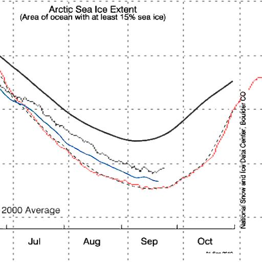
NSIDC measures 15% concentration ice. DMI measures 30% concentration ice. NSIDC always reports more ice, because they measure it at a lower threshold.
The graph above normalises the two by visually lining up 2007 – NSIDC dashed and DMI red. The match for 2007 is nearly perfect from July through October.
As you can see, the behaviour in 2010 is quite different. NSIDC (blue) shows 2010 much closer to 2007 than DMI (black) does. What this tells me is that most of gap since July has been due to loss of low concentration ice (less than 30%.)
The DMI higher concentration ice is 25% above 2007, while the NSIDC lower concentration ice is less than 10% above 2007.
It occurs to me that the position of the edge of low concentration ice is not particularly interesting – in the context of the death spiral. The DMI 30% graph is a better metric for measuring the “health” of the ice.


First snow of the season in Barrow
http://seaice.alaska.edu/gi/observatories/barrow_webcam
The DMI 30% graph is a better metric for measuring the “health” of the ice.
Makes sense. Wouldn’t you agree everyone at NSIDC?
A cooler Canada this winter and a cooler Atlantic from the leftover heat from El Nino going out to space should make Arctic ice even thicker. But you’ve been saying that for a few months. And I know everyone at the NSIDC must be agreeing.
Just as an aside, global sea ice area is currently the 2nd lowest in the last 30 years.
http://arctic.atmos.uiuc.edu/cryosphere/IMAGES/global.daily.ice.area.withtrend.jpg