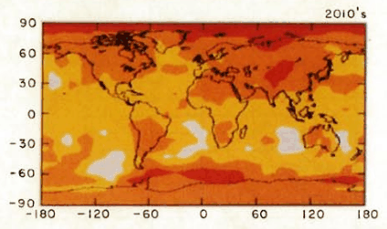
http://pubs.giss.nasa.gov/docs/1988/1988_Hansen_etal.pdf
http://data.giss.nasa.gov/gistemp/tabledata/GLB.Ts+dSST.txt
Hansen’s GISS shows just how poor Hansen’s 1988 forecasts were. The GISS trend line since 1960 is overlaid in red on Hansen’s 1988 forecast graph (Fig.3.) The green dot is the GISS reading for April, 2010. Scenario C assumed that CO2 would remain fixed at 368 ppm.
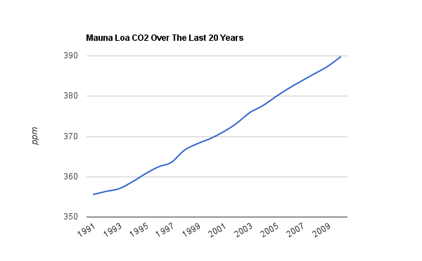
The fact that even bloated GISS numbers are falling below scenario C is a clear indication that Hansen’s understanding of the climate is fatally flawed. Since Hansen made those predictions, CO2 has increased faster than linear. During the 1990s, CO2 increased at 1.5 ppm/year. During the past decade, CO2 increased by 2.0 ppm/year.
ftp://ftp.cmdl.noaa.gov/ccg/co2/trends/co2_annmean_mlo.txt
Where is the heat Hansen forecast? The US was supposed to have warmed more than 1C.
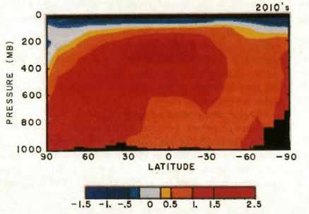
Where is the mid-troposphere hot spot?
Why is government setting policy based on the views of a scientist who’s own data falsifies his theory?


Which shows this to be a political contrivance and nothing more.
It can be nothing else anymore….
I’m amazed that we are even still talking about it, none of their predictions have come true
Once the world’s mightiest empire… now brought to its knees by an atmospheric trace gas.
And stupidity.
Amazing.
Since GISS temperatures are fabricated data at best would not the actual current green dot be much further below scenario C, highlighting an even further error? If that’s the case then where would it be located? Whose data, if any, can be trusted to be accurate?
I would actually say that scenarios B and C agreed well until around the year 2000.
Also, on the above graph’s scale, the differences between GISS and other data sets would be small enough that it doesn’t make too much difference.
-Scott
His disaster scenario kicks in after 2000, so you are really damning him with faint praise.
If the divergence continues for much longer then Congress should invite him in again and ask questions. No turning of the airconditioning this time. 🙂
Scott, the graph starts in 1960, Hansen made this prediction in 1988.
1960 – 1988 should be spot on of course. He used past records to make it look like he knew what he was talking about, hindcasting again. That first 28 years makes the whole graph appear to be accurate, and fooled some people.
Other than a small hiccup, it starts diverging the second Hansen opened his mouth, in 1988
Where is the heat Hansen forecast?
It is only Hansen’s incubus. It’s in his mind. And it’s in his data—at least he’s trying to put it there.
I recollect that US mean temps have not gone up for a very long time now. I could be wrong.
down
OK Scenario “C” is no increase in CO2, and the
actualGISS provided temperature is even below that, which surely falsifies the GISS AGW greenhouse theory. There are no other plausible interpretations. This is the proof that the theory is not correct.The “plausible interpretation” that the CAGW believers try to put forth is that he slightly overestimated the climate sensitivity to CO2. But if that was the case back then, what evidence do we have that anything is different now? Don’t temperature records indicate the sensitivity is on the order of 20-40% of the reported 3 C/doubling?
-Scott
I am not a US citizen, so I cannot demand of my congressman to haul him to a committee meeting; but there surely are Americans here who can.
The forecasts were inaccurate due to Stone Age models we had in 1988. But just wait!
Time for the good folks in jolly old England to start putting the lampposts to good use.