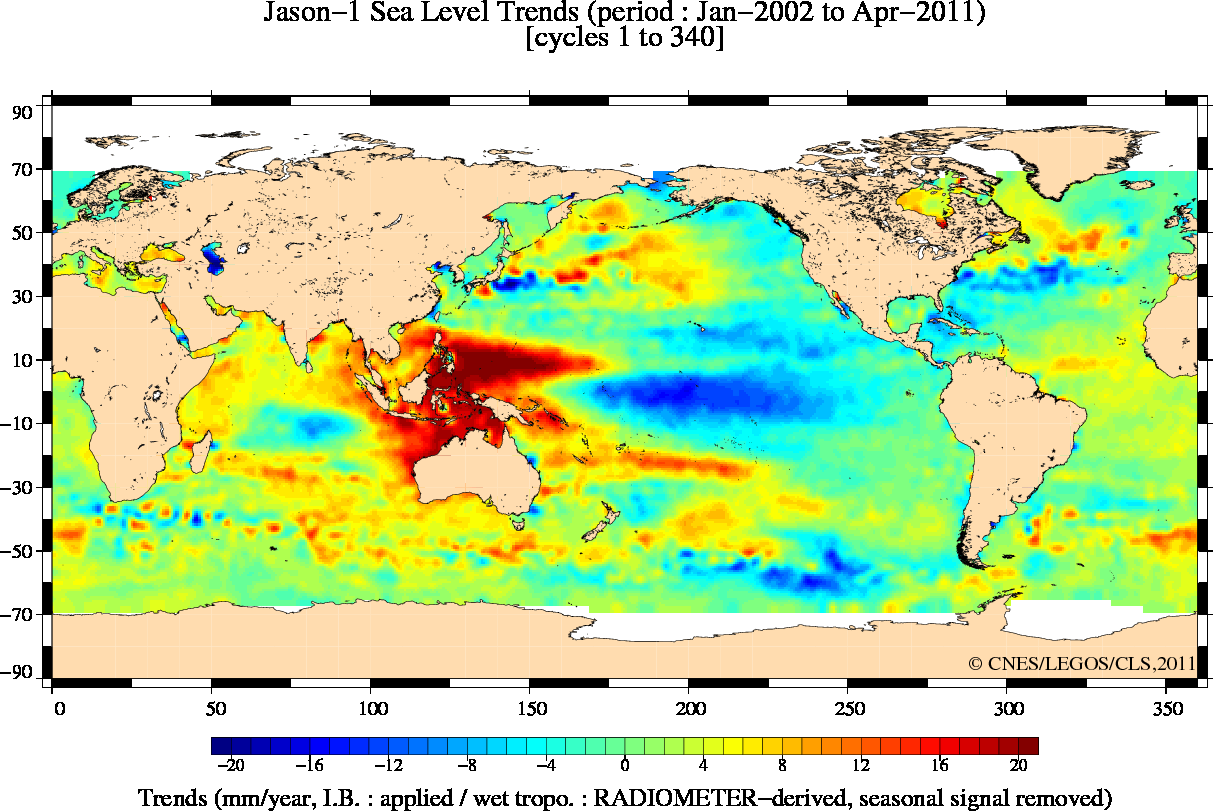
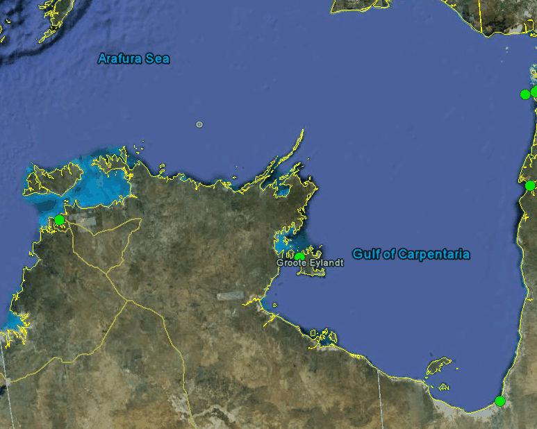
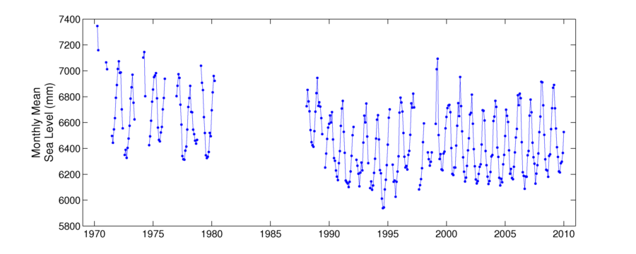
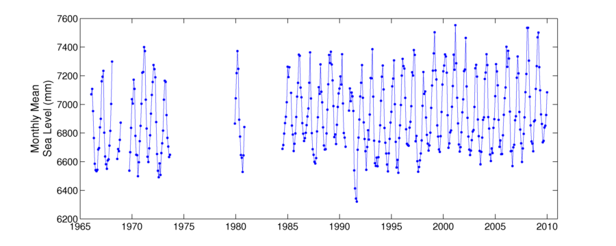
The reason that some satellites show a rise in sea level is because of a “hot spot” north of Australia which skews their numbers way up. Tide gauge data from the region shows nothing of the sort.
http://www.psmsl.org/data/obtaining/stations/1268.php
http://www.psmsl.org/data/obtaining/stations/1157.php
http://www.psmsl.org/data/obtaining/stations/835.php

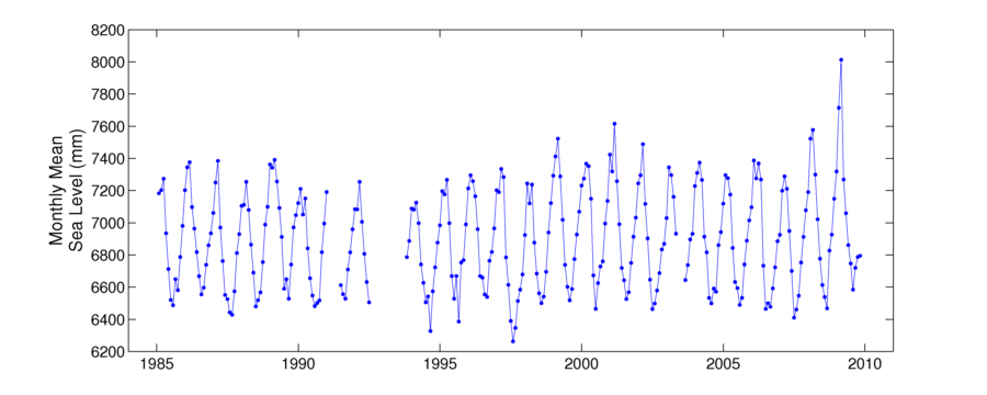

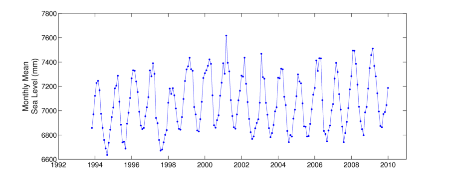

The globe in that region is gaining weight or it represents the Middle Age Slump towards the waist.
There is another possibility!!!!! I understand the Aussies like BEER and we all know what a BEER Belly looks like!!!! 😉
Seeing how it is below the waist and to the rear, I think less sitting and more exercise is called for by the citizens of that region!!! 😉
why would the features mostly align latitudinally ?
I think it has to do with the La Nina/El Nino dynamic. But, yes, the brush strokes are east/west.
Bob Tisdale summarises the latest NODC ocean heat content data over at Anthony’s.
No increase since 2003.
http://wattsupwiththat.com/2011/06/19/tisdale-on-2011-ocean-heat-content-and-the-giss-miss/#more-41915
Anyone believing a satellite can accurately measure a body of fluid in constant motion to a tenth of a millimeter is smoking something more than hemp.
And selling satellites, or something…
This is strikingly similar to the ‘Russian maneuver’, which appears to be one means by which the surface temperature averages are raised.
Parts of Scandinavia are rising 11mm a year due to glacial rebound.
Could some of the tectonic plates be rising?
Or is it just crap software … or even worse, the equivalent of Hanson’s Artic?