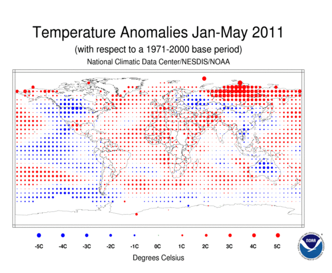
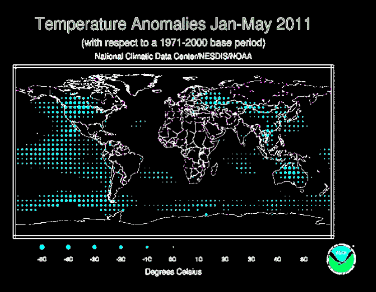
NCDC maps always make it look like the world is burning up, because of their choice of color scheme.
http://www.ncdc.noaa.gov/sotc/service/global/map-blended-mntp/201101-201105.gif
I removed all the red, and hue shifted the blue. It becomes clear that much of the planet has been running cold in 2011.


If you remove all the bits that are hotter than average, then the remainder is cooler than average?
STOP THE PRESSES!
As usual, you miss the point.
Peter, a large area of the Pacific ocean, most of North America, the largest portion of Asia, the Antarctic, and Australia has cooled. Now, do you deem that as news worthy?
And, your welcome, anytime you need an in depth interpretive analysis such as this one, just ask. I know its trick for warmists. 🙂
No wonder they have them fooled……………
Is the original NCDC map based on GISS data? I have seen it before – and ignored it. It looks like total . . . . ! For a start, it’s a grid of equally spaced dots superimposed on a Mercator’s Projection – what’s going-on there? These seem to give a more plausible picture.
http://nsstc.uah.edu/climate/ and
http://www.esrl.noaa.gov/psd/map/ANIM/sfctmpmer_01a.fnl.11.gif
Sorry wrong link the second one should have been
http://iridl.ldeo.columbia.edu/maproom/.Global/.Atm_Temp/Anomaly.html
You’re right – Mercator makes the Arctic Circle look the same length (circumference) as the equator. I understood the map was supposed to be based on grid squares of equal size, but the NCDC map has grid squares reducing in actual size towards the poles. Creative accounting indeed.
GISS reports are based on NCDC Data. NCDC is part of the National Weather Service and they are responsible for the equipment used to measure the temperatures as well as collecting data from other nations. They do their “Magic” then turn it over to GISS for further Torture!
That is not a Mercator Projection.
You’re right it’s not Mercator, it’s sort of “squashed” at the poles. But what is it? Certainly NOT an equal-area projection! Look at the relative sizes of Greenland and Brazil. Area of Greenland = 836,109 sq mi. Area of Brazil = 3,287,597 sq mi.
There are some obvious tricks up their sleave. They have a large, very hot area in Siberia, right next to a large cold area just to the south. They have Australia surrouded by hot water, even though the land mass is cold. In fact they have to whole south Pacific warm, with their warm areas virtually touching the cold areas.
Basically, every place that is not clearly documented to be below nomal, they make it above normal. There is a clear attempt to warm bias this chart as much as humanly possible.
Perhaps a way of showing the visual deception with the red dots, is to reverse the colours so that red represents cool and blue represents hot. That would even be more in line with physics.