arctic.atmos.uiuc.edu/cryosphere/timeseries.anom.1979-2008
In 2008 Mark Serreze declared that the Arctic was in a death spiral
Arctic Ice in “Death Spiral,” Is Near Record Low
Mason Inman
for National Geographic News
September 17, 2008The Arctic Ocean’s sea ice has shrunk to its second smallest area on record, close to 2007’s record-shattering low, scientists report.
The ice is in a “death spiral” and may disappear in the summers within a couple of decades, according to Mark Serreze, an Arctic climate expert at the National Snow and Ice Data Center in Boulder, Colorado.
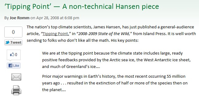
In 2008, James Hansen declared that we were at a tipping point due to ice loss at both poles which was going to decimate life on the planet. (Note that Romm describes Hansen as being plural.)
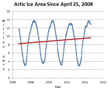
Since the same date in 2008, Arctic ice has increased by more than 15%. Global sea ice area is fifth highest on record for the date. The breathtaking ignorance of the experts is indeed breathtaking.
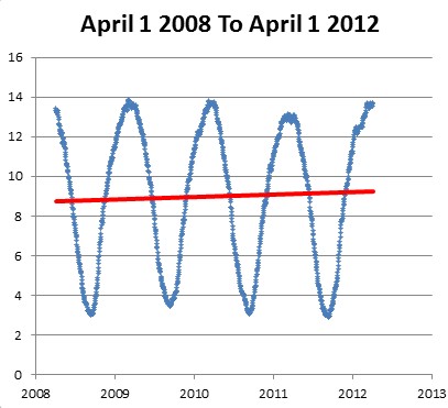
The graph below shows April 1 to April 1, which was the peak day in 2012.


A very nice recovery. Makes the alarmists look like total fools. They will go all out to “adjust” or just simply lie about this incline. Or say the science is still sound and that this is only a pause before superduper expontial warming sets in. Or a result of low sunspots, La Nina, evil Chinese aerosols. Whatever!
The blue graph looks like arctic ice area is holding steady, when averaged over an annual cycle. However, the red line is bogus. The upward slope is an artifact of the fact that the start/stop point is in springtime, which makes the graph start with a summer and end with a winter.
BTW, I think you should sue Mr. Garwin.
Not really, we are very close to the peak – which was much higher in 2012 than 2008.
Nonsense — the 2008 peak isn’t on the graph — and the 2012 peak is in the same place as the 2009 and 2010 peaks. And to any reasonable error bars, the 2011 peak isn’t different, either.
Look at the bottom graph.
Okay, Steve, I’m looking at your bottom graph. It is labeled, “The graph below shows April 1 to April 1, which was the peak day in 2012.” But April 1, 2009 was not the peak Arctic ice extent in 2009, as you can see here:
http://nsidc.org/images/arcticseaicenews/20090504_Figure2.png
Comparing March 2009 to March 2012…
“Arctic sea ice extent in March 2012 averaged 15.21 million square kilometers…” – http://nsidc.org/arcticseaicenews/2012/04/
“[Arctic] Sea ice extent averaged over the month of March 2009 was 15.16 million square kilometers..” – http://nsidc.org/arcticseaicenews/2009/04/
That’s pretty darn flat!
BTW, I noticed a funny thing on the NSIDC site.
http://nsidc.org/arcticseaicenews/2009/03/ or http://www.webcitation.org/67TjRMEdJ says:
“On February 28 [2009], Arctic sea ice reached its maximum extent for the year, at 15.14 million square kilometers … Ice extent grew through much of the month of March, but it did not expand to the level seen on February 28.”
But http://nsidc.org/arcticseaicenews/2009/04/ or http://www.webcitation.org/67TjdqtC7 says:
“Sea ice extent averaged over the month of March 2009 was 15.16 million square kilometers”
I think it Interesting that the average for March 2009 was greater than the claimed maximum for that year. I wonder how they calculated that? 🙂
I’d like to see it graphed all the way back to the beginning of the data, in ~1973, not 1979 or 2008.
Can you get the data from 1973?
That is an interesting question. The maps used to be available from the National Ice Center (not the same as NSIDC) but have been taken down since I started posting about it.
Slope is still down after correcting for cyclical pattern… -0.189 million km^2/yr… See chart at:
http://naturalclimate.wordpress.com/2012/04/28/in-response-to/
The modeled trend is down, but the actual trend is flat.
Look at the ends of that graph closely, comparing the pink (modeled) curve to the yellow (actual) ice extent.
Look especially at the upper and lower peaks at the left end. The pink (modeled) peaks are well above the actual (yellow) ice extents (both minimum and maximum!) at the left (2008-09) end of the graph. That’s because the pink (modeled) curves show a declining trend which does not exist in the actual ice extent data.
OK, here is my attempt. You will have clicked on different spots than I did, but this is the data I extracted using EnGauge (a chart digitizer) :
http://www.divshare.com/download/17540955-39b
Download the sea ice excel sheet…
Looks reasonably close. Need a better original to have a better result.
http://digitizer.sourceforge.net/
Very cool! Thank you!!