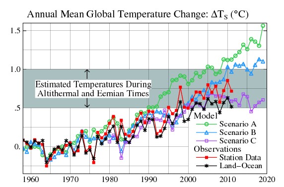
I was amazed to find this graph on the Columbia University website. It shows that temperatures are running below Scenario C – meaning that Hansen’s forecasts failed miserably.
Instead of admitting it though, they tried to obfuscate it with a grey block containing some irrelevant nonsense about alti eenie weenie times, and by adding an irrelevant and phony red station only data line.
Here is what the graph looks like with the obfuscation removed. A glaring statement that Hansen was wrong – about everything.


WE couldnt make this stuff up…
but THEY sure can!