It was the best of times,
it was the worst of times,
it was the age of wisdom,
it was the age of foolishness,
it was the epoch of belief,
it was the epoch of incredulity,
it was the season of Light,
it was the season of Darkness,
it was the spring of hope,
it was the winter of despair,we had everything before us, we had nothing before us, we were all going direct to Heaven, we were all going direct the other way— in short, the period was so far like the present period, that some of its noisiest authorities insisted on its being received, for good or for evil, in the superlative degree of comparison only.
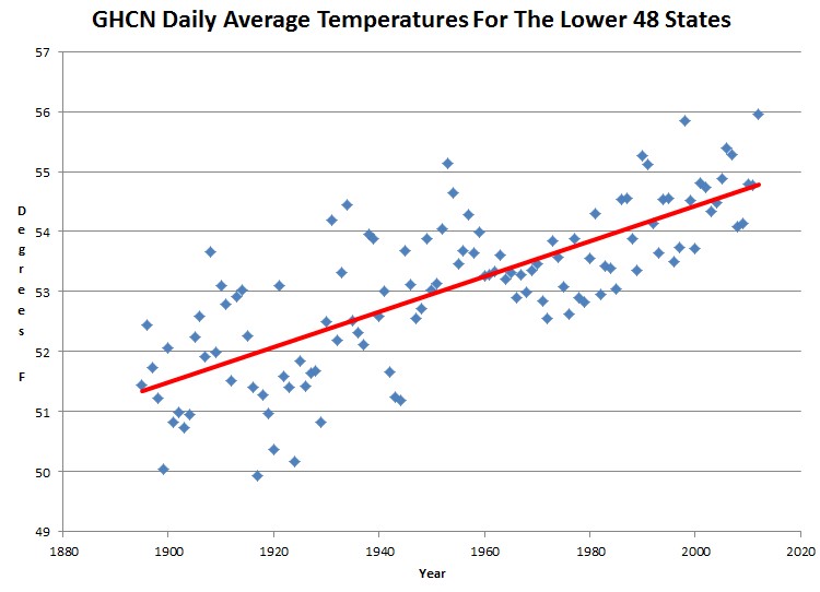
I found the GHCN daily data files, and analyzed their 1600 stations in the lower 48 states. The yearly average showed more than three degrees F warming in the US since 1895 – about the same as GISS shows since Hansen corrupted the data a decade ago.
ftp://ftp.ncdc.noaa.gov/pub/data/ghcn/daily/ghcnd_all.tar.gz
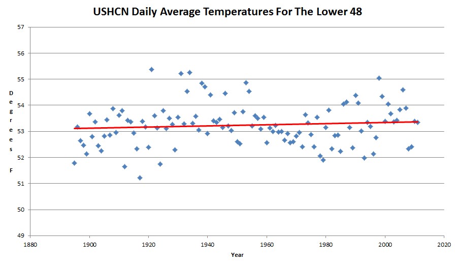
Here is the daily data for the same lower 48 states from USHCN. It shows almost no warming.
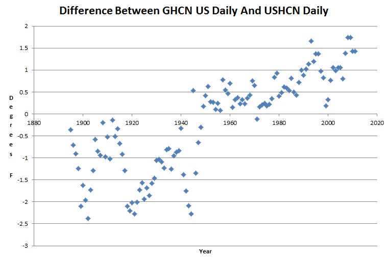
It appears that GHCN must cherry pick or alter 1600 locations in the US to create a trend which doesn’t exist. The graph below shows the massive difference between GHCN daily and USHCN daily data for the lower 48 states.
Most of the GHCN US data seems to come from airports, which are known to be strongly affected by UHI.
So how did Richard Muller come to the conclusion that the world is heating up due and it is due to man-made CO2?
Simple : he used crap data from GHCN to generate the trend. CO2 must be very powerful stuff, as it appears to have corrupted the GHCN database. Garbage in, garbage out.


Spinning fast today, aren’t we? (PS: USA48 is 1.6% of the globe.)
About half of the GHCN data set is located in the US, and it doesn’t even vaguely resemble reality.
Steve are you claiming that Muller used adjusted data to perform his adjustments on? Because I was under the impression that his team used the raw data. Otherwise the entire exercise would be utterly pointless???
No, I am looking at what is supposed to be the raw data.
So David are you going to admit you were wrong and it’s closer to 50% and not 1.6% ?
If you can back up your statement this would at least demonstrate that you are not completely clueless.
… Crickets …
I suppose a clearer way to phrase my question is, if it’s possible that 50% of the data set is crap, why would there be reason to be confident in the other 50%? What has 1.6% surface area got to do with anything given the point being made here?
If Appell is yelling “Bullshit!” I would like to know if his response is actually nothing more than bullshit, or if his remark has some relevance to the actual claim being made.
Will – 1.6% is of the globe. BEST isn’t even global, it’s land-only and doesn’t include Antarctica. So Dr. Appell’s number is off by >3x.
-Scott
Hmmm…. total global land surface area 149m2. Antarctica is 13m2. And USA 9m2.
So that’s about 15% of the measured area, not 1.6% as Appell stated. So he seems to be out on his claim by more than an order of magnitude, even if you ignore the required temperature extrapolations to get a global average (which in themselves must be huge).
Sounds like a very disingenuous claim to me…
Will – it’s lower 48 states’ land area…so exclude ocean and Alaska. I got 5.7% on my calculation.
-Scott
Is BEST global? (P.S. The lower 48 comprises about 5.7% of the land area of the Earth after Antarctica is subtracted.)
-Scott
About half of the GHCN data set is in the US, and it appears to be complete crap. Are you expecting the other half to be lots better?
I’m not expecting it to be better. My response was to Dr. Appell, as his “correction” was itself off by over a factor of 3.
I would actually argue that the U.S. record is probably the best out there (by far), and yet even it seems to be pretty poor.
-Scott
http://www.youtube.com/watch?v=XgyMUChgcbU&feature=related
Send lawyers guns and money
Fine choice.
Also Warren Zevon – Hit Somebody – The Hockey Song sorta fits.
USHCN and GHCN(US) use different station data? I figured the USHCN went straight into GHCN as a subset. Please tell me we don’t have 2 separate sets of stations…
Where did you find the data?
Completely different – it appears that the GHCN data is largely at airports . The URL is in the article.
VALPARAISO HURLBURT FLD MAYPORT PILOT STN PENSACOLA FOREST SHERMAN HUNTSVILLE INTL AP EASTOVER MCENTIRE ANG BLUEFIELD MERCER CO AP HUNTINGTON TRI STATE AP MERIDIAN NAAS SPRINGFIELD AF TERRE HAUTE HULMAN RGNL A GREER CINCINNATI WSO CITY BECKLEY RALEIGH CO AP FT BENNING MCKENNA FT STEWART WRIGHT VALPARAISO TROY MUNI AP CENTREVILLE 6 SW PANAMA CITY BAY CO AP BIRMINGHAM WSFO DECATUR AP ATLANTA FULTON CO AP JACKSON BLOOMINGTON MONROE CO AP
The question then: Is this a deliberate cherry pick of airports to obtain the desired warming, or is it that someone ignorantly assumed it would be simple to use METARs as they are freely available and maintained – and airports are big open spaces therefore not subject to UHI?
In other words – cock-up vs conspiracy.
For those who are interested, the Berkeley Earth Surface Temperature (BEST) methodology can be found here: http://berkeleyearth.org/pdf/berkeley-earth-averaging-process.pdf. The methodology is robust and credible.
Steve, this is huge… HUGE. That 2 datasets over the same area show 3°F difference is amazing! How can this tie in with Anthony’s work?
Don BEST is complete fraud crap based on GISS,MOAA, BOM adjusted fraudalent
data check AMSU check this site for GISS adjustments for example these guys will go to jail mark my words
Seems Appell spun himself outta here real fast today.
I thought that two of the few things almost everyone agreed on were that N.H. temps had climbed about 0.75C during twen-cen, and that the U.S. had the biggest and best station network in the world and was therefore a pretty good indicator of N.H. temps.
Considering that, it seems unbelievably dumb that team BEST would use an only slightly longer and problematic data set that shows almost 2C warming. Do these guys ever pause and think before they publish? They’re their own worst enemies.
I don`t see any reason to agree with that idea,
Eh? Which/what idea? That most people on both sides of the debate agree on the temperature trend of the 20th century, and that the U.S.’s network is the best? I’m not qualified to comment, but you (and Anthony) seem to have done a good job deflating both of those; but that was beside my point, which was that it was dumb of Muller to deviate from the standard dogma, crappy or not. He seems to have barely mentioned it, let alone tried to justify it. He may as well have painted a big red & white target on his back.