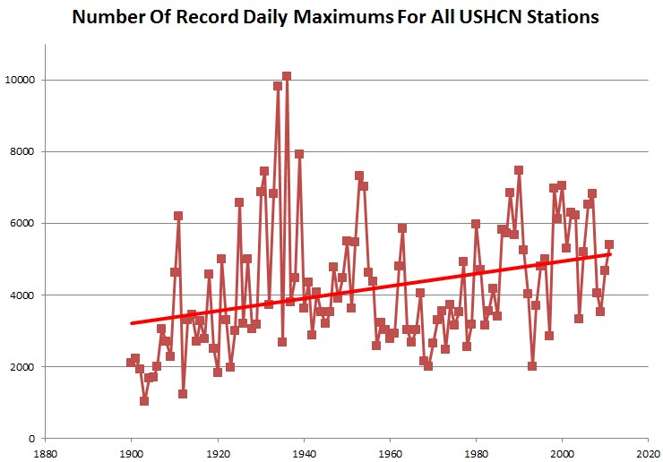
When we do an apples to apples comparison of all-time record maximums set or tied for stations which have long term records (since 1900) – we see that they are in steep decline since the 1930s.

Warmists don’t like this, so they cheat. They throw in a lot new stations which are guaranteed to have recent record maximums. The next graph shows the same plot for all USHCN stations, regardless of age. Record maximums appear to be increasing, but it is only because they added stations with no data from the 1930s. (Even with their cheating, recent years are no where near as hot as the 1930s.)
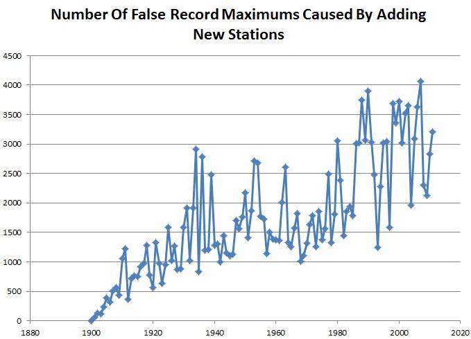
The next graph is the difference between the two graphs above, showing the error in the second graph. Note that 2007 had over four thousand potentially fake record maximums.
But it is worse than it seems. Most of Jeff Master’s records are much shorter than the USHCN stations at the same location, so his error is much larger than the graph above.
It is interesting how they find very obscure issues as excuses to make corrections, and ignore huge issues like the one described here.


There was a book called “How to Lie with Statistics”. Am certain that Masters and friends are very well versed in that.
Dude.
According to your own graph, the frequency of new records has been pretty constant since the 60s.
What exactly do you think that means?
Hint: if temperatures had remained roughly constant, the frequency of new records would follow an exponential decrease. So basically, your own graph shows that temperatures have very much kept increasing since the 60s.
Dude, why don’t you try using your brain and think about the meaning of “all-time record maximums set or tied” before making stupid comments.