Disrupting the Borg is expensive and time consuming!
Google Search
-
Recent Posts
- Analyzing The Western Water Crisis
- Gaslighting 1924
- “Why Do You Resist?”
- Climate Attribution Model
- Fact Checking NASA
- Fact Checking Grok
- Fact Checking The New York Times
- New Visitech Features
- Ice-Free Arctic By 2014
- Debt-Free US Treasury Forecast
- Analyzing Big City Crime (Part 2)
- Analyzing Big City Crime
- UK Migration Caused By Global Warming
- Climate Attribution In Greece
- “Brown: ’50 days to save world'”
- The Catastrophic Influence of Bovine Methane Emissions on Extraterrestrial Climate Patterns
- Posting On X
- Seventeen Years Of Fun
- The Importance Of Good Tools
- Temperature Shifts At Blue Hill, MA
- CO2²
- Time Of Observation Bias
- Climate Scamming For Profit
- Climate Scamming For Profit
- Back To The Future
Recent Comments
- Bob G on Analyzing The Western Water Crisis
- arn on Analyzing The Western Water Crisis
- Bob G on Analyzing The Western Water Crisis
- Bob G on Analyzing The Western Water Crisis
- Bob G on Analyzing The Western Water Crisis
- Hank Phillips on Analyzing The Western Water Crisis
- Hank Phillips on Analyzing The Western Water Crisis
- Hank Phillips on Analyzing The Western Water Crisis
- Hank Phillips on Analyzing The Western Water Crisis
- Bob G on Analyzing The Western Water Crisis


The Arctic melt season will likely end in September (probably between 9/7-9/21 given past seasons). The earliest minimum since 2003 occurred on 9/9/2011. The “gain” you suggested took place actually turned out to be a large loss.
Stop lying.
I expect analyses that show ice area will show the minimum earlier than those that follow extent because of the impending re-freeze north of 80N in areas that are not already 90-100% concentration ice. Since extent measurements count those areas as all ice anyway, they won’t start showing an increase in ice until it’s cold enough around the margins of the ice pack to start the refreeze.
FYI, NSIDC’s extent surpassed the 2007 minimum as of this morning’s data update.
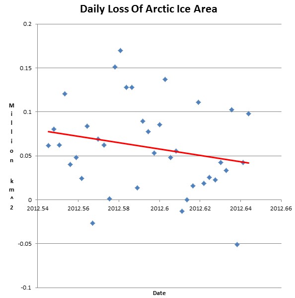
Steven you berk, you’re graphing the wrong column. Your graph shows the day-to-day differences for the fourth column, i.e. the average values across the reference period. To show what’s going on this year you should be graphing the third column.
Thanks for correcting that. Do you have the equation and r-squared values to hand? By eye it looks to be projecting an end to Arctic ice loss some time after the start of October. I think you’re being needlessly pessimistic here, that gradient’s unlikely to be significant with that much scatter.