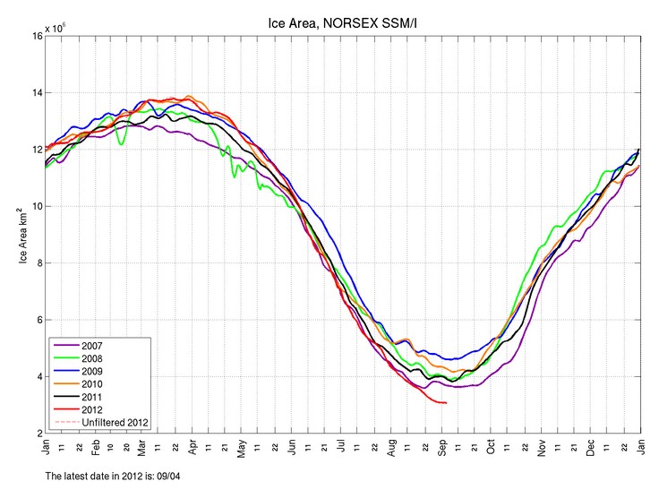
The Arctic melt season pretty much ended on August 25. That was the last day which JAXA maps showed any noticeable contraction of the ice edge.
Almost all of the ice pack is covered with fresh snow now, and each Polar bear only has two Manhattans of ice to herself now. Similar to living in Wyoming.


http://www.ijis.iarc.uaf.edu/cgi-bin/seaice-monitor.cgi?lang=e
Search for 25th of August and then overlay the 5th of September (overlay function is at the bottom of the right hand column. The retreat is very clear, mainly on the Atlantic side and in the northern Laptev sea.
From Bastardi, Arctic ice return with a vengence?
https://twitter.com/BigJoeBastardi/status/243647934581862400/photo/1/large
I’ve been looking at that plot over the last week too. Keep in mind that it’s supposed to be an SST plot, not a sea ice plot. I’d be interested to see an overlay from the above source compared to previous years…specifically looking at areas that supposedly didn’t have ice to see if this year is an anomaly, because the conflict indicated by those plots might be present every year.
-Scott
Do we see the increase in sea ice that Joe Bastardi shows us on the Norsex map?
No.
What is the reason they give for it to be happening?
Guys isn’t that a SSTemp map and not sea ice that Bastardi is posting? I like that map and it is a fair to good proxy for ice but it has problems and you only have to look at it animated to see the lack of continuity between days to see what I mean.
Dang I should have added that if you look at the Canadian sea ice map in the arctic islands west of Baffin Island you can see the nice match of temps and sea ice that cryosphere and others ignore and so that is what got me looking out into the more central part of the Arctic Ocean and wondering if the same was happening there. Initially I thought yes and then sometime in the last several days I looked at the animation and it was goofy enough to make me question the match. Not perfect but another tool to use to try to get to the truth 😉
http://www.aari.ru/odata/_d0015.php?lang=1&mod=0&yy=2012
I think this look more like the dmi sst graph shown by Joe Bastardi.I am not sure what dmi are trying to do with the graph but the white areas may represent low concentration ice which is in the process of freezing up.A number of other things indicate that the area of ice that was broken up by the storm will freeze up quickly one is the theory held by the warmist scientists that sometimes comment here that open water warms up during the arctic summer and must be released into the atmosphere before the water can refreeze,the water where there is broken up ice will not have warmed up very much this late in the Arctic summer.
Hi Steven,
all the sudden you look at ice area not at extent anymore?
Funny!
Waht about my 50 bucks?
BR
MFKBoulder
I told you I am going to pay the bets. Stop spamming the my blog.
looks like the melt season is not over just yet. it’s melting again.
http://arctic-roos.org/observations/satellite-data/sea-ice/observation_images/ssmi_ice_ext.png
Wind.
amazing the arctic is so windy the last few years.