http://denisdutton.com/newsweek_coolingworld.pdf
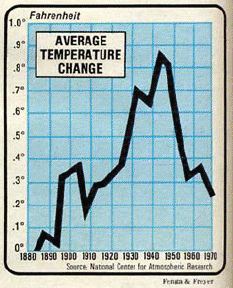
The NCAR graph above from the 1970s, showed 0.6F (0.33C) global cooling from 1945 to 1970, despite the fact that CO2 increased substantially during that period.
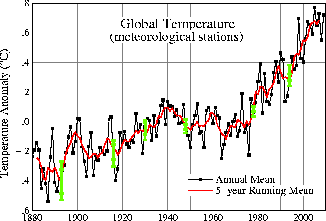
Fortunately, through careful analysis – Hansen has been able to reduce the amount of cooling from 1945-1970 by almost 40%.
http://data.giss.nasa.gov/gistemp/graphs/Fig.A.lrg.gif
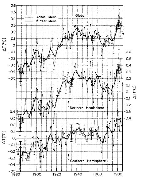
That is a cool nature trick. But not the only one. The graph below was published by Hansen in 1987. Note that the 1940 anomaly was 0.25, but in the current graph it is only 0.1. Both graphs use the same baseline of 1951-1980.
Nature trick #2. Nice!
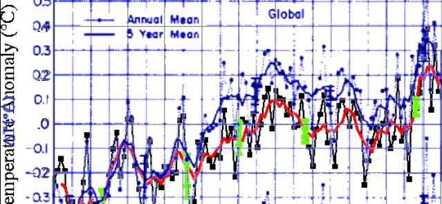
The image below shows the 1987 Hansen graph overlaid on the current one.
Note how temperatures were nearly identical in 1900, but in 1940 they were reduced by 0.15C. What a great way to get rid of that pesky global cooling problem!
No doubt it was all due to TOBS or homogenization or some other important temperature adjustment.
If the present refuses to get warmer, the past must become cooler.


We should consider ourselves warned. Don’t head on over to Hansen’s diner yet, he hasn’t finished cooking the books … they’re not done yet.
You mean 0.6F of cooling?
The configuration for the model that produces the Surface temperature reports is configured with dynamic historic temperatures. Even the temperature you saw last month needs to be fluid rather than stable. The numbers for the start might be fixed but even that is doubtful. Since this “Thing” started I have been watching the temperatures and seeing differences in historic records which lead me to believe the issue is fluid computations in the models. I saw something about this at CA and I believe WUWT. Nasa Giss web site has a Q A page where they explain their method to arrive at what they call SAT (Surface Air Temperature). I erased the link recemtly but the gist was they estimate the individual stations and test each against others in the grid to arrive at an estimated grid figure which becomes the grid mean ( They do high, low mean). This is run through a model until it arrives at a well done record. As was said it appears they cook the books. I am sure they have justifiable explanations for their best guess estimates and all but comparing GISS results to real world is comparing hot dogs to Filet Mignon or Prime Rib.
I went to a “Hot Dog” cook out at my cousins a few weeks ago and made the mistake of reading the package on the hot dogs. It did say beef, chicken, and pork,along with possible turkey. The package said may contain any of the following!
The Giss temperature records reminded me of that package label!
If you make proper allowances for UHIE; what decline?
There might be some heating, but you would be hard pressed to find it on a chart with proper error bars.
Wow, the graph changes over time. Fascinating.
The past changes over time? Pretty sick concept.
Yes static things like a temperature reading should change over time. But only if you have an agenda. You can’t be serious.
Sorry but I dont see how these graphs would show it. The base periods are different so are the offsets. In both versions the decline from 1940-1970 is 0.25C. In 1940-1980 increase is around 0.1C, both. Honestly, it more looks like they have warmed up the beginning of 1900’s.
But the studies before that… they show a more rapid decline. Studies like Mathews (1976) and some of Hansen’s earlier paper. Frank Lasner has pointed them out at hidethedecline.eu.
You should probably read the article before posting.
“Both graphs use the same baseline of 1951-1980.”
but in 1940 they were reduced by 1.5C
I think you mean 0.15C
If the present refuses to get warmer, the past must become cooler.
What will they do as the present cools?
Will a Republican house investigate the GISS record and their methods of adjustments? Many of the press alarmist statements seem to have their origins in the Hansenised figures.