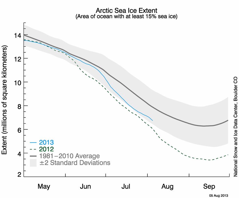
NSIDC shows Arctic sea ice about 10% higher this year than last year, and dropping fast.
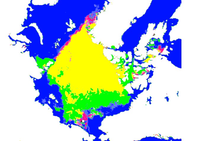
Satellite imagery shows that there is 50% more ice than last year (green area.)
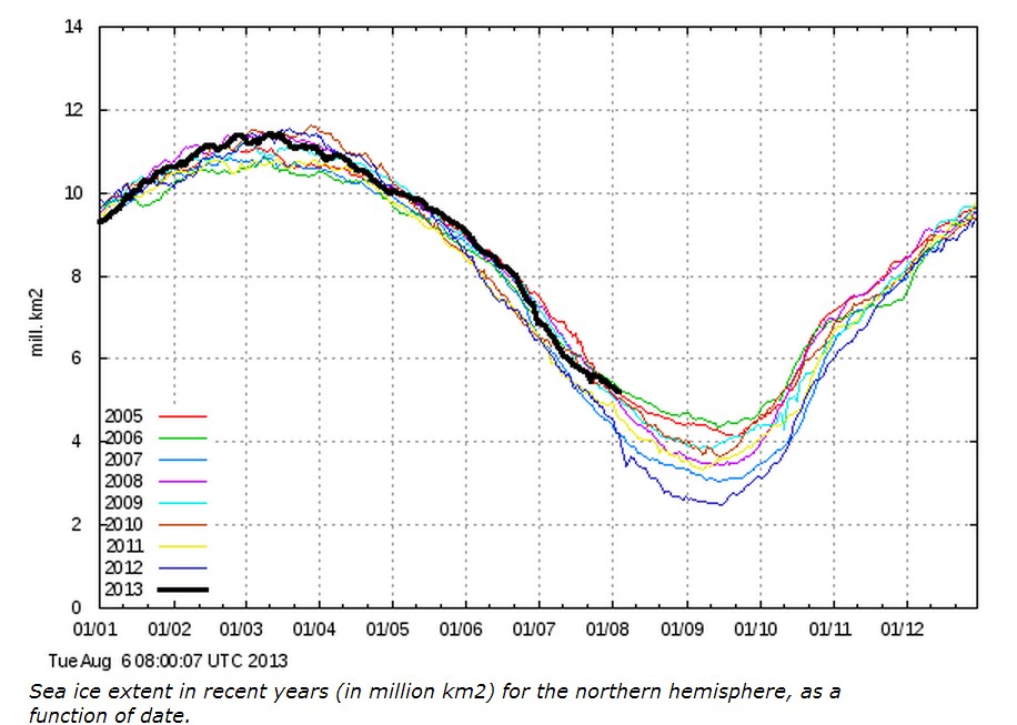
DMI has this right. They show almost 50% more ice than last year, and dropping slowly
What are they smoking in Boulder?


I think NCDC measures extent with at least 15% ice cover while DMI uses area with 30% cover. It would appear that means that this year’s ice is much more consolidated than last year’s.
Didn’t NSIDC announce last year they were using a “new” and “improved” algorithm (filter, something) to separate more ice from water?……anything they can to make it smaller
NSIDC is using a special “torture the data” algorithm combined with a special “grant whore” function … guaranteed to yield the desired answer every time 😉
When the weather doesn’t cooperate, you know the drill. This is their last gasp. They bet the farm on this. They’ll try to get away with this, but won’t. It makes you wonder why these idiots assume that ice extent, previous to 1978-1979 (which was a record year for extent and volume), wasn’t comprised of “thin ice” before now. There were no records/satelites that showed how much ice was packed up there. We know there were major gaps in the ice, enough to raise a submarine in. We know the ice pack of the early 1970s was said to be 15% ABOVE normal, by climatologists in that era. None of this is about finding out what’s true: it’s all about keeping the lie going. Their insistance of lying (mostly because they usually get away with it) is what proves the whole thing is a lie. If it were true, and “facts” were so overwhelming, they wouldn’t have to be so deceptive. It’s really as simple as that. This year was a disaster for them, that’s why they’ve been acting so crazy.
This year was a disaster and they are going to do whatever they can to minimize the damage to “the cause.”
Perhaps “they’ve been acting so crazy” because they are f’en crazy 😉
True, but even for them, they’ve been more hysterical than usual.
It ain’t pot, must be crack.
It may be both; it sounds crack-pot.
Ding Ding Ding. We have our winner!
It’s not what they’re smoking. It’s what they’re milking.
What are they cooking in Boulder?
http://youtu.be/VGD8HwoiO9Q
Even that “satellite” map doesn’t seem to show the ice close enough to the Alaskan and Canadian north coasts, compared to some Canadian ice-cover charts.
When you notice it is really clear over a part of the arctic, go to the satellite view and use your lying eyes. See for yourself.
Scientists living in the past. No mention of 2013!
(Face slap)
http://m.theaustralian.com.au/news/health-science/scientists-record-year-for-ice-melt-greenhouse-gases/story-e6frg8y6-1226692541283
More Arctic alarmist stuff from the University of Boulder, Colorado
http://youtu.be/mv5udkIacBw
They should open a geology department there, and hire someone who is familiar with the Earth Sciences. 😉
NSIDC plots a 5-day trailing mean, whereas DMI simply plots daily values. In a few days a similar 50% difference may be visible in the NSIDC graph as well.