
Ninety years ago, the New York Times reported unanimous consensus that Earth’s climate was controlled by the sun.
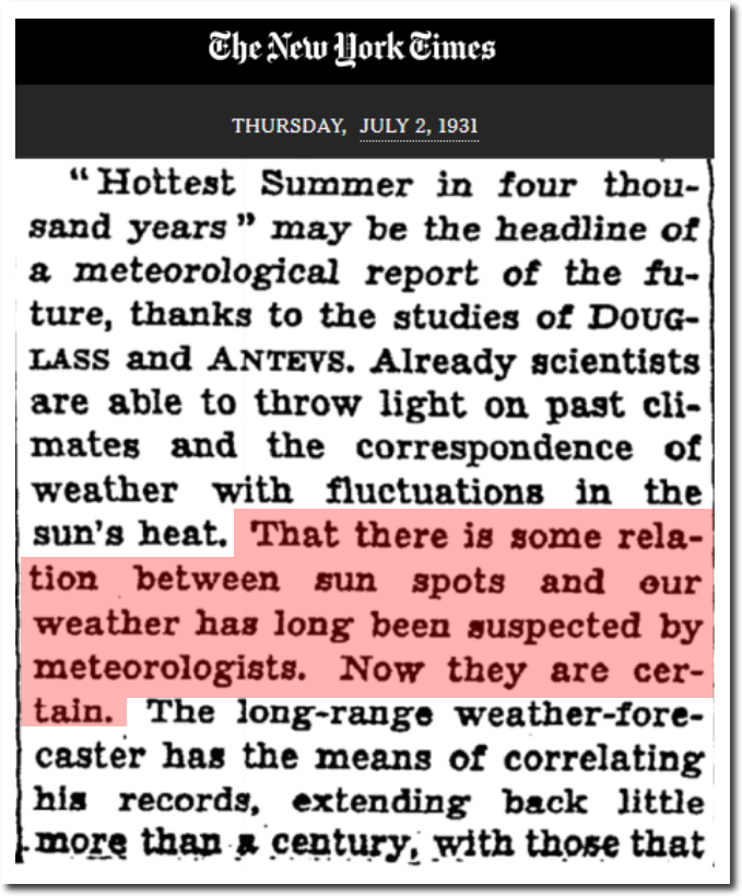
TimesMachine: July 2, 1931 – NYTimes.com
Now NASA reports 97% consensus that Earth’s climate is controlled by CO2.
“Multiple studies published in peer-reviewed scientific journals show that 97 percent or more of actively publishing climate scientists agree*: Climate-warming trends over the past century are extremely likely due to human activities.”

Scientific Consensus | Facts – Climate Change: Vital Signs of the Planet
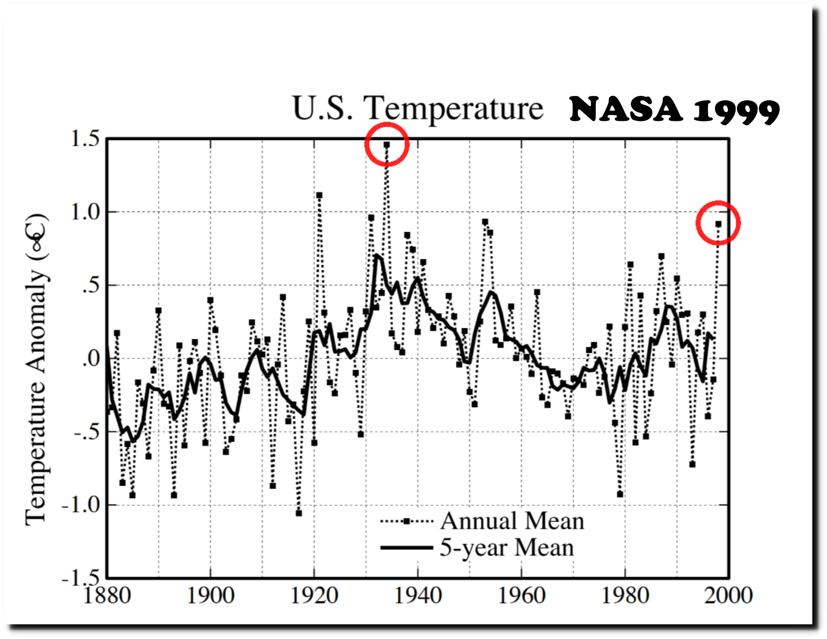
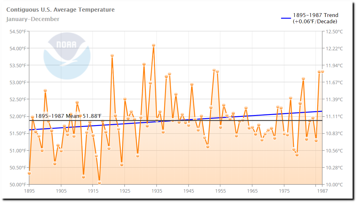
I agree with them – the warming trends over the last century are primarily due to human activities – data tampering by organizations like NASA and NOAA. For example, over the past 20 years NASA has turned a cooling trend in the US from 1930 to 1998 into a warming trend. This is the 1999 version.
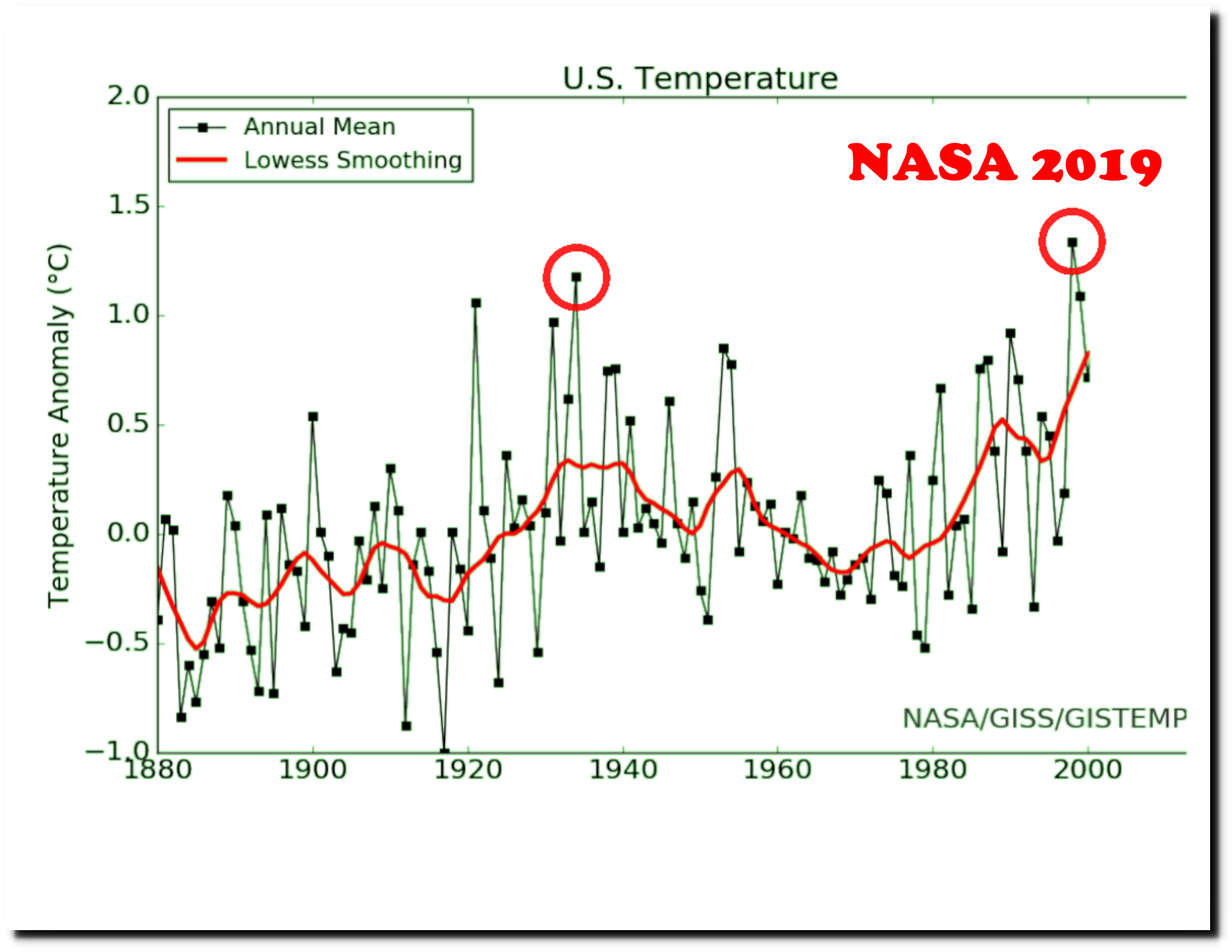
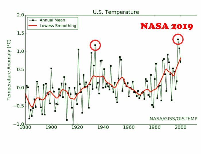
And this is NASA’s current graph.
Here is an animation showing how the data has been altered over the past 20 years.
The US temperature record is very important, because the vast majority of global stations in the NOAA GHCN database with a long term daily temperature record are located in the US.
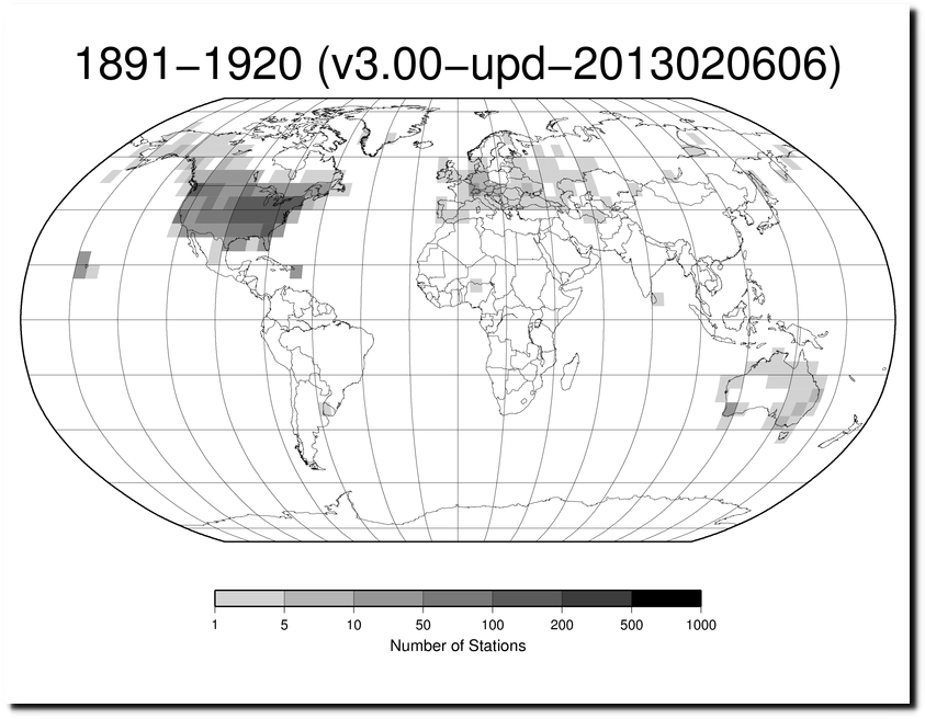
station-counts-1891-1920-temp.png
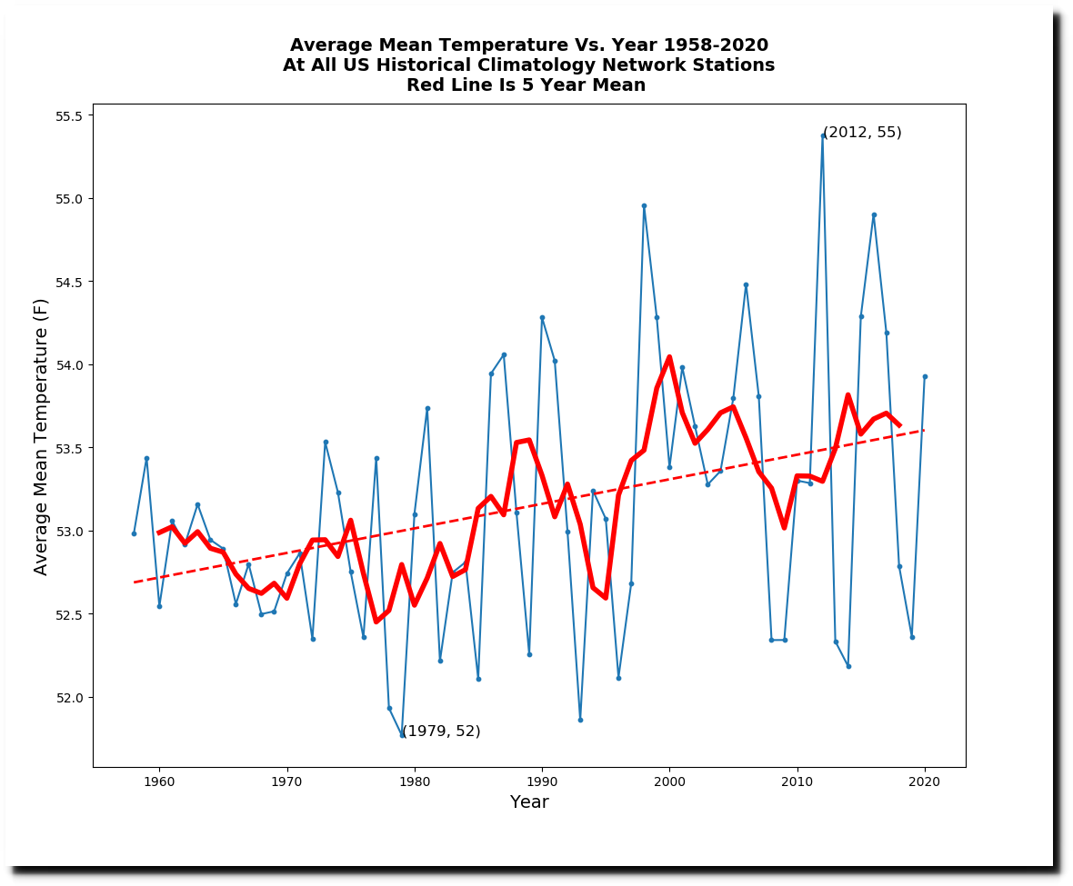
In 1986, NASA’s James Hansen predicted 4-6 degrees warming for the US by the year 2020, and a huge increase in heatwaves.
“He said that with an expected doubling of atmospheric carbon dioxide by 2040, the number of days each year with temperatures over 80 degrees would rise from 35 to 85 in Washington, D.C., and Omaha, Neb.”

12 Jun 1986, Page 12 – The Evening Times at Newspapers.com
The actual temperature increase from 1958 to 2020 was about one degree.
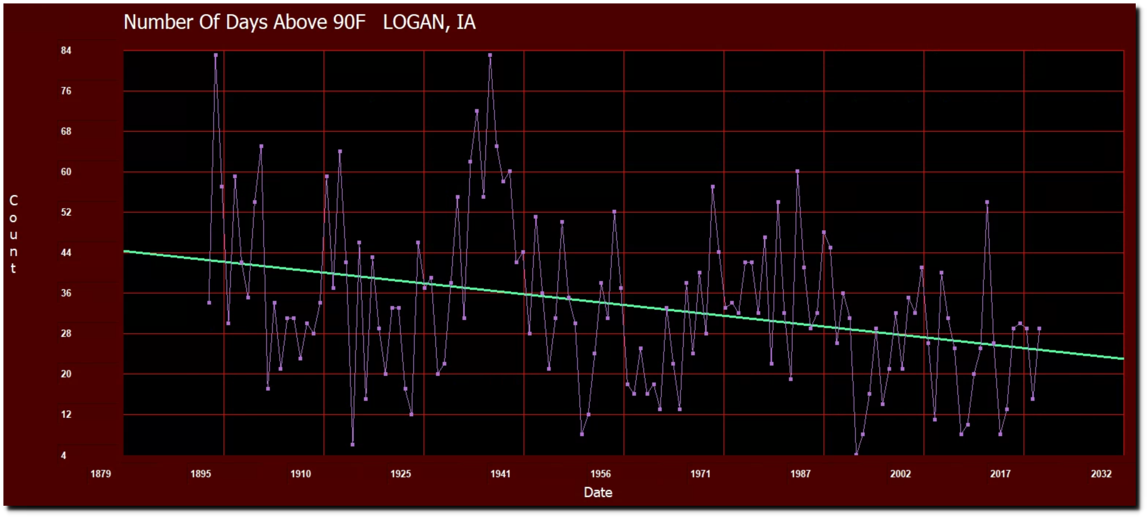
The closest currently operational USHCN station to Omaha is at Logan, Iowa. The number of 90 degree days there peaked in 1894 and 1936 (83) and have been declining sharply ever since.
The closest currently operational USHCN station in Virginia to Washington DC is at Purcellville. The number of 90 degree days there peaked in 1911 (96) and 1930 (89) and have been declining sharply ever since.
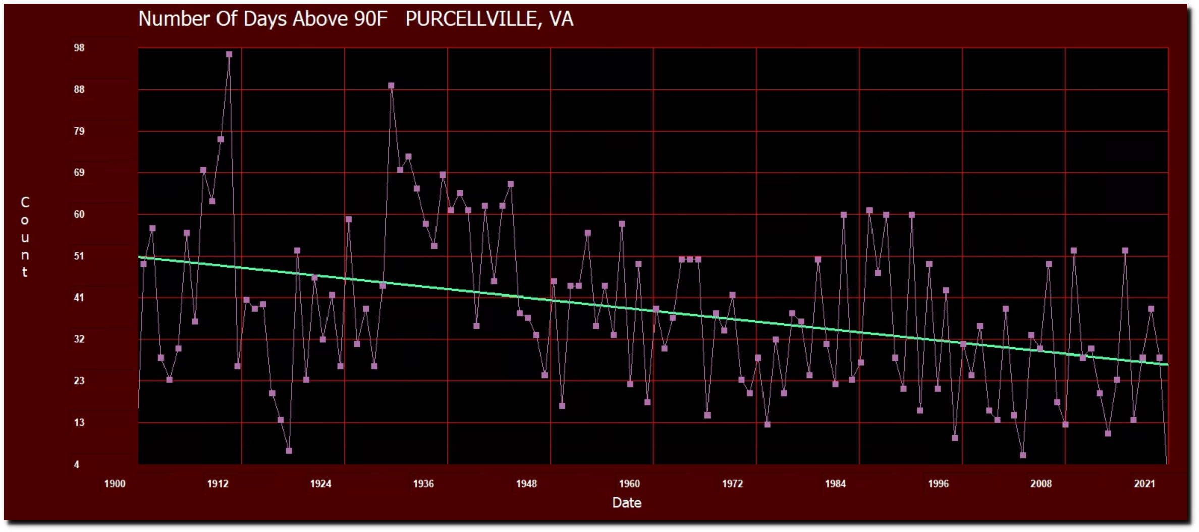
For the entire US, the frequency of 90 degree days has dropped sharply over the past century. Hansen got that exactly backwards.

In 1988, Hansen predicted a large increase in droughts.
“Dr. James E. Hansen, director of the Goddard Institute for Space Studies, who presented recent data compiled from computer models, said that predicted regional effects of global warming show that the chances of summer drought in the low and middle latitudes would be 1 in 3 by the year 2030, as against 1 in 20 in the 1950’s.”
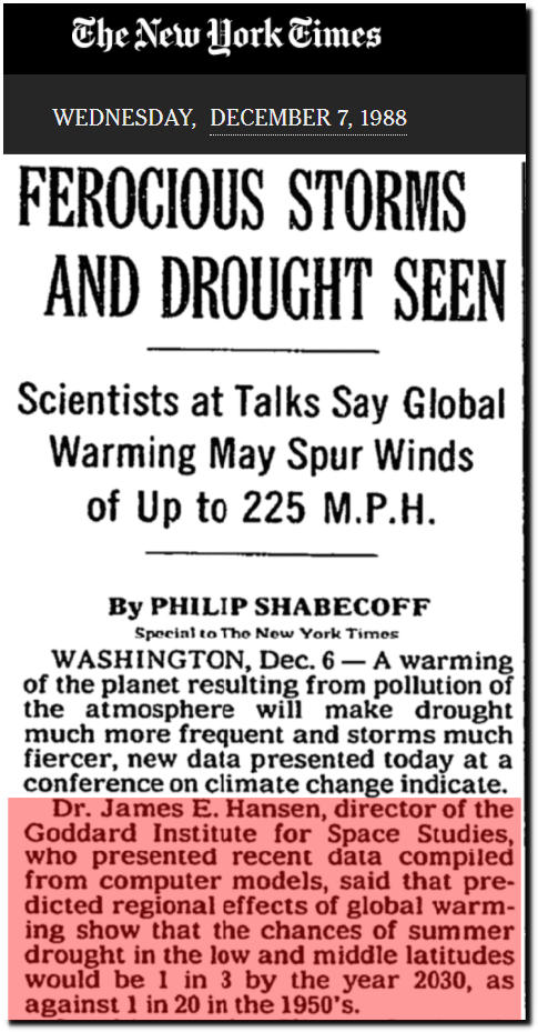 FEROCIOUS STORMS AND DROUGHT SEEN – The New York Times
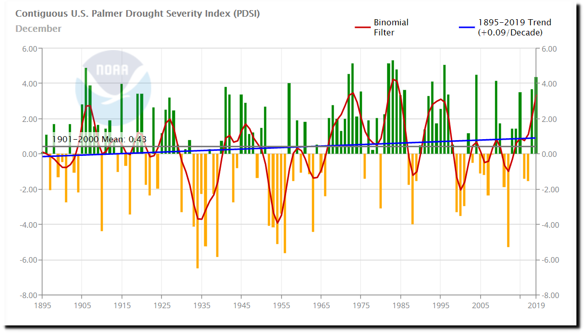
During the 1950’s the US was in drought most of the time, but droughts have been much less common over the past 60 years. Hansen also got that exactly backwards.
Climate at a Glance | National Centers for Environmental Information (NCEI)
One year after Hansen made his forecasts, scientists at NOAA set the record straight.
U.S. Data Since 1895 Fail To Show Warming Trend
“After examining climate data extending back nearly 100 years, a team of Government scientists has concluded that there has been no significant change in average temperatures or rainfall in the United States over that entire period.
While the nation’s weather in individual years or even for periods of years has been hotter or cooler and drier or wetter than in other periods, the new study shows that over the last century there has been no trend in one direction or another.
The study, made by scientists for the National Oceanic and Atmospheric Administration was published in the current issue of Geophysical Research Letters. It is based on temperature and precipitation readings taken at weather stations around the country from 1895 to 1987.”
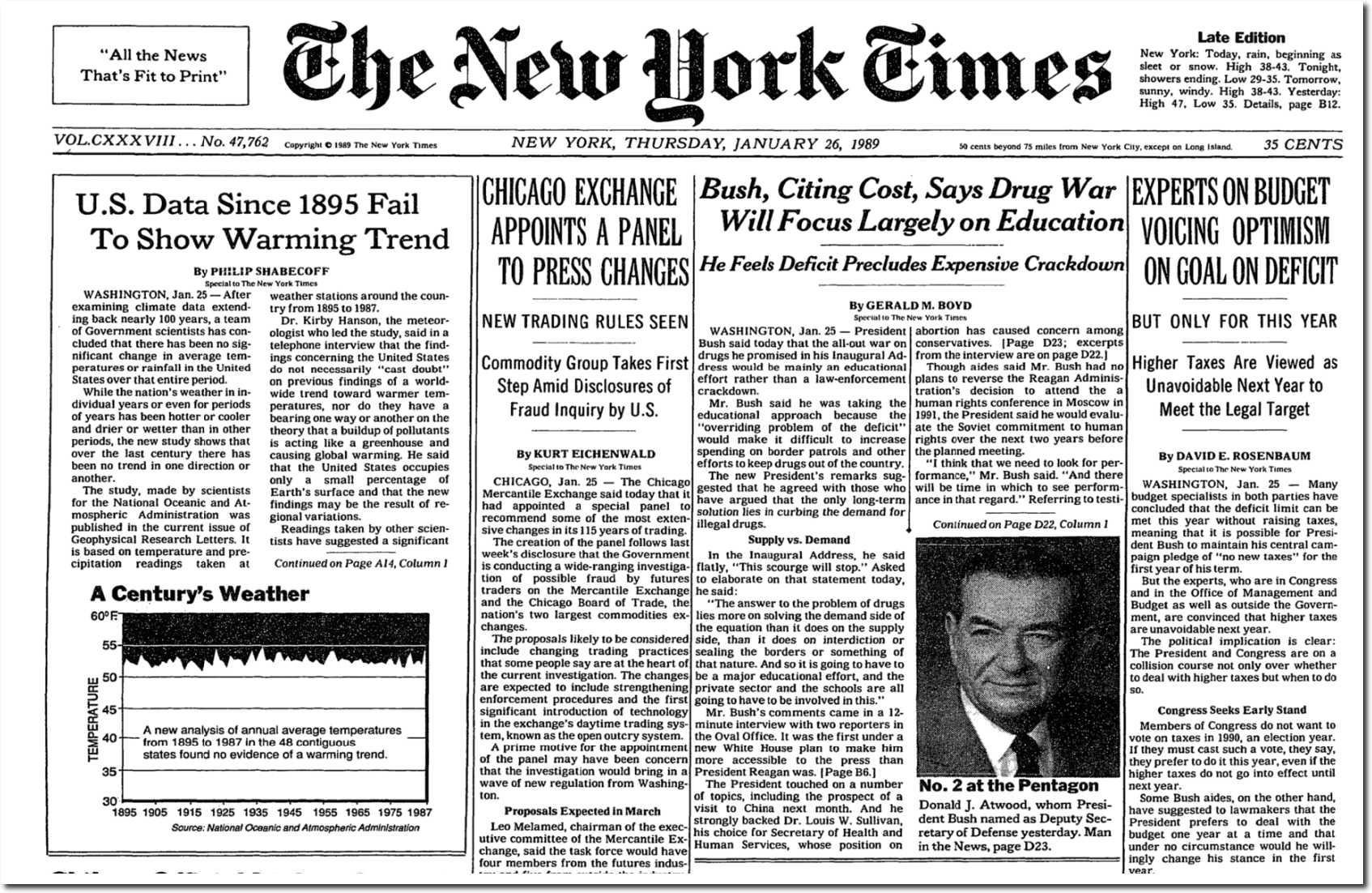
U.S. Data Since 1895 Fail To Show Warming Trend – NYTimes.com
Ten years later, Hansen was upset that the US wasn’t warming as he predicted and the droughts weren’t occurring.
Empirical evidence does not lend much support to the notion that climate is headed precipitately toward more extreme heat and drought. The drought of 1999 covered a smaller area than the 1988 drought, when the Mississippi almost dried up. And 1988 was a temporary inconvenience as compared with repeated droughts during the 1930s “Dust Bowl” that caused an exodus from the prairies, as chronicled in Steinbeck’s Grapes of Wrath.
The U.S. has warmed during the past century, but the warming hardly exceeds year-to-year variability. Indeed, in the U.S. the warmest decade was the 1930s and the warmest year was 1934.
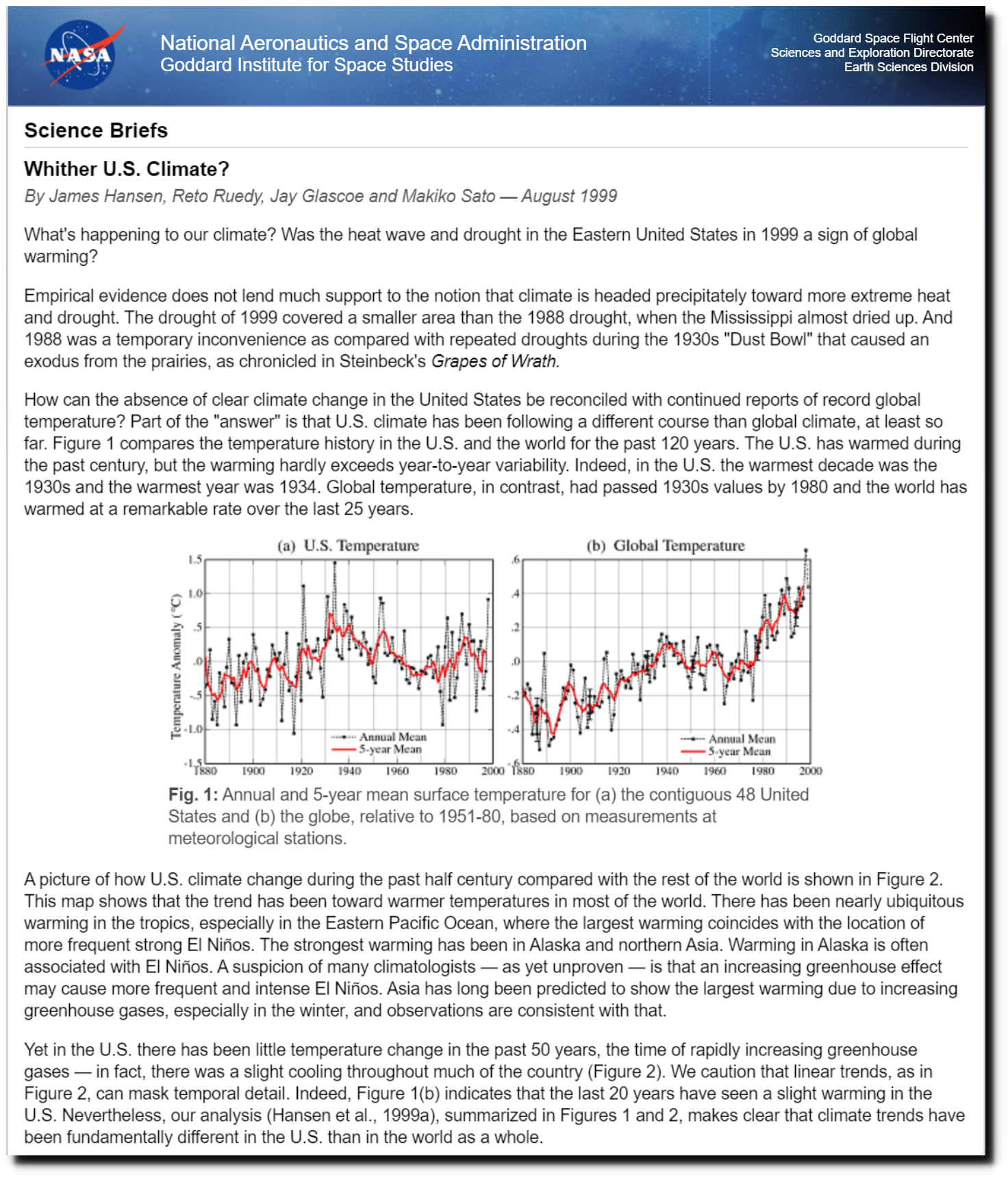
NASA GISS: Science Briefs: Whither U.S. Climate?
So Hansen and NOAA got together and altered the US temperature record. NOAA now shows a warming trend from 1895 to 1987.
Climate at a Glance | National Centers for Environmental Information (NCEI)
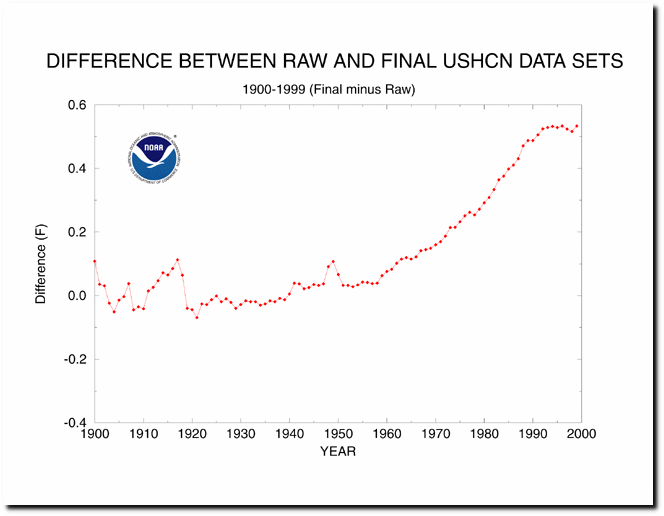
In 2004, NOAA showed that they were altering US temperatures by 0.5F since the year 1900, with no further charges after 1990.
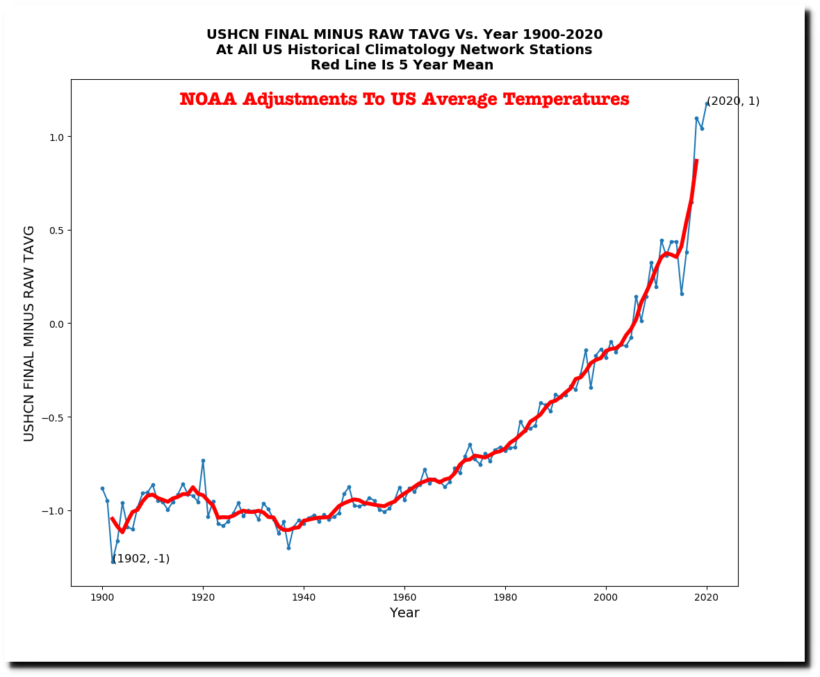
But now they are altering the data by more than two degrees Fahrenheit.
ftp://ftp.ncdc.noaa.gov/pub/data/ushcn/v2.5/
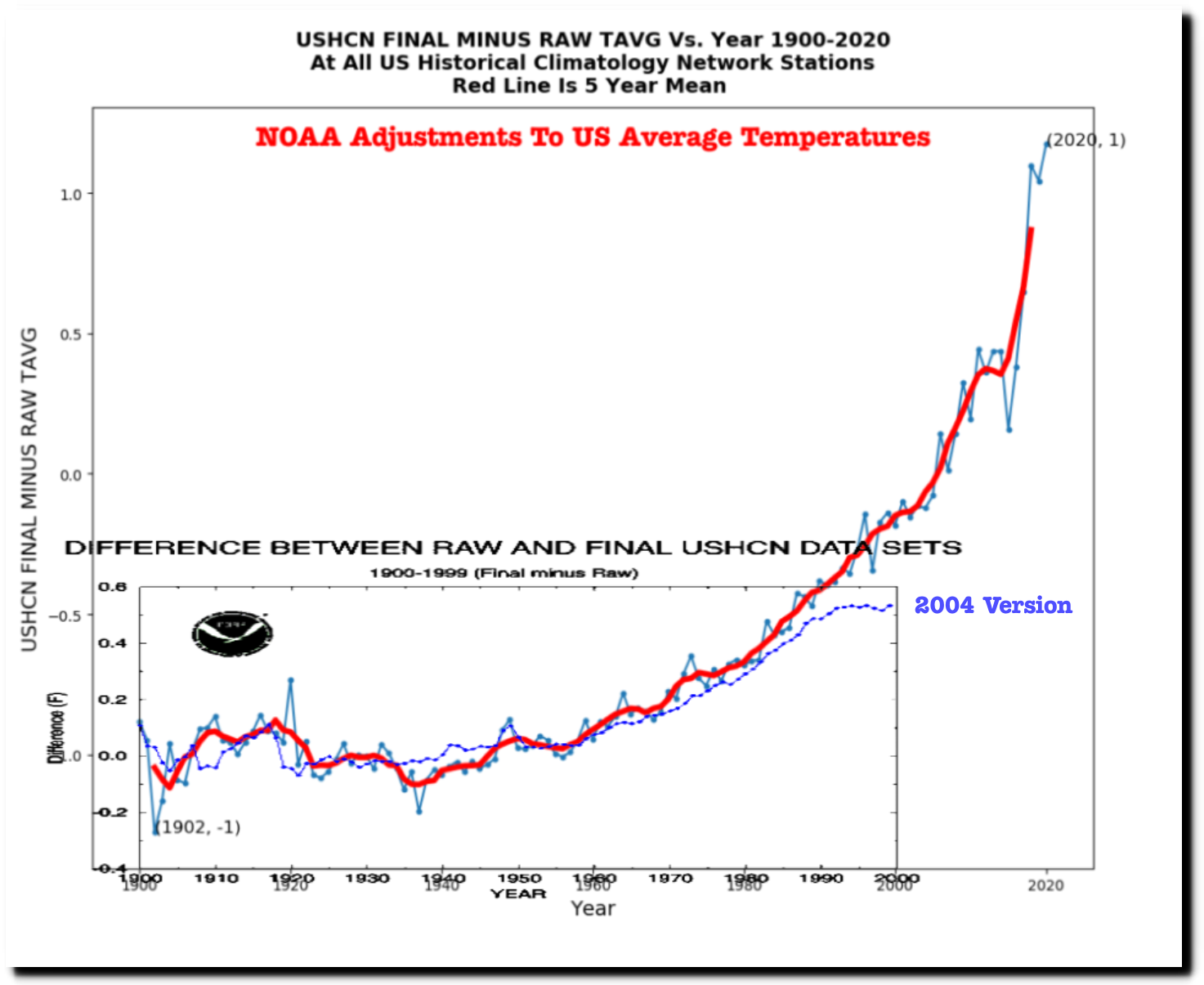
The graph below compares the 2004 adjustments in blue, to the current adjustments in red.
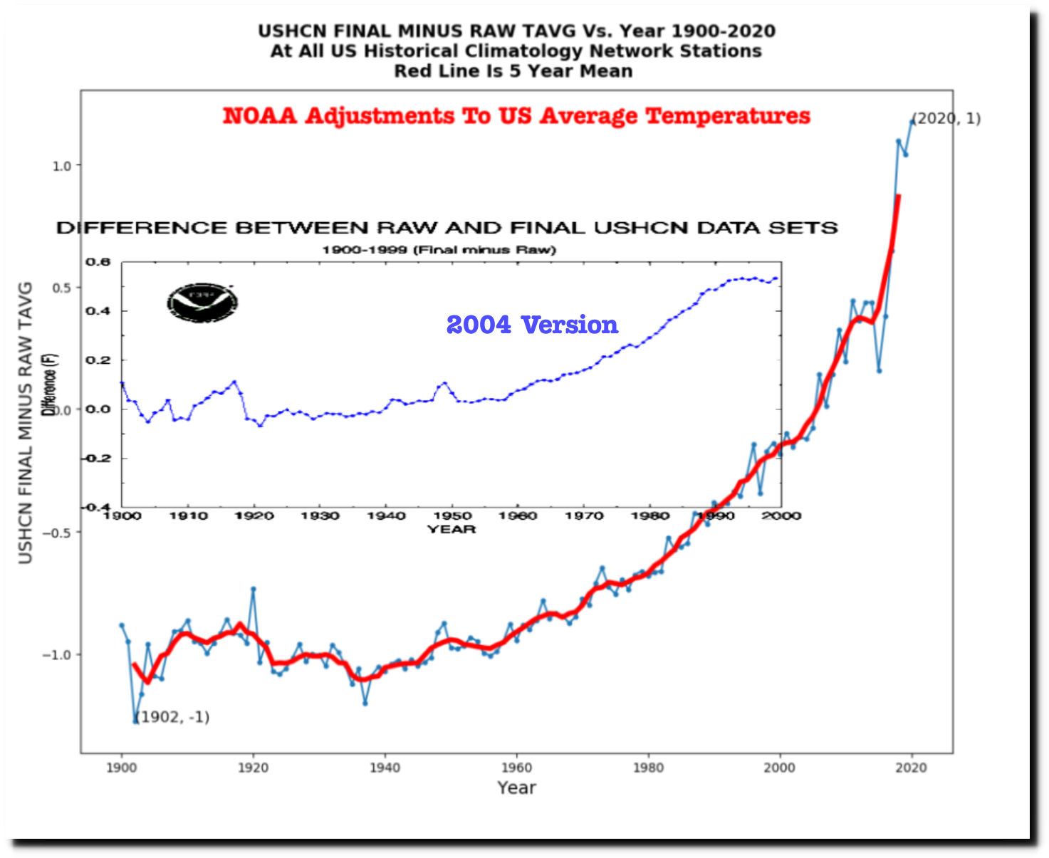
And the next graph normalizes the two sets of adjustments along the Y-Axis. There has been a huge increase in the amount of data tampering for years since 1990, which makes no sense because the data should be stabilizing after 1990, as in the 2004 version of the adjustments.
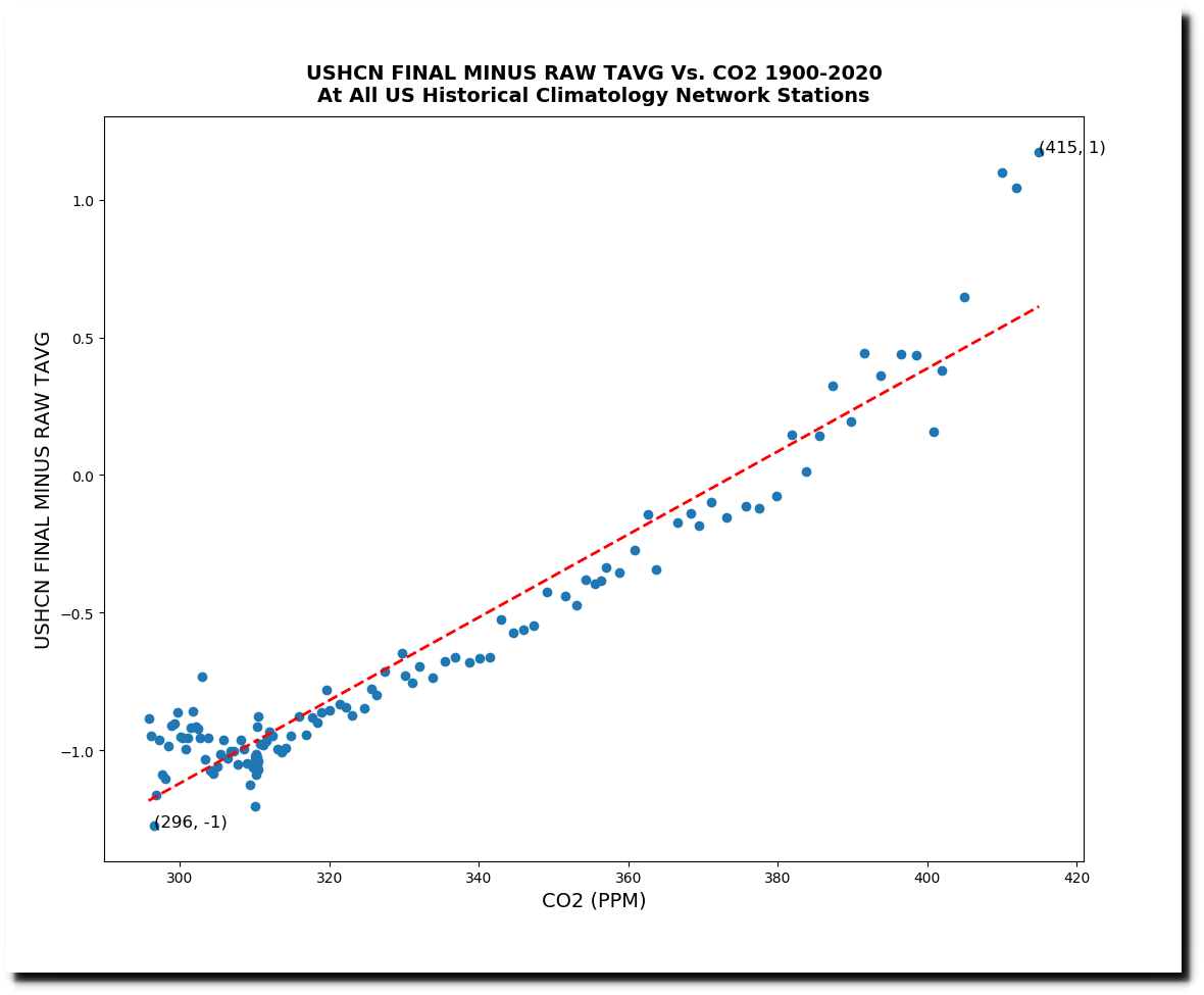
The NOAA adjustments trend very closely with the amount of carbon dioxide in the atmosphere, or at least they did until three years ago, when there was a huge increase in the amount of tampering. Data is being altered to match global warming theory.
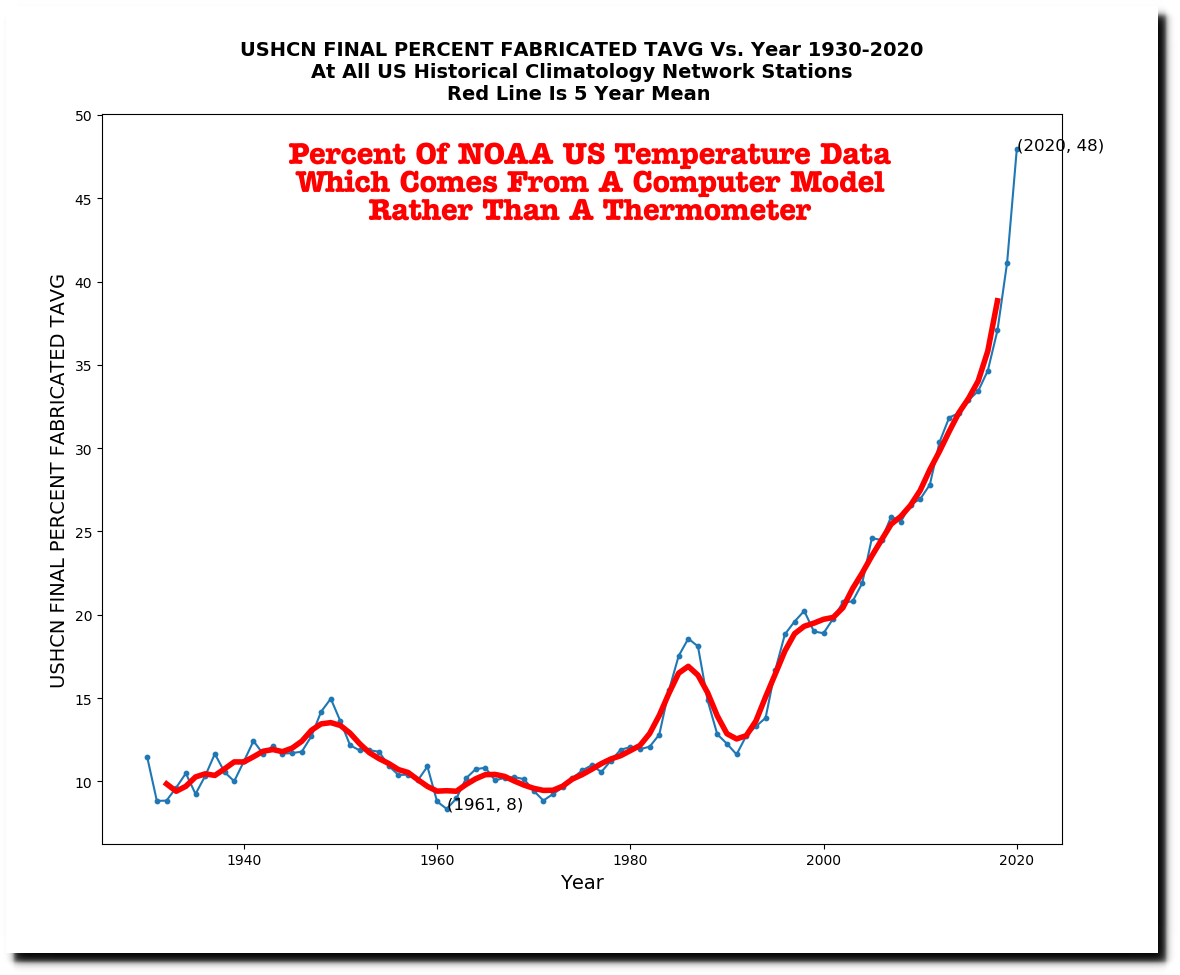
NOAA fabricates missing data using a computer model, and last year almost 50% of their monthly US temperature data was fabricated.
This is the data for Brewton, Alabama. If the data is estimated rather than measured, it is marked with an “E” – All twelve months of 2020 were marked with an E.

ftp://ftp.ncdc.noaa.gov/pub/data/ushcn/v2.5/ushcn.tavg.latest.FLs.52j.tar.gz
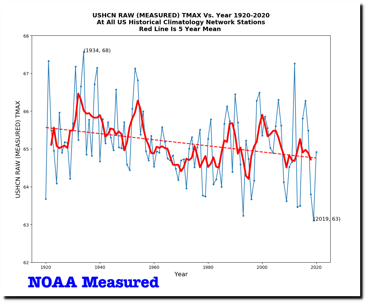
The current data tampering is huge. The measured daily maximum temperature data for the US shows a strong cooling trend.
ftp://ftp.ncdc.noaa.gov/pub/data/ushcn/v2.5/
But the adjusted data shows a strong warming trend.
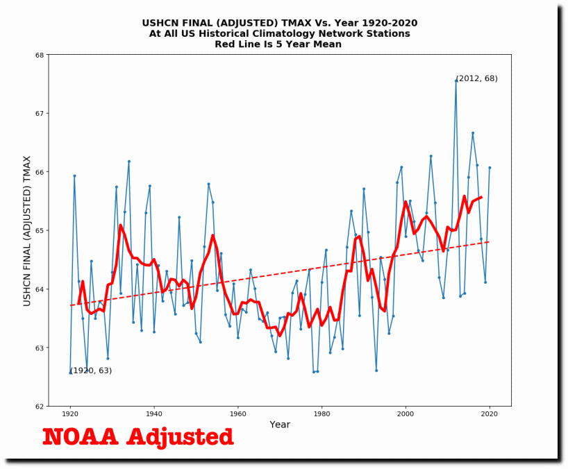
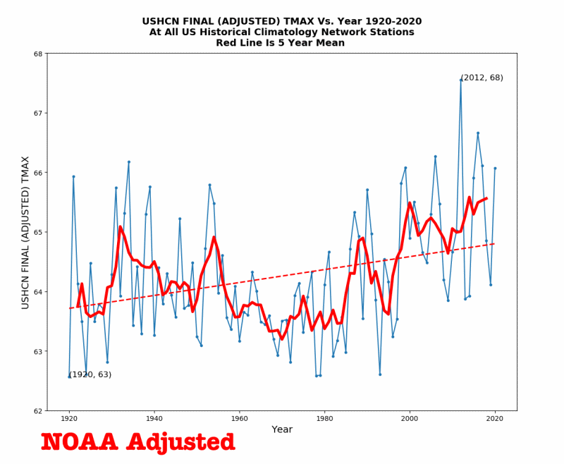
Official US temperature graphs are not in the least credible.
