http://nsidc.org/images/arcticseaicenews/20101004_Figure6.png
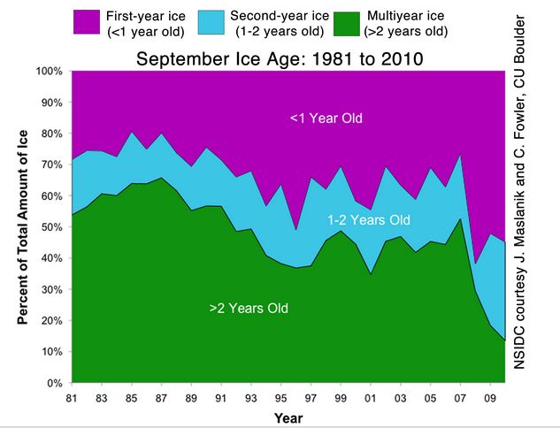
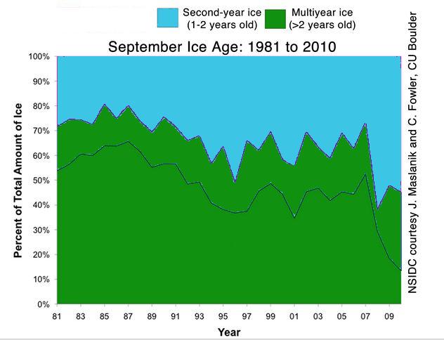
Ice in the Arctic Ocean is born in October. So all that turquoise ice in the NSIDC graph above is now green (except for the little bit which has been transported out of the Arctic in the last two weeks.) In other words, the area of multiyear (MYI) ice is now just below 1995.
The animation below shows the party at the pole.

The image below shows ages after the party (ignoring new ice which has formed in the last few weeks.)
Over the winter the area of MYI ice will decline. This is because some ice will get blown from west to east out of the Arctic where it will melt. During the winter of 2007-2008, a lot of MYI was lost.
The key to survival is the wind, and it would be nice if NSIDC did updates of these very helpful age maps every few months.
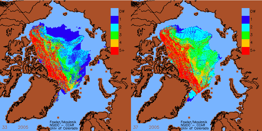
The image below shows the aging of the ice in Autumn 2005.


It would be clearer if you weren’t comparing one map show MYI in the same color gradients.
At the moment the recent one tops out at 2yr+ MYI vs the one from 2005 which had MYI shown through to 5yr+.
Or is the 5yr+ ice just gone now?
NSIDC has not yet published the map you are requesting, so I can’t use it.
Given that all of the first year ice disappeared in 2007, there won’t be any replenishment of 5 year old ice until at least 2012.
Guess that would explain the volume loss.
http://psc.apl.washington.edu/ArcticSeaiceVolume/images/BPIOMASIceVolumeAnomalyCurrent.png
PIOMAS LOL
And yet Ice Sat agrees.
http://psc.apl.washington.edu/ArcticSeaiceVolume/images/IceVolAnomaly19792010.MarNov2.png
I can also write a computer program that shows volume loss! (I hope someone can found me, quickly, before I get inconvenient Cryosat measurements to compare with)
You state that the area of multi-year ice is back to 1995 levels. But the graph you’ve displayed has percentage on the y-axis, not area. So, while the percentage of present ice area that is multi-year might indeed be the same as 1995, if the area of total ice is down significantly, so is the area of multi-year ice.
I’m not saying total area is actually down from 1995, by the way. But it does have to be considered.
Furthermore, even if area is the same, volume might have changed considerably from 1995 (lower?) so the volume of MYI might be considerably changed since then.
The area of ice at the end of September 1995 was not much different than 2010.
http://igloo.atmos.uiuc.edu/cgi-bin/test/print.sh?fm=09&fd=30&fy=1995&sm=09&sd=30&sy=2010
Your third graph isn’t correct. Prior year 1-2 year old ice doesn’t suddenly become multi-year ice. The correct approach would be to paste an image of figure 1 in a diagram and then extend it to the right which should show a big jump of multi-year ice and also an area of 1-2 year ice above it. The impact of doing this would be much more dramatic in appearance.
Yes it is.
Look at the blink comparator from NSIDC at the bottom of the article. The ice gains a year in age in the autumn. In 2005 it happened in September.
The age of the ice is determined by the oldest ice. There will always be younger ice above.
Sorry but any of the year 1-2 ice in graph 3 stays as 1-2 year ice. That is history and cannot change. The only thing that changes is when the graph extends to the right for 2011. At that point, the 1-2 year ice gets added to the > 2 year old ice to give >2 year old ice at close to 50% (barring any further drift losses). Then the 1 year ice will become 1-2 year old ice. You cannot change the past.
The NSIDC maps clearly show all 1-2 ice becoming MYI ice in the autumn.
Interesting to see that nearly all the 1-2 yr ice disappeared in 2007/8ish (was this over the winter? as it is hard to see from the graph)
Yes, most of the remaining MYI disappeared during that winter as far as I can tell.
If it was during winter, presumably it could not have been caused by warm temperature but by wind, currents etc.
Warm water temperature – outside of the Arctic.
1-2 year ice disappeared over the summer 2007, not the winter. It was due to that extreme year
“The ice cover in 2008 began the year heavily influenced by the record-breaking 2007 melt season. Because so much ice had melted out during the previous summer, a vast expanse of ocean was exposed to low winter air temperatures, encouraging ice growth. Although still well below average, March 2008 saw slightly greater ice extent at the annual maximum than measured in recent years. However, the ice was also thin: less than a year old and vulnerable to melting in summer. Even the geographic North Pole was covered with thin ice, capturing the imaginations of many in the media and general public.”
Andy
Or it will continue on the trend and keep losing mass.
http://nsidc.org/images/arcticseaicenews/20101004_Figure3.png
Given that the we’re in the warmest recorded decade, and this year is also near record temps, I don’t share your optimisim about growth in MYI or volume.
This is shocking, is there really no new ice now? A sad day indeed.
Pingback: A Better Visualization Of The 2010 Ice Recovery | Real Science