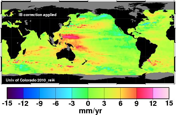
Now that we know that sea level altimetry data is being used as the basis of misinformation being presented to the US Congress, lets have a closer look at how it compares to tide gauge data.
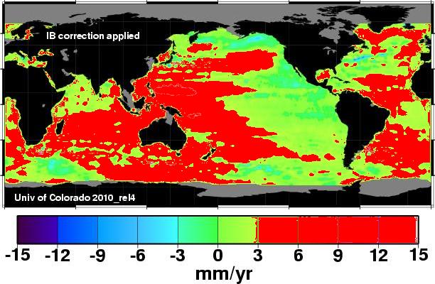
It is difficult to interpret this color scheme, so I took all of the areas greater than 3mm/year and painted them red below.
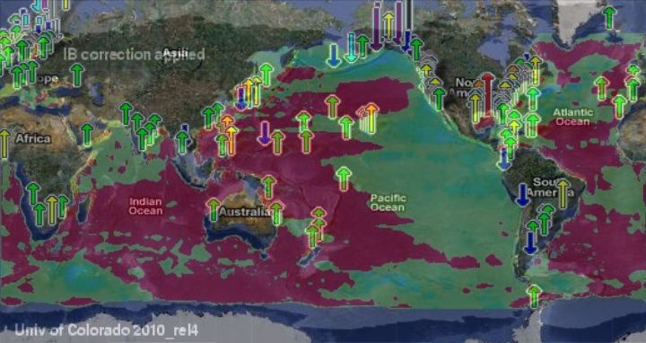
Next I overlaid the NOAA tide map on top.
The altimetry data shows vast areas of ocean greater than 3 mm/year, whereas tide gauges show less than 2mm/year. NOAA actually has very few tide gauges showing 3mm/year or more.
People could attempt to argue that the altimetry data is only since 1994, and that sea level rise has been greater during that period. That argument doesn’t work, because the tide gauges have shown no change.

http://www.globalwarmingart.com
Conclusion : the altimetry based claims of 3+ mm/year sea level rise are much too large.


You need to use the data that best fits the agenda. It is worse than we thought!!!!!
Take a look at the graphs produced by the University of Colorado Interactive Sea Level Wizard and you quickly realise they are just reading tea leaves i.e. the have no idea or they are just trying scare tactics to keep the gravy train rolling.
The following link gives you the graph for a point on the equator in the Pacific:
http://sealevel.colorado.edu/wizard.php?dlon=180&dlat=0&map=v&fit=n&smooth=n&days=60
[You might have to scroll down a bit as the page rendering is strange on my machine]
From the graph you can clearly see annual variations above and below their chosen benchmark… there are also clear outlier years above and below their benchmark – possibly El Niño and La Niña years… the oscillations seem to range between -20 cm and +25 cm… the only point of interest might be a very slight correlation with the solar cycle.
To identify any meaningful trend based upon this dataset, which only stretches back to 1993, is laughable… especially when we know the PDO cycles, the sun cycles about every 11 years, the moon has a 18.6 year cycle and there are outlier events like El Noño.
The work of John L. Daly regarding the 1841 Ross-Lempriere sea level benchmark on the `Isle of the Dead’ in Port Arthur, Tasmania is very interesting… and seems to confound the warmist agenda… Well worth the read at http://www.john-daly.com/ges/msl-rept.htm