
“He who controls the past controls the future. He who controls the present controls the past.”
? George Orwell, 1984
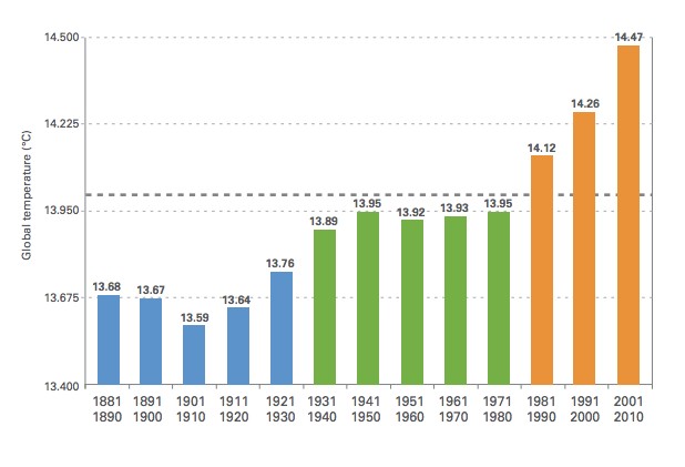
WMO just published this graph, which completely erased the cooling from 1940 to 1970.
In 1975, the National Academy of Sciences showed more than half a degree cooling in the Northern Hemisphere from 1940 to 1970, and that 1970 was no warmer than 1900.
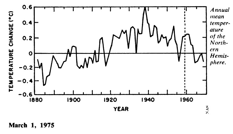
NCAR showed exactly the same thing in 1975.
The graph below overlays the 1975 National Academy of Sciences Northern Hemisphere graph on the current WMO Global graph, and shows how the UN has created a 100% political data set, which has no basis in the actual temperatures which were recorded.
The Northern Hemisphere data is not going to exactly match the global data, but both are driven by ENSO which means that it is not credible that the two hemispheres could be moving in opposite directions..
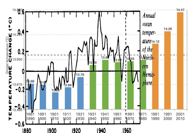
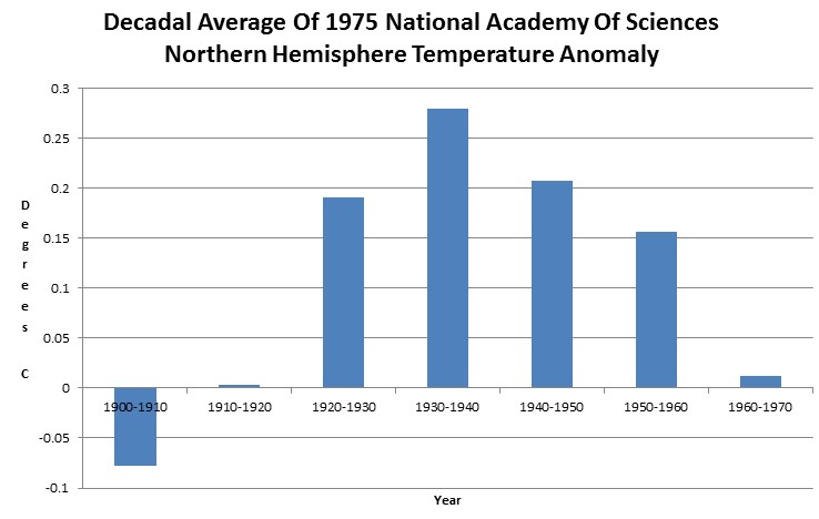
The next graph shows the decadal average of the NAS graph, calculated by numerical integration. Note that 1930-1940 was 0.25C warmer than 1960-1970, but through the magic of data tampering – WMO made the 1930s colder than the 1960s.

Hmmm … fudge 😉
Reblogged this on The Firewall.
And UHI could explain the last 3 decades.
Three! We started paving runways in the 1930’s. I studied UHI over thirty years ago, and it goes back to the first city. UHI is constantly expanding in area, and magnitude.
Steven, have you been able to rule out that this discrepancy could have been driven by different levels of sampling bias, as opposed to a pure overwriting of temperature measurements? Thanks.
RTF
Given that Arctic Sea ice expanded 15% and everyone was hysterical about an ice age, what would be your guess?
Don’t get me wrong, I’m sure there is a lot of overwriting reflected in that bar chart. But I just wish I or someone could find some way of trying to quantify it. It would go a long way in turning the tide….
Mosher says that government temperatures are all good. No matter how many times they change them..
😀 Good job on this comparison!
Steve. I recall that in the infamous 1974 (?) Time Mag diagram – “Expanding Arctic” – illustrated the ice expansion (that was freaking everyone out), delineated the average ice/snow extent growth from May of 1968 to May of 1974 (yep – I’m looking at it). It’s not a very good graphic, but the gut says there’s at least a 15% increase right there.
It’d be nice to have around, if you’d put out some good data and graphics on that cycle of cooling/expansion. And, keep having fun.
What use is the WMO if they are going to start lying with graphs? Oh, I forgot, they are following the CASH.
Forget about the data tampering. Pffffttttt….. That isn’t what is bothering me. What bothers me is that there is someone out there that thinks there is an issue with a temperature increase from 13.59c to 14.47c … in 112 years! … are you freaking kidding me? How utterly stupid does one have to be? And to top it off … to the 100th of a degree? Yeah, right … and I have a wonderful beach front property to sell you … cheap!
This is simply criminal behavior all the way around….
“simply criminal behavior” … You know it and I know it. But to prove it to an impartial jury, by the standard of clear and convincing evidence, we need more. Specifically we need to be able to scientifically estimate what percent of the changes that happen are from fabrication and what percent are from their subconscious delusions driving various biases in the different temperature histories that they put out.
The graph is infantile. They like to accuse skeptics of cherry picking, but by producing a little bar chart you hide the fact the temperature is no longer changing. I also note the magical dotted line as if temperatures below that are normal and temperatures above that equal proof of global warming.
Time ended three years ago!
Right – another convenient cherry pick by the team.
It isn’t a cherry pick – it is the intentional omission of the most significant data in the series.
14.47C way back in 2010 is a global calamity. We are all going to fry. Now looking back over the Holocene we find that this temperature is at the low end. But we are still going to fry. 🙁
Isn’t it standard practice and also recommended by the WMO that the last 30yr period be used as their ‘base period’? ie; 1981-2010. Why is this graph using the older 1961-1990 base period as their reference?
You might want to take a look at the source paper. Here it is:
http://library.wmo.int/pmb_ged/wmo_1119_en.pdf
Here is the basic finding:
“The period 2001–2010 was the warmest decade on record since modern meteorological records began around the year 1850. The global average temperature of the air above the Earth’s surface over the 10-year period is estimated to have been 14.47°C ± 0.1°C. This is 0.47°C ± 0.1°C above the 1961–1990 global average of +14.0°C and +0.21 ± 0.1°C above the 1991–2000 global average. It is 0.88°C higher than the average temperature of the first decade of the 20th century (1901–1910).
“A pronounced increase in the global temperature occurred over the four decades 1971–2010. The global temperature increased at an average estimated rate of 0.17°C per decade during that period, while the trend over the whole period 1880–2010 was only 0.062°C per decade. Furthermore, the increase of 0.21°C in the average decadal temperature from 1991–2000 to 2001–2010 is larger than the increase from 1981–1990 to 1991–2000 (+0.14°C) and larger than for any other two successive decades since the beginning of instrumental records.
“Nine of the decade’s years were among the 10 warmest on record. The warmest year ever recorded was 2010, with a mean temperature anomaly estimated at 0.54°C above the 14.0°C baseline, followed closely by 2005. The least warm year was 2008, with an estimated anomaly of +0.38°C, but this was enough to make 2008 the warmest La Niña year on record.
“The 2001–2010 decade was also the warmest on record for both land-only and ocean-only surface temperatures. The warmest worldwide land-only surface-air temperature was recorded in 2007, with a temperature anomaly of +0.95°C. The warmest worldwide ocean-only surface temperature was measured in 2003, with an anomaly of +0.4°C above the 1961–1990 average. This is consistent with climate-change science, which projects that the ocean surface will warm more slowly than the land because much of the additional heat will be transported down into the ocean depths or lost through evaporation.”
Etcetera. I think one valid criticism of their display method is the use of a decadal bar graph. The 1970s, for instance, were half sort of warm and half growing harshly colder. It’s misleading to just show the average temps for the decade. I’d have preferred more data points, i.e. each year.
Others have. They show an increasing trend toward warming, regardless of solar TSI or periodic oscillations. You’d have to find a longer cycle, that is, longer than 1880-2013, to illustrate that we’re just on the warming side of some long cycle.
Well, that’s the task. I know it won’t be a bit of trouble for someone here to find that phantom long cycle.
If you tamper with the source data, you can come to any conclusion you want.
I’m sorry… did you show that the data had been tampered with? I’m going to guess that we’re looking at apples and oranges here, and that the data don’t show up the same way on a bar graph comparing whole decades that they do on the point display. More importantly, though, we see that the conclusions drawn in the 1975 article were premature.
Look at the trend of their graph: it goes from an extreme low around 1890 to a high in the 1930s. Then it goes back down.
An analyst back in 1975 would be tempted to think he’s looking at a cycle, and that the increasing cold seen in the 1970s would be likely to continue. But as we’ve seen since, that conclusion turned out to be anything but the case. Instead it’s been getting increasingly hotter since 1980.
So much for the theory that it’s all cyclic, and natural. Good effort though, Science News.
I really hope that you are smarter than you pretend to be.
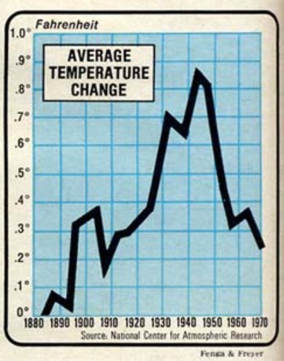
The WMO’s bar graph is really a lot closer to your second 1975 comparison than it is to the first. In the Science News graph, peak warming occurs in the mid-to-late 1930s, and then cools off as you enter the 40s.
Then in the Newsweek graph there are two peaks. It warms in the early 1930s, then cools precisely where Science News thinks it’s warming– and then shows the REAL peak as occuring from 1940 to 1950… precisely when Science News thinks it’s cooling off again.
I know it’s tough to wrap your head around this comparison. But take a closer look and appreciate the discrepancies in the two 1975 charts. Note how closely the Newsweek chart looks like that period as expressed by the WMO.
I added a another graph at the bottom showing the decadal averages of the NAS graph, which shows just how far off base you are.
michael,
You may also like to notice that Steve is trying to counter a global temperature graph with his own NH graphs — he is not comparing apples to oranges but rather grapes to watermelons.
I mentioned that about five times in the article, dumbass,
You are gone. People like you make me sick.
This is a form of cherrypicking. Try the same data using the 10-year periods starting with a 3 and you will get a different result.
Amen to that, Billy. They should just have showed the annual data. And not even attempted to show trend lines. Greater resolution that way.
Not to mention is has been cooling since the turn of their “hottest decade ever”
You are all missing the critical point: The Standard Atmosphere has, for a hundred years, specified 15°C as the mean surface temperature. After a hundred years of supposed global warming, they are still touting temperatures below 15°C. So point number one, climate scientists are denying the Standard Atmosphere model. But (point number two), my comparison of temperatures in the Standard Atmosphere model with temperatures in the Venus atmosphere (at points of equal pressure, and over the range of Earth tropospheric pressures) CONFIRMS the Standard Atmosphere PRECISELY–and disproves the “greenhouse effect” of increasing temperature with increasing atmospheric carbon dioxide besides. The bottom line is that all of our “authoritative” institutions are suborned, and are now no better than criminal organizations, working against the truth and the public good. The System Is Broken: Incompetent Science and Insane Politics.