Steven,
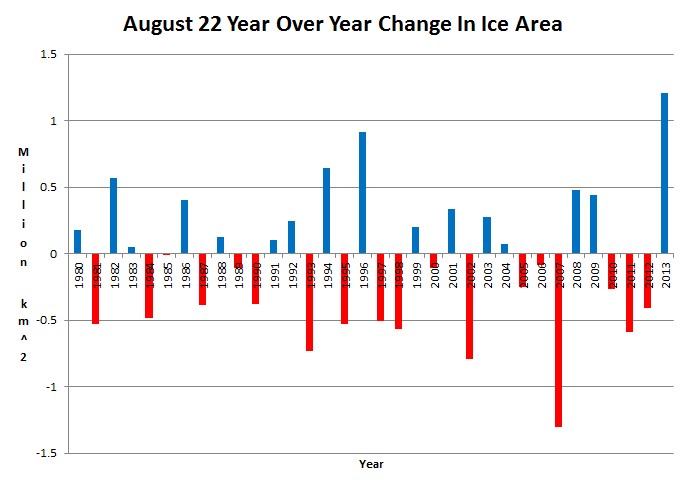
My father has asked me to explain how this graph was made from the data at that link. Can you provide some info so that I can explain it to him? I realize the first column is the date in a strange format, 2nd column is difference between 3rd and 4th columns. Not sure what the 3rd column is, assuming 4th column is Ice Area, but how do you create the graph from this data. Many thanks in advance,
Terry


Children just aren’t going to know what global warming panic was all about.
Where’s the crisis? Where’s the beef?
Reblogged this on CraigM350.
Reblogged this on Health Science Watch.
Steven,
My father has asked me to explain how this graph was made from the data at that link. Can you provide some info so that I can explain it to him? I realize the first column is the date in a strange format, 2nd column is difference between 3rd and 4th columns. Not sure what the 3rd column is, assuming 4th column is Ice Area, but how do you create the graph from this data. Many thanks in advance,
Terry
Date, Anomaly, Area, Mean Area For 1979-2000