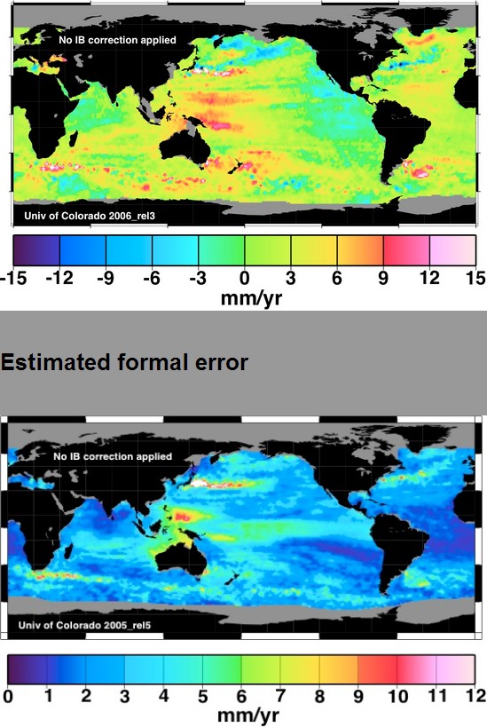
I located a 2007 version of the CU sea level error map, and its corresponding trend map.
Note the region north of New Guinea where the trend is 9 mm/year and the error is also 9 mm/year. This region severely skews the global numbers upwards. In other words, their 3mm/year trend claim is completely meaningless scientifically.
Even worse is that they have taken the error map off their web site. Their fake 3 mm/year serves as the basis for many fraudulent claims by scientists that sea level rise rates have increased.
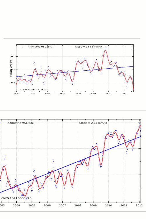
The most sophisticated satellite (ENVISAT) used to show 0.5 mm/year, before they quadrupled the numbers overnight , and then immediately euthanized the satellite.


It’s worse than we thought…
“Faced with the embarrassing fact that sea level is not rising nearly as much as has been predicted, the University of Colorado’s NASA-funded Sea Level Research Group has announced it will begin adding a nonexistent 0.3 millimeters per year to its Global Mean Sea Level Time Series. As a result, alarmists will be able to present sea level charts asserting an accelerating rise in sea level that is not occurring in the real world.”
http://www.forbes.com/sites/jamestaylor/2011/05/11/nasa-funded-group-doctors-sea-level-data/
Which is why I keep pushing this paper as it appears to offer some very honest science.
http://pluto.mscc.huji.ac.il/~msdfels/wpapers/Tide%20gauge%20location.pdf
and shock and awe…….
they actually used the Null
When will be able to surf down that growing mountain of water off New Guinea?
Reblogged this on Edonurwayup's Blog and commented:
The warmists don’t even know what their taking about.
Whoever created those maps are frauds and those who promote them are deniers of physics. Only earthquakes can do that to the ocean and then only temporarily.
This fraud is the one I get most cranky about.
http://youtu.be/5-zfCBCq-8I
“…..and then immediately euthanized the satellite…”
Obamacare death panel has a wider scope than first thought.