
In 2005, NCAR did some wonderful junk science, disappeared the LIA, and tacked Hansen’s fake temperature record on to the end.
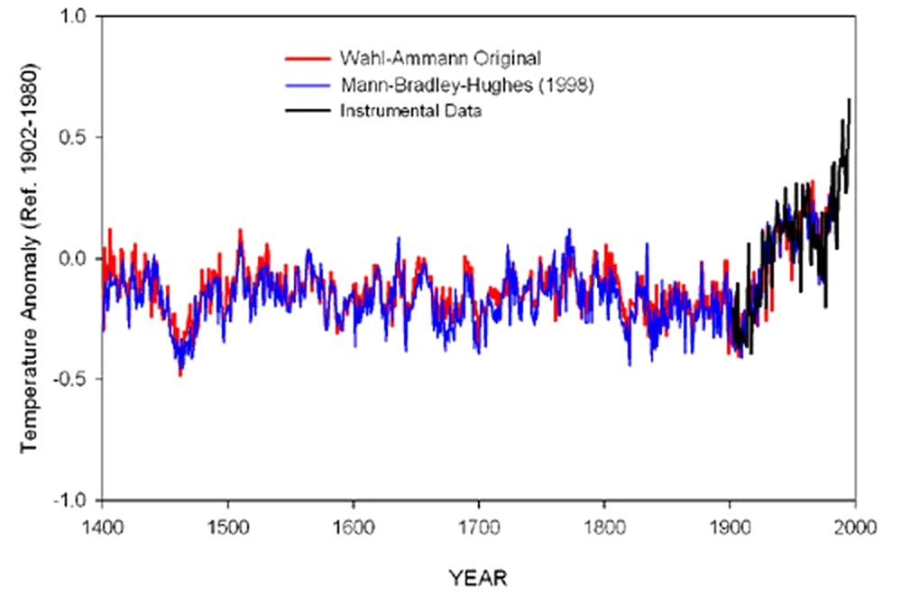
Ammann and Wahl’s findings contradict an assertion by McIntyre and McKitrick that 15th century global temperatures rival those of the late 20th century and therefore make the hockey stick-shaped graph inaccurate. They also dispute McIntyre and McKitrick’s alleged identification of a fundamental flaw that would significantly bias the MBH climate reconstruction toward a hockey stick shape. Ammann and Wahl conclude that the highly publicized criticisms of the MBH graph are unfounded.
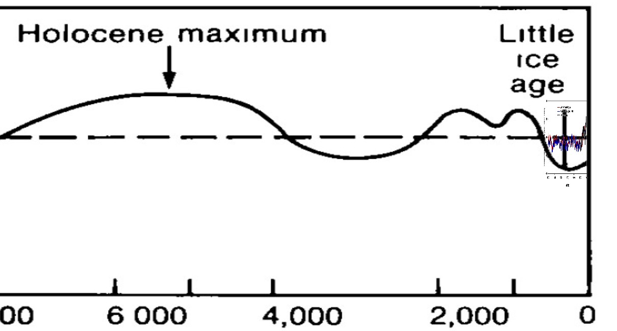
The 1990 IPCC report showed that the LIA was the coldest period in 10,000 years, but somehow NCAR completely missed it.
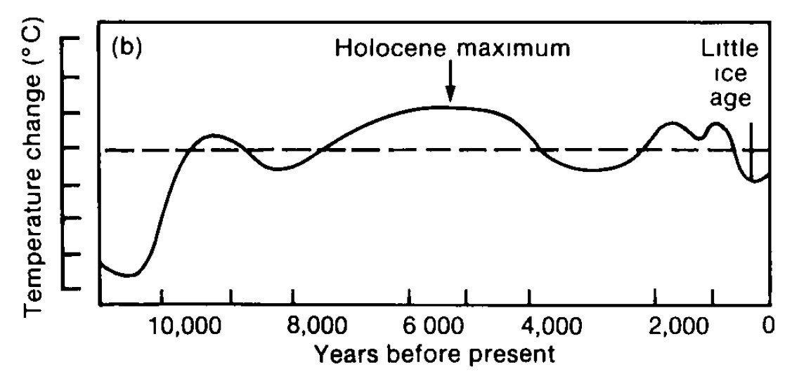
So for fun, I overlaid NCAR’s toy hockey stick on the 1990 IPCC graph, in the image below. Terrifying, isn’t it? Clearly the Earth is going to end soon.

Ammann and Wahl convincingly demonstrated that if used the same methodological assumptions and data sets of Mann, you would produce the same results as Mann.
That’s not terrifying. But this speech before the Australian election was.
http://mobile.abc.net.au/news/2013-09-03/llewellyn-smith—abbott-climate-change/4931534
Mann proved that if you average 122 randomly selected proxies you get nothing but noise, and if you glue a different set of data from urban heat islands you get hot urban noise should be playing basketball not hockey.
If Mann’s Hokey Stick chart is good, then why has the UN/IPCC stopped publishing it?
Mann’s chart was a visual masterpiece of climate alarmist propaganda. The IPCC would never have stopped using it — unless the downside was too great.
The downside: Mann’s chart was completely bogus. So now the IPCC uses similar spaghetti charts [which are also bogus]. But they lack the visual impact of Mann’s thoroughly debunked hockey stick chart.
And what finally happened to Wahl and Amman 2005?
http://bishophill.squarespace.com/blog/2008/8/11/caspar-and-the-jesus-paper.html