
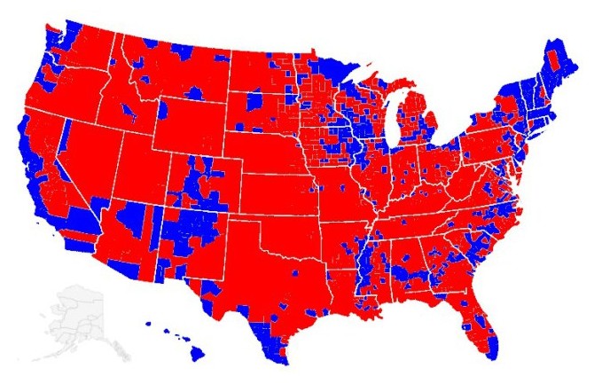
Disrupting the Borg is expensive and time consuming!

Google Search
-
Recent Posts
- Analyzing The Western Water Crisis
- Gaslighting 1924
- “Why Do You Resist?”
- Climate Attribution Model
- Fact Checking NASA
- Fact Checking Grok
- Fact Checking The New York Times
- New Visitech Features
- Ice-Free Arctic By 2014
- Debt-Free US Treasury Forecast
- Analyzing Big City Crime (Part 2)
- Analyzing Big City Crime
- UK Migration Caused By Global Warming
- Climate Attribution In Greece
- “Brown: ’50 days to save world'”
- The Catastrophic Influence of Bovine Methane Emissions on Extraterrestrial Climate Patterns
- Posting On X
- Seventeen Years Of Fun
- The Importance Of Good Tools
- Temperature Shifts At Blue Hill, MA
- CO2²
- Time Of Observation Bias
- Climate Scamming For Profit
- Climate Scamming For Profit
- Back To The Future
Recent Comments
- Bob G on Analyzing The Western Water Crisis
- arn on Analyzing The Western Water Crisis
- Bob G on Analyzing The Western Water Crisis
- Bob G on Analyzing The Western Water Crisis
- Bob G on Analyzing The Western Water Crisis
- Hank Phillips on Analyzing The Western Water Crisis
- Hank Phillips on Analyzing The Western Water Crisis
- Hank Phillips on Analyzing The Western Water Crisis
- Hank Phillips on Analyzing The Western Water Crisis
- Bob G on Analyzing The Western Water Crisis
Easy enough to see where there are people on the dole.
Reblogged this on The Firewall.
America has over 44 million people on Food Stamps. Where do you think most of them live ?
If you magnify the screen, you will see tiny little hands out in the blue section.
You don’t understand population density do you?
I understand progressive IQ density
Sadly, the map also coincides with where most of the people live- blue areas.
We are just a bunch of moo cows here in the red
Nope. Not people – sheeple.
I like the Global Warming stuff here, but some of the political comments posted here are just stupid; it’s like the IPCC of politics in its misuse of statistics. Here’s some data; is this what you expected?
http://chartsbin.com/view/1403
ROFLMAO – Democrats infest every state.
How does 10% food stamp usage impact anything I said? Every state has at least 30% Dems. That map uses the standard left wing trick of using bright red colors for completely inappropriate numbers
Or http://www.selectsmart.com/commentary/indymap.png
Homer, look at the election map more closely. Almost every state is majority red in area. Pennsylvania is 90% red, but voted for Obama because of hundreds of thousands on welfare in Philadelphia. Your bullshit maps don’t mean anything because they smear sickly urban blue welfare areas in with healthy productive rural red areas..
Right because nobody is on welfare in rural counties… oh wait
The blue stuff, looks like a metastasic cancer.
Lot’s of the them hording along the coastal area’s. Time for a Tsunami.