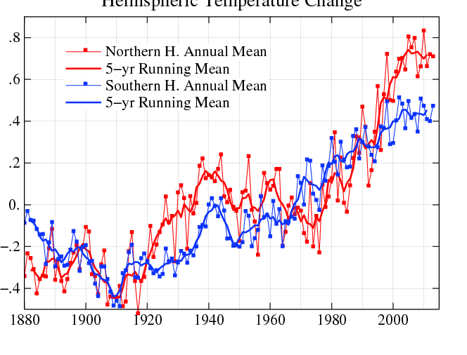
GISS shows about 0.1 C cooling in the Northern Hemisphere from 1950 to 1980, and about 0.2 C warming in the Southern Hemisphere during that time. It is simply not credible that the hemispheres could move opposite each other for 30 years. They both are driven primarily by sea surface temperatures, and warm and cool in phase with each other.
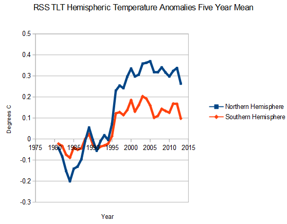
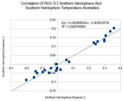
 Looking at satellite data, there is almost perfect correlation between the trends in the two hemispheres. The northern hemisphere swings are larger, but they both swing in the same direction.


On payday they do.
The northern and southern hemispheres are like 2 different planets. One experiences summer when it’s on the other side of the solar system from the other. So many things can be going on astronomically. Cosmic rays can be hitting that side of the orbit more, or coming from the north for a few years or decades and then from the south. Vostok ice cores don’t line up with greenland very much at all.
There is a lot more ocean in the Southern Hemisphere compared to the Northern Hemisphere. So there is a much larger hydro-cycle occurring down south which would moderate any temperature cycle that is occurring.
The tilt of the planet makes a difference as well, but I am not sure by how much.
“GISS shows about 0.1 C cooling in the Northern Hemisphere from 1950 to 1980, and about 0.2 C warming in the Southern Hemisphere during that time. “
As Truthseeker said there is a lot more ocean in the Southern Hemisphere compared to the northern hemisphere. That means there is a lot more data that can be made up.
Also because there is a lot more ocean and water has a much higher heat capacity, the swings in temperature are going to be moderated as the RSS data shows.
Here is verity Jones’ plot of world surface station dropout vs dT link
http://diggingintheclay.wordpress.com/2010/01/21/the-station-drop-out-problem/
E.M. Smith in his Bolivia Effect post shows how few actual readings there are link in the southern hemisphere and how hotter stations are smeared.
So E.M. Smith and Verity Jones also noticed the same problem Steve has. “inconvenient data” is removed and replaced by made-up data that is always warmer. And that is the scientific evidence we are using to destroy our civilization – NICE!
why teh RSS data, why not the UAH data?