
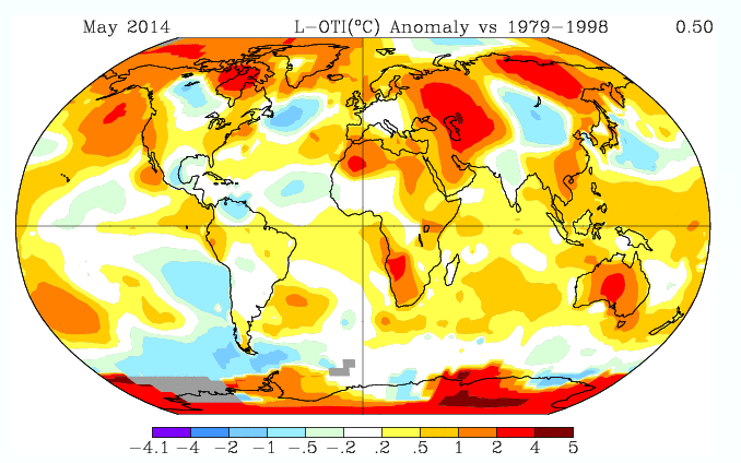
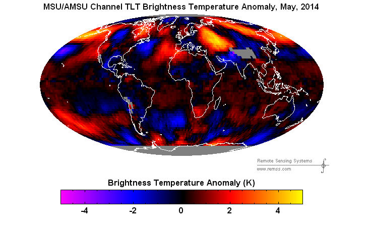
GISS shows Australia far above the 1979-1998 average in May, while RSS shows Australia just about average for the month relative to the same baseline period.
Data.GISS: GISS Surface Temperature Analysis
GISS shows Australia far above the 1979-1998 average in May, while RSS shows Australia just about average for the month relative to the same baseline period.
Data.GISS: GISS Surface Temperature Analysis

while its just an event
having daytime temp of just 7C in stheast aus this week..sure isnt warm
the midnight temp same day was? 6.5
These maps are an excellent example of how the GISS adjustment methods smear high temperatures over large regions where it has little/no data, using its 1200 km matching trend assumption.
Look at the Arctic north of Alaska. The satellite measured data is blue–less than the climatology average. But, GISS smears the hot spots south of Alaska and by the Hudson Bay into a large region covering half the Arctic north of Alaska.
The absence of melt ponds on the Arctic Ice throughout May confirm that the satellites got it right, it’s the GISS results that are erroneously manipulated.
So, I just want to make sure I’m following the information correctly:
The top image is sound science*, and the bottom image is the product of a right-wing climate denier site.
How did I do?
* Where “sound science” includes adjusting raw data without justification, interpolation and extrapolation of data, and arbitrary removal of raw data without justification
Expert alarmist extrapolation and interpolation with obvious intent to warm bias to the maximum extent possible and then some.
Antarctica is broiling! We are doomed! That is why it was -100 F there before winter even set it.
2-4 C above average!! How can any lucid person believe this?
Someone took the thermometer out of the Stevenson screen at Alice Springs.
GISS gridding smeared it over the entire continent.
RSS admits that we don’t know much about Antarctica, while GISS just fills the South Pole in with plenty of warming.
GISS also has a strange hot spot off the coast of Rio de Janeiro in the South Atlantic Ocean.
Does anyone know if there’s a secret island lair out there somewhere? Maybe a Bond villain, or the CIA perhaps? They would have got away with it if it wasn’t for those lazy mainstream media reporters.