
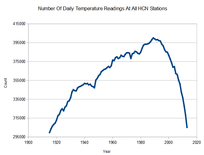
Since 1989, the number of US daily temperature readings has plummeted back to the level of 100 years ago.
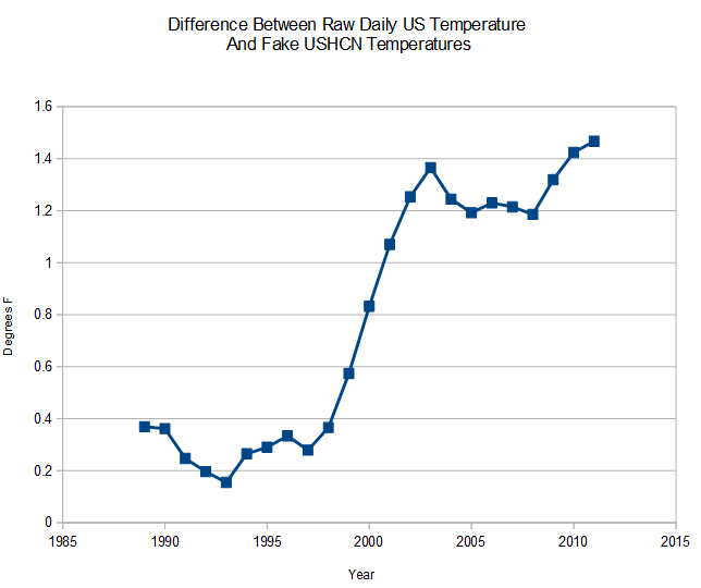
NCDC has taken full advantage of this, by creating a massive warming bias through manufacturing fake missing station data. The graph below shows the steps of data tampering, all introducing a warming bias. Fabricated data is defined as USHCN final monthly station data marked with “E” – meaning there is missing thermometer data from that station.
- Drop colder HCN stations to warm the present 0.1ºF. Raw Daily -> Raw Monthly
- Cool the past 0.5ºF. through TOBS . Raw monthly -> Non-Fabricated
- Warm the present through making up fake data. Non-Fabricated-> Fabricated
This is a very important discovery, because most of the data tampering since 1990 is due to manufacturing fake data rather than adjusting actual thermometer data.
Final : ushcn.tavg.latest.FLs.52i.tar.gz
Raw : ushcn.tavg.latest.raw.tar.gz

Steven, you are knocking ’em out of the park! Seriously, I am impressed with your find.
Just a small suggestion for all of us who follow this blog — and one which I just followed for myself. Public thanks are nice, saying “thank you!” in your comments is good. But you know where I am going with this, huh?
Donate. Send Steven some money. He deserves it. Think of how many thousands of hours he has worked in this field. Give him at least a small part of his due. The “Donate” button is in the upper right hand of this page. Use it. This blog is WAAAAAAY better than public radio or TV when it comes to CAGW facts. Donate. NOW!
You know you want to….
Thanks Phil, It is gratifying to see other skeptics picking up on this story, like Sunshine Hours
http://sunshinehours.wordpress.com/2014/06/04/estimated/
I have you on automatic renewal $25 a month, wish I could afford more. Money well spent.
I am not new to being a skeptic about global warming but I am ignorant (and can therefore learn) how to share this information with a few non-skeptical people. How do I show someone this information or point them to this page and “prove” the data was manipulated or manufactured? Because you graphs on a blog have not been very convincing for me so far.
And now I’m going to donate.
Thanks in advance.
Thanks! This is a very simple calculation. Fake data is marked with a trailing “E” in the final data set. Anyone with computer programming skills can easily reproduce it.
I have to take your word for it. C+++ is way over my head, but I do very well with Excel and the WayBack Machine
Where are the links to the data where I can verify that the number of temperature readings has dropped since the 1989 peak?
Steve, I agree. This looks huge. It appears it would mean that all of the declarations of “warmest decade” would be blown out of the water, certainly for North America. They’re probably doing something like this globally as well.
Same applies globally. I once roughed out the claimed change in global temps immediately following the Great Dying Of The Thermometers in 1990 as 1.5°F.