
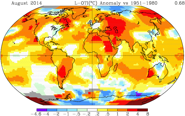
Yesterday, Gavin told the Huffington Post that August was the hottest on record globally. He seems to have changed his mind since then, because today his map shows August was cooler than 2011 by 0.02 degrees.
2014 0.68 anomaly : Data.GISS: GISS Surface Temperature Analysis
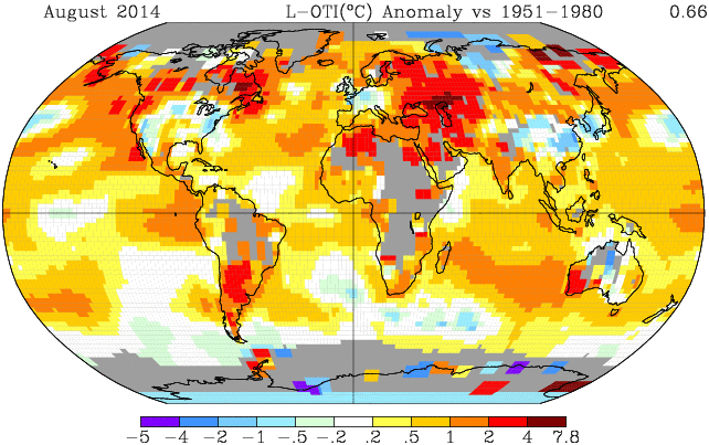
2011 0.70 anomaly : Data.GISS: GISS Surface Temperature Analysis
RSS shows that August was seventh coolest and below average since 1997. So how did Gavin create his since reversed scientific flustercluck?
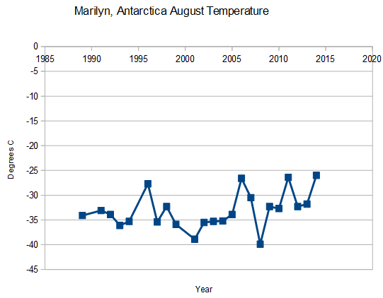
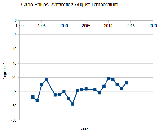
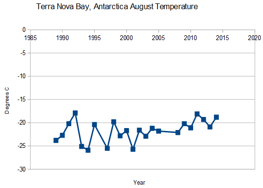
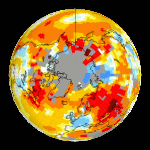
There were three stations in Antarctica on the right side of the 250 km map below which he marked as very hot. Those three stations averaged about -20C. This map has 250km extrapolation, and gives a feel for where the stations are located, and where there is no data.
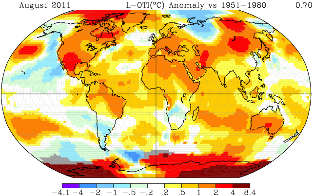
He extrapolated those three -20C Antarctic stations across a huge area of below normal temperatures on both the lower right and lower left side of the map, and massively skewed his global average anomaly using a large area of fake +6C anomaly, which he declared hot at -20C. This map shows Gavin’s 1200 km extrapolations to smear the earth with non-existent warm data.
But it is much worse than it seems. None of those three stations actually have any temperature data during the 1951-1980 baseline period, so his since recanted (disproven by his own data) claim is a complete fraud. How can he know what the anomaly is, if there was no temperature data during the baseline period? These are the three stations in the region which he has August 2014 temperature data for.
There are all kinds of other things he did wrong, including filling in Africa and South America with fake warm data, when RSS showed them cold. Problems with Australia too, which RSS showed cold.
Now lets look at Gavin’s abuse of the Arctic. DMI showed the area north of 80N as first or second coldest on record. Gavin had no data north of 80N, but filled it in with hot data,
In summary, the claim of record heat has since been disproven by his own data, and was based largely on fake, cold data at the poles – which he declared to be hot.
How could Antarctica have been hot? They have record sea ice extent, indicating the winds are blowing away from the pole, towards the coast.

“How can he know what the anomaly is, if there was no temperature data during the baseline period?”
Sounds like an excellent question for Moser, Zeke, or McIntyre. Gentlemen? We’re all ears.
Gentlemen??
Moser = Mosher
I like “Moser” better, like mosey on in and make some obtuse utterance and then leave again … also called “seagulling”- fly in, shyte on everything, and then fly off.
“How can he know what the anomaly is, if there was no temperature data during the baseline period?”
Because at this point, they’re just pulling things out of their arses.
Just noticed this on the GISS Updates page, related?
“September 15, 2014: Color maps using the Robinson projection are now presented without contour smoothing, since that process occasionally results in skipping some color bands.”
http://data.giss.nasa.gov/gistemp/updates_v3/
No, that’s something entirely different, actually.
I notice that not too far (relatively speaking) from the “very hot” area on the right of Antarctica there is an area that has an anomoly of about -4C (the scale varies from map to map). Why doesn’t this anomoly get smeared out to cover a large area, the way the warm anomolies get smeared? Never mind, I think I know…
As David Karoly has made perfectly clear for the benefit of amateurs, you will need to publish in a peer reviewed journal before anyone can credibly believe there is anything wrong with what NASA has done. The publication will need to critically analyse and rebut the homogenisation methods used. These methods can be found published at.. ah, umm.., just shut up!
Excellent work Steven – now to get the word out there.
Steve would the infilling not still be consistent with the prior years?
NO!
Stations were dropped. See The ‘Station drop out’ problem (and adjacent posts)
http://diggingintheclay.files.wordpress.com/2010/04/canadadt.png
Thanks Gail. May I ask what you consider to be most reliable land based record we have globally, or is that something that just doesn’t exist? Do you believe satellite records are sufficient?
At this point it is something that does not exist although people are working on putting together the raw data.
Frank Lansner has done a lot of work
The Original Temperatures Project (WUWT over view)
Frank’s website:
http://hidethedecline.eu/pages/who-are-we.php
http://www.hidethedecline.eu/
Cool, thank you, do you have any opinion on how an accurate UHI adjustment could be obtained and applied? As I currently understand it, this may very well be the cause of ?all? the land station warming being recorded?
Check out Dr Roy Spencer’s work:
The Global Average Urban Heat Island Effect in 2000 Estimated from Station Temperatures and Population Density Data
Global Urban Heat Island Effect Study: An Update
He is one of the keepers of the satellite data:
http://www.drroyspencer.com/latest-global-temperatures/
Awesome, thanks, exactly what I wanted. 🙂
http://wattsupwiththat.com/2014/06/07/noaa-shows-the-pause-in-the-u-s-surface-temperature-record-over-nearly-a-decade/
If it is just continental USA the new Climate Reference Network is all class 1 sites with 3 temp sensors taking readings simultaneously, auto calibrated.
Only downside is that they only have 10 years of data (it’s getting colder).
That’s stunning. Thanks Gail for posting that graph. I’d lost track of it.
I sometimes feel I am the Librarian for the Skeptics. {:>D
you are indeed gail ,encyclopedia gailanica 🙂
Quiet, no talking. Shhhhh!
With “climate change” being the “greatest threat facing humanity” and billions spent for climate research, plus trillions wanted for “climate mitigation”, can’t we spend a few dollars for a few thermometers here and there so we don’t have to speculate and leave it up to “experts” to decide how to fudge the data for a large part of the world?
Instead we are doing just the opposite and losing stations at an alarming rate.
Yep… exactly my thoughts… rather than adding stations they are removing them… Steven has documented that here… and they should all be linked via cellpone towers to report data easily…
These stations should be OUTSIDE Urban Areas to avoid UHI…
Yep.. we’re spending hundreds of billiions each year on Climate Mitigation, Grants, etc… without upgrading the monitoring system for Temperature… well, satellites have been added, there are some upgrades/new technology… but this seems to be lacking at Ground stations…
E. M. Smith looked at Thermometer Years by Latitude and Verity Jones did more work on his idea at Digging in the Clay
http://2.bp.blogspot.com/_vYBt7hixAMU/SzpY-r3HTbI/AAAAAAAAALI/bIMyN3qFjGE/s1600/March+of+the+Thermometers.bmp
Dr. Schmidt’s arrogance is leading to his downfall. He couldn’t bring himself to be in the same room with Dr. Spencer in this video I saw the other day. He says he’s not interested.
https://www.youtube.com/watch?v=V96k4BO2sBw
Wow…if I could convert Gavin’s first 30 seconds in that clip to fertilizer, I’d be set for the next 10 yrs. Never seen such a concentrated amount of BS in such a short period of time.
That’s too much.
Promise you’re not gonna do it. Wouldn’t be prudent at this juncture.
https://www.youtube.com/watch?v=4QHHGHve_N0
and another wow from me. if that is the best there is from nasa in regards to climate no wonder they have to fiddle the books to make a case for warming.
Actually I thought Gavin admitted to a lot of things… the causes for past Climate Change… where we disagree is how much Mankind’s CO2 & Methane, etc.. is affecting Current Climate and if it even matters…
It was quite interesting how such a well educated man was Sooooo unwilling to even acknowledge Roy Spencer… Lame… he is asking that we spend all this money… yet is unwilling to acknowledge any dissent…
Signs he knows he is lying and does not want to get caught at it.
Someone who has the facts and is confident in his hypothesis is willing to debate all comers and if needed to modify his hypothesis.
Gavin shows none of these hallmarks of a true scientist.
Reblogged this on Centinel2012 and commented:
Good work thanks for saving us from melting — the “believers” will do just anything to make us believe their lies!
Outstanding post
+1
Great work Steven.
You are one of the few that can debunk the “global” temperature fraudsters.
I wonder if the quick ‘readjustment’ to Gavin’s map (note the USA is now cool) had anything to do with outraged comments at Huff ‘n Puff and at places like this website.
Seems to me the Huff ‘n Puff piece was a trial balloon to see how BIG a LIE they could tell and still get away with it.
A big thanks is owed to Tony Heller and all the rest of the watch dogs.
Agree.
Steve, where’s the link to “today his map shows August was cooler than 2011 by 0.02 degrees?” Thanks.
I want to show the before and after.
The links are right below the maps. The anomaly is shown in the upper right corner of the map.
Thank you. I just realized that. I am about to go to sleep here and brain is not working. Sorry to have bothered you with the request.
Great pickup, btw.
I think that although skeptic comments at the propaganda lap dog sites like the Groiniad and the BBC and the LA times are not published they ARE NOTED. How else can they tell if the Big Lie is working? Preaching to the choir doesn’t work on those sitting on the fence.
The impact has already hit… Huff Po and other places post this big headline “Hottest August ever”… and that’s what people see… our follow up rarely gets seen…
So the “Seagull” or “Drive-by” Media just moves on .. leaves its pile of crap… Skeptics need to find ways to get ahead of this curve …
Must be tough being a government scientist.
1. Obama needs some global warming panic to distract from his disasters in domestic and foreign policy.
2. NASA/GISS gets their marching orders.
3. Presto Magico . . Gav “adjusts” the data to produce what is required.
Probably thought folks wouldn’t notice the super hot Antarctic region also was setting records for ice levels. Who says Gaia doesn’t have a sense of humor. Or Irony.
It’s one thing to try to determine the land-based temperatures with any degree of accuracy, especially when it comes to comparing modern data with historical records prior to 1950. (1950 is an arbitrary date, but represents a time period before modern communication infrastructure would have made data widely accessible). But let me ask everyone – do you think we REALLY know the temperature of the OCEAN surface with ANY degree of accuracy prior to 1950? There would have been any number of El Ninos and other events that could have led to warmer than average temperatures in the past. And all we have are ship records (and ships aren’t stationary) with bucket measurements of ocean water!
My personal view is that any pronouncement of “records” for Earth’s averaged temperature is speculative at best, and that we don’t have enough data to know one way or the other.
Oh, I think the ESTIMATE might be good to +/- 5 °C
{:>D
Erm…..
You neglected to mention that such “estimates” are always “rounded-off” to the nearest 2 decimal places 😉
What can be done is stitch together all the Historical data we have and compare it to what readings are today… location, time, etc… a point in the past can be compared to current info…
Problem is all the “infilling” and data manipulation… “Aw, 1934 couldn’t have been that hot, with soooo many 100 degree days and people dying from the heat… ” when in reality it WAS… we can compare those data points with current info… location, date, time… and see if 1980 – 2014 even came close.. which it doesn’t… Alarmists got rid of the blip and don’t care to acknowledge it..
Climate scientists are truly marvelous and bright folks. They can take a measuring system that resolves at 0.1° with an accuracy of 0.3°F, adjust the readings, estimate temperatures for missing stations and areas without stations and come up with hottest/coolest comparisons at 0.02°C or better. No estimation of variance and no testing of means to see if they are statistically different. And they can do this world wide.
It seems that folks that smart would hardly need data at all, they surely would just know.
Correct, they don’t need data..
cc: “Shoni Dawkins”
date: Fri, 7 Sep 2007 08:28:03 +100 ???
from: “David Jones”
subject: RE: African stations used in HadCRU global data set
to: “Phil Jones”
Thanks Phil for the input and paper. I will get back to you with comments next week.
Fortunately in Australia our sceptics are rather scientifically incompetent. It is also
easier for us in that we have a policy of providing any complainer with every single
station observation when they question our data (this usually snows them) and the
Australian data is in pretty good order anyway.
Truth be know, climate change here is now running so rampant that we don’t need
meteorological data to see it.
Bob, best take a look at the surface station project again.
So the USA surface stations, the BEST SYSTEM IN THE WORLD, has an error of 2 °C or greater for 70% of the thermometers.
Since each site is unique, each thermometer is unique and each point in time is unique, the sample size is ONE, not hundreds of repeated tests at the same time and place. This means you can not use the statistics of large numbers and some how squeeze out another decimal point. The error of the entire calculation is the same as the WORST data or error >= 5C.
The entire Global Temperature as measured by surface thermometers is a completely bogus/political number.
http://www.climateapplications.com/GHCN/images/NOAAraw1880to2010map.png
Bare in mind that in the Soviet Union the amount of coal alloted for heating to a village or city was based on the temperature so there was a real incentive to ‘cool’ the thermometer readings between 1920 and 1980. Also the Russians accused CRU of messing with the data by selectively dropping stations that showed cooling. Russia affected by Climategate (about 2/3 of the way down the page)
Gail, that bit about the Soviet Union’s allocation of coal is fascinating, and something that never even occurred to me. Do you know where I could learn more about it?
From a comment at WUWT
Björn = Bjørn Lomborg?
Very cool. Thank you!
Hey Gail! You say: “Since each site is unique, each thermometer is unique and each point in time is unique, the sample size is ONE, not hundreds of repeated tests at the same time and place. This means you can not use the statistics of large numbers and some how squeeze out another decimal point. The error of the entire calculation is the same as the WORST data or error >= 5C.”
I thought I understood that concept, but perhaps I am getting slower with old age, because now I am confused again. Consider this: Suppose I have a data set of 100 unique stations. Suppose 99 of them have zero error. (Perhaps an angel appeared with the readings on a piece of paper and gave them to me! 🙂 ) The one remaining station has an error of one degree. If I just added them up, obviously the sum would be plus or minus one degree — but if I am looking at the average, how can the error for the average still be one degree? Wouldn’t it be 1/100th of a degree?
I don’t expect anyone to do a long essay to answer me, but if you or anyone can link me to an understandable explanation, it would be appreciated. (And of course this says nothing at all about the wisdom of using something so nebulous as a global average of temperatures which tells us very little about overall changes in climate.)
Jason there are mathematical equations for adding up error that can be used. PROPAGATION OF ERRORS
However given 70% of the US stations have error >= 5C and that the USA is considered to have the best data, you can be pretty sure the error is in the vicinity of >= 5C… Then add in 70% of the earth is oceans with temperatures measured by random sailors using buckets in all types of weather…
I do not need to use math to see the error is going to be a heck of a lot larger than the 0.1 °C or so the warmists get into a lather about.
…..
And people wonder why I do not make short posts and I do a lot of links. {:>D
Hey Gail! You say: “I do not need to use math to see the error is going to be a heck of a lot larger than the 0.1 °C or so the warmists get into a lather about.”
Yes, that we can agree on! It looks to me like the error of an average should be equal to the average of the errors involved. As you say, the errors do not reduce the way the Law of Large Numbers would indicate. Instead, I think that for averages, you just add up all the various error ranges of all the data input and do a weighted average of the errors. As far as surface temps go, even if you pick the really best long term sites, you probably still have an error somewhere in the range of one degree — and if you include the many bad sites, probably several degrees error. As for ocean temperatures (especially down to 2000 meters) the closest error size I could even guess would be just “VERY BIG”!
The hubris of the CAGW crowd is stunning…
Gail, I was just citing what I recalled of the coop weather station thermistors, which aren’t much better than the Oregon Scientific indoor-outdoor unit I have. Add the siting and other problems in your post plus Jason Calley’s comments and I find it a bit difficult believe hundreths of a degree temperature differentiation other than by divination.
Even with great thermometers in triplicate, the temperature in my pasture (at the top of the ridge) is not going to be the same as the temperature 3000 feet away on the river flood plain even if you do an adjustment for the ~ 50 to 100 ft in altitude change.
That is the other reason the error the Climastrologists claim is laughable.
Right now looking at two sites near me, 7 miles apart I see: 78.3 °F to 85.7 °F yet the Climastrologists smear data over 100 kilometers or more!
Gail, they can use readings up to 1200 km away. that’s about the distance between my last two residences. The climate in central VA and SW Michigan are a bit different.
Really? I thought we always got -20 degree temps in Central Va in the winter. 😉
And two feet of ice on the all the lakes.
I
Yes, Virginian’s are known for their prowess on ice skates.
Gavin gave Puffington Host a map of the change from 1880-2014, showing an increase of 0.86.
http://data.giss.nasa.gov/cgi-bin/gistemp/nmaps.cgi?sat=4&sst=3&type=trends&mean_gen=08&year1=1880&year2=2014&base1=1951&base2=1980&radius=1200&pol=rob
The same data for 1880-2011 shows an increase of 0.81.
http://data.giss.nasa.gov/cgi-bin/gistemp/nmaps.cgi?sat=4&sst=3&type=trends&mean_gen=08&year1=1880&year2=2011&base1=1880&base2=2011&radius=1200&pol=rob
Why would this “change” in temperature differ from the anomaly maps?
This is something that had to come back and bite Hansen/Schmidt sooner or later. They have repeatedly used the lack of temperature stations in the Arctic and Antarctic to generate fake heat to keep the CAGW argument going. For years now we’ve seen the Arctic shown as flaming red with no justification other than statistical hand waving. Some of us can remember the outrage when Hansen did the flaming red thingy to the Arctic in 2011. It’s hard to justify showing both poles hotter than hell when there is record ice extent. Hansen feels he is justified in doing the red flaming thingy because it fits his theory of accelerated warming at the poles, not because there is proof.
They have only been able to keep up with the charade of a warming planet by adjusting the surface station thermometer records upwards. And like the flaming red thingy, this too will come back to haunt them. In a few years even the most ignorant acolyte will have to question why there has to be such huge adjustments to the temperature record.
This is the reason that RSS and UAH should be used rather than GISS, NOAA, Hadley or Berkley. RSS and UAH may not gather information above 80 degrees, but you don’t need it as long as you continue to compare apples to apples.
Bob Tisdale has an excellent post explaining much of how each temperature record is maintained.
http://wattsupwiththat.com/2014/09/16/august-2014-global-surface-landocean-and-lower-troposphere-temperature-anomaly-update/
To correct my prior post, satellites cover from 85N to 85S.
If you are a conservative, your prize is and IRS audit and jail for speaking out.
If you’re a progressive, your prize is promotion and $m grants.
The tide had well and truly turned many years ago, when progressives managed to claim the title of “liberal” in an epitomy of double-speak, from the libertarians and conservatives.
Once that happened, they gained the upper hand and it was inevitable that things would need to move to their usual, historical conclusion before the tide turned back. History is an interesting subject. From the time of the ancient Greeks, you will see a battle between conservative/practical forces and progressive/fanciful ones.
What we are living through now is nothing new – while humanity is incredibly gifted at generational learning from technological mistakes, it is monumentally dumb in its societal learning.
All I can put it down to, is that science advances by individual or small-group efforts, whereas society stagnates because we are a group of millions. Individually, humans can be brilliant. As a mob, we are quite obtuse.
All of which is rather disturbing, because it points towards implications which are anathema to me.
it also shows that because Sociopaths have no conscience, no feelings toward their fellow humans they often rise to high positions if they are intelligent. Therefore many leaders are the worst that society has to offer in terms of what is best for society as a whole.
This has not changed since some idiot with charisma and an Iron Fist convinced a bunch of his fellow thugs and thieves it was easier to steal or better yet to have slaves do all the work. The really successful thugs we call kings and princes.
“None of those three stations actually have any temperature data during the 1951-1980 baseline period,”
===================================
Which begs the question why are they still using the 1951-80 baseline, in breech of the WMO guidelines which recommend using the most recently available 30-year period which would be 1981-2010.
I am reading the anomaly graphs as indicating anomalies of ~ -25 to -20 C.
I expected the anomalies to be positive if the adjustments were made to warm the Antarctic above the baseline period.
Am I misunderstanding the graphs?
Thanks!
Tom
to me why they use the 1951 -80 baseline is obvious i was born in 1951 so that should be the baseline for ALL things moving foreward…..lol…..actually they use that period because it is a COOLER period and CREATES an anomaly of warming out of any return to the temperatures of the 30’s deacade
Great post!
I have been saying for awhile that eventually we will be freezing to death in record warmth. Gavin just proved me correct.
As I have said more than once, they will never give up. They are far too hooked on taxpayers money to give up, and Obama basically told them that they give him what he wants or their funding goes away.
The three Antarctic station August temperature graphs are labeled as temperature anomalies but appear to display actual average temperature readings.
Great work Steven in ferreting out Gavin’s temperature prestidigitation.
More good work Steve.
Curiously, I see no sign of the ‘usual suspects’ trying to make out that “the data is accurate – no, really!” – or perhaps “I know Gavin personally and he wouldn’t do a thing like that, honest”!
Trouble is, all the usual crackpot alarmist propaganda blogs and publications have already spread the lie, so it will take a lot of countering.
Not so sure about that…there were way too many areas that experienced a rather cool summer, especially August, that it’s going to take some convincing to have that turning on the furnace was just a figment of imagination. So, the alarmist blogs are opening themselves up for massive mocking…or just plain old fashioned ignoring.
For the last two (cool) summers, I have been asking people (strangers) “How do you like your global warming” The usual response is a nice long raspberry.
My small business is entertainment at birthday parties and church fairs so I see a lot of new people.
Are you sure they aren’t responding that way because they think you are a supporter of the ‘Team’?
Either that or the ‘hillbillies’ up here in WV really are saner than the rest of this country. (No, those idiots on that short-lived, so-called ‘reality’ show don’t count.)
mjc, the raspberry is usually followed by a remark indicating they think CAGW is a scam.
Maybe the city folk who never see the light of day still believe the scam but the people in suburbia and rural NC sure don’t.
Threaten them with fraud if they print a retraction!
They must love you at NASA. Gavin’s discovering what it’s like having a Rottweiler locked onto his leg.
+100
More like a pit bull rottweiler cross. (Rottweilers were bred as cart pulling dogs not fighters.)
How can Holland have an anomaly of -0.2 to 0.2 for August 2014, when the knmi (Dutch meteorological institute) finds that August in Holland was 1.4C below the long term average http://www.knmi.nl/klimatologie/maand_en_seizoensoverzichten/maand/aug14.html. (In Dutch, just see numbers first paragraph…) that just doesn’t make sense.
The map shows the anomalies of 1951-1980 when the average August temperatue in the Netherlans (De Bilt) was 16.4. The average August temperature from 1981-2010 was 17.4 degrees. August 2014 had an average temperature of 16.1. So 0.3 below the long time average shown in the map, so nothing wrong there.
hans, thanks for explaining. it be great if all would use the same baseline years conform the WMO
here in Monroe County, Wisconsin, August was cooler than normal by an average of.3871 degrees + September is even much colder
If Antarctica warms by 15C and rest of the world cools by 1C it’ll be a darned colder planet but they’ll be able to claim a strong global warming
Actually, NASA explains why their graphs sometimes do not match the raw data…
——————————————–
Q.Why is the number in the right hand corner of the global maps sometimes different from the corresponding value from the GISTEMP data files (tables and graphs)?
A.This is related to the way we deal with missing data in constructing the global means:
In the GISTEMP index, the tables of zonal, global, hemispheric means are computed by combining the 100 subbox series for each box of the equal area grid, then combining those to get 8 zonal mean series, finally from those we get the Northern (23.6-90ºN), Southern and tropical means, always using the same method. Hemispheric and global means are area-weighted means of the following 4 regions: Northern mid-to-high latitudes, Southern mid-to-high latitudes, and the Northern and Southern half of the tropics.
For the global maps, we subdivide the data into the 4 regions 90-24ºS, 24-0ºS, 0-24ºN,24-90ºN and fill any gaps in one of those 4 regions by the mean over the available data in that region, and then get a global mean.
For data-sets with full coverage, this should make no difference, but where there is some missing data, there can be a small offset. In such cases the number in the index files should be considered definitive, because in that method the full time series is involved in dealing with the data gaps, whereas for individual maps only the data on that particular map are used to estimate the global mean.
——————————————-
The raw data from GISS does show August to be the warmest August on record.
http://data.giss.nasa.gov/gistemp/tabledata_v3/GLB.Ts+dSST.txt
I tend not to leave a leave a response, however after reading a few of the responses here August 2014 Is No Longer The Hottest On Record | Real Science.
I actually do have some questions for you if it’s allright.
Could it be only me or do some of the remarks come across like they are written by brain dead people?
😛 And, if you are writing on other social sites, I’d like to follow everything new you have to
post. Could you list of the complete urls of all your social pages like your Facebook page,
twitter feed, or linkedin profile?