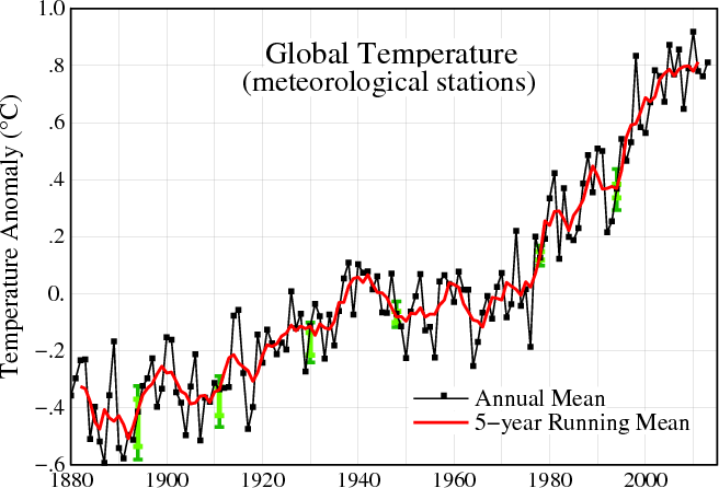
Ignoring all the junk science behind the temperature reconstructions, let’s have a look at the hockey stick grafted blade. Note how it starts at 1880, right after Australia’s hottest years on record.
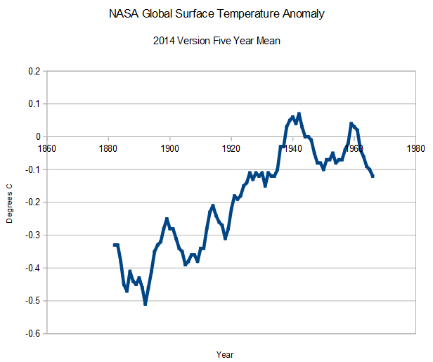
Here is the current pre-1966 portion of the graph – a nice hockey stick caused no doubt by Grover Cleveland’s horse flatulence in the 1880’s
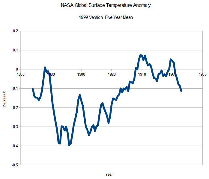
But it wasn’t always like that. NASA used to publish global surface temperatures back to 1866, which showed no net warming during the century from 1866 to 1966
Apparently Grover Cleveland’s horse wasn’t that bad after all. NASA simply hid the inconvenient pre-1880 data, because it wrecked the hockey stick.
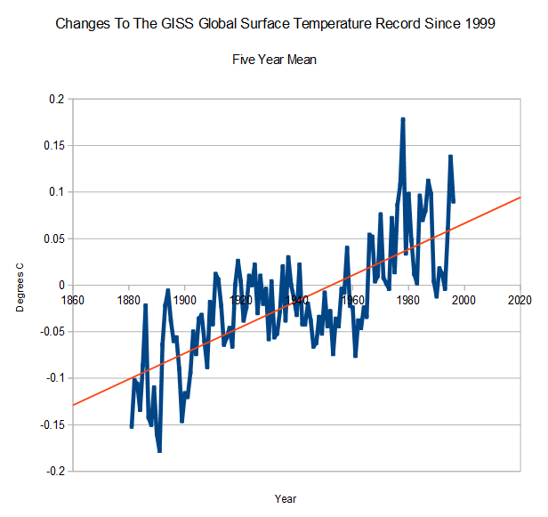
But it is worse than it seems. NASA is not only hiding the pre-1880 warmth, but they are also tampering with the post-1880 data to increase the amount of post 1880 warming. The graph below shows how they have changed their own data over the past 15 years.
All of this wonderful data tampering has brought hundreds of billions of dollars to climate science research over the past 15 years. There must be a word for that.


One basic problem plagues us each individually and pervades all society : The most selfish rise to the positions of greatest power.
http://wchildblog.com/2014/09/13/how-so-many-psychopaths-manage-to-reach-positions-of-power/
I notice that for about a 35 year period from the end of WW II through the 1970s that the temperature trend remains basically flat. Yet there was a huge industrial expansion after WW II reconstruction and it was powered by coal and petroleum. Something does not compute. But for NASA GISS that’s normal.
Actually, there used to be published evidence that the 40s to 70s were showing cooling (and it was, from the early 20th century peak). Heck, this site showed some of those “The Ice Age is Coming” graphs and news clips.
http://www.woodfortrees.org/plot/hadcrut4gl/from:1850/trend/plot/hadcrut4gl/from:1910/to:1940/trend/plot/hadcrut4gl/from:2001/trend/offset:-0.1/plot/hadcrut4gl/from:1860/to:1880/trend/plot/hadcrut4gl/from:1970/to:2000/trend/plot/hadcrut4gl/from:1880/to:1910/trend/plot/hadcrut4gl/from:1940/to:1970/trend/plot/hadcrut4gl/from:1850/to:1860/trend/plot/hadcrut4gl/mean:120
That uses folded, spindled and mutilated ‘adjusted’ data. I’m talking about the stuff pre-Hansen 1988.
But still, 🙂
Fraud.