[Updated] – it looks like the GHCN Nobby’s data is BS, and means that Sydney is experiencing UHI
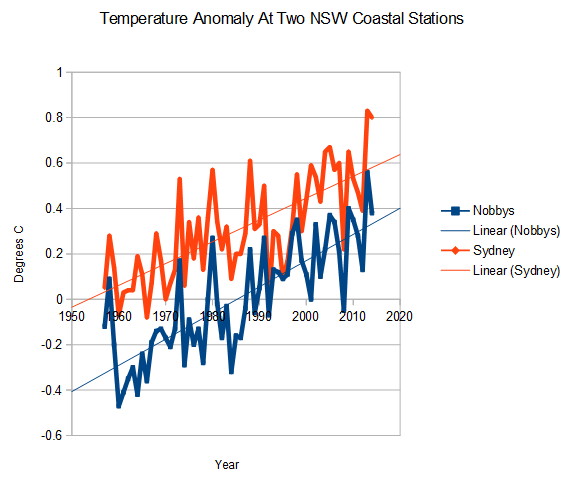
The tide gauge at Nobbys Beach shows identical warming to Sydney, since it opened in 1957
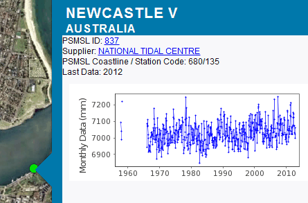
The tide gauge at Nobbys shows sea level about the same as the late 1970’s


I’ve been to Newcastle, walked along the sand of Nobby’s beach up to Nobby’s head.
It really is a lovely beach.
http://assets1.redbubble.net/assets/clear-24f1b1f9614bdeeb1c30a4aa48f963d0.gif
The tide gauge doesn’t measure the temperature. That is done on the Headland near the lighthouse.
The tide gauge is on the inner side of the harbour entrance.
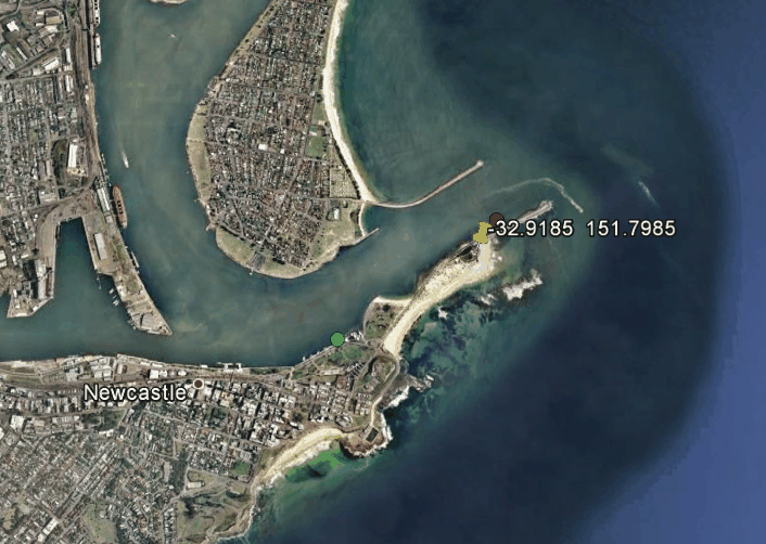
The weather station is located at the yellow pin, The tide gauge is located at the green dot.
Steven ,
Your wording implies that the tide gauge gave the temperatures.
“The tide gauge at Nobbys Beach shows identical warming…….. ”
I know they are close to each other, but the tide gauge doesn’t show any temperature of anything.
Being a bit pedantic, didn’t mean to come across as grumpy, but it was before my morning coffee. sorry 🙂
Terrifying image of rising sea level at Newcastle.
http://www.abc.net.au/reslib/201102/r725952_5808619.JPG
BRING ON SUMMER !!! 🙂
Sea level rise confirmed at Newcastle
http://transform.fairfaxregional.com.au/transform/v1/crop/frm/storypad-iKQx4aiD4Q7fvCgDvFeGgz/7b0ea56e-f51c-43a5-ae6a-2afebb3f7e2d.jpg/r0_177_3459_2129_w1200_h678_fmax.jpg
?? No yellow pin visible.
Here is a great pic of the weather station
http://www.owenwilson.com.au/system/files/imagecache/product_full/NCNSW0035%20Nobbys%20Beach%20Lighthouse%20_DSC0011.jpg
Rough duty there boy… getting stuck being a meteorologist in that awful place. How do they ever find anyone to take the job?
Yeah, Newcastle is a tough place. 😉 I’m near Cronulla, in southern Sydney, but I have friends up in Newy that I visit regularly to get away from the big city.
Its a tough choice as to which has the best beaches Cronulla or Newcastle, but the Newcastle beaches are always less crowded.
This is what Newcastle’s meteorologists do in their spare time!
http://transform.fairfaxregional.com.au/transform/v1/crop/frm/storypad-CAN5CAhus5tnnETRT6c7n6/d6ff3478-d603-4b09-bb25-b4525ea57225.jpg/r0_0_2072_1166_w1200_h678_fmax.jpg
Some of the best flathead fishing in Australia!
http://www.theherald.com.au/story/415218/fishing-fired-up-for-marlin-fray/#slide=5
That is an awesome pic, thanks!
Steven, I’m a bit puzzled.
While the tide gauge was possibly set up in 1957, near the pilot tug boat station , I assume…
I would have thought that the weather station on Nobbys Headland would have been there quite a lot longer.
Another point which has one of these basically untouched sites might be Norah Heads on the central coast . Remiss of me, but I’ve never actually been there !
http://www.qsl.net/vk3ek/Norah_Head.jpg
Here is Norah Heads data.
http://berkeleyearth.lbl.gov/auto/Stations/TAVG/Figures/152027-TAVG-Raw.png
Closer to Sydney, but only seems to go back to 1970
Not much trend there.
I was at Fort Scratchley (near the green dot) a few weeks ago watching a coal ship come in. That aerial shot is of the biggest export coal port in the world. Its a nice thing to see on a US blog.
Some nice photos from 1929-35 of the same area can be found here.
Bruce, any way of finding out when the Newcastle weather station was established. Steven’s temperature data only goes back to 1957, but surely the weather station was there previous to that.
Hey, I just found this posted by AndyG a few topics back
http://berkeleyearth.lbl.gov/auto/Stations/TAVG/Figures/152044-TAVG-Raw.png
Seems the 1957 start point Steven has used was probably the very lowest point on the whole record.
How do you figure that?
Yeah Griss, 1962 looks like the low point. But Steven’s graph has the 1957 point higher as well. ( Maybe the coffee hadn’t taken effect? 😉
Looks to me like totally natural climate cycle variability. I can’t see anything that points to any particular warming otherwise.
That is very interesting. The GHCN database doesn’t have any data from before 1957 for that station, and most other stations. I wonder if that is intentional? Looks suspicious to me.
Heh. The fewer assumptions, the better, or Occam’s razor in climate science: First check if the record keepers screwed with the data again.
But don’t “assume” that they did, just because the data doesn’t fit your preconceived notions of homogenous climate zones.
Certainly.
But don’t “assume” that they did not, just because screwing with the data doesn’t fit our established notions of scientific research.
Like at Rutherglen. BOM assumed a site move because they didn’t like the raw data, but it has been confirmed by someone who used to work there, that there has not been a site move.
I wonder how many other fictitious site moves there are in BOM’s “adjustments” that just “happen” to adjust the trend from cooling to warming !
pps.. Might also be interesting to see where the Kiama weather station is, if they have one. I can’t see one on google Earth (trying to think of where these lighthouses might have a weather station)
The trend is the same, however Sydney is consistently about 0.4C warmer than Nobby’s. That’s UHI.
While it is on the harbour, Sydney Observatory is actually a few km inland from the sea. That makes a big difference.
I’m surprised not more than 0.4C, but then, Newcastle is 150km closer to the equator.
It’s also sited pretty poorly:
http://wattsupwiththat.com/2008/07/02/sydneys-weather-station-150-meters-makes-all-the-difference/
Melbourne’s main weather station has to rank as one of the worst; I often walk past it when I go to Melbourne.
Brisbane’s isn’t too bad as these things go. It’s in a park.
http://www.panoramio.com/photo/78028580
Guess what the raw Brisbane trend is, before BOM get their hands on it?
https://kenskingdom.files.wordpress.com/2014/07/bris-raw-v-reg-mean-raw.jpg
Anto, I wonder if that “mean of neighbours” is before or after BOM has adjusted them. !
Find one that they can maybe justify changing to a warming trend.. adjust the next,using that first station..
…… then use those two to adjust other stations, etc etc until they all have the required warming trend.
There are so many stations in Australia that seem to have been adjusted from cooling to warming, one can be very suspicious of the method adopted !!
Sydney’s Observatory Hill is surrounded by a road loop that feeds traffic to the Sydney Harbour Bridge, plus is also near one the major road approaches to the bridge.
http://wattsupwiththat.com/2008/07/02/sydneys-weather-station-150-meters-makes-all-the-difference/ (as per Dave N)
These two pictures are typical of am & pm peak traffic and are directly east of the Stevenson screen in the WUWT photo where the loop road feeds into bridge main deck roadway.
http://www.drive.com.au/motor-news/major-delays-after-accident-on-harbour-bridge-20130117-2cvlz.html