A lot of people I know are very afraid of COVID-19. Many have essentially suspended life “until the virus is gone.” President Trump wants to get America back to work, but fear is holding the country back. In this blog post I am going to show why there is good reason to expect that things are going to get better.
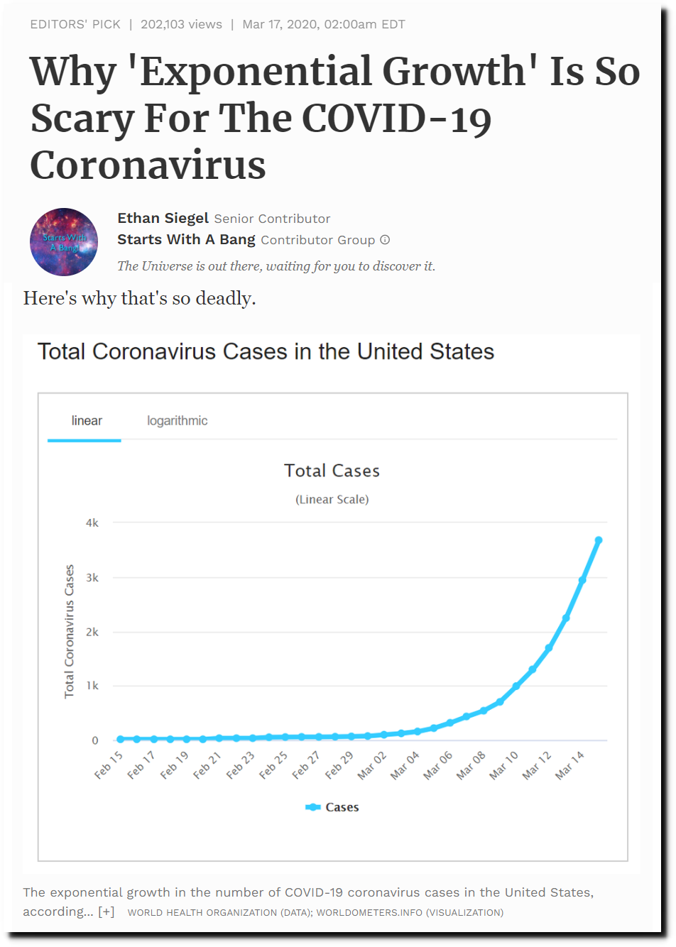
A month ago, the press was full of stories like this, implying that everybody was going to die in a few months, as the disease rises out of control in an exponential curve.
Why ‘Exponential Growth’ Is So Scary For The COVID-19 Coronavirus
This led to panicked decisions by governors and mayors, who shut everything down and crushed the economy, putting more than 20 million Americans out of work so far.
But the exponential rise did not continue. After three weeks, new cases plateaued.
United States Coronavirus: 728,293 Cases and 38,244 Deaths – Worldometer
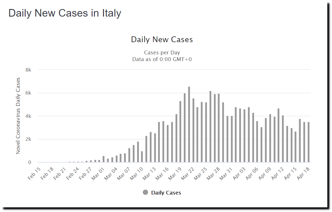
Most other countries have followed similar three week patterns. New cases in Italy are down significantly from their peak.
Italy Coronavirus: 175,925 Cases and 23,227 Deaths – Worldometer
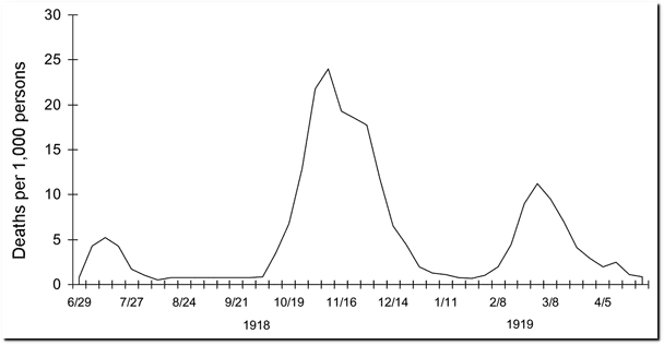
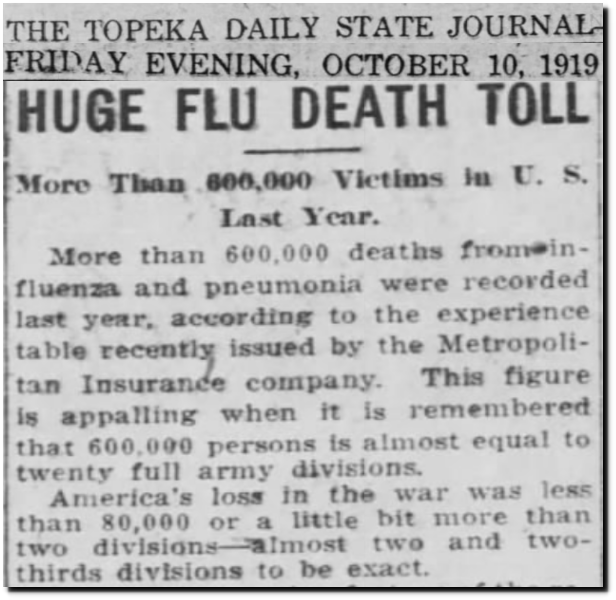
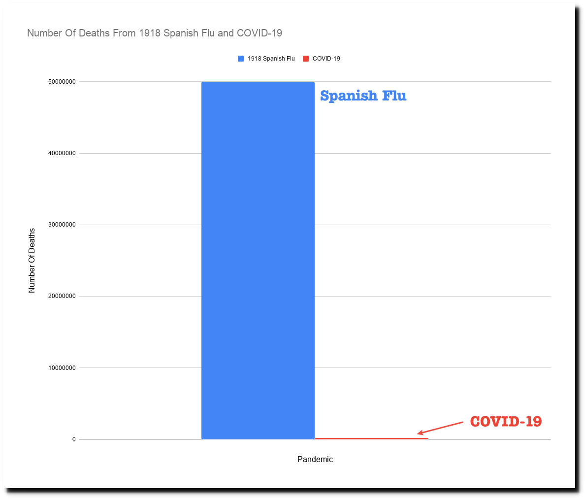
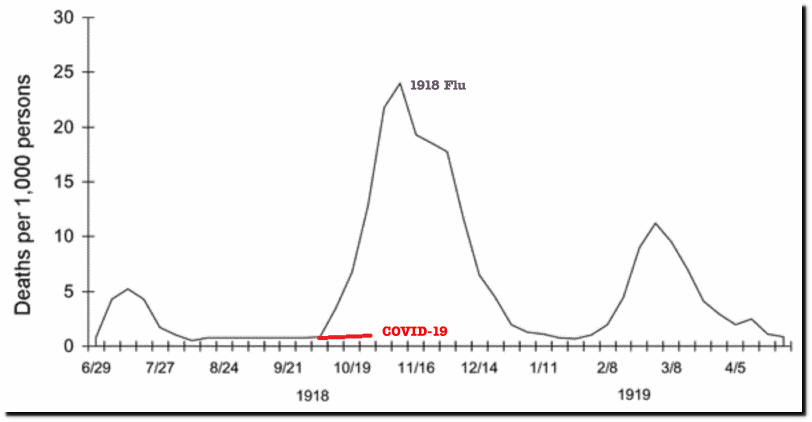
The three week rise is fairly typical for these type of viral outbreaks. The graph below is for the 1918-1919 Spanish Flu, which globally killed five hundred times as many people as COVID-19, most of whom were at prime of life in their teens, 20s and 30s. The Spanish Flu also showed a three week exponential rise, followed by a sharp decline. But three weeks into the outbreak, people probably assumed it was going to kill everybody.
10 Oct 1919, 7 – The Topeka State Journal at Newspapers.com
The graphs below put the magnitude of 1918-1919 flu in perspective.
An Israeli mathematician has shown that a similar pattern is happening all over the Northern Hemisphere with the current outbreak. He also says that lockdowns serve little purpose other than to decimate the economy.
Top Israeli prof claims simple stats show virus plays itself out after 70 days | The Times of Israel
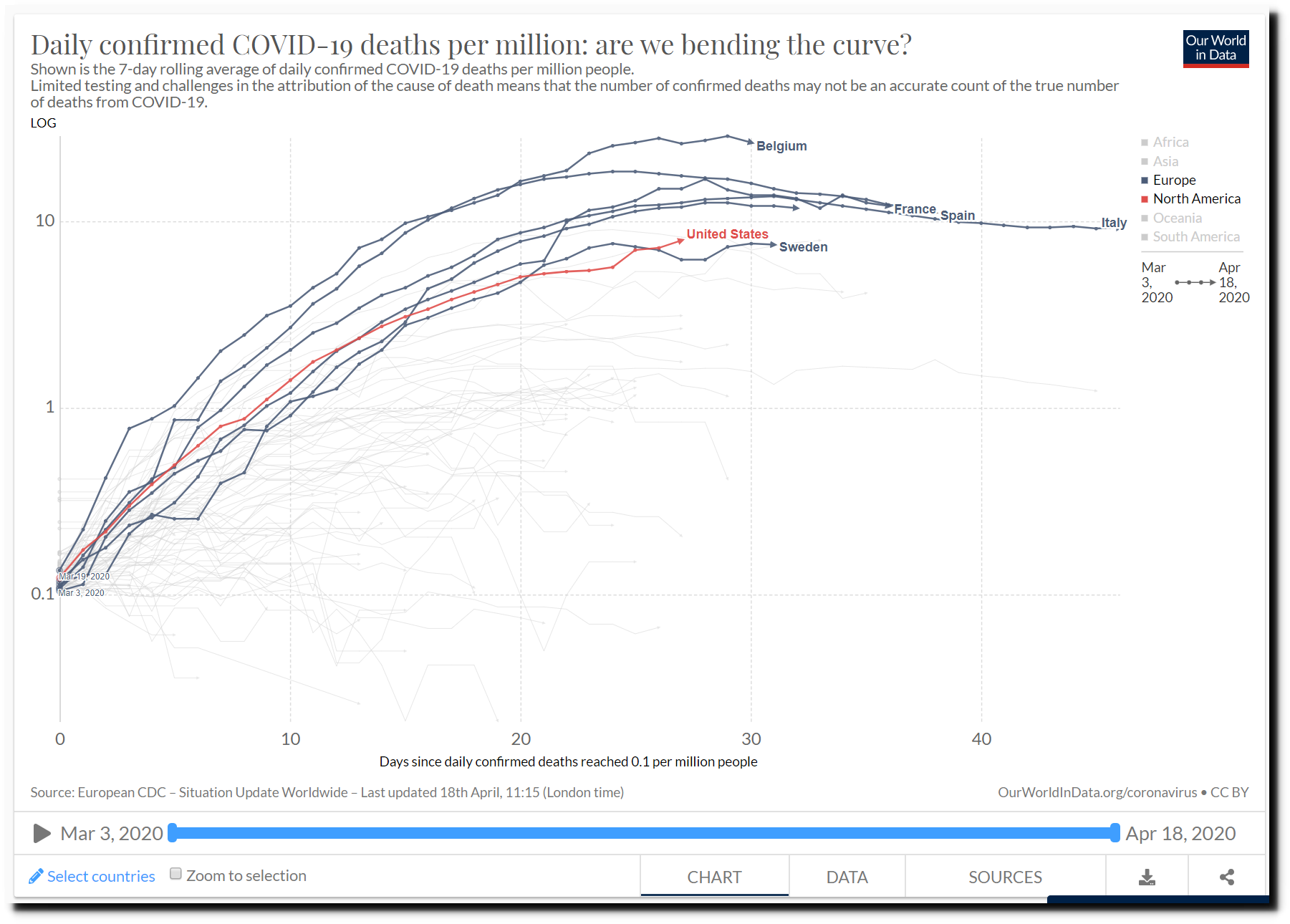
Here is some data which supports his contention. Regardless of lockdown policy, most industrialized Western countries are on similarly shaped trajectories with a downwards curvature.
Daily confirmed COVID-19 deaths per million: are we bending the curve?
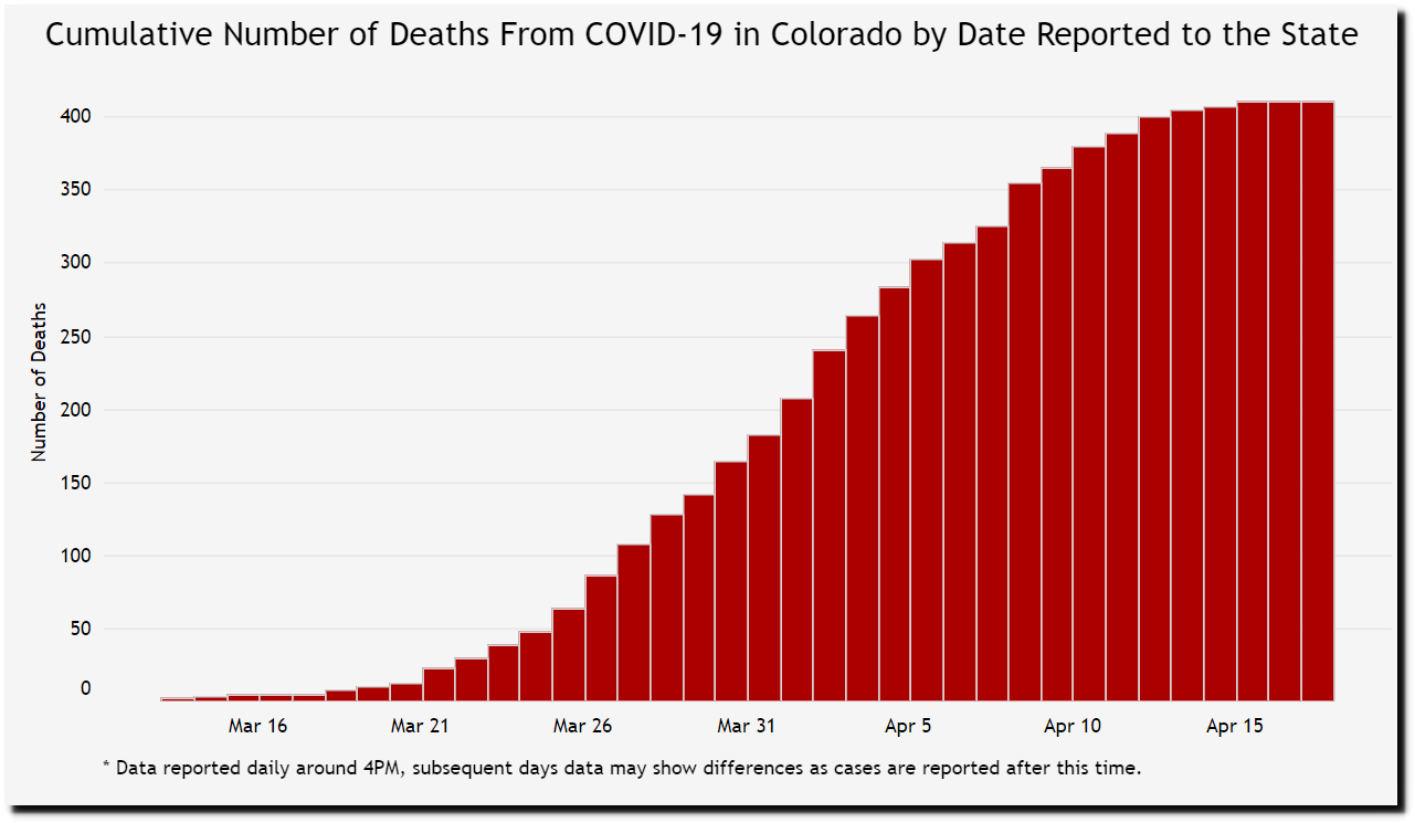
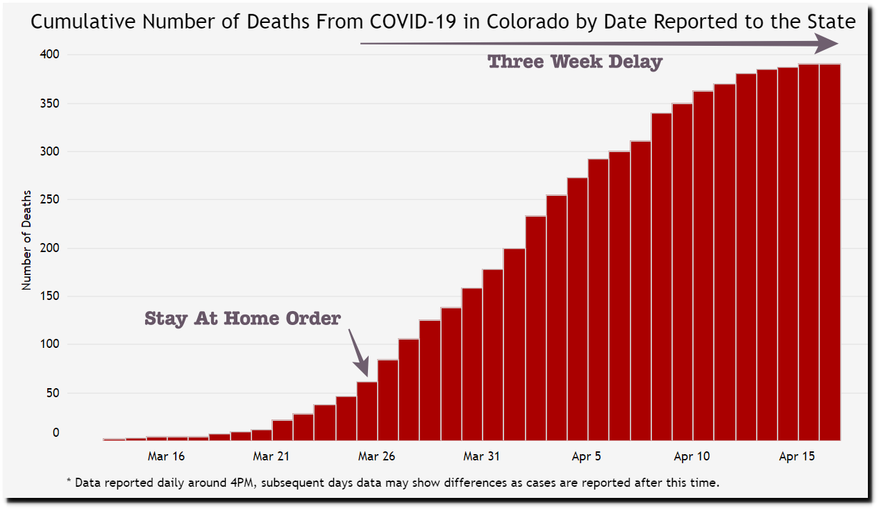
Here is data from Colorado, where the state was locked down on March 25. Deaths are becoming rare in Colorado, and are a tiny fraction of what models predicted. A large percentage of the deaths were in nursing homes.
Case data | Colorado COVID-19 Updates
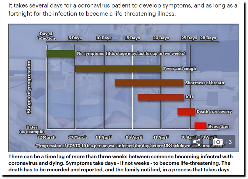
At first glance, it appears that the lockdown was successful – but let’s take a closer look at that idea. There is typically a three week lag between infection and death.
This means that the effect of the Colorado lockdown would be just starting to show up in the graph now. However, the curve started to tail off two weeks ago, long before the lockdown would have had much (if any) effect on death rates.
The governor will of course take credit for this, even though there is little evidence to support that idea. More likely Colorado is just following the same curve described by the Israeli mathematicians.
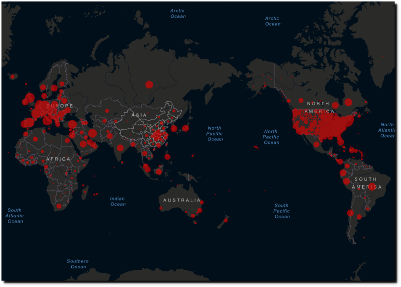
So far, this has been a largely Northern Hemisphere problem, though that is starting to shift a little.
Coronavirus COVID-19 (2019-nCoV)
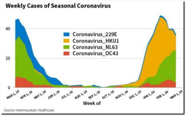
Coronaviruses typically peak during the winter, and then tail off as UV light increases in the spring.
It is likely that southern hemisphere countries like Australia (which have had little problem so far) will keep their borders closed indefinitely as winter approaches. But here in the Northern Hemisphere there is good reason to expect things will get better, and that young healthy people will be able to back to work, if there are any jobs left to go back to.
In my next blog post on this topic I will discuss risk levels for different age groups, and the Swedish strategy to obtain “herd immunity” by the end of May. But in the meantime, let’s support President Trump and get America back to work!

