Hi, everyone.
Today, I’d like to add one thing to a familiar story for many climate realists.
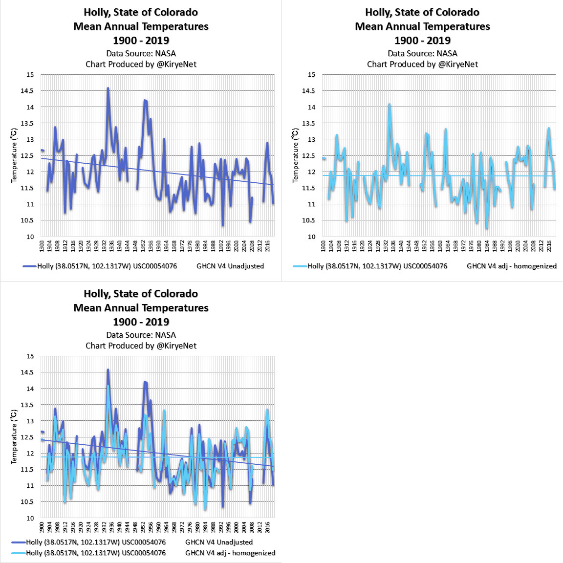
Please pay attention to the animation chart below.
The annual temperature in Holly, Colorado has had a distinct cooling trend since 1900.
However, NASA didn’t like that, so they changed the data.
As you know, there are many similar cases. Examples: here and here.
Some people still don’t know those facts, so I will continue to make charts.


