
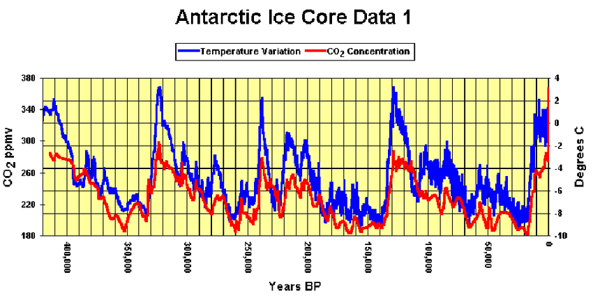
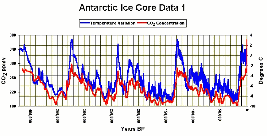
The claimed “300 year lag” between temperature and CO2 is just an illusion created by how the graph was drawn. By shifting CO2 upwards slightly, the lag disappears.
Vostok, Antarctica Ice Core Data 4 . | Download Scientific Diagram
The claimed “300 year lag” between temperature and CO2 is just an illusion created by how the graph was drawn. By shifting CO2 upwards slightly, the lag disappears.
Vostok, Antarctica Ice Core Data 4 . | Download Scientific Diagram

By adding 30 ppm to the CO2 concentration, we get rid of the lag. Only, that additional 30 ppm does not exist. Whose crazy idea was this?
By shifting the CO2 plot time axis by 300 years we also get rid of the lag.
Shifting the X-axis is not legitimate. By contrast, the relative positioning on the Y-axis was chosen arbitrarily by the authors of the original graph.
I naively assumed that the plots were based on actual CO2 concentrations, not relative values. If we are free to adjust the Y-axis, can we legitimately draw any conclusions from these data? Offsetting the axis to maximize the cross correlation function smacks a bit too much like petitio principii.
I must be getting senile. Of course the Y axis is arbitrary.
It’s two different scales superimposed on each other to try to show any correlation between them. The more I look at it the more they are correlated, but the lag time is iffy on this scale, where a thin line represents a 1000 years. Someone must have explained why they believe in the lag time in some document, somewhere. I know I have seen depictions for the Greenland core samples that showed CO2 definitively following temperature. It’s difficult to see here. There appear to be times when CO2 leads temperature and other times, particularly with descending temperatures, it definitely lags. Maybe the deeper into the past, the less reliable the dating becomes. So look at only the last 200,000 years for the lead/lag issue?
I see what you’re doing here Tony – using the Libs’ old trick of misdirection
Changing the Y-axis position of the two datasets gives the “appearance” of making them more coincident – especially as the rate of change reduces approaching a glacial minimum.
But the points of inflection (cooling vs warming and vice versa) do not change places in time. The change in temperature trend always happens BEFORE (X-axis) the equivalent change in CO2 trend.
As Steve McIntyre often said, “Keep your eye on the pea under the shell”
Good catch. It appears to me that CO2 is some running average of the temperature, which would be the case if
gas solubility in a liquid, particularly a deep liquid, were a slow migration process, both in and out.
Surely what matters are the inflection points. In other words, when does the change from increasing to no longer increasing happen.
Does the temp stop rising before the CO2 stops rising. Or stop falling before the CO2 stops falling? This would not change depending on the y axis adjustments.
I can’t tell this from the graphs above but this should be possible when looking at the data.
most morons dont / can’t or lack capacity to understand a PPM _ I told one dip stick that CO2 has only gone up 100 PPM in 200 years- WOW thats a LOT IT replied
The intellectual standard of climate activists leaves a lot to be desired.
Slightly off topic , but very scientific as it comes from a democrat top politician.
“A full moon is that complete rounded circle
which is made up mostly of gases (10.000.000 ppm co2 are at least necessary for a rock solid surface to land on)
and that’s why the question is why or how we as humans could live on the moon.
Are the gases such that we can do that?
The sun is a mighty powerful heat.It is almost impossible to go near the sun – the moon is more manageable.”
Sheila Jackson Lee (speaking in front of students)
Either Hank Johnson is no longer no1 with Guams tipping point or this was some decent deep fake.
WOW, I hope that your quote is right, otherwise you have committed the most vaudeville mockery of the poor SJ Lee. Politicians are strange animals. They may not be very bright, but somehow they are able to dupe the public into voting for them, or else our elections have been manipulated much longer than we think. This should be frightening to anyone with the least bit of understanding of numbers and science. I’m afraid, though, a lot of people would know that some of that is wrong, but not many would know how wrong it is.
I’m going to save SJL’s words so that I can have something to laugh at when I’m blue. I wonder if she inspired any of those kids to major in science?
So far Id say the quote is real.
Everything seems authentic , the only thing that bothers me is
that she was part of a Science committee AND Space and Aeronautics committee and ran for Mayor of Huston where NASA is located makes me wonder, as in this case she should have at least the most basic 3rd grade knowledge.
Even as a NY born democrat.
It is real, I saw the video clip.
I had a haircut by a man from Lebanon a few days ago. He assured me that there were no planets and the moon was plasma. There is a lid over the world on which are attached little points of light. The moon landing was faked because we cannot land on plasma.
This was so far beyond the border of Stupid Land that I had to consider how a set of beliefs this obtuse could be spread, and by whom. It occurred to me that religious leaders are teaching this and that it represents beliefs dating back to the Ancient Greeks. It is literally 7th Century science.
Trifles like Guam tipping over and the pittance of fabricated temperature data pale in comparison, when we think of climate policies.
However that is not why I write. As a generator of graphs myself, I would like to point out changing the scale and the base value of the right axis in that chart not only matches the CO2 to the temperature vertically, it shows that temperature drives CO2 concentration, largely because of the ocean temperature. It is the largest sink and source of all.
We know that the temperature has to come first to warm the oceans so there should be a lag. Ocean temperature lags are real, both up and down. Ocean temperature lags air temperature. What was the proxy for the temperature? Something in the oceans or in the air? It is 18O2 ice core data, isn’t it? If so, there should be an air temperature rise before an ocean temperature rise, at which time CO2 should out-gas. Hence the delay on concentration.
Tony, is it possible to convert the chart to data and then re-scale to to create a properly matched pair of lines? The scales on the right and left are arbitrary, so adjusting either to show they match is legitimate. As shown, the impression is give that “CO2 doesn’t move as much up and down” as temperature. it is just a scaling issue. If all peaks were matched, is should be possible to see the ocean temperature lag, which is the same as a CO2 lag.
In defence of this option, I point out that CO2 cannot cause the oceans to outgas CO2 before a temperature rise, as a temperature change from CO2 is essentially instantaneous., and there is no viable source of CO2 save the oceans.
Thanks
Isn’t this what cross correlation analysis is for? Or am I missing something? BTW, when people have trouble getting the feel for how big 420 ppm CO2 is, I find that it’s useful to mention how much gas per square meter is sitting over their heads. There’s about six and a half kg of CO2, of which less than 2 kg is carbon. That may sound like a lot, but the rest of the air over their one square meter plot is over 10,000 kg, or 10 metric tons. The other fun fact is that an adult human exhales about 1 kg of CO2 per day. Compared to the real big animal components on land (the ants and the termites) we’re pipsqueaks.
I don’t understand the infatuation with C. It’s CO2, the gas, which everyone is worried about. No one bothers to say it right. No one bothers to look up tables and graphs of its actual ? and ?. It’s the ? that Hottel et al actually measured. I think it has been better refined to specific ?s since their study, which I believe was published in the Journal of Chemical Engineering in the 1950s, possibly as early as the late 1940s. No one bothers to look at the spectrum of ?s that are absorbed by CO2 and that most of that spectrum is also absorbed by H2O, which is more dominant in the atmosphere by magnitudes. If the atmosphere’s composite were a sheet of typing paper, and you colored N2 green and O2 red and CO2 white, you would have difficulty finding the 4/10,000 ths which represents CO2.
? represents special symbols in order respectively: emissivity, absorptivity, emissivity, wave length, wave length.
The reason why carbon is a vital variable is that it’s the carbon component in a fuel that counts when it comes to mass balance. The obvious comparison is coal vs methane. Also, the O2 in CO2 comes from the atmosphere (no net mass change there), so for many very important reasons, it’s the C content that’s important for the emission of CO2. At least, that’s if you are worried about anthropogenic CO2. I’m not particularly worried about it.
Maybe the original position is the best position to “view” what the data says. Even with the shift proposed, it appears to me that the CO2 follows the temperature most of the time, not the other way around. The graphs are smoothed representations of discrete data points. The idea that the CO2 follows the temperature comes from the data points and the scientist’s understanding of the meaning of those points. The graphs also do, but the graphs represent 450, 000 or so years. A 1000 years is the width of a line (I’m guessing). So I still believe that CO2, driven by temperature, moves from one reservoir to another within the system of Earth’s surface, with occasional inputs from the core through volcanic activity, and continual subtraction through various biological activity. The two main reservoirs being the oceans and the atmosphere.
Well….
what are the error bars in time, temp, and CO2 concentration?
is any plot legit enough to make a decision?
Reading Annals of the Fromer World by John McPhee, his last Chapter is titled Crossing the Craton. In it he interviews a Geologist who is happy to get within a few million years of the correct age of certain rocks.
Just saying…
Which all goes to say; the science does not seem to be “settled” as corrupt politicians would like you to believe. In the mean time we spend trillions of dollars we don’t have to produce a phony economy and for which much better societal and economic benefits could be found.
And (hopefully) adding to the conversation:
1. Way way way back, the earth I believe was mostly CH4….but a huge gazillion of 1st life creatures consumed CH4 and spit out CO2 (and O2?)…thus changing the composition of gases in the atmosphere…ad also killing themselves off.
2. It is speculated that the The N-S line through NA was really on the equator those millions of years ago.
JB … play with this … note you can change the time period represented. I think the period you speak of was about 300 million years ago. You can increase the globe size & note the write up on the left
https://dinosaurpictures.org/ancient-earth?fbclid=IwAR04Qexjg8rbSU5fHYsoStU56yIWT8jnJMg0rM6d0F6qTIDjfVXFyRfHhH8#540
I just remember that there were supposed to be hydrocarbons in the atmosphere, and lots of volcanic activity. So, I think in the 1970s a bunch got the idea that they could mimic the atmosphere in a test tube, and spark it a bit with electricity and see what they got. Well, they got some simple enzymes, and exclaimed that they had created life, or would soon. The problem is that they forgot, or didn’t know at the time, that the simplest one celled thing has a string of DNA that is 10 feet long, a far cry from a blip of enzyme. They are still trying. I think that the ultimate problem is that if you have all 10 billion particles of DNA correct and lined up, the odds are about equal 1 that one of them will mutate bad, before your last one mutates right.
thanks
thanks
To find the lag, if any. Multiply the temperature by the carbon dioxide concentration off set by a time delay for all data points. Integrate (sum) these products over the whole sample. Repeat for a range of values of delay (positive and negative). This will yield the cross correlation function which tells us how similar the two plots are as one is offset in time with respect to the other. The delay corresponding to the peak of this function will tell us how much carbon dioxide lags temperature.
Has anybody found a cross-correlation plot in the literature?
He re is one from a Prof. Murray Salby’s presentation (CO2 and T anomalies measured since 1960) :
https://youtu.be/HeCqcKYj9Oc?t=514
Thanks for the reference. I will reread differential equations text book and then listen again. Just kidding….somewhat. He is very thorough and sharp. I suggest that when Trump gets elected, he put Salby in charge of NOAA, if he is still alive. Now we just need to find someone to run NASA.
Sadly, Prof. Murray Salby passed away in 2022.
Tony, it was great to see you in the documentary “Climate the Movie: The Cold Truth.”
The documentary was smashing, and I look forward to sharing it with students in an upcoming semester. Of course, between their confirmation bias and overall fragility, and me standing against the narrative, it could very well go south but I am past disgusted at this point; the arrogant ignorance has become too much to endure.
Keep up your good work!
fondly,
The Miscreant Pea
True. The outgassing starts in synch with temperature rise, and on short time scales is detectable immediately. I wish I could paste a chart here, but in analyzing deseasonalized MSU globe data from the 1998 El Nino, DeltaCO2 is virtually indistinguishable from DeltaT. CO2 follows along quite closely even when there isn’t a huge temperature spike like 1998.
Try this: https://naturalclimate.files.wordpress.com/2024/04/2024-04-11-19_55_25-co2_growth_vs_temp.pdf-and-2-more-pages-personal-microsofte2808b-edge.png?resize=438%2C438
Nope… Try this one…
https://naturalclimate.files.wordpress.com/2024/04/2024-04-11-20_00_27-co2_growth_vs_temp.pdf-and-3-more-pages-personal-microsofte2808b-edge.png
Hello Michael.
An interesting graph. I have been drawing similar graphs to try and get a better understanding of what is really happening. Something I think is interesting is that there is an inbuilt 6 month lag in the data that I don’t think many people are aware of.
When calculating the annual change in the atmospheric CO2 (CO2 growth/dCO2), NOAA adds up the values for November to February and divides by 4 .
This becomes the official end of year value for CO2. They then subtract the previous year’s value to get the dCO2 for the year.
If you calculate the average temperature value for the year you would add up the values from January to December and divide by 12.
This means the average temperature value for that year is six months before the dCO2 value. Which is a six month lag built into the data.
If temperature is the cause of the CO2 growth, then a change in temperature should result in a change in growth.
Here is a dropbox link to a graph of change in temperature and change in CO2 growth.
https://www.dropbox.com/scl/fi/6ygzxvr4bzan6ky4vapdn/Change-in-UAH-Globe-T-and-Change-in-CO2-growth.jpg?rlkey=x7m1a1gm2b2iexc6cegkwrklx&dl=0
Thanks for that. I must admit to have been taken in by the ‘CO2 lags temperature’ argument, when the physics of the problem clearly indicate they must rise together.
Also, full marks to Tony for pointing out this fallacy.
We must be critical of all arguments which appear to support the skeptics cause, including the one that the greenhouse effect is saturated at current values of CO2 concentration.
The reality is that the greenhouse effect is folklore, initiated by Sagan’s assertion that it is the reason why Venus is hot. An assertion which is complete humbug.
Venus is hot because of the massive adiabatic compression of the gas circulating in the Venusian tropopause. The temperature lapse rate is likewise determined by the exchange of thermal and gravitational potential energy as the gas circulates. It’s called the First Law of Thermodynamics, which is evidently beyond the alarmist’s understanding. Venus would be just as hot with a pure nitrogen atmosphere. The greenhouse effect is thermodynamic nonsense.
When looking at all these assertions we must go back to the basic physics and put aside deference and peer pressure.
for ‘tropopause’ read ‘troposphere’. The tropopause is largely isothermal, from the radiative balance with the solar constant, modified by the albedo.
CO2 is proportional to the integral of the temperature according to Salby. This makes sense because its rate of outgas is proportional to the temperature.
The solubility of gas depends on the temperature of the liquid at the gas/liquid interface. Also at the surface there can be evaporative cooling of the liquid in response to higher atmospheric temperatures. In deep bodies of water, there is a temperature gradient, generally cooler with depth. It will take a while for the deeper water to warm or mix with the warmer water caused by rising atmospheric temperatures. I assume that the deeper, cooler water holds more dissolved gas than the warmer surface water. I’m not sure how long it takes gas to work its way down from the surface, and there may also be gas being bubbled up from the bottom through volcanic activity. It seems that there may be some inertia involved in getting the gas from the deeper water to be expelled from solution. I don’t think that there is a slam-dunk answer on the CO2 lag issue, and that an in depth study of the CO2 distribution and migration in the oceans is required to start understanding just what is going on.
When looking at the Vostok graph, it is interesting that the CO2 line is smoother than the temperature line. The CO2 level may be an indicator of the temperature over a rolling time period, X, plus or minus any lead or lag.
Even when you understand the dynamics, which are complex, you still have to be able to quantify them. The devil is in the details.
However we look at the situation, the claim that CO2 is causing the oceans to heat up remains an absurdity.
Back radiation from CO2 can never warm the ocean because it can’t pass the ocean’s surface. Only direct sunlight can warm the oceans. So to have a warmer planet somehow the sun’s radiation has to go deeper and warm more ocean. A more active sun or/and a weaker magnetic field seems the most likely. More out gassing and solar impacts could also rise atmospheric pressure.
Why do you say it cannot warm water? Is it because the particular wave lengths which are captured and reradiated by CO2 are reflected off of the surface of water? Those are longer wave lengths described as heat radiation, rather than in the spectrum of light. I don’t know what the difference between an atmospheric high pressure area vs a low pressure is, but I think it is trivial in absolute terms.