Some Progress With Australia

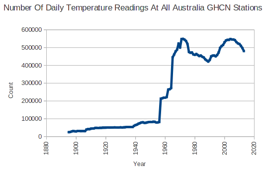
The absolute temperature graphs I posted earlier show that there are some serious discontinuities in the Australian temperature record. There was a huge increase in the number of temperature readings, immediately after 1956.

ScreenHunter_2481 Sep. 02 10.56

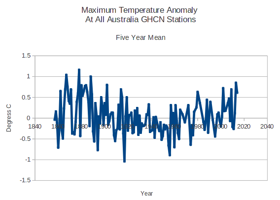
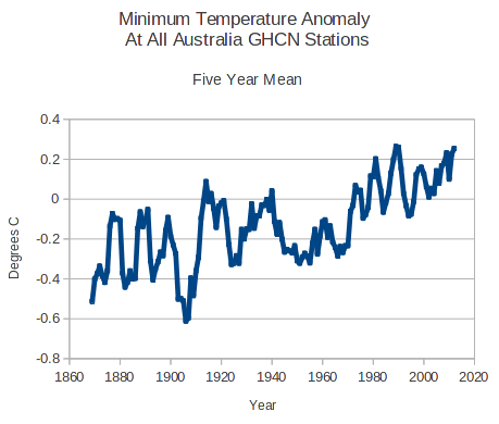
Because the Australian record is so fragmented, I tried generating anomaly graphs (daily anomaly from the monthly mean at that station.) Here are a couple of interesting graphs, for maximum and minimum anomalies.

The maximum anomalies peaked in 1878, declined until the 1950s, and have been rising ever since.

ScreenHunter_2487 Sep. 02 20.03

Minimum anomalies have been rising steadily for the entire temperature record. Possible UHI effects.

ScreenHunter_2486 Sep. 02 20.02

What does it mean?

About Tony Heller

Just having fun
This entry was posted in Uncategorized. Bookmark the permalink.

13 Responses to Some Progress With Australia

  1. norilsk says:

    Watch Andrew Bolt roast all the Australian global warmers. See the lie busting shot of the Brisbane dam releasing water.
    https://www.youtube.com/watch?v=s9voS5MJSuM

    • D. Self says:

      Good God! The disease is more widespread than I thought! My local news must have now received the memo because they just stated the Polar Vortex this winter was caused by global warming. The epidemic is here and now….

  2. The answer, in my view, lies in the range of the anomalies (the y-axis in both graphs). As I have said here a number of times before, it looks like the long term trend, both regionally (as in Australia or the USA) and globally, is a constant long-term mean surface temperature (varying from one climate region to another, of course), with a natural variability of about 0.5°C above and below that mean. The 45-year recent rise in the minimum Australian temperature (about 1970 to present) only encompasses 0.4°C.

  3. norilsk says:

    I want to post it, but you can go look it up on YouTube: Won’t Get Fooled Again by the Who.

  4. Bill S says:

    Demographics.
    Where did all the vets go after WW2?

  5. SMS says:

    Looks like UHI. The older stations are probably in major cities and the newer stations are more rural.

  6. EternalOptimist says:

    nuclear testing
    patio heaters
    multiple tobs
    error in the sql group by statement (most likely imho)

  7. anthonyvioli says:

    It means the Australian dataset, called ACORN, is unreliable and a joke.

    Ken Stewart and Jennifer Marahosy ( and others) have been working on this for years.

    We are only just starting to scratch the surface on this scam.

    Keep up the good work Tony.

    • Gail Combs says:

      Don’t forget Jo Nova. Looks like ACORN is a real mess. (Acorn is an ADJUSTED data set BTW)

      BOMs new data set, ACORN, so bad it should be withdrawn (954 min temps larger than the max!)

      One of the independent auditors, Ed Thurstan writes to me to explain that though the BOM says it aimed for the “best possible data set” and specified that they check internal consistency of data (one such check is to make sure that the maximum on any given day is larger than the minimum) when Thurstan double checked ACORN he found nearly 1000 instances where the max temperatures were lower than the minimums recorded the same day.

      This raises serious questions about the quality control of the Australian data that are so serious, Thurstan asks whether the whole set should be withdrawn.

      June 2012 Threat of ANAO Audit means Australia’s BOM throws out temperature set, starts again, gets same results by Joanne Nova and Ken Stewart

      A team of independent auditors, bloggers and scientists went through the the BOM “High Quality” (HQ) dataset and found significant errors, omissions and inexplicable adjustments. The team and Senator Cory Bernardi put in a Parliamentary request to get our Australian National Audit Office to reassess the BOM records. In response, the BOM, clearly afraid of getting audited, and still not providing all the data, code and explanations that were needed, decided to toss out the old so called High Quality (HQ) record, and start again. The old HQ increased the trends by 40% nationally, and 70% in the cities.

      So goodbye “HQ”, hello “ACORN”. End result? Much the same.

      That meant the ANAO could avoid an audit, since the BOM had changed data-sets, the point of auditing the old set was moot.

      For me, this version is so much worse than the previous one. In the HQ data set the errors could have been inadvertent, but now we’ve pointed out the flaws, there can be no excuses for getting it wrong. Instead of fixing the flaws (and thanking the volunteers), it’s almost as if they’ve gone out of their way to not solve them. Instead it’s been complexified, rushed, has many typo’s and gaps, and the point (see below) about the “adjustments having no impact” — when they obviously do — begs to be audited by the Auditor General, the ACCC, Four Corners (ha ha) and 60 Minutes…..

      ACORN and the BOM claim that since the new results are pretty much the same, really they give more confidence than ever that Australia has warmed since 1960.

      Ken Stewart and the independent BOM analysts team have sliced and diced through the ACORN data.
      They conclude:
      Like the old HQ series, the Acorn record is also still impossible to replicate.
      The record is much shorter than 100 years for many sites. It’s supposed to be high quality, but it has many gaps and spurious errors. If volunteers can write code on laptops to check for errors — and find, for example, that one 36.8C was accidentally changed to a 26.8C (and there are many) why can’t the Australian BOM?
      Like the old series, Acorn’s trends are very different from what the raw data shows. (Why do we bother with thermometers?)
      Hot and cold extremes have been adjusted, for the most part warming winters and cooling summers, and at some sites new and more extreme records have been set.
      Too tricky by half? The BOM tries to hide the effect of adjustments

      Here’s a piece of sleight of hand — ACORN, they claim, has a random set of a adjustments of both up and down (which is what we’d expect).

      The official CAWCR Technical Report No. 04:

      “There is an approximate balance between positive and negative adjustments for maximum temperature but a weak tendency towards a predominance of negative adjustments (54% compared with 46% positive) for minimum temperature.”

      But the independent auditors point the positive adjustments are larger than the negative:

      While there may be a numeric balance of positive and negative adjustments, analysis of a representative sample indicates that adjustments predominantly increase warming.

      This is for me the most sinister point. Recall that Dr David Jones, Head of Climate Monitoring and Prediction, National Climate Centre, Bureau of Meteorology, stated clearly that the adjustments made “a near zero impact on the all Australian temperature”….

  8. catweazle666 says:

    Here for comparison is the (detrended) HadCRUT4 graph.

    http://www.woodfortrees.org/plot/hadcrut4gl/from:1850/trend/detrend:0.778/plot/hadcrut4gl/mean:120/detrend:0.778

    It appears to bear some resemblance to the min. anomalies inasmuch as it appears to have a ~60 year periodic element, the max. anomalies, on the other hand…

    Mmmm… Curious.

Leave a Reply

Your email address will not be published. Required fields are marked *