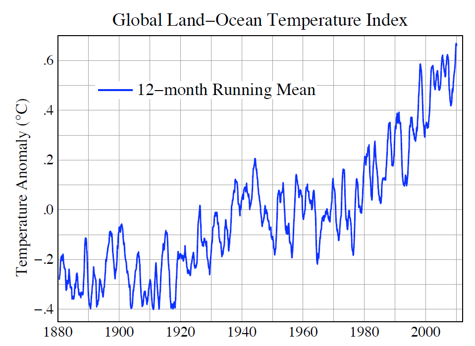
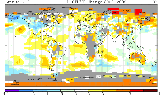
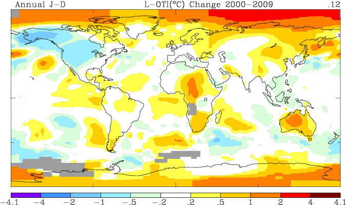
http://data.giss.nasa.gov/gistemp/2010july/figure2.pdf
GISS is the only temperature index which shows significant warming since the year 2000. The animation below highlights the primary thing they are doing wrong.
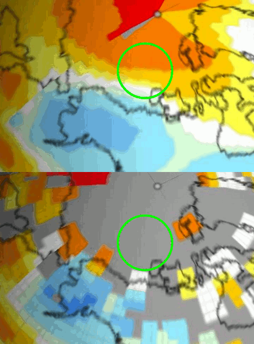
The blink comparator flashes between their 250 km (measured) and 1200 km (extrapolated) 2000-2009 trend maps. The region at the center of the green circle is showing 1-2 C of warming, even though the closest actual measurement near Herschel Island shows no warming.
Their algorithm creates an imaginary hot spot at the North Pole (2-4 C based on no actual data within 800 km) and then weights it as heavily as a closer measured temperature reading, in the next step.
They appear to be using at least two steps of extrapolation/interpolation – which compounds error. In other words, their entire 21st century warming story is based on a defective interpretation of the Arctic.
“A likely explanation for discrepancy in identification of the warmest year is the fact that the HadCRUT analysis excludes much of the Arctic ….. (whereas GISS) estimates temperature anomalies throughout most of the Arctic.”
The GISS article with this statement has disappeared from their web site, but it used to be at http://data.giss.nasa.gov/gistemp/paper/gistemp2010_draft0319.pdf.
Note that the only red spots on the map are a few thermometers north of Russia, and they are exaggerated in size due to the map projection.
When GISS is done torturing the real data, it looks like this – with massive temperature and geographical distortion near the pole.
The video below shows a world tour of the thermometer data – as an equal area projection. Not much warming on this planet.
GISS graphs are broken, there is no significant 21st century warming trend.
[youtube=http://www.youtube.com/watch?v=-QI3mbx7_d0]


So GISS really is making up data.
You notice the Antarctica on 250 meter map of the globe? They’re not just mucking up the Arctic, but also the Antarctic. Especially directly south of Madagascar. Where does the long bar of warming (representing the interior Antarctic) come from? I don’t believe they have temp stations functioning there.
RSS have been suckered into this scam of Arctic warming as well
http://www.ssmi.com/data/msu/graphics/plots/MSU_AMSU_Channel_TLT_Trend_Map_v03_2.png
Nice straw man. You picked a different time period.
This article is about temperature trends since 2000.
In other words, a SWAG sans science.
E.M. is running a post detailing the rounding up of temp to even degrees C at many airports thru-out the world. That ought to be a +.3C bias right there…
Send Al Gore a math book for dummies. What a total and complete fool these people have made of themselves and their silly environmentalist desires to reduce the earths population by 2/3 or to a sustainable level according to them?
Progressives are losers – Environmentalists are power grabbers that seek to contol the total production of all industries. The is is the first principle of Marxism/Socialism contol the industrial policy. They destroyed the entire middle class blue collar skilled labors JOBS with false threats and over regulations.
Notice anything hot about Australia? Now read this, if you have not already.
http://wattsupwiththat.com/2009/12/08/the-smoking-gun-at-darwin-zero/
Yeah, wow, those radical GISS guys are over-exaggerating things!! Steve’s pointed this out like a million times already.
But here’s what the data says
hadcrut3 slope = 0.00602583 per year
gistemp slope = 0.00583138 per year
Sure Brendon, what’s the time frame you’re referring to? From 1880? Bwahhahahahaha. But if you go further back(say 1800) for CRU, then their trend is lower, but then as one steps closer to the present, the divergence become significant……which is odd, because they mostly share the same data. Try 1980, then 1990, then 2000 and you’ll plainly see the divergence.
http://woodfortrees.org/plot/hadcrut3vgl/from:2000/trend/offset:0.05/plot/gistemp/from:2000/trend
What’s the difference? Could it be the interpolation/extrapolation methods employed at GISS?
suyst says:
The divergence changes both up and down and yes, for sure it is because of the technique. Over the past 30 years they’ve pretty much been the same. Why doesn’t Steve complain about GISS underestimating temps for the previous 2 decades, or does he flip it around and complain about CRU data?
1980 onwards – Divergence almost zero
1980-90 – GISS are lower
GISS are lower again
GISS are higher
Because, at the time they didn’t. Apparently, you’re not familiar with the algorithm they use. It literally allows them to change historical temps. And they do, but always in a lower manner as you move in the past and always in an upward manner as you come closer to the present. I’d be really surprised to find you didn’t know this. If you didn’t, let me know, and I’ll show you all of the proof you need to. Or ask Steve, he’s very familiar with the technique employed and can probably explain it better than I can. That said, I’d be more than happy to show where people believe this is acceptable.
suyts, no I’m not aware of the specifics of the changes to the GISS algorithms but I am aware that all scientific bodies change their algorithms over time in an effort to improve them. That shouldn’t be surprising to anyone.
I see GISS list many changes here.
That they differ from other attempts doesn’t surprise me either. There’s many ways to attempt global reconstruction from the data available and I would hazard a bet that the scientists themselves do not always agree on which method is best.
That said, the different reconstructions all still show long term warming trends.
Its not about the steepness of the slope, or with the question whether the world has warmed or not.
It is the SHAPE of gistemp.
There is no recent flattening shown in gistemp. Nada, nil. The trend just continues just like before. 2005 is a record year and 2010 will set a new record, while other datasets will still have 1998 as a record.
Is this important? Yes it is. Since the natural indexes are dropping Hansen is trying to make a point, that CO2 is driving temperatures, when it is not.
Using the woodfortrees trend plots doesnt tell much. Linear trend depends soooooo much on the starting year, and you can find any results you want by cherrypicking the prefered dates. And any self-respecting scientist knows, that linear trends never continue ad inifitum, they have no predictive power whatsoever. They are also very bad on estimating recent changes since the slope is always ehm… just linear?
Quadratic fits are much better to visualize how the temps are developing. Heres some proof from the divergence between GISS and HADCRUT:
HadCRUT quadratic:
http://users.tkk.fi/kse/hadcrut3-quadfit.png
So you see, a recent flattening, if not even a beginning of a decline (surely, this does not have predictive power either but during the same time PDO is cooling and AMO will be cooling soon too.)
GISTEMP quadratic fit:
http://users.tkk.fi/kse/gistemp-quadfit.png
No flattening whatsoever. Even quadratic fit gives a monotonic, linear rise. Hansen has a point and since he is an activist and the “father” of GW movement he is not to be trusted.
Here’s GISTEMP compared with Roy Spencer:
http://www.woodfortrees.org/plot/gistemp/from:2000/normalise/plot/gistemp/from:2000/normalise/trend/plot/uah/from:2000/normalise/plot/uah/from:2000/normalise/trend
Roy Spencer?
GISTemp in recent years compared to GISTemp before that:
http://www.youtube.com/watch?v=w8ZhWZj8zfQ
Here’s your graph but starting at 1997 instead of 2000 so that the change GISTemp makes can be noted:
http://www.woodfortrees.org/plot/gistemp/from:1997/normalise/plot/gistemp/from:1997/normalise/trend/plot/uah/from:1997/normalise/plot/uah/from:1997/normalise/trend
Hammiesink
Why did you use normalise?
Hammiesink
Is GISTemp supposed to track closer to the satellite record of the CRU record? It’s supposed to be closer to CRU, right?
here is GISS vs CRU (from suyts post above) :
http://woodfortrees.org/plot/hadcrut3vgl/from:2000/trend/offset:0.05/plot/gistemp/from:2000/trend
You can see GISTemp is unlike CRU. So one has to ask the question why does GISTemp resemble satellite and not land?
Hammiesink
Here’s the big 4. Somehow GISTemp shows a sharper warming from 2010 El Nino than even the satellites do, and far more than CRU.
http://www.woodfortrees.org/plot/hadcrut3vgl/from:2000/normalise/trend/offset:-0.0955/plot/gistemp/from:2000/normalise/trend/offset:0.1075/plot/uah/from:2000/normalise/trend/offset:0.0656/plot/rss/from:2000/normalise/trend/offset:0.1028
So the question has to be asked, why?
I’d fail a freshman for presenting extrapolation of this magnitude. A high school freshman.
Everyone knows that you can’t extrapolate very far at all if there are significant changes between the points. I would say even the 300 mile is suspect. If I was in charge, each thermometer would be responsible for a fifty mile radius or halfway to the nearest neighboring thermometer. Any data not covered would simply be blank. That is the ONLY honest way to do this calculation. Interpolating over hundreds of miles is simply dishonest.
It’s the product of mixing activism with science.
I have an honors degree in physical chemistry and I spent a lot of time working in large scale thermodynamics. Clearly this data and the ‘climate gate’ scandal should be a wake up call that this ‘global warming caused by CO2’ is some sort of a political takeover of energy production and a bad joke. I cleaned by Glock 9mm this morning.
Thank you, gentlemen, for arguing both sides of this thing, so we laymen can have some idea of what in hells bells is going on. Please keep up the debate. Sooner or later, definitive clarity will emerge.
Pingback: The Artic is Melting (,Todo). : Candid Conservatives
Of course the world is warming. The polar ice cap once extended down to the Ohio River, then started to retreat. It is still retreating, and probably will continue until it melts completely. Then it will reform and crawl down the slopes again, just as it has many times before. Now is the time to start thinking about some resort property in Nome.
Barney Fife:
Let’s hope that Nome property works out. Keep a room available for me, just in case.
But, recent history (the last 1.3 million years) tells us that interglacial periods last, on average, 10,000 years, proceeded (and followed) by ice ages which last, on average, 90,000 years.