
Winter temperatures in the US, Europe and Asia have been plummeting since global warming ended 17 years ago.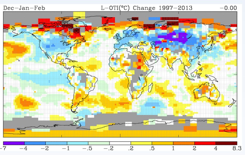
Disrupting the Borg is expensive and time consuming!

Google Search
-
Recent Posts
- Cattle And The Climate
- One Atomic Bomb Per Hour
- New Video : Analyzing Oil And Gas
- Is Antarctica Melting?
- High Speed Analysis And Visualization
- El Nino To The Rescue?
- Fake News Update
- Growth Of Antarctic Sea Ice
- 65 Years Of Progress!
- El Nino To The Rescue?
- Worst March Drought On Record
- ChartGL Process Control Demo
- The Biggest Money Laundering Scam
- Drought In The Headwaters Of Lake Powell
- Unrealistic Expectations Of Water Availability
- Did Bill Gates Do This?
- Worst March Drought On Record In The US
- The Real Hockey Stick Graph
- Analyzing The Western Water Crisis
- Gaslighting 1924
- “Why Do You Resist?”
- Climate Attribution Model
- Fact Checking NASA
- Fact Checking Grok
- Fact Checking The New York Times
Recent Comments
- arn on Cattle And The Climate
- Bob G on Cattle And The Climate
- Robertvd on Cattle And The Climate
- Bob G on Cattle And The Climate
- Robertvd on Cattle And The Climate
- Billyjack on Cattle And The Climate
- Bob G on Cattle And The Climate
- Robertvd on Cattle And The Climate
- Robertvd on Cattle And The Climate
- Robertvd on Cattle And The Climate
Hansen’s charts stopped when IPCC formed?
https://twitter.com/NJSnowFan/status/383421621790191616/photo/1
NASA is now citing SkS? 😆
The fat lady is singing, as she jumps the shark.
Notice how the meme now is “global warming has slowed”? Apparently that is the purpose of skewing past data.
Interesting Chart.. Did the IPCC see this one..lol
http://thetempestspark.files.wordpress.com/2013/03/oxford-average-november-sunspot-number-and-march-minimum-temperature-1865-2012.gif
When did they find their grey pen? Didn’t they formerly just paint those areas red or pink?
I used 250km smoothing, which cuts out much of their fake data.