The animation which Dr. Meier from NSIDC posted on WUWT is very helpful.
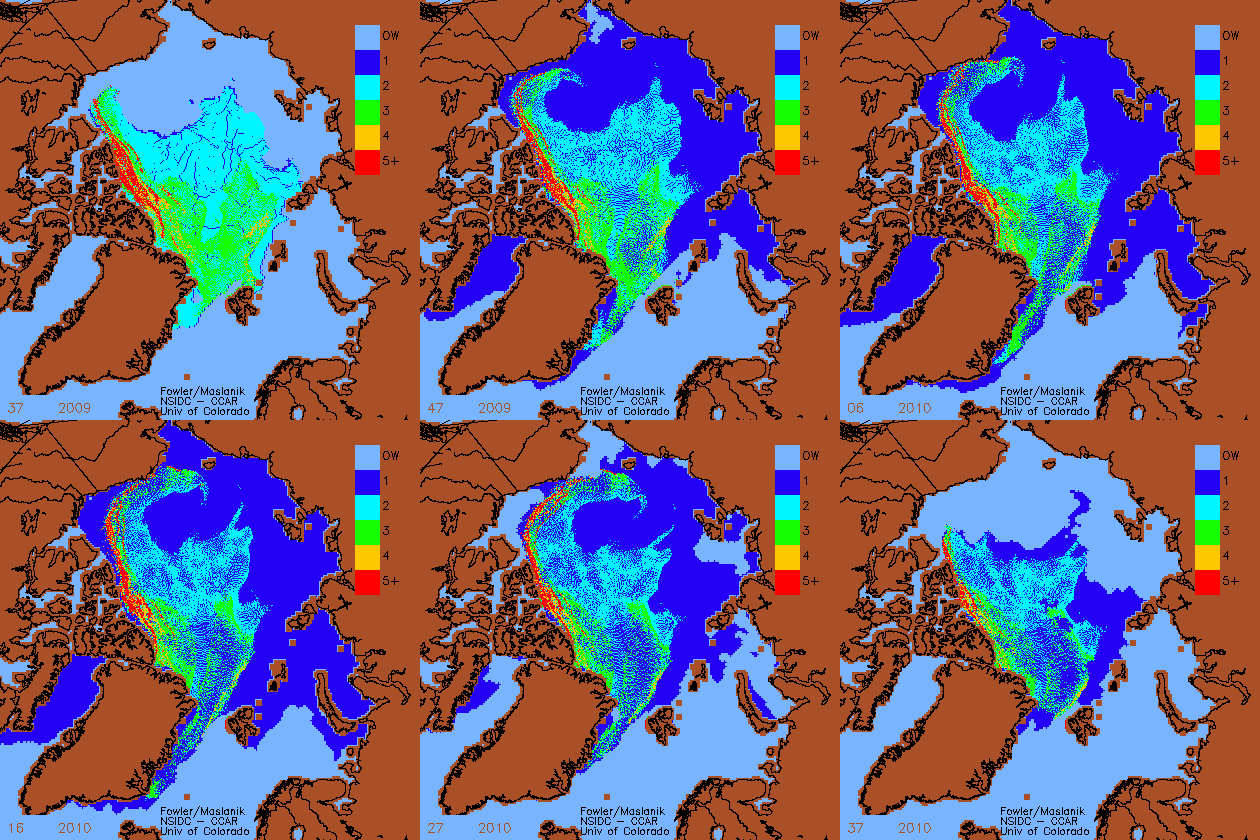
It shows how old NSIDC believes the ice is, for each week from mid-September 2009 to mid-September 2010. So theoretically we should be able to do an apples for apples comparison between the start and end dates. But there is a major problem …
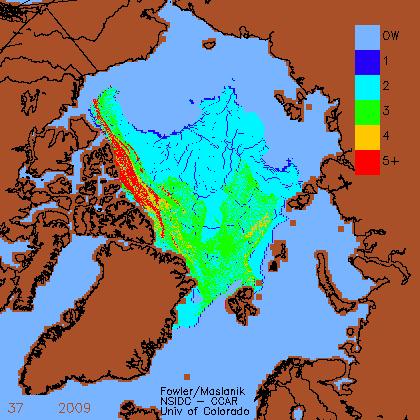
Some years they advance the ice age on week 37, and other years they do it the next week. In 2009 they had already thrown a birthday party for the ice by Sept 15, but in 2010 they hadn’t. So it appears that a lot of older ice has been lost in 2010, which is not the case.
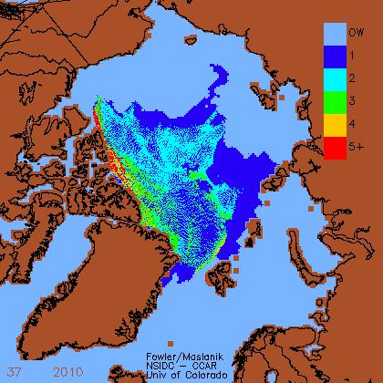
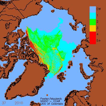
The images below give the 2010 ice it’s proper birthday party, so that we can do a real apples for apples comparison. It is not clear to me why NSIDC did not shift the start/end dates by a week so that a proper comparison could be made.
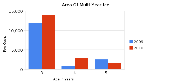
Now that looks better, doesn’t it? Lets do the math and see how much multi-year ice (MYI) there actually is.
There is more three and (a lot more) four year old ice now than in 2009, and less five year old ice. This is what we would expect, because all the first year ice melted in 2007. Because of the loss in 2007-2008, it was mathematically impossible to have a recovery of five year old ice until 2011-2012.
Also, the bulk of the three year old ice is located further west than last year, where it is more likely to survive – so there should be less loss of MYI over the winter.
Conclusions :
- The MYI is recovering. The amount of four year old ice has more than tripled since last year.
- NSIDC should have either shifted the start/end dates of the animation by one week in either direction, or they should have aged the 2010 ice on week 37. The animation they provided shows a steady decline of MYI from frame one to frame fifty-three. One more frame was needed to be a useful representation of the year-over-year change in the ice.



Steve, you seem to have removed the blue colouring on the 2010 graph to make it look more like 2009 as the age of ice is shifted down to the next colour, or am I missing something?
Andy
I advanced the age of all ice by one year. There wasn’t any way for me to distinguish new ice from one year old ice, but the amount of new ice on Sept 15 should have been very small.
Right thanks, I get that now.
It’s 5.46am here so I probably need another coffee 🙂
Andy
Steven,
You get funnier! Make sure so one realizes that this is extent and not area and we are all laughing!
It is area. They track discrete flows of MYI.
Very nice Steve. FWIW, it seems to me that the ‘birthday’ should be maybe a week or so after the minimum has been reached, whenever that might be.
Regardless, I would like to hear a comment about this from Walt (or the lovely Julienne) . . .
I have requested comment from Julienne.
And they have changed their own data…
This was the arctic sea ice age at the end of july 2010 (week 30) in the map provided by Fowler and Maslanik for the ARCUS website: http://www.arcus.org/files/search/sea-ice-outlook/2010/09/images/pan-arctic/siofig5.png
But in the animation posted by Walt Meier, the map used for the week 30 has completely changed.
Then and now, seen in an animation:
http://img821.imageshack.us/img821/7995/animateanda.gif
The same week, but a lot more of younger ice…
Astonishing…
Two major problems:
1) Not all the area shown in blue on the 2010 map is in fact ice. There was a large polynya (i.e. open water) near the Pole, which has been coloured blue in the 2010 map. Their age-tracking model is not set up to handle open water within the ice pack and falsely indicates it to be 1-year ice.
2) Even neglecting the open water pixels, you need to take into account the ice concentration in each pixel for both years. Much of the ice across the pack was in a poor state this year, with concentrations around 60%. Corresponding concentrations in 2009 were higher. An 80% two-year pixel from 2009 clearly contains less actual ice than a 60% two-year (adjusted) pixel from 2010.
Actually, looking at the animation itself, my point (1) is erroneous – the frames just before the end of the animation do indeed show the polynyas as open water. Presumably these had frozen over by Sept 15th. It would be helpful for you to use frames 36/37 of the animation to distinguish areas of new ice (i.e. this coming year’s first-year ice) from the stuff that’s about to become two-year ice.
Note this still doesn’t absolve you of the need to adjust each category according to the appropriate per-pixel concentrations if you want to draw valid conclusions.
But they have changed their own data…
This was the arctic sea ice age at the end of july 2010 (week 30) in the map provided by Fowler and Maslanik for the ARCUS website: http://www.arcus.org/files/search/sea-ice-outlook/2010/09/images/pan-arctic/siofig5.png
But in the animation posted by Walt Meier, the map used for the week 30 has completely changed.
Then and now, seen in an animation:
http://img821.imageshack.us/img821/7995/animateanda.gif
The same week, but a lot more of younger ice…
Astonishing…
I’m only counting 3+ ice
And what is the result of adjusting that for overall concentration levels?
Steve, do you understand the change in the sea ice age data provided by NSIDC?
Note: Inconsistencies in the data of multiyear ice
http://translate.google.es/translate?u=http%3A%2F%2Fdiablobanquisa.wordpress.com%2F2010%2F10%2F22%2Faviso-inconsistencias-en-los-datos-de-hielo-multianual%2F&sl=es&tl=en&hl=&ie=UTF-8
Please read my next piece.
http://stevengoddard.wordpress.com/2010/10/22/a-better-visualization-of-the-2010-ice-recovery/
At the bottom is a blink comparator from 1995, showing how they advanced the age of the ice between week 33 and week 37. It all happens at once.
Pingback: A Better Visualization Of The 2010 Ice Recovery | Real Science
Steve, I think the issue is worst.
The changes of color between the map with the sea ice age at late July and the map at the September minimum was strange, difficult to explain or understand: http://stevengoddard.wordpress.com/2010/10/05/nsidc-multiyear-ice-disappears/
Julienne said us that Maslanik would publish an animation that would clarify the doubts.
Well, we have the animation. And what is the explanation it offers us? They have changed the map of July, taking away much of the multiyear ice that they showed in their previous map for that same data.
Indeed, for this new animation, they have now changed the whole range of data and maps of sea ice age published from October 2009 to August 2010.
Did not liked the result of September? To justify the september map, it seems that they have had to change all their own previously published data…
See the sea ice age map for week 30 in http://www.arcus.org/search/seaiceoutlook/2010/august
And now compare it with the frame used for week 30 in the animation provided by Walt Meier: http://img836.imageshack.us/img836/4473/172010anima.gif
It is showed in this animation: http://img821.imageshack.us/img821/7995/animateanda.gif
The change is astonishing…
Manipulation of data??
Thank you.
Thanks, I added your map to the bottom of the follow-up post.
http://stevengoddard.wordpress.com/2010/10/22/a-better-visualization-of-the-2010-ice-recovery/
Thanks, Steven!
FYI…the week that the ice is aged another year depends on when the freeze-up happens. Thus, every year will have a different week that the ice is aged another year.
For example, in 2009 the minimum happened in week 36, and in 2010 the minimum happened in week 37. In 1992 it happened in week 34.
What Walt was showing in the animation was the evolution of the age of sea ice from the start of the 2009 freeze-up to the 2010 minimum.
If we compare the 2009 to 2010 distribution of ice age during the week the minimum was reached, it’s clear there was further loss of the oldest ice (5+) this year, dropping from 342,000 sq-km during week 36 in 2009 to 57,000 sq-km during week 37 in 2010. Even the 4-year old ice dropped significantly (from 130,000 sq-km to 71,000 sq-km).
A closer look at trends in MYI during the entire record reveals the strongest downward trends in the 3+ year old ice and little change in the 2nd year old ice.
Julienne, could you explain this? : http://img821.imageshack.us/img821/7995/animateanda.gif
Thank you!
I believe the difference you are seeing is because during this summer C. Fowler received more buoy data that was then incorporated into the ice motions. Once this happens, the data changes slightly.
The buoy data are very important to incorporate into the ice motion fields, especially in summer when it’s harder to track the ice using satellite passive microwave data that can be affected by surface melt. The final ice motion product is a blend of passive microwave, visible, thermal satellite data and buoy data. But for real-time analysis, not all those fields are available. After the data are received, the ice motions are reprocessed, and consequently the ice age. It’s the same as NSIDC’s final ice concentration/extent products. We use real-time data, but once we get the better quality controlled satellite fields, we reprocess. There is always a trade off between real-time and higher quality data for use in climate studies.
Thank you very much Julienne.
But, I have still some doubts.
The changes are not limited to the last few months, but they reach until the week 37 of 2009.
Look at the map of the week 37 of 2009 as published in Tschudi et al. 2010, page 6: http://soa.arcus.org/sites/soa.arcus.org/files/sessions/2-1-observations-arctic-change/pdf/2-1-3-tschudi-mark.pdf
Direct link to the map: http://img218.imageshack.us/img218/76/image002fl.gif
And this is the map of the week 37 of 2009 as shown in Walt Meier´s animation:
http://stevengoddard.files.wordpress.com/2010/10/paintimage3255.jpg
Large changes…
It is strange for me that so many new buoy data of about a year ago have been received recently…
Julienne,
You said “in 2010 the minimum happened in week 37,” So why didn’t they use week 38 in the animation, to do an apples to apples comparison?
It goes without saying that the amount of MYI decreases every 52 week period after the birthday. Using the NSIDC scheme, the only time it can age is mid-late September.
I believe Walt was simply trying to show the evolution of the ice cover from winter 2009 to end of summer 2010. I’m not sure what you mean by the NSIDC scheme, but the ice is aged each year depending on when the minimum is reached so each year it is different, happening as early as week 35 and as late as week 38 in the data record thus far.
Isn’t a more valuable comparison the one I did, which shows the change from 2009 to 2010 – the week after the minimum?
By comparing 2009 after the minimum to 2010 before the minimum, it is likely that many readers got confused about the implications.
It seems clear to me that three and four year old ice has increased since 2009.
Steve, what there was more of at the minimum in 2010 than in 2009 was 3 year old ice, not four or 5+ year old ice. The point is that the Arctic has continued to lose it’s store of the oldest ice. In the 1980s you had more than 2 million sq-km of 5+ ice, and today you have less than 100,000.
Julienne,
Right. But one week later the three year old ice became four year old ice.
Thus, by shifting the dates of the animation by one week it would have been clear that four old ice has actually increased substantially since the end of September 2009.
Also, the October NSIDC newsletter had an image labeled “End of September” which was actually week 37.
Steve, yes the amount of 4 year old after the ice is aged another year is more this year than in 2009. But it remains less than the mean, and less than the amount at the end of the 2007 melt season.
It’s also important to remember that ice is not only lost from thermodynamic melt, but also through transport and that the Beaufort Gyre is becoming a region of “export”.
Hi Steve,
Julienne pretty much answered your questions, but I’ll chime in.
1. The animation is showing one seasonal cycle – from the beginning of freeze-up to the end of the melt season. You suggest that I should have shown one seasonal cycle plus one week. That’s not an unreasonable suggestion, but first, that’s the data that I have from Chuck Fowler at the moment. It was sufficient to show what I intended.
As I said in my post, “A lot of the 2nd year ice remained at the end of this summer, which has now aged into 3rd year ice. So maybe there’s hope for next year, but what we’re seeing is that the MYI just is not surviving like it used to.”
In our News and Analysis post, the data we discussed is all from the end of the melt season – before the ice is aged – so it is a completely consistent comparison. We could have I suppose waited another week and done the comparison from a week late, but it would have been pretty much the same – all the ice would just be one year older. Conclusions about the changes in the ice cover would be the same.
2. Concerning changes in earlier data, as Julienne mentioned, new data is sometimes added when it becomes available, buoys for example. There has been a lag in getting buoy data, so there have been a few years where initially buoy data wasn’t available. I believe AMSR-E data is also now starting to be incorporated as well.
walt
Do these changes also affect the data prior to September 2009, or is this date the point from which the data and maps of the sea ice age have been reprocessed?
diablobanquisa says:
October 22, 2010 at 2:59 pm
This summer C. Fowler received quite a bit of buoy data, that included buoy data from not just this summer, but back to at least 2008 (and perhaps further). He then went back and reprocessed the ice motions and the ice age data. I believe a new ftp push of buoy data has been set up so that they can incorporate IABP buoy data in a more real-time fashion.
It’s important to remember that with any satellite derived data product, improved calibration, improved algorithms, improved data streams, etc. result in data products that are constantly evolving, with the goal of making the most accurate climate data record possible (and hence the reason why there are often several version numbers in data products). At some point NSIDC be the distributor of the ice age product, and it will likely be that we have a final QC’d version as well as a near-real time version like we do with our sea ice extent/concentration products.
Thank you Julienne.
I really would like to see the updated sea ice age map of the minimum of 2008 (and perhaps further minimums, if they have also changed) for can compare it (them) with the updated versions of 2009 and 2010.
An easy access to regularly updated sea ice age maps (as with extent/concentration in NSIDC´s Sea Ice Index) would be very useful.
Pingback: Más sobre las inconsistencias en los datos de hielo multianual | Banquisa en el Ártico: el blog del hielo marino