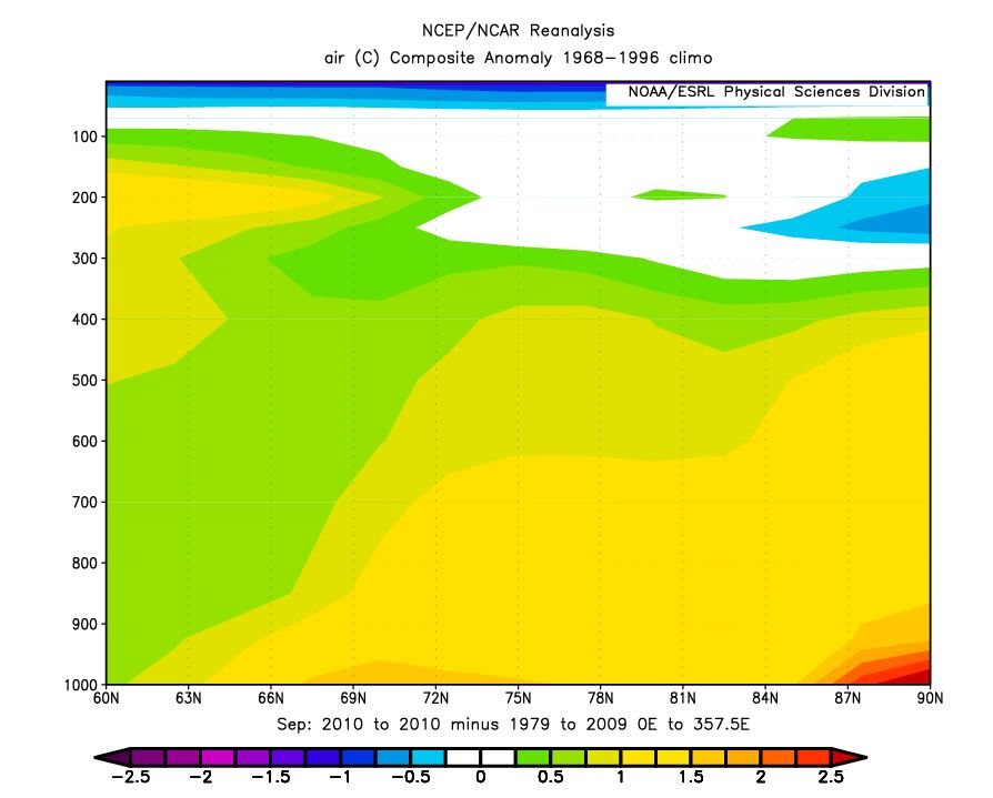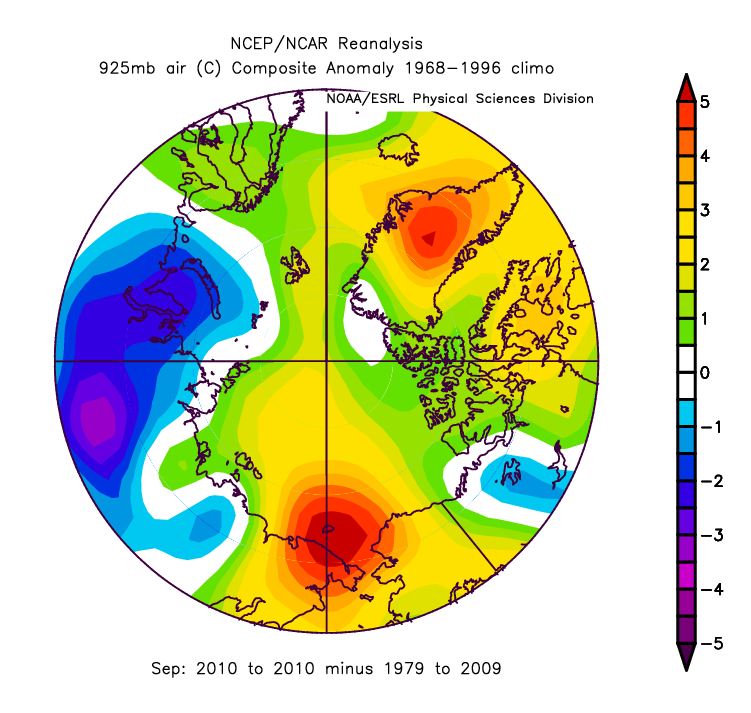
Just a quick comment on Arctic amplification. I sent Steve a couple of images for the month of September that show amplified warming over the Arctic, focused over the areas of ice loss, but also extending with height in the atmosphere and spread out over a larger area. As there is more open water in September, before the Ocean can once again refreeze in winter it must first release the heat it gained during summer. This will be seen in amplified warming of near surface air temperatures, extending with height in the atmosphere. The last several years have shown anomalously warm autumn temperatures related to more open water in September.
NSIDC briefly discussed the apparent paradox of rapid autumn ice growth and amplified warming (nsidc.org/arcticseaicenews/2008/111008.html)
Note From Steve : NSIDC’s website is down now and I can’t post this discussion yet.


Thanks Julienne, I sort of understand the explanation of warm autumn temps relating to open water.
Steven, I have a problem with the graphics, warm area appears to be over Greenland, not open water is this to do with your “Note From Steve : NSIDC’s website is down now and I can’t post this discussion yet.”?
The graphics were sent to me by Julienne. She should probably explain them.
Thanks Steven, hope Julienne has a minute to spare, TIA
The warmest anomaly is over Greenland but almost all of the water has a positive anomaly.
Yes, there is a large anomaly over Greenland, which is likely not directly related to the sea ice reductions around Greenland since it’s focused near the summit of the ice sheet. Thus, it is probably circulation driven. Note that when you have anomalously warm temperatures over the open water areas, this decreases the atmospheric air density and raises the height of upper-air-constant-pressure levels over the Arctic Ocean. These increased heights north of 75 °N weaken the normal north-to-south pressure gradient that drives the normal west-to-east airflow in the upper troposphere. In this sense, the effect of higher air temperatures in the lower Arctic atmosphere is contributing to changes in the atmospheric circulation in both the Arctic and northern mid-latitudes.
BTW..NSIDC has had some server problems since yesterday and we’re still working on getting the system back up.
Ah, there is my 70N x 170W Ice Muncher!
I still do not see Steven’s 80N x 100W Ice Fountain of Youth…only 1 degree warmer.
Isn’t that a volcano in the middle of Greenland, has anyone checked? Hotspot.
The other area also could be volcanic, there were pyroclastic flows under the ocean in the arctic. http://www.sciencedaily.com/releases/2008/06/080625140649.htm
Volcanoes melt ice don’t they? http://news.discovery.com/earth/volcanoes-warming-ice-age.html
I always think there needs to be a “time” element added to any discussion of the climate. Even something like the greenhouse impact of CO2 has no “time” dimension to it. How much extra delay in surface IR photons escaping from Earth does extra or doubled CO2 add? Well, that has never been outlined before. The answer is, it is just a few minutes.
In this case, there is also a time dimension. The NCEP reanalysis dataset can be reviewed for how much the temperature anomaly has varied over time by latitude as well.
A hovmollor of the surface temperature anomalies at 1000 Mb from 60N to 90N throughout 2010. We can see a very cold January lead to more ice growth, but into February and March, temperatures were very high (yet the ice still grew and the max extent was actually the latest on record despite the very high temps in the period). A short very high warm spike around September 15th caused an extra long melt time and the minimum extent happened a little later than the original minimum “call” indicated.
http://img826.imageshack.us/img826/1474/mlor2010.gif
If we go back to 1995 (understanding that 1996 was a kind-of a record high minimum extent and thus, back to 1995 can take us from the record high to the record lows of today) (and the NCEP dataset times out if we go much farther back), it is hard to see a lot of difference. 2009 temps were not much different than 1996 for example.
http://img819.imageshack.us/img819/9760/mlor1995.gif
Let’s look at the (kind-of) record high year of 1996. Cold start to the year (and the ice melt throughout the year was the least of any year on record back to 1979, so much so that it really sticks out compared to the normal pattern). Cooler July and August (especially at the 75N for example where the real ice melt happens or doesn’t) and a warm September 15th again.
http://img202.imageshack.us/img202/5223/mlor1996.gif
2007, not much to write home about. Very warm period into the later periods of September and the 2007 melt extended to the latest date on record.
http://img230.imageshack.us/img230/5752/mlor2007.gif
Generally I see lots of variation and then a warm spot right around the peak of the melt. I don’t dispute Arctic amplification because it shows up in all the historical proxy temperature records back to very beginning. There is generally about twice as much temperature change at the poles as the global temperature. But there is a lot of variation in the recent time period that helps explain lots of the record.
Shucks, no volcano. It’s reading the anomaly. And I can understand why it’s so dang HOT.
DMI shows a spike all the way up to -12C. ….didn’t last, but it was there for a day or two. 🙂
Pingback: Craig Newmarket: Real culture change to tr? Tte dyrl? GER p? Veterans Affairs | 1whp.com