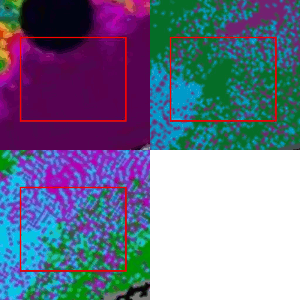
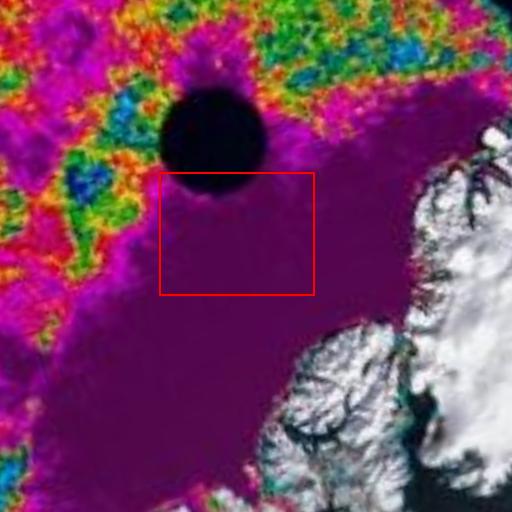
Reader Peter Ellis is not convinced. The animation below circulates between three images – end of July ice age/end of September ice age/UIUC ice concentration on the date of the minimum. The images are already normalised for drift. The ice in that region was close to 100% concentration all summer.
There is no valid reason I can think of for the selective loss of all the MYI inside that rectangle. How would an observer even know looking from above? If the ice remains intact at the surface, how would you know that the MYI underneath was gone?
Temperatures inside that rectangle were generally below freezing for the entire period of record.


Steve, just time for a quick comment on this post…the ice concentration you show does not counter the loss of MYI during the summer in that region, since even if the old ice declined in summer, the ice concentration could still be high. What you may want to consider generating is a movie of the ice concentration through the summer to see changes in ice movement and development and closing of open water areas.
Julienne,
Thanks. That sounds like a good idea.
better yet would be to do an animation of the 89GHz brightness temperature from AMSR-E for that would give you higher resolution view of the ice cover. Wouldn’t be that hard to put together, but you would need to download the data from NSIDC
Do you have a link?
Steve, this the link to the 89 GHz data set: http://nsidc.org/data/ae_si6.html
I believe we have browse imagery available so that you wouldn’t have to download the actual data yourself (which is in the not-so-user friendly HDF format). I would contact NSIDC user services to ask about location of the browse imagery (I don’t know it off-hand).