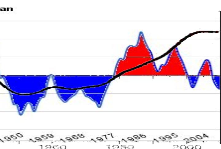
HadCrut in black. Five year running mean of the PDO in blue/red.
When the PDO is dominantly positive, temperatures warm. When the PDO is negative, they don’t.
I wonder why Hansen/Tamino choose to cherry pick the start date of the mid-1970s as the beginning of their “period of modern warming?”


If one could know how much to adjust for El Chinchon and Pinatubo, the correlation would even more clear. And if AMO will be calculated on top of PDO the main reason for recent temperature changes comes even more clear.
Someone posted this the other day
http://www.giss.nasa.gov/research/briefs/hansen_02/
“I wonder why Hansen/Tamino choose to cherry pick the start date of the mid-1970s as the beginning of their “period of modern warming?” ”
Could it be because they are dishonest?
Naaah!
I am sure ChrisD will come here and tell us why we should accept those cherrypicking decisions in 3…2…1….
Brendon can not because he injured himself using that word too many time.
He he…
The reason for defining the mid-1970s as the modern warming period is because that is when the models (with/without CO2) diverge. Prior to that the models can replicate the temperature using only natural factors. See: http://www.appinsys.com/globalwarming/SeekingWarming.htm
““I wonder why Hansen/Tamino choose to cherry pick the start date of the mid-1970s as the beginning of their “period of modern warming?” ”
Even according to Steve’s graph above, warming appears to have started in the 1950s.
But if Steve’s theory has merit we should be able to look at a past PDO warm phase and if it is as warm as the present one then temperatures should be similar – yes?
But if there has been any background warming during the intervening years then there should be some bias to even more warming.
Here is the record of PDOs;
http://chartsgraphs.files.wordpress.com/2010/04/pdo_trend_latest.png
There was another warm phase from early 1920s to late 40s. It appears to have been even warmer than the present one so global temperatures during that time should be as warm or perhaps warmer than our present warming trend.
Are they?;
http://woodfortrees.org/plot/hadcrut3vgl/from:1900/to:2010
No, so where has all the extra heat energy come from? Well as it happens actual climate scientists have a theory to explain that….