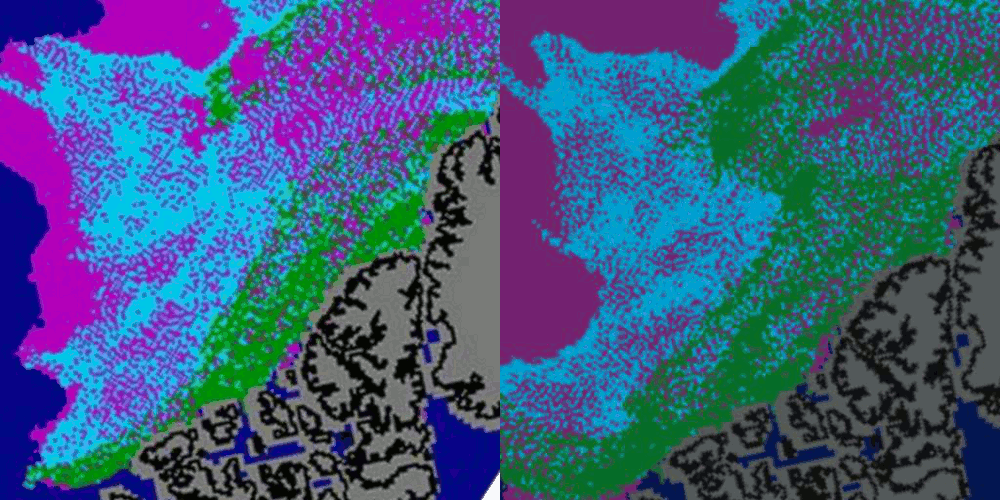
The blink comparator above shows changes between NSIDC’s end of July map, and end of September map. They are at the same scale, but I have shifted the maps to account for drift.
Note that the 1-2 year ice (turquoise) is left largely intact (about two-thirds survived) but less than one-third of the thicker, denser multi-year ice (MYI) survived. Most of the first year ice survived as well.
This doesn’t make much sense to me. I would expect highest survival rates for the MYI – not lowest. DMI showed temperatures north of 80N as below freezing for almost the entire period.
Note that the shape of the thinner (turquoise) ice is barely altered during the period, but the thicker ice has changed radically. The thicker ice has been targeted selectively by the evil gods of melting ice.
Whatever the cause, the turquoise will turn green over the winter – unless it magically disappears too.


You see, but you don’t see.
Once you account for the drift by shifting the maps, the “internal” MYI ice edge north of the CA – i.e. the boundary between MYI and 1st year ice in this region – stays pretty much stationary. There was no selective loss of MYI within the pack north of the CA. In some areas near the Pole, as we discussed last night, the overall concentration dropped low enough that the MYI concentration went below 40% and the pixel got “filled in” as pink first year ice. That’s a separate issue.
So what then of the rest of it – the high concentration stuff near Greenland and the CA? Your own blink comparator shows you what happened! It disappears as the drift carries it southwards towards land. In the blink comparator, since you’ve adjusted for the drift, it looks like amusingly like it gets “eaten” by a northward-advancing Greenland / CA.
In reality, as the winds/currents pressed it against the Greenland/CA shores, it either got pushed sideways into the Beaufort (and was melted), or out through Fram (and was melted), or through the channels between the CA archipelago islands (and was melted).
The statistics show a huge bias towards loss of MYI over other types. I’m surprised you don’t see that. The area north of Canada has lost more than half of the MYI since the end of July.
The ice drift in that area showed by the IABP buoys: http://iabp.apl.washington.edu/maps_daily_arcticbasin.html
Export through CAA straits? Yes.
But I´m not sure if it is enough to explain the change in that area from green to blue/pink.
I would like to see the Maslanik´s animation.
Well no, the CAA straits alone won’t explain it. That’s why I pointed at Fram and Beaufort as well (Julienne mentioned the latter too). That’s a really nice buoy picture though, and the length of the buoy tracks through the CAA are reasonably commensurate with the size of the “shift” in the landmasses on the blink comparator.
Corner at the Northeast of Ellesmere Island. The IABP buoys show this point as the limit between the Transpolar Drift (drift to Fram) and the Beaufort Gyre (drift along the north boundary of the CAA).
The exporting of the green pixels located in that corner, is not showed in the IABP drift map, not through Fram, not through CAA straits. The lenght of their drift doesn´t seem enough. They remain north of Ellesmere and other CAA islands. But, some of the green pixels, have turned from green to blue/pink.
I have some doubts about it, that is the reason because I would like to see that animation. (Some convergence/compactation of MYI is also showed, that could explain a part of it)
Peter, good explanation of the “40% treshold paradox” yesterday, thank you.
Hmm, you mean the few pink pixels appearing in the Lincoln sea near the entrance to Nares strait? That area had some odd dynamics at the start of July, with ice flow through the Nares actually reversing. So you had MYI coming in from the North, warmer water coming up from the south, and ice exiting both West (across the CAA towards Beaufort) and East (across Greenland towards Fram). Don’t think you can draw any conclusions without seeing the full animation.
Regarding the 40% threshold, I guess if a given pixel started at 45% MYI and 55% younger ice, then a drop to 90% overall concentration might drop the MYI part below the cutoff, and would barely show up on the CA concentration map. It depends what state the MYI was in at the start of the melt season. Both then and now there have been some huge chunks moving into Nares which in previous years would have jammed solid and blocked the channel – this year they’re just shattering into smaller lumps as soon as they hit something. Simply put, even the stuff that started green and stayed green is not 100% solid MYI, some of it is rubble held together by younger ice with lower overall integrity.
Along the north of Ellesemere and Queen Elisabeth Islands.
At the end of july seems to be three bands of green MYI, compacted in two in september. Convergence?
Maybe not enough density of buoys in that area.
We have to wait to Maslanik´s animation.
Sorry, I said Northeast, when I want to say Northwest, or simply North.
NSIDC say older ice melts away leaves younger ice ,that is a surprise.
At the time I made some animations of the transport of multi-year ice through Peary Channel, Sverdrup Channel, Ballantyne Strait and the Prince Gustaf Adolf Sea. Of course, the buoys tell the same story.
Neven,
My maps are normalised for drift already.
Look at the buoy 5312 and its 60 days drift track: http://iabp.apl.washington.edu/maps_daily_arcticbasin.html
Now, look its drift showed by a red line in the ice age map at the end of july; and its location in september´s map:
http://img408.imageshack.us/img408/5408/image009k.png
A time traveller ice floe? Why changed from green to pink/blue?