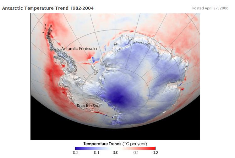
NASA map from 2006 showing cooling trend
Gavin acknowledged the cooling verbally at real climate
Antarctic cooling, global warming? …. the continent and in the interior appear to have cooled slightly …… we fully expect Antarctica to warm up in the future.
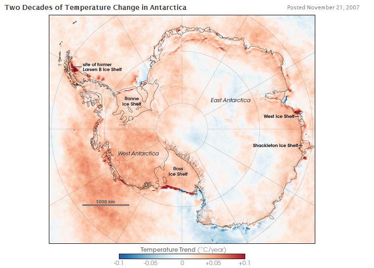
Wow! the predictive skills of climate scientists is uncanny. Somewhere between 2006 and 2007, Antarctica did exactly what Gavin predicted. It switched from a long term cooling trend to a long term warming trend – in just one year!
http://earthobservatory.nasa.gov/IOTD/view.php?id=8239
One might think that such a change is mathematically impossible, but these guys are pure genius.


Hold it.
So the bright red shows where there was ice and there fore the skin temperature was `cool’. When measurements were made and ice was gone, e.g. a piece of an ice shelf broke of, then they measure the skin temperature of the ocean and that shows up as red.
So they are comparing open water vs ice. This sounds like another hide the decline scam. They are splicing water temperatures onto ice temperature data and making a map! Now that is crap.
So they re-did the temperature map, re-calibrated between sensors and came up with a totally completely result. lets see if I have this right. Its warming in area X by 0.03 C/yr and their error is 2 – 3 degrees C. So in areas with the most extreme warming, or the most extreme cooling could also actually be no change, or possibly ( in the warming areas) a 1 deg. C cooling, and in areas with the most extreme cooling it could actually be warming of 1 deg. C over the time period.
But it is far worse than that. Since most of the map is white and a faint red, the error is more or less potentially 3 times the measurement, or from an alarmist perspective, 300% …it sounds so much more dramatic.
Another question is whether the satellites all had the same tracks and if missing data covered similar missing data areas. That would make it even worse.
And the warming is equally spread over the seasons? So it was still way below freezing except for a few areas except for a few(?) months where it warmed say 2 months which would be 1/6 th of the ……. sorry, my mind just exploded!
Whoops, foregot to mention. satellites don’t do well in white-outs itc as they identified cloud, etc. So the best measurements would be when, possibly summer? I don’t know, I’m asking. In that case for all the coastal areas (where the red is), they are measuring water, thin ice over water (<10 cm thick, max. penetration depth), or cracks with thin ice/water in between.
Doesn't look like they are measuring skin temperature, maybe they are mapping summer sea ice extent in some sort of weird way …… or storminess as in temporarily breaking up the sea ice to expose water that would show bright red.
http://pubs.giss.nasa.gov/docs/1974/1974_Lacis_Hansen_1.pdf hmmm how come the O3 and H2O were so important in the past and not now :P?
“Wow! the predictive skills of climate scientists is uncanny.”
Yep, they have been on the money for the last 30-40 years, predicting there would be global warming and there has indeed been global warming. That’s sound science for you.
Not in the Antarctic – nor anywhere else for the last 15 years.
Here are all four of the major global temp data sets.
Which ones do not show warming over the last 15 years?
Pingback: You’re Either a Theoritician or a Experimentalist « Federal Way Conservative