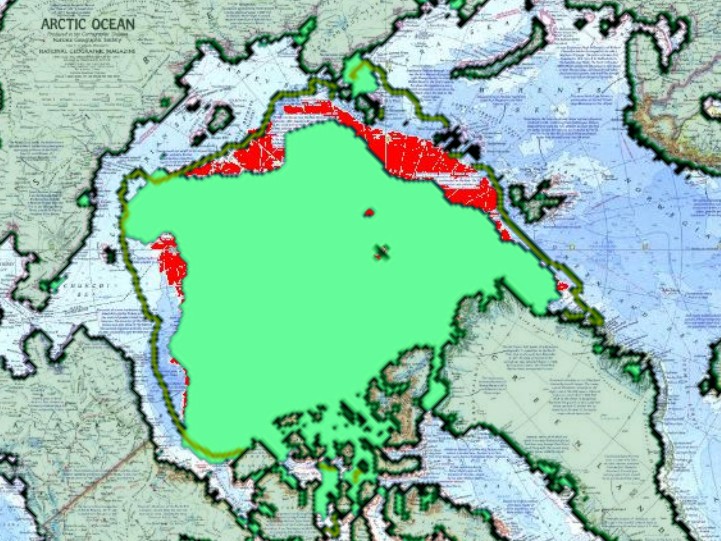
Green shows current ice. Red shows 1971 ice.
Arctic Ocean Map 1971 by National Geographic from Maps.com.
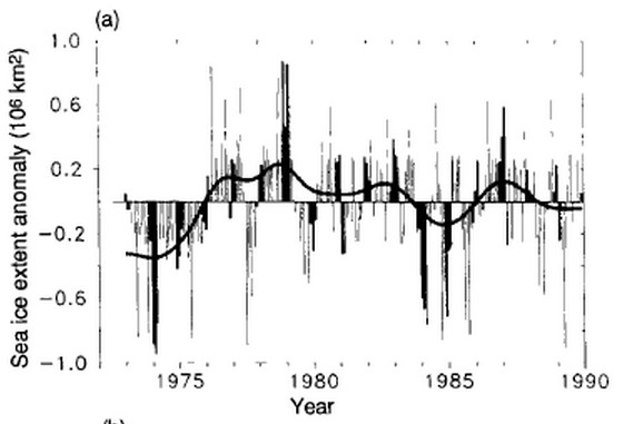
The IPCC report from 1990 showed that ice extent was low in the early 1970s.
www.ipcc.ch/ipccreports/far/wg_I/ipcc_far_wg_I_full_report.pdf
NCAR also noted that prior to 1972, ice extent was low.
by Walter Orr Roberts Aspen Institute for Humanistic Studies, and National Center for Atmospheric Research, Boulder, Colorado
In February of 1972 earth-orbiting artificial satellites revealed the existence of a greatly increased area of the snow and ice cover of the north polar cap as compared to all previous years of space age observations.
www.iaea.org/Publications/Magazines/Bulletin/Bull165/16505796265.pdf
Alarmists want you to believe that there used to be a lot more ice, but they are lying.


Look how fast the ice went from very negative (~ minus 1 million km2) to very positive (+1 million) from 1974 to 1978-79. I bet we’ll see it happen again, and even more impressively now, with the low grand minimum solar radiation levels.
Probably something similar happened during the WWII years up to 1952 period.
IPCC is still in denial. Did time stop in 2012?
http://m.canberratimes.com.au/environment/climate-change/antarctic-greenland-ice-melt-accelerating-ipcc-leak-20130906-2t93z.html
A 2200 page report! That would have cost billions IF it contains any real scientific studies. And who in the world would read 2200 pages? 5 novels!
Oh, it did cost billions, and if mitigation plans are included it will cost trillions beyond what it already has cost. If Europe had even a decent cheep energy plan, they would have no need for an energy pipeline through Syria. Please add the about 1/2 the cost of all energy in Europe to your costs, associated with these very wrong people. If Syria conflates to WWIII, please add that to the cost.
What’s Syria got to do with it? This is a very strange set of garbled unrelated thoughts, isn’t it?
You think it costs over 1 million (£ or $) per page? You must be joking or just lost in your own hyperbole. And what’s the problem with 2,200 pages? It’s a complex subject. Maybe if you read some of it you might learn something.
LOL!!!
This is a question that I love to put to warmists. If the satellite data for Arctic ice extent goes back to the early 1970’s, why is it not reported by the official reporting bodies? The obvious answer is that its inclusion would dilute the message. We wouldn’t want to confuse the public, would we?
They are more interested in not giving deniers amunition than being correct. There was a time when we could give warmists scientists the benefit of the doubt, but now any warmists scientist that doesn’t at least express serious doubts are either incompetent or immoral.
Yep.
I believe the official reason is that the sensors pre-Nov 1978 were lower resolution, and I also think coverage was incomplete at times.
But that excuse is convenient because it allows them to make plots like this instead:
http://arctic.atmos.uiuc.edu/cryosphere/IMAGES/seasonal.extent.1900-2010.png
It’s weird that the linked graph is still up given the revelations shown here:
http://nsidc.org/monthlyhighlights/2013/04/glimpses-of-sea-ice-past/
They basically found he Sept 1964 value to be similar to the first half of the modern satellite series…definitely disagreeing with the plot in my first link.
-Scott
In the 2nd link they say
“It suggests that September extent in the Arctic may have been generally stable through the 1960s and the early 1970s.”
but Steve’s post shows the ice extent in 1971 close to present levels, which has an anomaly of ~ 1 million km2 negative.
I believe their analysis is biased, but interesting link nonetheless.
No they didn’t. Look at the graph.
Try looking at the data. Here’s a graph that includes a 1964 value from early satellite records.
http://www.the-cryosphere.net/7/699/2013/tc-7-699-2013.pdf
It supports the message, doesn’t it? Now who is confused – or perhaps you prefer to ignore the truth?
Jct: Guess the polar bears are saved. Wish Adriana Magnutto-Hamu, the Green Party candidate, would pay me her losing $100 bet that the temperature has kept rising when it broke off 15 years ago.
Polar Bears die when there is too much sea ice. They are in danger.
why? same problem as the penguins? Too far from open sea to get food?
Anyone who uses the peak of an exceptionally strong El Niño cycle as their baseline for commenting on global temperature trends is beneath contempt. You might as well argue that we’re all going to freeze by extrapolating the trend from summer into winter. But then perhaps you might?
Huh?
He must be a newcomer Steve, I guess he never read any of your posts about data tempering by Hansen et.al.
Amazing that the low levels in the beginning of that graph were hailed at the time as unusually high.