
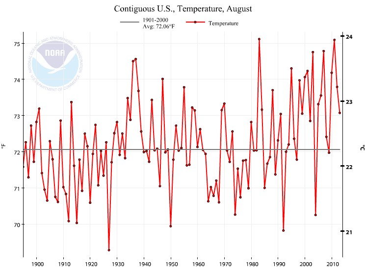
NCDC has released this completely fake graph, which shows a rapid warming in US August temperature.
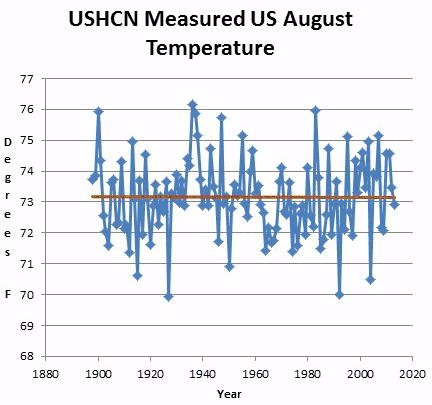
Their thermometer data doesn’t look anything like that though.
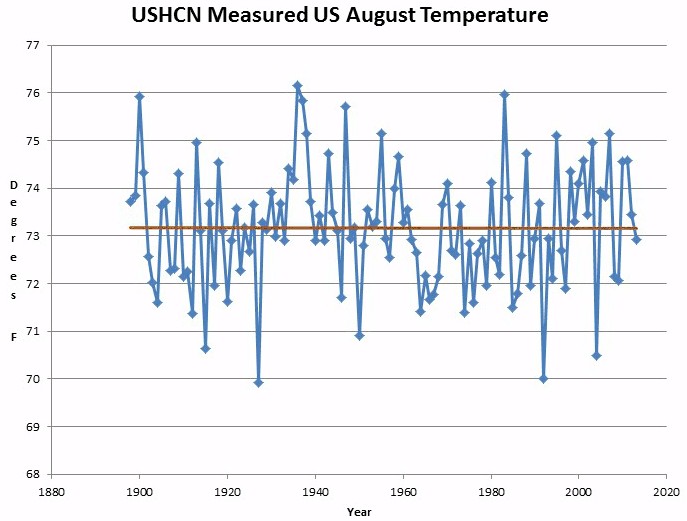
The animation below alternates between their measured and published temperatures.
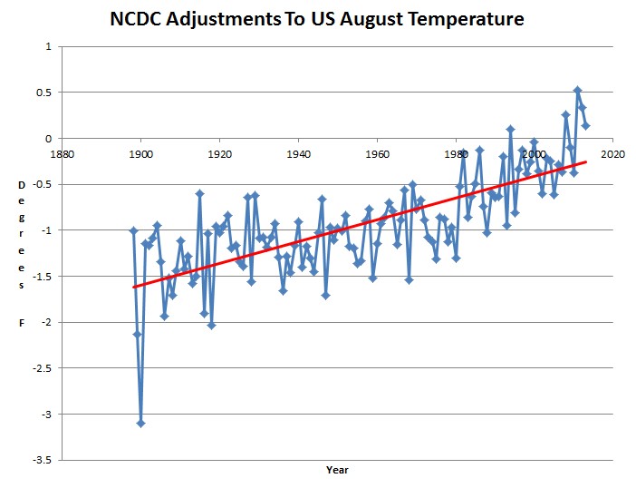
The next graph shows their alterations to August temperature. They have massively cooled the past and are starting to warm the present.
Published NOAA US temperature trends have nothing to do with scientific or historical reality, and everything to do with providing political support for politicians who want the public to believe that CO2 is ruining the climate.
This is what the original US Weather Bureau map for August 1936 looked like, before the modern experts chopped 1.7ºF off the August 1936 temperature. Almost the entire US was blistering hot that month.


policy-based evidence making
This Gov’t lies. They have turned all elements of the Gov’t to support the unsupportable. I am 97% sure of it!
This is infuriating. Data tampering to create greater warming trends has been obvious for decades.
Has Andy Revkin ever addressed this complaint? I mean, every now and then I suspect he’s actually sincere in wanting truth. But how does he possibly ignore stuff like this?
I’ve showed it to him several times. He ignores it.
What explanation do THEY give? I’m not asking whether it’s right or wrong, but what is their answer?
They don’t. There are some docs which purport to explain it, but they don’t even vaguely resemble the magnitude of the adjustments being made.
Such a massive fraud not only going on while being fully noticed, but reiterated and made worse every single time, it is unbelievable.
Another animation which would be both informative and fun : the successive versions of “adjusted” temperature graphs.
Every time, they re-“adjust” their data, so they MUST give a justification for EVERY SINGLE TIME they re-“adjust”, and why the “adjustment” had to be revised. They didn’t even justify once (they can’t, obviously).
Any engineer modifying a system behind the user’s back like that would at best lose his job in a heartbeat (if not outright jailed). How come they are still having a job ?
Just got banned from Huffington Post for mentioning this.
Screw Hufpo. Never read their crap.
What does it matter? We’re manipulating our elections too!
http://www.washingtonpost.com/local/new-charge-in-campaign-finance-investigation-into-dc-businessman-jeffrey-thompson/2013/09/11/c89cb2e2-1af6-11e3-82ef-a059e54c49d0_story.html
I would love to see a detailed analysis of exactly how and why they adjust each daily hi/low temp report. Can we find such a thing? I agree they’re making invalid modification to the records but can we prove it?
Here are the stepwise adjustments
The only way to fix the chart is to get all the cult members out of control of congress. Then open an investigation. I don’t think the GOP see it for the threat it is.
This is not exclusive to this administration (though the fraud is blessed by it). Government scientists have been adjusting the data since the beginning of the 21st century.