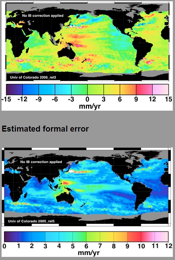
Prior to 2010, the University of Colorado prominently displayed an error map right below their satellite sea level map, like the one below taken off the Internet archive.
They no longer include the error map
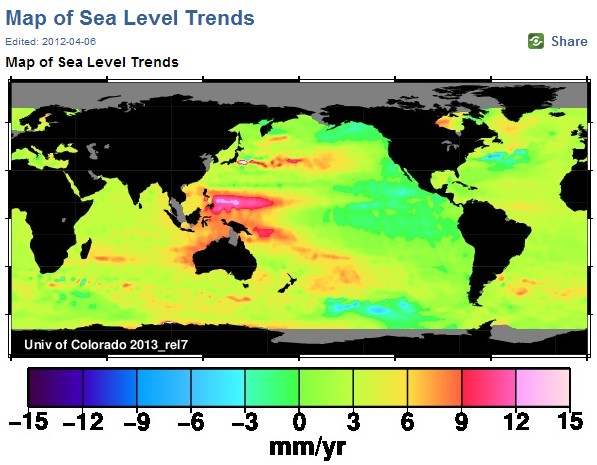
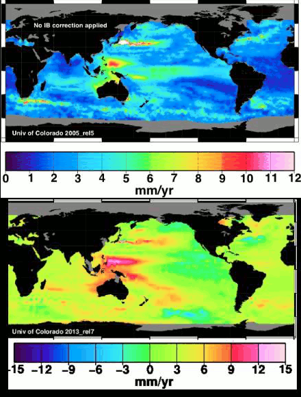
The animation below shows their little problem. It alternates between the blue error map, and their current trend map. In their claimed high sea level rise areas, the error is almost as big as the trend – in some places it is greater than the trend.
To make matters worse, the claimed global trend of 3 mm/year is heavily weighted by the large numbers – which are the least reliable. Satellite sea level is the basis for alarmists fraudulent claims that sea level rise rates have increased since 1992, something which tide gauges show no evidence of.


satellites are tuned to tide gauges….
..yet 65% of tide gauges show no sea level rise at all
how did they manage to tune satellites to show sea levels rising…
..when the majority of tide gauges says it’s not
http://pluto.mscc.huji.ac.il/~msdfels/wpapers/Tide%20gauge%20location.pdf
That is easy. They created an imaginary 15 mm sea level rise out in the middle of the ocean away from any tide gauges.
true……
In apparent violation of the law of gravity… I guess?
Or maybe there is a new continent emerging under Indonesia… old Lemuria returning perhaps?
Even when the error map was displayed, an estimated error of 6mm per year (twice the “catastrophic” rate!) was portrayed using the neutral, happy color. A correct display would match the error color to the SL rise color, which would make the linkage even more obvious.
===|==============/ Keith DeHavelle
The alarmists do their best work when they ignore the error in their data and when they adjust / torture the data to yield the desired results!!
Typo: “someone which”
They achieved 95% confidence and declared they are error free.
As the Pope became “infallible” at some point in history too.
Why, look, the sea is disturbed off of Fukushima!!!!!!! 😉
Reblogged this on CraigM350.