
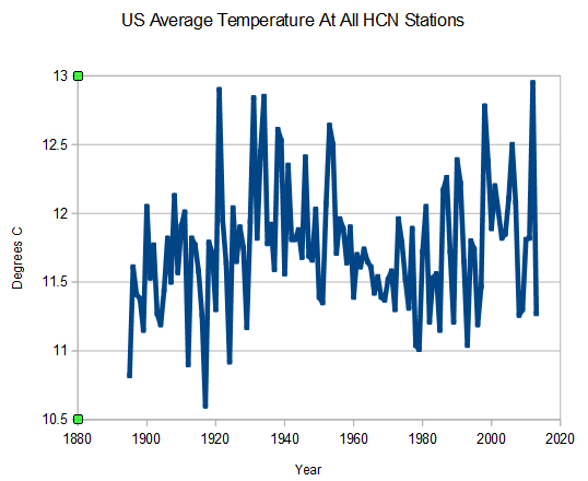
Zeke insists that temperature anomalies will produce different patterns for the US than absolute temperatures. So I tried it out.
The anomaly graph is almost identical. This is calculated by averaging the daily anomalies of the min/max thermometer readings from each station relative to the monthly mean for that station.
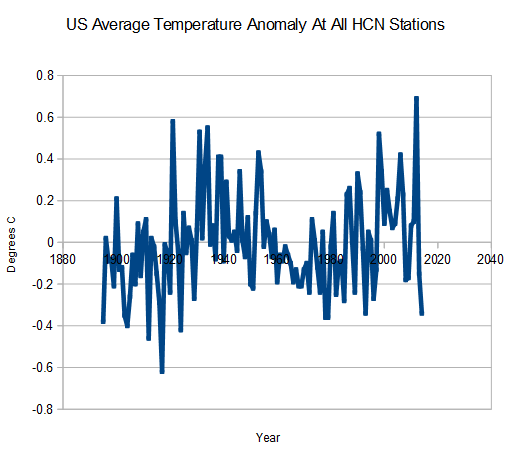
I expected this result, because the US has an excellent, consistent temperature record – with a large enough sample size so that errors cancel out.

I wonder if Zeke ended up with a different result, from the check that he presumably did before suggesting you do it? (someone who is diligent would have done so)
That’s a ,but only if !
Zeke and Mosher have been peddling their snake oil evry since their collaboration with BEST. The worst thing that Mosher every did. Zeke was already brainwashed.
This whole crew of “modelers” (Zeke, Mosh, Stokes, and many in the WUWT crowd) need to take a hard look at what they are doing with their work and their lives. Do they want to just be known as more “kool-aid” guzzlers? They try to act like they are “independent thinkers”, but they fall over their own feet trying to grovel to the IPCC, GOV agencies, and academia. They are NOT thinking independently.
The hard question for them, since they spend so much time with temperature data, is why didn’t one of them discover what Tony Heller discovered?
Not only did he beat them to it, but many of them tried to challenge him on his findings.
They have TOTALLY disgraced themselves.
Steve — I am sure you already see it coming — since your results do not match the “consensus” plot, it must be because it is not gridded. Have you tried that?
First thing I noticed is that the miid-30’s in BOTH graph’s are not the highest temp.’s so the data used for these graphs must be “adjusted”. Where is the raw data? This is exactly what the warmists want, confusion over which data is used.
I thought an anomaly graph is just subtracting a constant, namely the average temperature, from the absolute measurements. Why would anyone think that would change the look of the graph. It should only change the location of the zero point on the ‘Y’ axis.
If there is a lot of missing data and a fragmented record, like in Australia, then use of daily anomalies is the only way you are going to get meaningful information.
This jibes with what I’ve thought ever since the anomoly vs absolute temperature debate started raging here when WUWT trashed Steve a few months ago.
I didn’t see how using absolute temperatures could be any more or less an accurate way to guage the temperature flux than using anomolies given the availability of US temperature data. Unless the data had been cherry-picked or adjusted, of course.
That’s been really the biggest doubt as a lurker here and now it’s been laid to rest.
Thanks Steve.
make that gauge rather than guage.