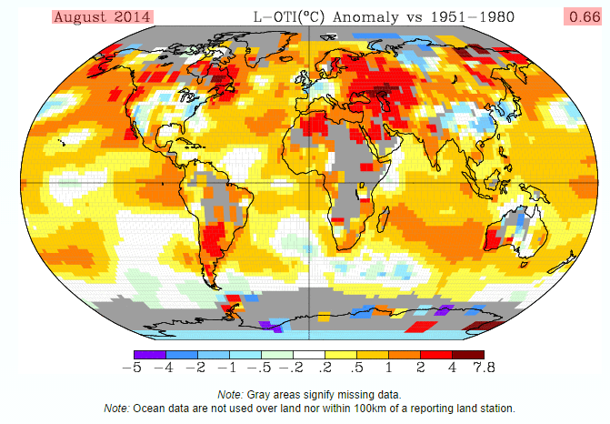
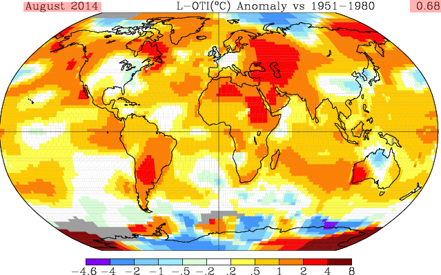
In order to reach the desired”hottest August ever” – start at 0.66, extrapolate that out 1200 km to 0.68, and then extrapolate that out across multiple regions of the planet to get to 0.70.
As a final step, you then ignore the huge discrepancy vs multiple sources of much more accurate satellite data – and go directly to the press with the story the White House is looking for.


Looking for help with Gavin’s explanation.
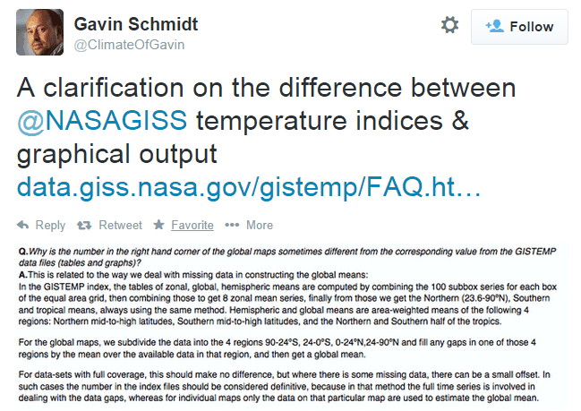
Gavin stated…”For data sets with full coverage this should make no difference….but for data sets where there is missing data, there can be a small offset. In such cases the number in the index file should be considered definitive because (here is the part that makes no sense to me) the full time series is involved with filling in the data gaps, whereas on individual maps, only the data on that particular map is used to estimate the global mean.”
Yet the individual map data has been in-filled, and so the gaps no longer show, and are colored coded based on the same 1951 to 1980 anomaly. Is Gavin saying they show the gap color on the map, based on…” “For the maps we subdivide into regions…. and fill in any gaps by the mean in the available data in that region, and then get a global mean.” but they do not count that infilling in the number posted next to the map? This makes no sense. In order to fill in a particular color in the gap area, they had to assign a number to it. Perhaps Gavin is talking about the difference in the maps that leave the gaps blank, vs. the maps that are in-filled?
As to the gap filling in the index, why would they use the full time series to fill in the data gaps in the index? Does Gavin mean they do not use the current surrounding temperatures in the index, like they do in the maps, but use the mean of the entire time series for those surrounding areas, based on the average anomaly?
This would make no sense, as current temperatures in that anomaly area could be vastly different then the historic mean. ( Like central Africa infilling in the previous RSS graphic, vs Gavins graphic here.) Thus with the index area, you could get a reading completely wrong from the actual temperatures in that region. In which case the map method of using current surrounding temperatures would be superior to the index method that makes no sense.
Am I not understanding what Gavin is saying here?
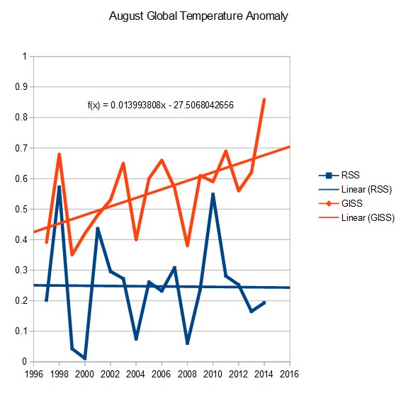
The RSS vs. GISS plot is a keeper. Adding in UAH would further strengthen it in my view.
Previous to about 1999 does anyone know what the historic mean difference was between RSS and GISS? Currently they are about .65 degrees apart. Is that a record?
0.66 is statistically different that 0.68? Oh, yes, I keep disremembering that the measurement variance is 0.
This is a message for any and all journalists monitoring this thread:
If you don’t run with this scoop, you are perpetuating a fraud and deception and failing your responsibility as the Fourth Estate.
If you ignore this compelling exposé (and the others demonstrated here repeatedly), you are not a journalist, you’re a propagandist and a fraud.
You decide.
I assume you are challenging serious mainstream journalists like David Brooks of the New York Times. Sophisticated opinion makers like Brooks not only understand the deeply Burkean conservative qualities of our Progressive President but are also capable of holding nuanced views, and without suffering any symptoms of cognitive dissonance, balancing in their minds the importance of the temperature extrapolations of Gavin Schmidt and the perfectly creased leg of Obama’s pants.
http://newsbusters.org/blogs/p-j-gladnick/2009/09/01/david-brooks-broken-bromance-obama-now
The banks bought the press back in 1917 to make sure the USA got into WWI. They have seen no reason to loosen their hold on our money supply, on our press or on congress.
link 1
link 2
SG Keep it up man!., Thanks for this. It is the only site apart from Jo anne Nova and J Mahorasy that is actually doing something practical about the scam
As a final step, you then ignore the huge discrepancy vs. multiple sources of much more accurate satellite data – and go directly to the press with the story the White House is looking for.
Exactly, Steve. The land-based temperature measurements are driven more by politics than anything approaching reality. By the time GISS gets done massaging the data, a decline in global temperatures magically turns into a warming trend. Accurate satellite measurements, using
on-board precision redundant platinum resistance thermometers (PRTs), is simply ignored.
Schmidt is a political animal, a corrupt self-serving charlatan posing as a scientist. He’s demonstrated that he’ll go to any length to give his political bosses the conclusions that support their war against cheap fossil fuel, while bolstering their collectivist crusade to destroy what’s left of our market-based industrial economy. He should have received his pink slip long ago.
+1
+2
How often do they cool the present and warm the past? Where you had airport weather stations that were created during the 1950’s in rural areas that are now densely populated, that should be a no brainer, but does anyone know how often, if ever, that is ever done?
Just in the DC area, two of the major station sites, Dulles and BWI are classic examples of what is stated above, but they are probably adjusted to cool the past and warm the present, totally opposite of what common sense would dictate. If that could be demonstrated, it would be a huge smoking gun.
You think that’s bad, take a look at what NCDC appear to do (image posted at WUWT here) :
http://wattsupwiththat.com/2014/09/18/open-thread-17/#comment-1740644
They have vast swathes of missing data on the land-only temperatures, which makes any claimed global temperature anomaly pretty much worthless.
However, when they combine the same data with the SST data for their land-ocean temperatures, much of the missing data appear to be in-filled – presumably using SST data since they are using the same source for land data – even in locations such as Kazakhstan, which are about as far from the oceans as any place on Earth.
Reminds me of something Upton Sinclair said:
“It is difficult to get a man to understand something, when his salary depends on his not understanding it.”
? Upton Sinclair, I, Candidate for Governor: And How I Got Licked
Looking at the land only graph it is worse then we thought…
http://wattsupwiththat.com/2014/09/18/open-thread-17/#comment-1740644
Reblogged this on Globalcooler's Weblog and commented:
I talked to a fellow from the Philippines today. When I asked about the weather over there he told me they were having flooding in the north central areas. When I told him man was not responsible he suggested that man was making it worse in some small way. I told him about my blog and asked him to leave a comment. Little did he know he would be the subject of my comments. Nice fellow for sure and helped me a lot. Well here is what I was talking about. Making up data out of thin air to make their point. This is as cogent an example as one can get. All those grey areas of no data suddenly filled in to set a record. WOW! Why didn’t I think of that? Just not in my nature.
Kirt
So, if you can’t dazzle ’em with science, baffle ’em with bullshit.