
Graphs like this would be trivial to debunk if my analysis was incorrect. Go for it.
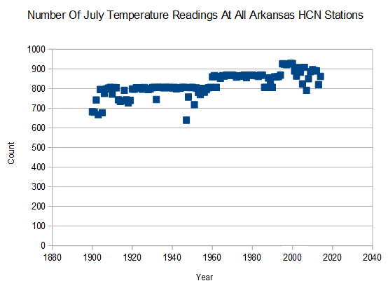
The number of temperature readings has increased over time, so that is not going to fly as an explanation for the decline.
Graphs like this would be trivial to debunk if my analysis was incorrect. Go for it.
The number of temperature readings has increased over time, so that is not going to fly as an explanation for the decline.

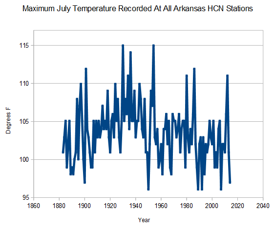
I don’t understand what is being presented. Is this the maximum temperature from among all station in Arkansas in a given period? I am in Indeneer, and acquainted with basic statistics, but I am by no means a statistical expert. The trendline there seems to be flat. The amplitude is very high, and I’m not sure what it signifies.
I know a tiny bit about extreme value analysis, and it would be interesting to come up with an extreme value distribution on that. I guess you could use that to prove that we’re all going to die.
“I don’t understand what is being presented. Is this the maximum temperature from among all station in Arkansas in a given period?”
>>>>>
“Maximum July Temperature Recorded At All Arkansas HCN Stations.”
… and , despite the fact that there are more readings as time goes on, (more opportunities to record higher T) still the past was warmer. (I have seen in other posts that continuously active stations show a similar pattern.)
The highest July temperature recorded in a given year at any Arkansas HCN station.
Your 100% correct, without a doubt we all are going to die. Most of us reading these pages undoubtedly by the end of the 21st Century.
REPENT! The end is near!!! (sarcasm)
The above should say “engineer.” That’s what I get for not proofing my voice dictation.
Thanks, Siri.
I want to try Cortana.
Wait another month, maybe. Not that I’m particularly interested in Cortana or Siri, for that matter.
When mine dies. The Androidette does ok with me so far. But if I have to support Windows 8, I might as well have it somewhere.
I’m in Indeneer, too.
Of course, they will not discuss experimental observations that disprove their Consensus (Standard) Model of AGW (Anthropological Global Warming) any more than they will discuss nine pages of precise experimental data that disprove their Standard (Consensus) Models of: Energy in the Cores of Heavy Atoms and Stars:
See: “Solar energy,” Advances in Astronomy (submitted 1 Sept 2014) https://dl.dropboxusercontent.com/u/10640850/Solar_Energy.pdf
You forgot to adjust the data, Steve. Now, what do I get for proving you wrong?
The gavin Schmidt fickled finger of fate.
Eeeewww….do you know where that thing’s been lately?
I never asked Rowan and Martin about theirs. 😉
Key word — ‘Recorded’
Problem is they will take the minumum temps and homogenize the whole thing
Do you have the same number of stations for every year?
It varies a little. Peak station count was 1990, which also had the lowest maximums.
Older readings were inflated by dirty/absent Stevenson screens, improper siting, use of traditional Min-Max thermometers rather than thermistors, and the TOBS bias caused double counting of very hot temps from June 30th into July.
All speculative handwaving, but I think I hit the main points.
TOBS has zero effect on this measurement. Min-Max has zero effect on this measurement.
The ‘improper siting’ is actually more likely to occur with current stations than past ones. There are many stations that were quite properly sited when first put online, but now since they’ve been encroached upon by development are no longer ‘properly sited’…which should make the ‘peak’ temps more recent.
Cherry picking a local/regional phenomenon when the real concern is global changes?
Ignoring the best temperature data set in the world, when the real concern is power, money and control?
BAM!
In isolation, one of Steven’s examples might be considered a “cherry” but over the years the shear number of such examples belying the consensus thus tells a tale. But maybe you are just being willfully argumentative and obtuse.
There is a logical progression to scientific criticism/denialism.
Stage 1 – The new effect being demonstrated doesn’t exist, is due to a methodological mistake, or is a misinterpretation of data.
Stage 2 – The new effect is real, the data is reproducible, and the data interpretation is proper, but the results are meaningless and unimportant.
Stage 3- The results are reproducible and meaningful, but they are no longer new so they don’t deserve attention.
Welcome to the life of every person trying to demonstrate the ignorance of the experts.
Don’t try to conflate “scientific criticism” with “denialism.” The former is a valid part of the scientific method, the latter is an ad hom to try to defend the undefendable.
Stage 2 – You got that one all wrong. The data isn’t reproducible, but it is heavily massaged. You can’t come to the correct ‘interpretation’ of the data if you have to massage it so much that you turn cooling trends into warming trends.
What KTM, do you think this is the only post on this site?
Rock solid. The increasing # of stations only serves to increase the likelihood of even higher temps, the opposite of what we see.
+1
g2,
Sounds like you are new to the blog. You will need to learn that stevengoddard likes to look at data from multiple angles (usually) looking for wrongness. In this case he is looking at the peak of thousands of samples and saying that if the trend was going up then surely the peak of all the samples would be going up.
KTM,
If we could convince stevengaddard to change the line width to 1 point it would be easy to see that there is enough variation in the peak from year to year to blow away your speculations.
OT – just to instill some cognitive dissonance in the witches’ coven:
http://www.economist.com/news/leaders/21614138-companies-must-be-punished-when-they-do-wrong-legal-system-has-become-extortion
(PS: Using monthly maximums is a great idea)
As a small business person you have to be a complete fool are stalk raving mad to go into a business that is regulated by the government.
The Dollarhites dotted their I’s, crossed their T’s and made sure they were legal. They sold well kept top flight animals. Then the law suddenly changed and they did not know it. A One liner attached to another bill, amended the Animal Welfare Act and caused the ‘Commerce Clause’ to kick in. Suddenly the USDA could enforce federal laws on businesses that only operated within state and therefore were only subject to state laws up to that point. The Dollarhites were ‘caught’ and made an example of.
USDA Animal and Plant Health Inspection Service… is threatening John and Judy Dollarhite with fines of up to $3.9 million in fines for the “crime” of selling more than $500 worth of bunnies during a single calendar year without a USDA license.
Every business is regulated by the government. Well, except for selling illegal drugs. It’s only the amount of regulation varies.
except for drugs, and many many others. The more govt regulates, the more the economy goes underground.
There are tiny fringes businesses they do not regulate… yet.
A flaw that I can see in charting the Max Temp for July across all stations in a State is that the boundaries of a State and the boundaries of a month have no meaning to Mother Nature and her climate.
In any of the “cooler” years, a single stinking-hot day might have occurred on 1st August (or 30th June), and this would dramatically change the graph had it occurred just a day earlier (or a day later as the case may be). It’s the difference between an “early summer” and a “late summer” – both could be equally hot.
Likewise, a July heatwave could just miss the State, causing one of the “cooler” years, or just hit the State, causing one of the “warmer” years. One July cool, one July hot, and the only difference is that the 2 heat waves occurred just outside and just inside the State boundary.
It’s the age-old problem of start and end dates, and also in this case, start and end locations.
I particularly like the idea of calculating the average maximum and minimum temperatures of all stations in CONUS for each given day, and charting those over the longest available time, along with average altitude, average latitude and average distance from the ocean, to see if the dropping or adding of stations is overly influencing the averages. This approach avoids the start and end date problem and greatly minimises the start and end location problem.
Thoughts?
Statistical gibberish
Defensive gibberish.
Is this statement true? “…the boundaries of a State and the boundaries of a month have no meaning to Mother Nature and her climate”?
Is this statement true? “…It’s the difference between an “early summer” and a “late summer” – both could be equally hot”?
Help me here… which part is gibberish?
You have no grasp on statistics
Far easier to go to “continuously active stations” as Tony has many times. The charts look the same. BTW, you do not get suddenly one hot day, and most all very high records are set in a heat wave.
Also Tony has done similar charts for 100 degree days, and 90 degree days. (Same results, the past was warmer in the U.S.)
The US has seen seven or eight decades, and still cannot match the warmth of the 1930, early 1940s. Hansen’s charts use to reflect this.
Also the US suffered through record low stream flows and the “Dust Bowl”. It was warmer and drier.
Hi David, I’m not for one moment disagreeing with what Tony’s analysis “shows”. Hey, I’m a donor here. What I’m pointing out is two reasons why the graph might not be as “water-tight” as it purports… namely, (a) a shortish window (July) within each year, and (b) a small window (a State) on a big country.
There is no denying that early and late summers could have some influence on the graph. Some of the lowest maximums could have occurred in years with an early or late summer heatwave (i.e. in June or August). It happens?
The analysis would answer my point (a) above if it took the maximum for each year, not just July…. early and late summer heat-wave problem goes away.
Sorry Crowbar but you are way off base. I analyze data for a living and what Goddard does is very standard bullshit detector work. If your algorithm is robust I should be able to take random samples of (here is the trick) any subset of the data and see how well it behaves your hypothesis. One random sample that produces contrary results is So What. But after you get to ten or so – your bullshit meter better red line.
In this case you have an arbitrary time period in an arbitrary area which is not obeying the hypothesis. Could more work be done? Sure. I’d like to see a 3D plot of histogram per year. Do I have the time. No. Am I going to ask Goddard do do the work I am not willing to. No.