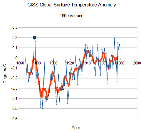
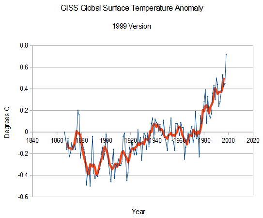
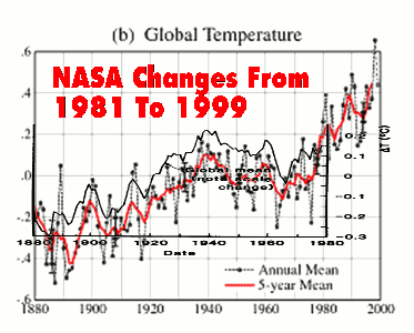
As of 1999. GISS showed no net warming from the 1870s through the 1970s, and that 1877 was the warmest year during that century.
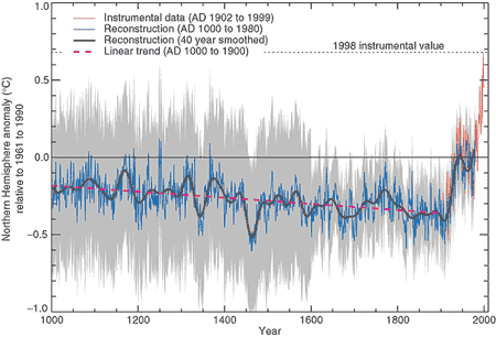
That was right around the time when Mikey was building his hockey stick.
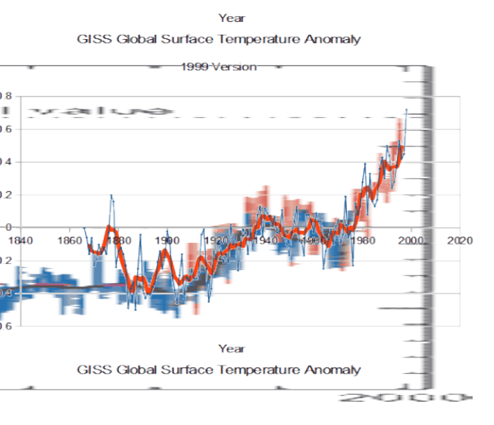
But the GISS data didn’t look much like a hockey stick, so Hansen simply got rid of all the warm pre-1880 years, and cooled all the remaining pre-1960 years. The image below shows what the original hockey stick would have looked like had Hansen not hacked the GISS database.
This is of course on top of all of his pre-1999 hacking, to cool the past from his 1981 version.
Scientists say they are 99% certain, based on this meaningless tortured data which wouldn’t withstand the slightest scrutiny by any serious engineering group in the country. And this doesn’t even address the other issue of Mikey throwing out the post-1960 tree ring data.


Plants tell us that Hansen and Mann are incorrect. The 1990s were cooler that at least two other decades in the 20th Century in the US Midwest.
http://www.sturmsoft.com/climate/suckling_mitchell_2000_fig2_3.gif
Gail, thanks for the graphs above.
An acquaintance was arguing that there has been warming based upon the fact that in Southern MN we have shifted one zone for plants. This info seems to contradict that shift.
Here in north-eastern Florida the climate has definitely shifted in the last 120 years or so. This area was once covered with successful citrus groves and still has cities with names like “Orange Park” or “Mandarin” or “Grove Park”. We get too many hard freezes to allow citrus crops here now. Yes, you might have a few plants that grow OK in small micro-climates — but commercial groves? No way. You need to go another 80 or 100 miles south for citrus operations today.
England, which was told that children by today would not know what snow looks like, is now being hammered by super cold/snow/ice, and hundreds are predicted to die there this next several days.
Hilarious!! … Killed by non-existent snow!!
Frank Lansner did quite a bit of work looking at different subsets of temperature data.
How geography determines temperature trends.
For all areas analysed (almost 20 countries by now) we see a large group of stations with warm temperatures trends after 1930 (“OAA” stations) but also a large group of stations with very little or no warm trend after around 1930 (“OAS” stations).
The classification of OAA versus OAS simply depends on geographical surroundings. Coastal areas (follow ocean temperatures) and Noncoastal areas
Non-coastal stations can be divided further into Ocean Air Affected stations (“OAA”, marked yellow) and then Ocean Air Shelter stations (“OAS”, marked blue).
http://hidethedecline.eu/media/AORIT/SUM/4.gif
In the following graph
Coastal areas = Red
Non-Coastal stations
OAA = Ocean Air Affected Stations (black)
OAS =Ocean Air Shelter stations (blue)
http://hidethedecline.eu/media/AORIT/SUM/8.gif
References:
http://wattsupwiththat.com/2014/01/06/the-original-temperatures-project/#comment-1526859
http://hidethedecline.eu/pages/posts/original-temperatures-introduction-267.php
If you were actually looking for the ‘True Temperature’ of the earth I would think you would want to use the sites Frank called “Ocean Air Shelter stations” since they would not be effected by the ~60 year ocean oscillations and therefore would give a better picture of the overall temperature trend.
I suspect that this disclosure will be met with a deafening SILENCE !
OH, look a squirrel!
(freezing his rump off)
Driving to work today I fox squirrel ran across the road in front of me. Took me a second to figure out what he had in his mouth. That little squirrel had about a hale an ear of field corn he had picked up from the harvested field on one side of the road and was taking it to the pasture with some trees on the other side of the road. I watched jump right through the farm fence bordering the pasture without missing a beat. I used to hunt squirrels and have always enjoyed their aerobatic antics but that was a first.
Should the first chart be labeled the 1981 version?
No, that is the 1999 version. The 1981 version was much warmer still .
Look again Steve, I see two 1999 charts.
I agree. Looks like 2 different charts, both labeled 1999 but one ends in 1979 (or 1981?)
Look at the zero line and the minus 4 C line in both charts.
The problem is the first chart starts at minus 6C and goes to plus 3C each line being 1 degrees C while the chart below it starts at minus 6C but goes to plus 8C with each line being 2 degrees C.
This gives an optical illusion since the lines are the same width.
Only the weather but it makes you wonder. The weather in Aus was hot last January when the US had global-warming induced polar vortex cause record cold weather, but nothing like in 1878.
http://joannenova.com.au/2015/01/forgotten-extreme-heat-el-nino-of-1878-when-miners-yearned-for-the-years-when-theyd-knock-off-at-44-4c/
Quote of the Week: “The last 15 years, there has been no recorded warming. Contrary to all the theories that—that they are expounding, there should have been warming over the last 15 years. It hasn’t happened.” Senator Ted Cruz, just named chairman of the Subcommittee on Space, Science, and Competitiveness.
Help please. We’re trying to figure out the twin “1999 version” chart labels.
See my comment above HERE.
The are exactly the same chart except the first one goes to ~ year 1975 while the second goes to year 1999.
The other issue raise by Zeke was TOBS = Time of Observation.
I address that issue HERE and another sleight-of-hand HERE Steve addresses TOBS in another manner HERE.
I should add this information here since it helps explain the bogus rise in temperature.
Zeke Hausfeather of BEST states @ Judith Curry’s site
First one of the moves was closer to the buildings when they installed the electronic temperature Systems. Less digging and less wire.
Second the conversion from liquid in glass thermometers to electronic devices is the conversion from a slow responding instrument (due to the amount of mass) to a very quick responding system.
Anyone who has worked in a lab using temperature recording devices would immediately go SAY WHAT!! The electronic temperature system are so much faster in response they are going to catch peaks the glass thermometers would never see.
German meteorologist Klaus Hager did the actual study of looking at glass thermometers vs the electronic temperature system
BACKGROUND supporting meteorologist Klaus Hager
Thermocouple technology makes these digital thermometers the fastest on the market, showing temperature readings in about 2 seconds, with high accuracy and a high temperature range.
Comparision of Thermistors, Thermocouples and RTD’s