
Hansen says UHI is 0.1 degrees.
Hansen and Lebedeff (1987) estimate that urban effects cause a warming of about 0.1°C/century on global average
Every night the weather forecaster says “and a few degrees cooler in outlying areas” – typically 20 to 40 times larger than Hansen claims.
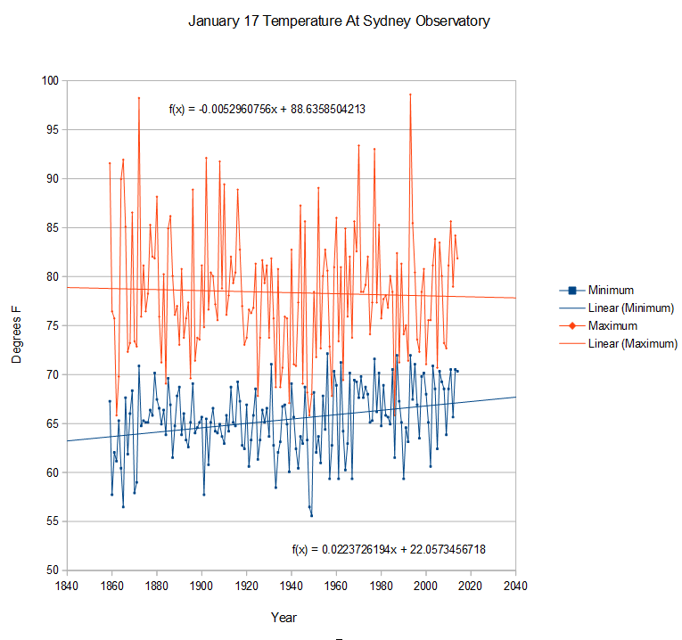
So what does UHI look like at an actual station? Midsummer temperatures in Sydney show a very strong UHI signature. Maximum temperatures have declined over the past 150 years, while minimum temperatures have risen sharply.
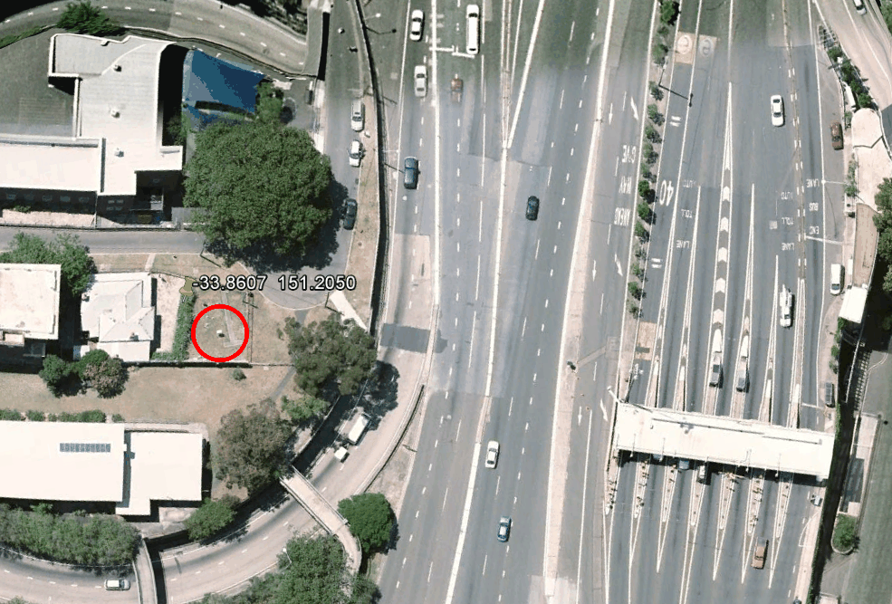
 This probably has something to do with being located adjacent to 20 lanes of asphalt.
The experts adjust for other factors very aggressively, but the one thing they should be adjusting for – UHI – they simply write off.

“NASA/NOAA UHI Adjustments Are A Farce”
Yep.
http://oprj.net/articles/climate-science/31
I’m at a loss as to the usefulness of comparing a global trend with the difference in temp on individual days. That said, I don’t doubt there are issues with properly accounting for UHI.
Do you think asphalt behaves differently on different days or in different countries?
Not far to the North of that photo is an escarpment that runs down to the harbour. Depending on which way the wind happens to be blowing, the thermometer could be recording a cool sea breeze or it could be recording the air off superheated tar.
Just to the South of that photo are a bunch of very tall buildings, any one of which could significantly distort the flow of wind in the local area. Many (but not all) of the buildings were built in the last 20 years, so over that time the trend could have been cooler, warmer, or anything in between.
I would suggest this particular temperature series does not give any meaningful long term information.
Man, I love your wit! I LOL’ed at that one!
+10,000
Dave, you can compare a global trend (warming) with a global trend (urbanization).
That’s 2 global trends.
“UHI – they simply write off.”
Just like natural variability.
…except when it does not warm, or cools, lots of reasons t cool, only one to warm.
The large number of lanes shown here are on the south end of the approach to the Sydney Harbour Bridge (Bradfield Highway). On the left you will see an circular road that leads on to this approach. That comes from the Cahill Expressway which heads east under the Bradfield Highway towards the eastern suburbs over Circular Quay (main terminal for the Sydney Harbour Ferries).
That circular road is a lot of fun to take at high speed in low gear, late at night.
Not that I would ever do such a thing …
97% of AGW is UHI
I suspect its more like 60% UHI, and 60% data adjustment.
I see what you did there!
NASA/GISS uses “lights” from satellites to determine UHI. There have been no UHI station surveys. Which is strange. They still cling to the old UHI values when there is a new NASA study out on UHI http://www.nasa.gov/topics/earth/features/heat-island-sprawl.html which clearly invalidates the prior “lights” survey.
If they were to input the values from this NASA paper, the world would certainly be cooling. Not even close the hottest year on record.
The bigger farce is NOAA’s adjustments for UHI. NONE!. They use Tom Petersons paper to justify inputting no corrections for UHI. And as I have so many times in the past shown using a Steve McIntyre posting from Climateaudit.org from 2007, the Tom Peterson paper is bogus trash.
http://climateaudit.org/2007/08/04/1859/ This posting by Steve McIntyre is what moved me from a fence sitter to a full blown skeptic. The results showing how much effect UHI has on our temperature stations is so obvious it is criminal for NOAA to use the Tom Peterson study to justify not making a UHI adjustment.
Here is an extreme example of weather station location. Syracuse NY before 1951 got an average of 80 inches of show a year going back to the 1800’s. From 1951 to the present it averages 120 inches a year. All 10 of the snowiest years happened after 1951.
Why? In 1951 they moved the weather station from downtown Syracuse to the airport 10 miles north, further into the snow belt. I’m sure Gavin Schmidt would try to spin that.
http://www/hyzercreek.com/oswego.jpg
http://www.hyzercreek.com/oswego.jpg
I think that map of the snow lines is a tad bit off.
The southern tier, the area between the 80 and 100 inch lines really gets socked with snow compared to Rochester or to Syracuse. I lived in various towns in that area including Syracuse and Rochester from 1950 to 1980. The two cities never got anywhere near the amount of snow that the areas south of them did.
Beg to differ. Syracuse gets hammered but north of Syracuse is way worse than south.
I lived southeast of Syracuse for 8 years and the snow was over the roof of the car all winter. we had to put colored tennis balls on the radio antenna. I also lived south of Rochester and in the city of Rochester. Again the snow was much worse south of the city.
I will grant you that Watertown and Potsdam really really get plastered.
But look at that map they have BUFFALO as having less snow than Rochester!!! NO WAY!!! Rochester just doesn’t get that much snow. Rain yes, ice yes but not snow. The lake keeps it too warm the same way Oneida Lake modifies the weather of the city of Syracuse.
Now I am going on memory from 1950 to 1970 and the weather patters may have changed drastically. But during that time the winds would pickup moisture from the great lakes come whistling south to the finger lakes region cool and dump the moisture as snow.
Maybe rah or emsnew will chime in since they both know the current weather in the region.
Beg to differ, about almost everything you said. Rochester gets hammered but nothing like Syracuse. Buffalo only gets hammered in December and then Lake Erie freezes. Rochester gets it all winter because Lake Ontario never freezes.
One day I got to work in Rochester at 10 AM, got there during the beginning of a whiteout. Could barely see my way to even walk across the parking lot. Went to lunch at 1 PM and 24 inches of snow had fallen in 3 hours. Did you hear me? 24 inches in 3 hours! And Syracuse is way worse, and it’s nowhere near Oneida Lake and on the wrong side of it. It’s on Onondaga lake which doesn’t modify anything because it’s frozen. Oneida Lake would modify Utica, not Syracuse, but, come to think of it, it’s frozen too and doesn’t modify anything, it’s too small to modify anything even if it weren’t frozen, maybe you mean Ontario. But Lake Ontario doesn’t “modify” anything, it’s the thing that produces all the snow, not “modify” it. What? Oswego on the shore of Lake Ontario once got 106 inches in 48 hours. That’s 11 feet of snow. Watertown and Potsdam don’t get anything like that, they are north of the snow belt. Pretty much everything you said was wrong.
9 feet
Morgan, Sounds like the weather patterns have changed since I lived in the Rochester and Syracuse areas forty years ago. Not all that surprising. The weather patterns here in North Carolina have changed since I moved here 20 years ago. Up until recently the winds were ALWAYS out of the west unless we got a hurricane. Now they come from all points of the compass. We go from 19F one day to 55F a day or two later.
I was just really surprised at that map
From WIKI
http://upload.wikimedia.org/wikipedia/commons/thumb/b/b9/Map_of_New_York_highlighting_Southern_Tier.png/210px-Map_of_New_York_highlighting_Southern_Tier.png
I lived a bit south of exit 45. A shift in those wind bands looks like it could make a big different on just where the lake effect snow got dumped.
I don’t understand when people talk about lake effect snow and the finger lakes. You hear it all the time. None of the finger lakes produce any lake effect snow, they are too small and all of them freeze over. Lake effect snow refers only to the Great Lakes. Jeesh!!!!!!!
Morgan the lake effect snow comes from the Great Lakes and gets dumped on the finger lakes region. That is what people are talking about.
As I said I lived south of Syracuse on route 20 sort of in the finger lakes region. As a kid I used to STEP OVER the telephone lines to go play in the field across the street. (Thank goodness they were not electric lines)
I do not think the area is as snowy now as when I was there.
I should also mention my father was a traveling salesman and drove all over that area racking up 100,000 miles a year. Mom was a real estate broker and they both grumbled all winter about Syracuse being 10F warmer with a lot less snow.
Morgan and Gail; pistols at 20 paces……….. ;^D
Edmonton Al,
NAH, he gets snowballs I get mudballs since I was smart enough to move out of the blizzard target area. {:>D
Thermal imaging here [and most official thermometers are kept in similar places]shows UHIE:
http://www.theage.com.au/victoria/melbourne-city-centre-a-death-trap-as-heatisland-effect-takes-its-toll-20140116-30xt8.html
If a leftie paper like the Age is prepared to say that UHI = 4-5 c then ACO2 must be causing cooling.
+1
Sometimes the leftie journos stray off message. They know that they shouldn’t mention UHI but can’t help themselves, because it sounds so “sciency”.
They’re not discouting UHI. In fact, they’re making full use of it by only using urban sites in calculating average temperatures.