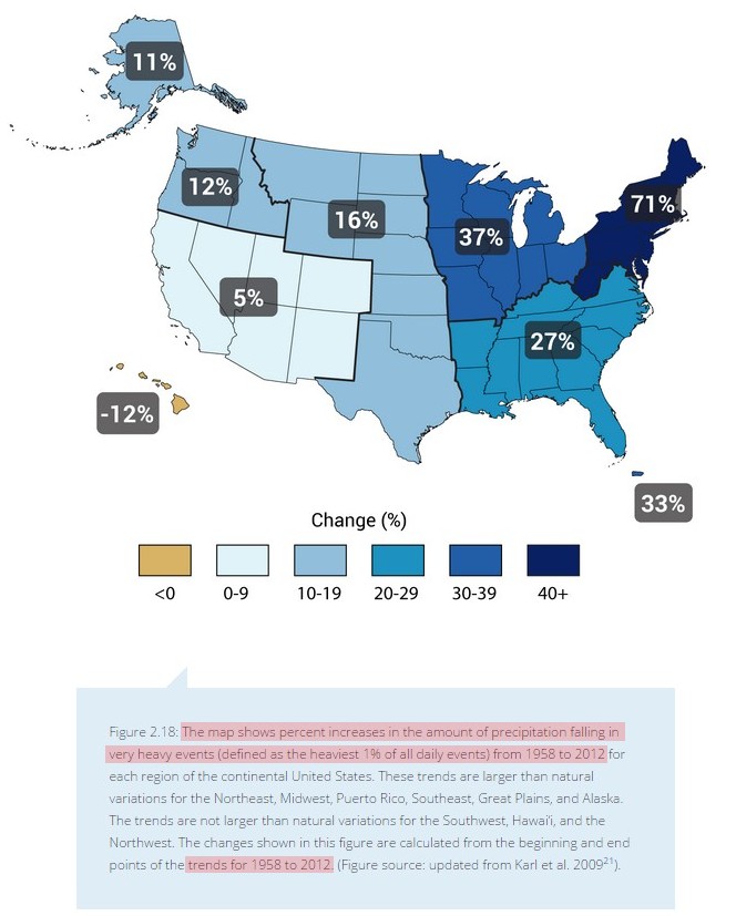
The National Climate Assessment uses this map, showing that heavy rainfalls have increased in the US since 1958
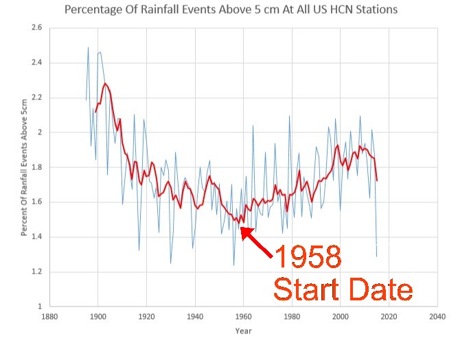
Look what they did. They picked the low point of the US record to begin their graph.
In fact, heavy rainfall events in the US are no more common than they were 100 years ago, when CO2 was close to 300 PPM. This is blatantly misleading propaganda, intended to give the reader the exactly wrong impression.


So 1958 is to rainfall what 1979 is to Arctic ice.
A convenient year to create a fraudulent impression to con a gullible pubic.
I just came to pose that very question: I thought 1979 was The Beginning of Climate-Time?
Keep trying. Idiots.
Yep , that’s why Jimmy the conman is on the case.
Choosing the coolest period of the last 50 or so years as his base line, while refusing to admit that for most of the Holocene there was most certainly a whole lot less sea ice at either pole.
Its just one big mis-information propaganda CON.
And don’t forget the “TOBS” adjustment for precipitation. The main reason that the observation time was moved from late afternoon to early morning was that thunderstorms occur most commonly in the late afternoon, and the measurement would occur in the middle of them, splitting the storm’s precipitation into two separate days.
Now, with early morning measurements, the precipitation from a heavy thunderstorm is more likely to be recorded in a single day’s measurement, increasing the likelihood of “heavy” rain events.
Figures don’t lie——-but liars figure!
Here is a chart that I would like to see: Gov’t agency from any country that does not cherry pick data to further the AGW agenda.
I think i may be able to plot that here as i think about it…
4
3
2
1
0____________________________________________________
FIFA = CLIMATE TEAM on gard!
I see Hawaii has got drier. No doubt that has also been caused by CO2.
No, Alaska and Hawaii are compared to a different period (1951-1980 average) than the rest of the country, and it is measuring a really weird stat. Not something like total rainfall, but it is measuring the change in the share of rain coming in the top 1% of daily rain events in a region over decades. Why a region and not a state, or some other percentile? Probably didn’t give the result they wanted.
The number of actual locations where they can measure the rain in a day would make a difference in the share for a given year. Because one station in a region has to register in the top 1% events, and they then I guess total up all the rain in the region for that day and all other 1% days, over the total for the region for the year.
So there’s a lot of extrapolation going on because how else would they measure the amount of rain in an entire region when that 1% event happens? In Hawaii, there probably aren’t nearly as many 1% events, simply because it is such a small area that adding more rain stations compared to 1951 isn’t going to make a difference. I would guess there’s just a whole lot more stations that can take daily rain readings spread out over the US than there were back in the 50’s. If anything, the number of airports surely is higher.
Those numbers are going to change radically after this months rains get totaled up. All the reservoirs are full and so are the rivers. They will have to update the drought map as well. I bet it takes them a long time to do that since they need to continue to scare us.
SMS, They won’t update the drought map, they will have to adjust it, after all we are in permanent drought. I live in Arizona, and they keep telling me we are in a drought, silly me I though the lack of rain was due to the fact we live in a desert.
http://www.msn.com/en-us/news/other/holy-crop-how-federal-dollars-are-financing-the-water-crisis-in-the-west/ar-BBki7co
The real story on water and drought
Reblogged this on Climatism.