Temperatures Following Hansen’s Zero Emissions Scenario C

“It doesn’t matter how beautiful your theory is, it doesn’t matter how smart you are. If it doesn’t agree with experiment, it’s wrong.

– Richard P. Feynman

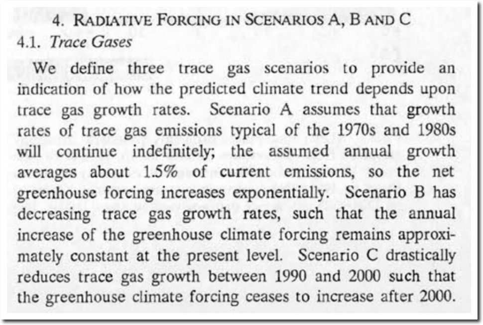
In 1988, NASA’s James Hansen made temperature forecasts for three emissions scenarios.  Scenario A was increasing emission growth rates. Scenario B was decreasing emission growth rates. Scenario C was no emissions after the year 2000.


“We have considered cases ranging from business as usual, which is scenario A, to draconian emission cuts, scenario C, which would totally eliminate net trace gas growth by year 2000.”

Climate Change and American Policy: Key Documents, 1979-2015 – Google Books

1988_Hansen_ha02700w.pdf

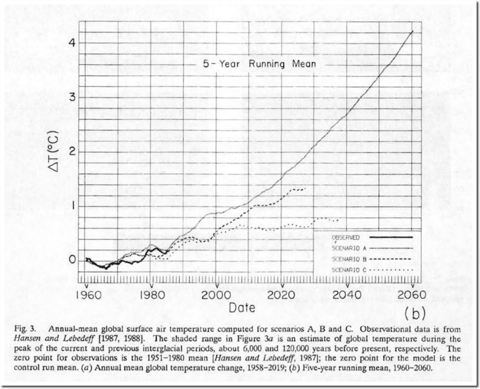
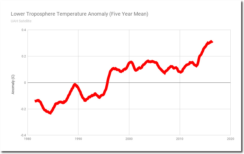
So how did Hansen do? The graph below shows the five year mean of lower troposphere temperatures measured by satellite.

Wood for Trees: Interactive Graphs

The next graph overlays the satellite lower troposphere temperatures in red, on Hansen’s 1988 forecasts – at the same scale and normalized to the early 1980’s.

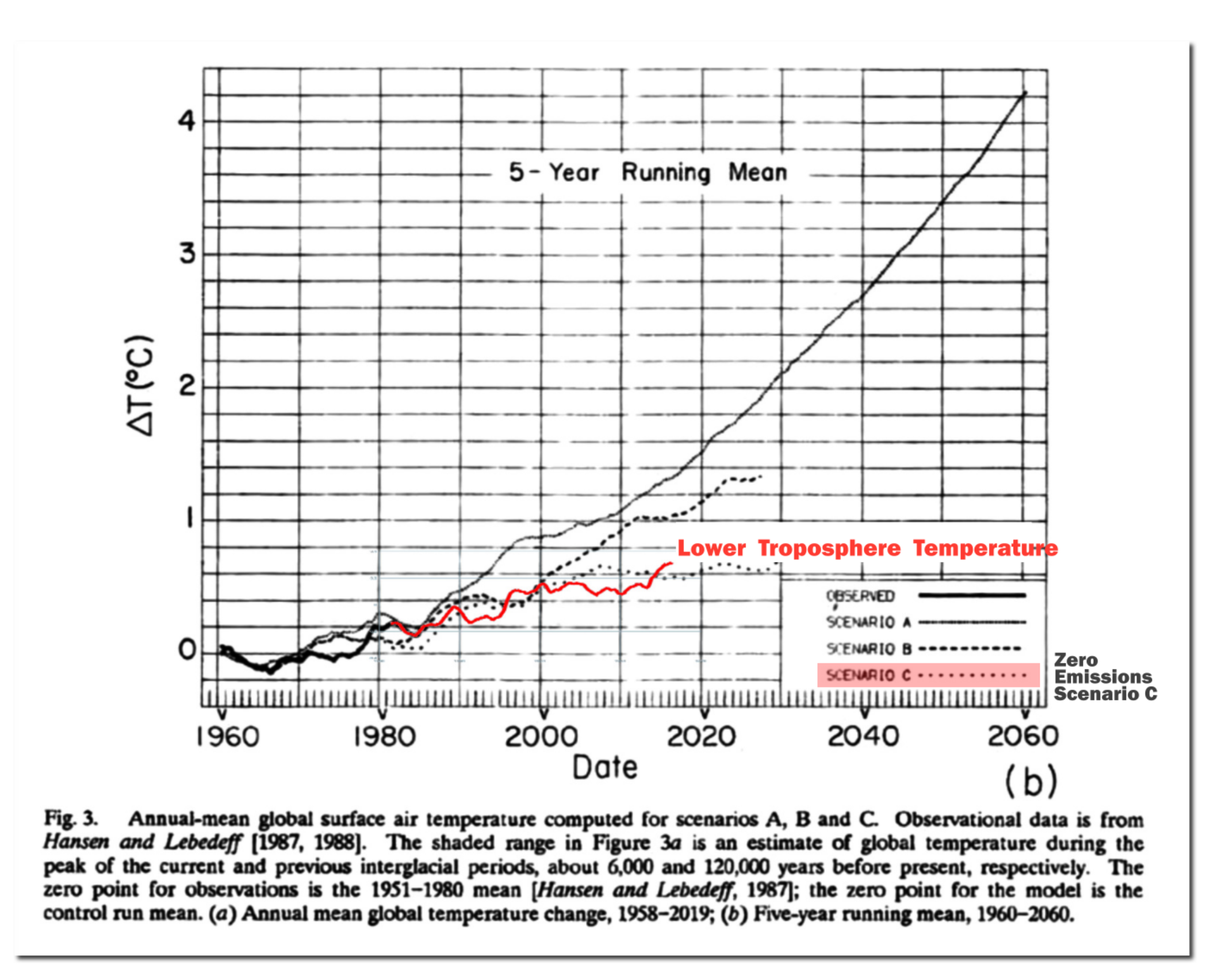
Lower troposphere temperatures have tracked Hansen’s zero emissions scenario. If (your theory) doesn’t agree with experiment, it is wrong.

This entry was posted in Uncategorized. Bookmark the permalink.

50 Responses to Temperatures Following Hansen’s Zero Emissions Scenario C

  1. Kent Matthew says:

    Yes, this is something I’ve always found interesting. And, the media tends to ignore.

  2. The assumptions are concern emissions and are aimed at policy.
    Scenario A is without policy. Emissions growth of 1.5%.
    Scenario B is a policy that holds emissions at a level of the mid-1980s.
    Scenario C is a policy that effectively reduces emissions to zero in the 1990s.

    For all GHG emissions actual growth since the end of the 1980s was about 1.3% pa. The major reason that it was below Hansen’s 1.5% estimate was due to the collapse of communism.
    When you see alarmists try to justify the Hansen scenarios, they look at linear trends for the last 30 years. In the 1990s emissions hardly grew at all. Post 2000 emissions rocketed, mostly due to China industrializing. Look at Gistemp or HADCRUT surface temperature anomalies. Even the current versions show the rate of temperature rise reducing dramatically after 2000. So around 2000 rate of emissions growth went up and rate of warming went down.
    I looked at this in detail last year.
    https://manicbeancounter.com/2018/07/01/hansen-et-al-1988-global-warming-predictions-30-years-on/

    • rah says:

      I seem to recall that scenario A was referred to as the “Business as usual” scenario.

      • You are correct. Hansen 1988 estimated the historical trend. In James Hansen’s testimony to Congress he stated.
        “We have considered cases ranging from business as usual, which is scenario A, to draconian emission cuts, scenario C, which would totally eliminate net trace gas growth by year 2000.”

      • Phil. says:

        Yes scenario A was set up to continue emission growth in the same manner as in the past and also to include some other minor gases that weren’t included in scenarios B & C. No Montreal Protocol for example. It was set up to represent the top of the range of possible outcomes.

  3. The temperature rise difference between the Scenarios A (BAU) and Scenario B (constant emissions) is quite small. Yet the policy difference is huge. After 30 years of 1.5% growth emissions would be 30% higher. That is due to the cumulative emissions being the key.
    I have charted the cumulative growth in emissions from the 3 scenarios from a base of 1984 = 100. I have also added CO2 emissions, which has averaged 1.9% per annum, with 1984 = 100.
    https://manicbeancounter.files.wordpress.com/2019/01/cum-ems-v2.jpg

    • David A says:

      So actual emissions, despite trillions in global spending, were closest to Businesss as usual.

      Actual GHG atmospheric accumulation was I believe between A and B, yet closer to B then the emissions. ( Apparently the earth-oceans absorbs more CO2 from the atmosphere then Hansen thought.)

      And T rise has been at or below scenario C – drastic reductions in emission growth.

      IMV Hansens errors are greater then the altered surface record represents. Per CAGW theory surface T increase is a RESULT of warming higher in the troposphere. As T can change for non GHG related reasons, then it is the rate of warming at CAGW specific altitude in the troposphere that must be used to evaluate Hansens W.A.G.!

      And this is best seen in the UHA troposphere measurements where Hansens failure is complete.

      • David A says:

        BTW, I know Tony used the correct T chart, yet alarmists often use the heavily altered surface charts.

        • Johansen says:

          David… can you expand on “trillions in global spending”? Do you mean “trillions in CAGW-mitigation spending”? Please expand…

          • David A says:

            Total global spending to limit CO2 – all windmills, all solar, government subsidies for those plus electric cars, thousands of bureaucrats attending thousands of conferences, Forrest clear cut, net job losses ( some studies show 2 lost jobs for every green energy job created) due to high energy costs and greater government debt and welfare-unemployment costs. Trillions on a global scale over the last decade is very reasonable IMV.

          • Johansen says:

            David A…. got it, thanks!

      • Squidly says:

        Concerning your “Apparently the earth-oceans absorbs more CO2 from the atmosphere then Hansen thought”

        The first 3m of ocean contain more CO2 than all of the atmosphere above it. Oceans cover more than 72% of the Earth’s surface. The average ocean depth is 4km

        You could dissolve ALL of the atmospheric CO2 into our oceans and you would be hard pressed to be able to measure the change in pH … ie: ocean acidification is physically impossible

        Also to note, ocean outgassing of CO2 dwarfs any human CO2 contribution.

        You can easily identify the annual natural uptake and outgassing in the Mauna Loa CO2 record. You cannot identify the “human” contribution of CO2 concentration within that record, as it is minscual by comparison.

        • Louis Hooffstetter says:

          Yep: The mass of the oceans is 1.384×10²¹ Kg.
          The mass of the atmosphere is 5.148×10¹⁸ Kg.
          So the mass of the oceans is ~270X the mass of the atmosphere, and the oceans contain at least 50X the amount of CO2 as the atmosphere (and possibly much, much more).

        • Johansen says:

          Squidly – Hoofstetter…. Has anyone attempted to measure/quantify/analyze the potential **increase** of green things due to increased atmospheric CO2??
          In other words, more CO2 = more food for algae, phytoplankton, etc etc = more photosynthesis = less CO2 = lower than expected temperature response?

  4. Tony starts the piece with a quote from Richard Feynman’s 1964 Lecture on the Scientific Method. To understand Hansen 1988 I think a quote from later on in the lecture is more relevant.

    You cannot prove a vague theory wrong. If the guess that you make is poorly expressed and the method you have for computing the consequences is a little vague then ….. you see that the theory is good as it can’t be proved wrong. If the process of computing the consequences is indefinite, then with a little skill any experimental result can be made to look like an expected consequence.

    There are a number of variables to take into account when evaluating the Hansen scenarios.
    1. The quantity of emissions to raise atmospheric trace gas levels by a unit amount. For CO2 Hansen over-estimated by 25% or more. For CH4 there are no figures for annual emissions as they are impossible to estimate.

    2. Climate sensitivity. Hansen 1988 4.2C. IPCC reports 1.5-4.5C (like the Charney Report 1979). Lewis and Curry 1.5-2.0C.

    3. The time taken for the warming to occur. In Scenario C, emissions stop in 2000 and there is no warming after 2007. Take IPCC TAR 2001 on transient climate response. If CO2 levels rise at 1% a year (much faster than reality) then they will double in 70 years. Even after 500 years the full warming has not come through. See TAR WG1 page 534 Fig 9.1.
    https://manicbeancounter.files.wordpress.com/2019/01/tar-wg-p534-fig-9.1-tcr.jpg

    4. Then there is the comparison to the surface temperature record. Curiously there seems to be a convergence with theory. That might be explained by the great climate scientists assuming that theory is a priori true, therefore the data must be wrong. (see this 2009 email copied to Schmidt of NASA, Karl of NOAA, and Jones of the Hadley Centre) This way of thinking is the opposite of the scientific method so clearly expressed by Feynman.

  5. griff says:

    Latest arctic ice update and review of 2018

    https://nsidc.org/arcticseaicenews/2019/01/new-year-lows-once-again/

    I noted particularly:

    “Coverage of old ice (greater than 4 years old) over the Arctic continued to decline. Such old ice covers only 5 percent of the area it used to in 1980s.

    It is interesting to compare these conditions to historical reconstructions. Today’s departures from average conditions are quite remarkable when viewed over the last 160+ years (Figure 5). While some lower than average (computed 1981 to 2010) winter and summer sea ice conditions occurred prior to the satellite data record, they were not as large in magnitude or as persistent as recent departures have been. Further, recent years have shown unusually low sea ice extent persisting well into autumn and winter, reflecting a distinct change in seasonality in the Arctic compared to earlier years with low summer ice conditions.”

    • Mr GrimNasty says:

      Reconstruction is another word for fantasy. And we all know the ‘old ice’ has undergone some very ‘inventive corrections’ over the last few years.Why bother posting this garbage?

      Have you noticed a fact though Griff, DMI 80N is currently within a degree or so of the absolute coldest recorded in recent years, and the whole Arctic area anomaly is firmly negative (1979-200 base).

      Happy new year.

      • David A says:

        Indeed, calling current reconstructions a fantasy, is charitable, as they are politically biased lies. The since altered past reconstructions were far more likely to be accurate, simply because they were arrived at honestly!

      • Phil. says:

        Actually the DMI 80N is above the long term mean, not firmly negative.

    • Gator says:

      So what? It is nothing new. There is currently more ice in the Arctic than the average of the past 9000 years.

      Why do you hate poor brown people Ms Griff?

    • spike55 says:

      Gees, there is ONE HECK OF A LOT OF SEA ICE up there, isn’t there, griffool

      FAR more than for nearly all the last 10,000 years. !

      Or are you going to continue with your childish Climate Change Denial. !

    • spike55 says:

      Last 160 years looks like the below, NOT like the FAKE AGW fabrication

      • AndyDC says:

        That chart clearly shows that without the blatant 1979 cherry pick, you have a cycle and not a trend.

        You could likewise start a summer max temperature chart in 1936 and show a trend toward catastrophic cooling. Without blatant cherry picks and fake data “adjustments”, the alarmists have very little to hang their hats on.

        This site shows repeatedly that the emperor has no clothes, but the emperor still is scamming billions from the Treasury.

        • spike55 says:

          And it matches Arctic temperature quite well, which is more than can be said for the fantasy fabrications from the AGW liars.

          • Phil. says:

            And it matches Arctic temperature quite well, which is more than can be said for the fantasy fabrications from the AGW liars.

            Of course it does, the Alekseev data is an inverse Arctic summer temperature index!

    • spike55 says:

      Extent is ABOVE the 12 year average in NSIDC.

      They seem to have FAKED up a report just for the GULLIBLE of the AGW scam.

      And griffool falls for it. , of course.

    • Squidly says:

      ICE FREE Griff !!!

      WHERE IS MY ICE FREE ???? … You said ICE FREE !!!

      I have been promised ICE FREAKING FREE !!!

      You can blather on all you want about little bit of change in ice here or ice there .. but I have been promised ICE FREAKING FREE !!! … where the hell is my ICE FREE Griff !!!??!!!?? … WHERE???

    • Louis Hooffstetter says:

      “Coverage of old ice (greater than 4 years old) over the Arctic continued to decline. Such old ice covers only 5 percent of the area it used to in 1980s.”

      Until now, climate “scientists” were only concerned about the areal extent and the thickness of arctic sea ice . But now that both are better than their cherry picked average, suddenly the age of the ice takes on mystical significance. And who cares how old the ice is? Do the seals care? Do the Polar bears care? No! Ice is ice. Plus, nobody goes to the high arctic in the middle of winter to collect ice samples, and even if they did, how could anyone determine whether the ice was 2 years old or 4 or 5 or 6 years old?

      As usual, Griff’s argument is an exercise in stupidity.

      • Squidly says:

        And I don’t give a rats ass about ice thickness, ice area, ice increasing, ice decreasing .. none of that matters one whit .. they claimed ICE FREE .. do they not know what “ICE FREE” means? .. that means .. NO FREAKING ICE !!!NONE! .. I’m still seeing ice! .. there is still ice in the Arctic!!! .. we have never had an ICE FREE Arctic since I have been alive (almost 60 years now). Not for one single second has the Arctic been “ICE FREE” since I have been alive. They continue to promise us that the Arctic is melting and “will be ice free in {choose your time period}” but it never happens and it never has happened.

        Until the Arctic is completely ICE FREE all the assholes in the world like Grif can just STFU !!!

        Nothing else matters but ICE FREE !!! .. it doesn’t matter if ice is shrinking, growing, thickening, thinning .. NONE of that matters one whit !!! … The Arctic has to be completely ICE FREE, even for just 1 second or nothing else counts … period!

        • Johansen says:

          Squidly… you’re just going to make Mother angry with all that shouting, and then we’ll plunge into Hothouse Hell

        • Johansen, that is a really cool graphic. It would be cool to see with actual data rather than made up data with no scales. I think the marble earth would be in the far left gutter for most of that graph if we were being honest with ourselves.

  6. Mr GrimNasty says:

    The other side have a new term of disparagement for the likes of our host.

    https://cliscep.com/2019/01/10/pielke-and-lomborg-accused-of-fact-mongering/

    Yes Tony is fact mongering – causing irrational calm and complacency!

    • DM says:

      FACT-MONGERING?!*##:-(

      The phrase and underlying concept might shock even Orwell, despite his low expectations for thought controllers.

    • Louis Hooffstetter says:

      “Where fear mongering can stoke irrational panic, fact mongering can cause irrational calm and complacency.”

      I love it!
      We should nominate Tony Heller for a Nobel Peace Prize for using facts and empirical data to cause irrational calm and complacency!

      In your face Mikey Mann and ManBearPig!

  7. fah says:

    A minor point, but one I wish to make. The lead quote from Feynman is so widely mis-quoted that it is hard to find the actual text by googling now. The quote in question is from one of his Messenger Lectures at Cornell in 1964, the year before he was awarded his Nobel. His words actually were:

    “It doesn’t make any difference how beautiful your guess is, it doesn’t make any difference how smart you are, who made the guess, or what his name is. If it disagrees with experiment, it’s wrong. That’s all there is to it.”

    In that section of the lecture he had described a theory as being fundamentally a guess at how nature worked, which evoked a fair amount of laughter, which he quelled gracefully. Part of the beauty of his use of the notion of a guess for a theory was that such a view immediately prepared one for the eventuality that the guess could be wrong, and no harm done since one knew it was just a “guess” in the first place. Thinking of your proposed theories as “just a guess” keeps you from investing too much effort in fooling yourself that it has to be true. He had a lot to say of the danger of fooling yourself.

  8. Scott Scarborough says:

    So the satellite temperature record matches Hansen’s C scenario closely. But it shouldn’t. Shouldn’t the satellite record warm faster than the surface record because of the mid tropospheric tropical hot spot?

    • David A says:

      Yes, Tony correctly used the troposphere record where, per CAGW theory, that T increase occurs first and eventually propagates to the surface.

      As the surface record warming is considerably greater then the CAGW troposphere warming, then whatever is causing the surface warming ( natural causes, biased adjustments etc…) much or most of claimed surface warming CANNOT be attributed to anthropogenic GHG emissions.

    • spike55 says:

      “But it shouldn’t”

      Actually, it should, because there is no known or measured warming by atmospheric CO2. So the temperature is behaving exactly as predicted.

      Hansen has proven that.

  9. I must admit that I tend to look at Figure 3(a) in Hansen 1988. rather than the Figure 3(b) shown above.
    I have created an extract of 1960-2000, with 1988 shown by a red line separating the past from the future. What I find interesting is that the scenarios depart from the actual in about 1970, eighteen years prior to publication. Hansen’s climate model could not even forecast the past, so it is not surprising it could not forecast 30 years into the future.

    https://manicbeancounter.files.wordpress.com/2019/01/hansen-fig-3b-extract.jpg

Leave a Reply to Mr GrimNasty Cancel reply

Your email address will not be published. Required fields are marked *