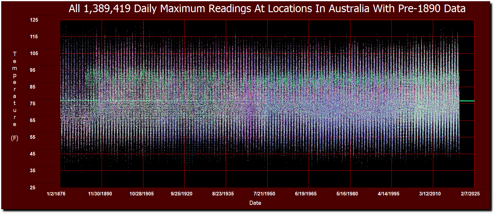
There are 25 locations in Australia with daily temperature data going back before 1890. This graph shows all 1,389,419 daily maximum temperature readings at those locations since 1876.
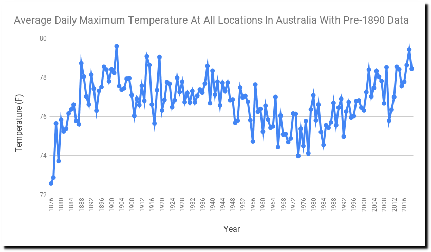
The actual waveform is a 120 year long cycle. The hottest year was 1902 and the second hottest was 2018. Australia was cold during the 1970s ice age scare, just like everywhere else.
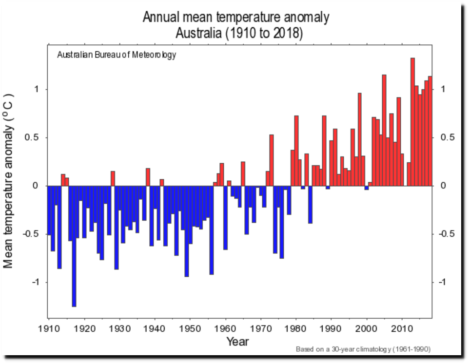
The real graph looks nothing like the fake graph generated by BOM, which uses hundreds of fragmented stations with short term records homogenized together into a meaningless hodgepodge of politically useful nonsense.
Climate change and variability: Tracker: Australian timeseries graphs
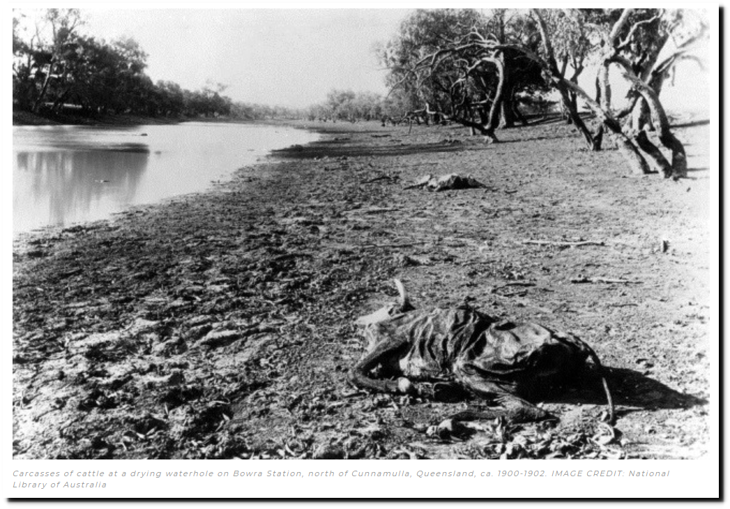
The hottest year of 1902 was at the end of the worst drought in Australian History – The Federation Drought.
These are all the stations used in the analysis :
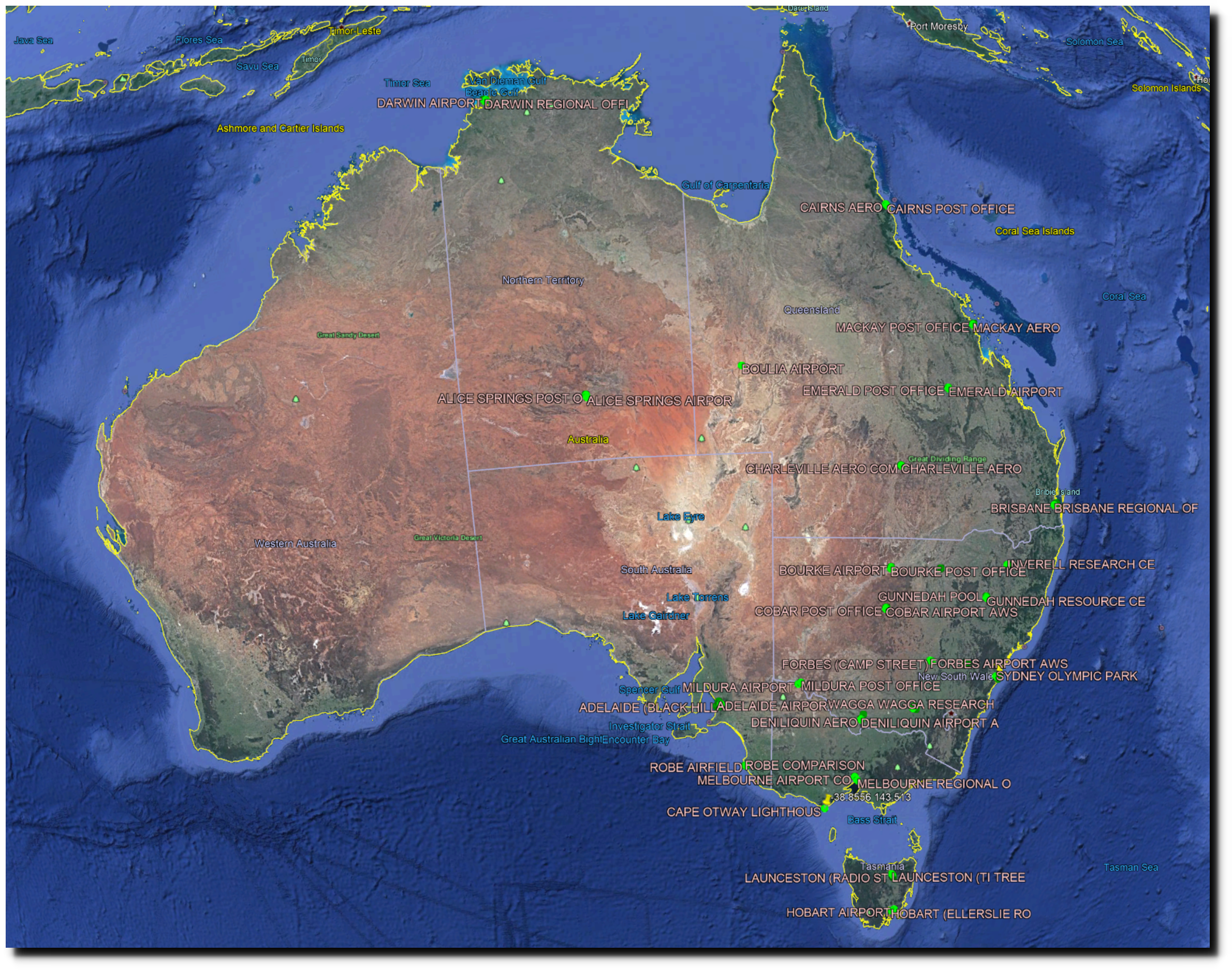
ASN00014015.dly : DARWIN AIRPORT -12.4239 130.8925 ASN00014016.dly : DARWIN POST OFFICE -12.4 130.8 ASN00014040.dly : DARWIN AIRPORT COMPARISON -12.4227 130.8844 ASN00014161.dly : DARWIN REGIONAL OFFICE -12.4667 130.8333 ASN00015540.dly : ALICE SPRINGS POST OFFICE -23.71 133.8683 ASN00015590.dly : ALICE SPRINGS AIRPORT -23.7951 133.889 ASN00015634.dly : ALICE SPRINGS CONNELLANS -23.6833 133.85 ASN00023000.dly : ADELAIDE WEST TERRACE -34.9254 138.5869 ASN00023031.dly : ADELAIDE (WAITE INSTITUTE) -34.9697 138.6331 ASN00023034.dly : ADELAIDE AIRPORT -34.9524 138.5204 ASN00023037.dly : ADELAIDE (PARAFIELD PLANT INTR -34.7833 138.6242 ASN00023046.dly : ADELAIDE AIRPORT OLD SITE -34.9566 138.5356 ASN00023057.dly : ADELAIDE (NORTHFIELD RESEARCH -34.8533 138.6517 ASN00023090.dly : ADELAIDE (KENT TOWN) -34.9211 138.6216 ASN00023097.dly : ADELAIDE (BLACK HILL CONSERVAT -34.8833 138.7167 ASN00026026.dly : ROBE COMPARISON -37.1628 139.756 ASN00026105.dly : ROBE AIRFIELD -37.1776 139.8054 ASN00031010.dly : CAIRNS POST OFFICE -16.9333 145.7833 ASN00031011.dly : CAIRNS AERO -16.8736 145.7458 ASN00033045.dly : MACKAY AERO -21.1706 149.1794 ASN00033046.dly : MACKAY POST OFFICE -21.15 149.1833 ASN00033119.dly : MACKAY M.O -21.1172 149.2169 ASN00033297.dly : MACKAY COMPARISON -21.1183 149.215 ASN00040214.dly : BRISBANE REGIONAL OFFICE -27.4778 153.0306 ASN00040223.dly : BRISBANE AERO -27.4178 153.1142 ASN00040842.dly : BRISBANE AERO -27.3917 153.1292 ASN00040913.dly : BRISBANE -27.4808 153.0389 ASN00035027.dly : EMERALD POST OFFICE -23.5267 148.1617 ASN00035264.dly : EMERALD AIRPORT -23.5694 148.1756 ASN00038003.dly : BOULIA AIRPORT -22.9117 139.9039 ASN00044021.dly : CHARLEVILLE AERO -26.4139 146.2558 ASN00044022.dly : CHARLEVILLE POST OFFICE -26.4025 146.2381 ASN00044221.dly : CHARLEVILLE AERO COMPARISON -26.4147 146.2608 ASN00048027.dly : COBAR MO -31.484 145.8294 ASN00048030.dly : COBAR POST OFFICE -31.5 145.8 ASN00048237.dly : COBAR AIRPORT AWS -31.5389 145.7964 ASN00048244.dly : COBAR COMPARISON -31.4861 145.8281 ASN00048013.dly : BOURKE POST OFFICE -30.0917 145.9358 ASN00048239.dly : BOURKE AIRPORT -30.0423 145.952 ASN00048245.dly : BOURKE AIRPORT AWS -30.0362 145.9521 ASN00055023.dly : GUNNEDAH POOL -30.9841 150.254 ASN00055024.dly : GUNNEDAH RESOURCE CENTRE -31.0261 150.2687 ASN00055202.dly : GUNNEDAH AIRPORT AWS -30.9537 150.2494 ASN00052026.dly : WALGETT COUNCIL DEPOT -30.0236 148.1218 ASN00052088.dly : WALGETT AIRPORT AWS -30.0372 148.1223 ASN00056017.dly : INVERELL COMPARISON -29.7783 151.1114 ASN00056018.dly : INVERELL RESEARCH CENTRE -29.7752 151.0819 ASN00056242.dly : INVERELL (RAGLAN ST) -29.7796 151.1121 ASN00063004.dly : BATHURST GAOL -33.4167 149.55 ASN00063005.dly : BATHURST AGRICULTURAL STATION -33.4289 149.5559 ASN00063291.dly : BATHURST AIRPORT AWS -33.412 149.654 ASN00063305.dly : BATHURST AG COMPARISON -33.43 149.555 ASN00065016.dly : FORBES (CAMP STREET) -33.3892 148.0081 ASN00065103.dly : FORBES AIRPORT AWS -33.3627 147.9205 ASN00066037.dly : SYDNEY AIRPORT AMO -33.9465 151.1731 ASN00066062.dly : SYDNEY (OBSERVATORY HILL) -33.8607 151.205 ASN00066195.dly : SYDNEY OLYMPIC PARK (SYDNEY OL -33.8521 151.0646 ASN00066196.dly : SYDNEY HARBOUR (WEDDING CAKE W -33.8414 151.2633 ASN00072150.dly : WAGGA WAGGA AMO -35.1583 147.4573 ASN00072151.dly : WAGGA WAGGA (KOORINGAL) -35.1333 147.3667 ASN00073127.dly : WAGGA WAGGA AGRICULTURAL INSTI -35.0517 147.3493 ASN00074114.dly : WAGGA WAGGA RESEARCH CENTRE -35.1311 147.3091 ASN00090015.dly : CAPE OTWAY LIGHTHOUSE -38.8556 143.5128 ASN00074039.dly : DENILIQUIN FALKINER MEMORIAL -35.3667 145.05 ASN00074128.dly : DENILIQUIN (WILKINSON ST) -35.5269 144.952 ASN00074210.dly : DENILIQUIN AERO -35.5333 144.9667 ASN00074258.dly : DENILIQUIN AIRPORT AWS -35.5575 144.9458 ASN00076031.dly : MILDURA AIRPORT -34.2358 142.0867 ASN00076077.dly : MILDURA POST OFFICE -34.1833 142.2 ASN00086071.dly : MELBOURNE REGIONAL OFFICE -37.8075 144.97 ASN00086282.dly : MELBOURNE AIRPORT -37.6655 144.8321 ASN00086384.dly : MELBOURNE AIRPORT COMPARISON -37.675 144.8419 ASN00091049.dly : LAUNCESTON (PUMPING STATION) -41.5 147.2 ASN00091104.dly : LAUNCESTON AIRPORT COMPARISON -41.5397 147.2033 ASN00091123.dly : LAUNCESTON (MOUNT PLEASANT) -41.4667 147.15 ASN00091179.dly : LAUNCESTON (RADIO STATION 7EX) -41.45 147.15 ASN00091218.dly : LAUNCESTON (ELPHIN) -41.45 147.1667 ASN00091237.dly : LAUNCESTON (TI TREE BEND) -41.4194 147.1222 ASN00091311.dly : LAUNCESTON AIRPORT -41.5492 147.2144 ASN00094008.dly : HOBART AIRPORT -42.8339 147.5033 ASN00094029.dly : HOBART (ELLERSLIE ROAD) -42.8897 147.3278
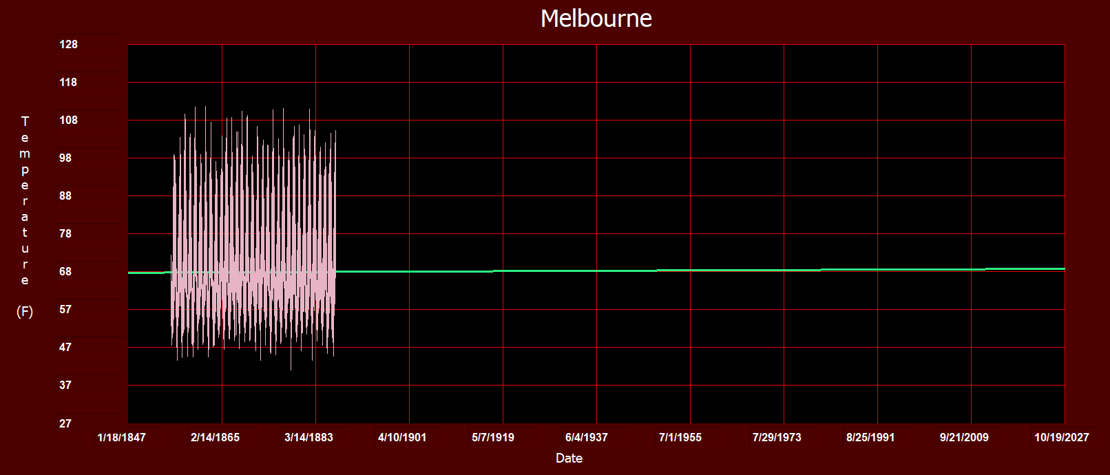
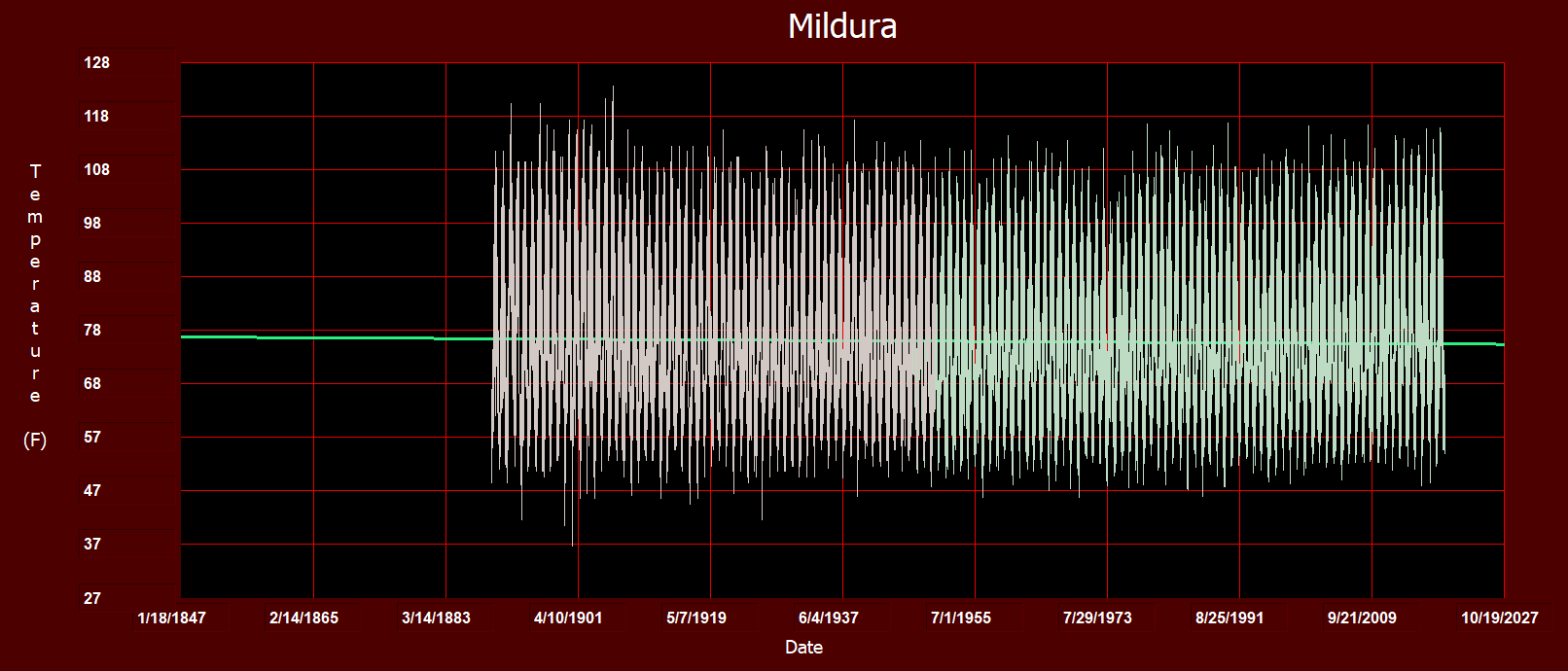
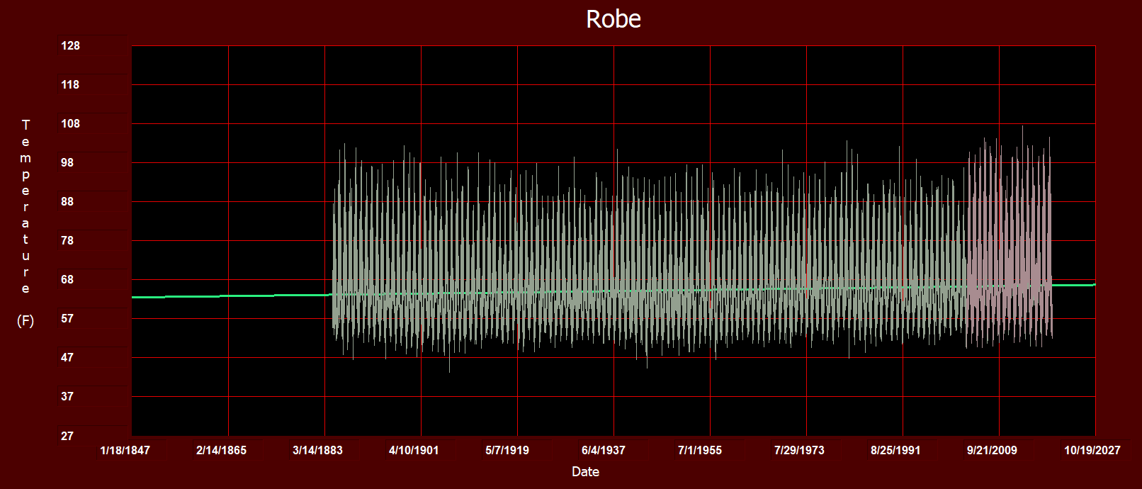
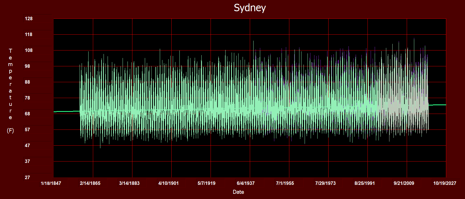
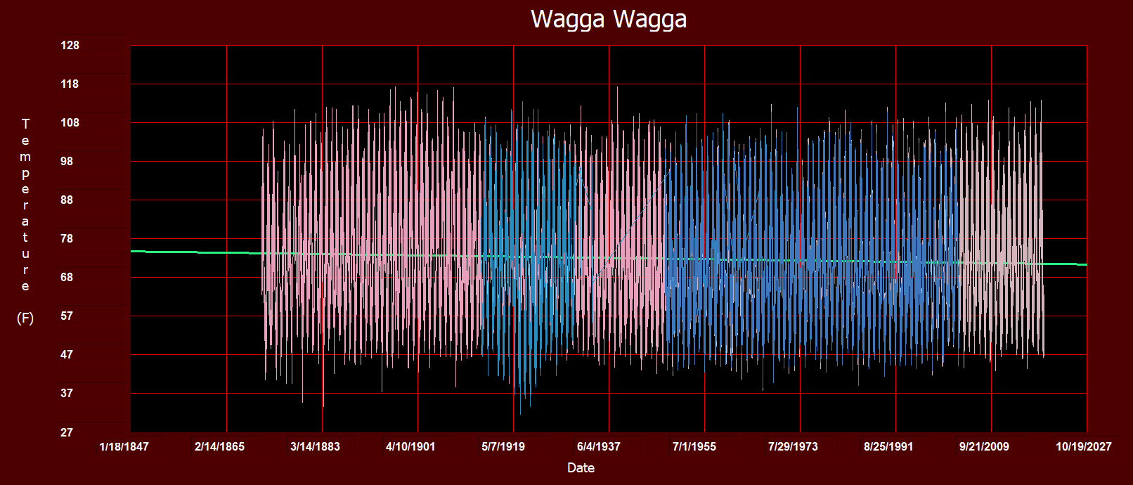
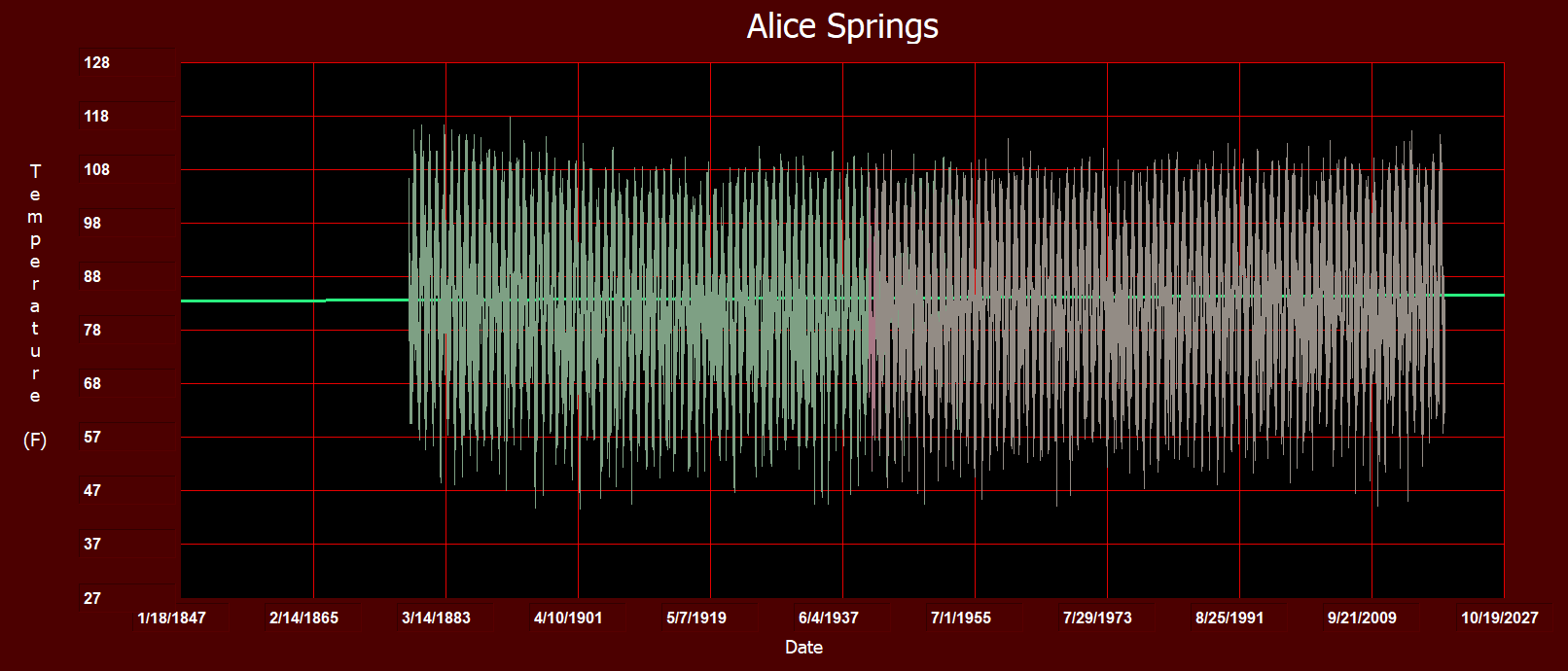
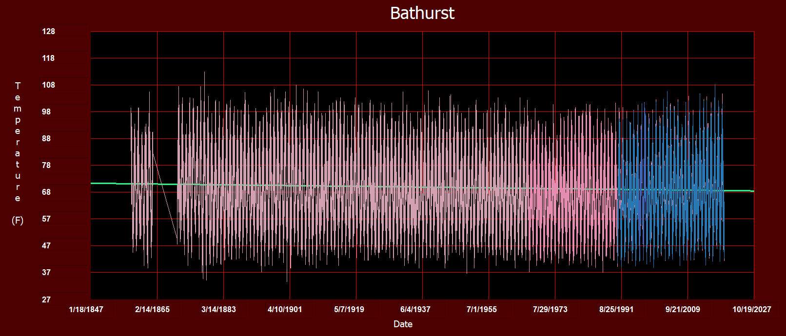
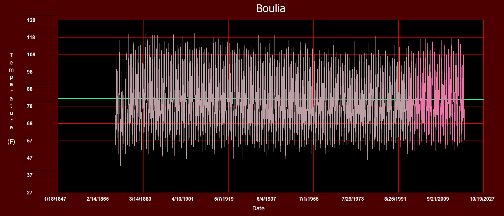
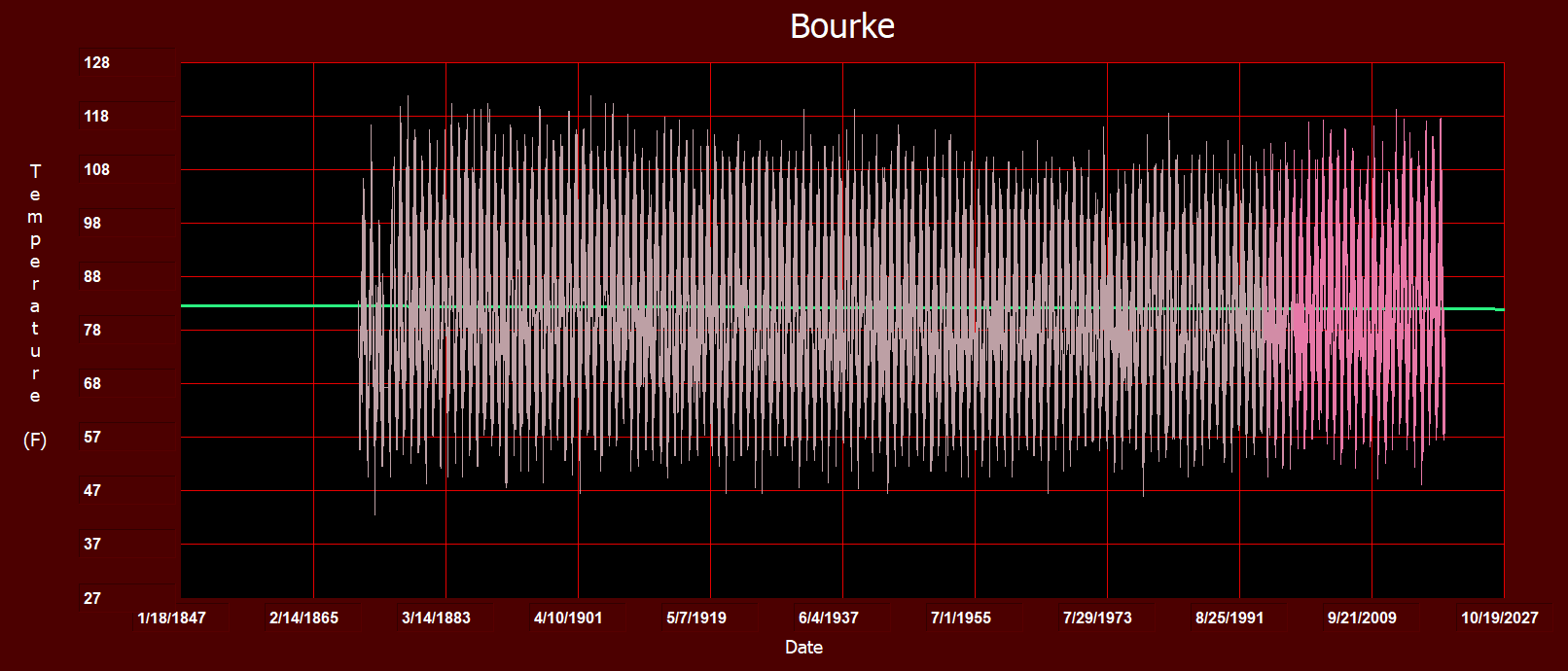
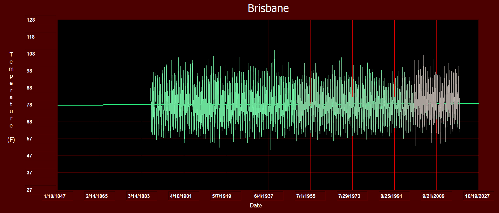
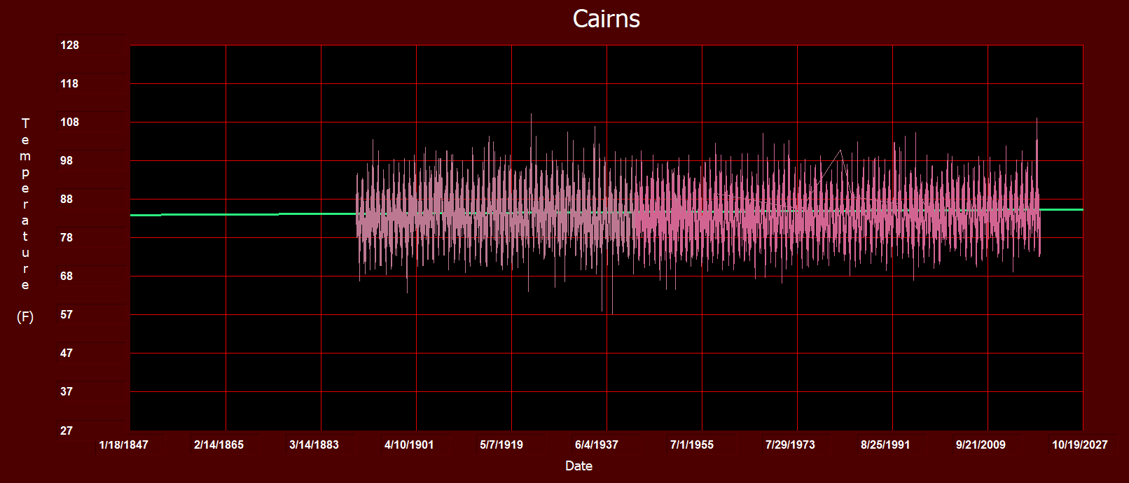
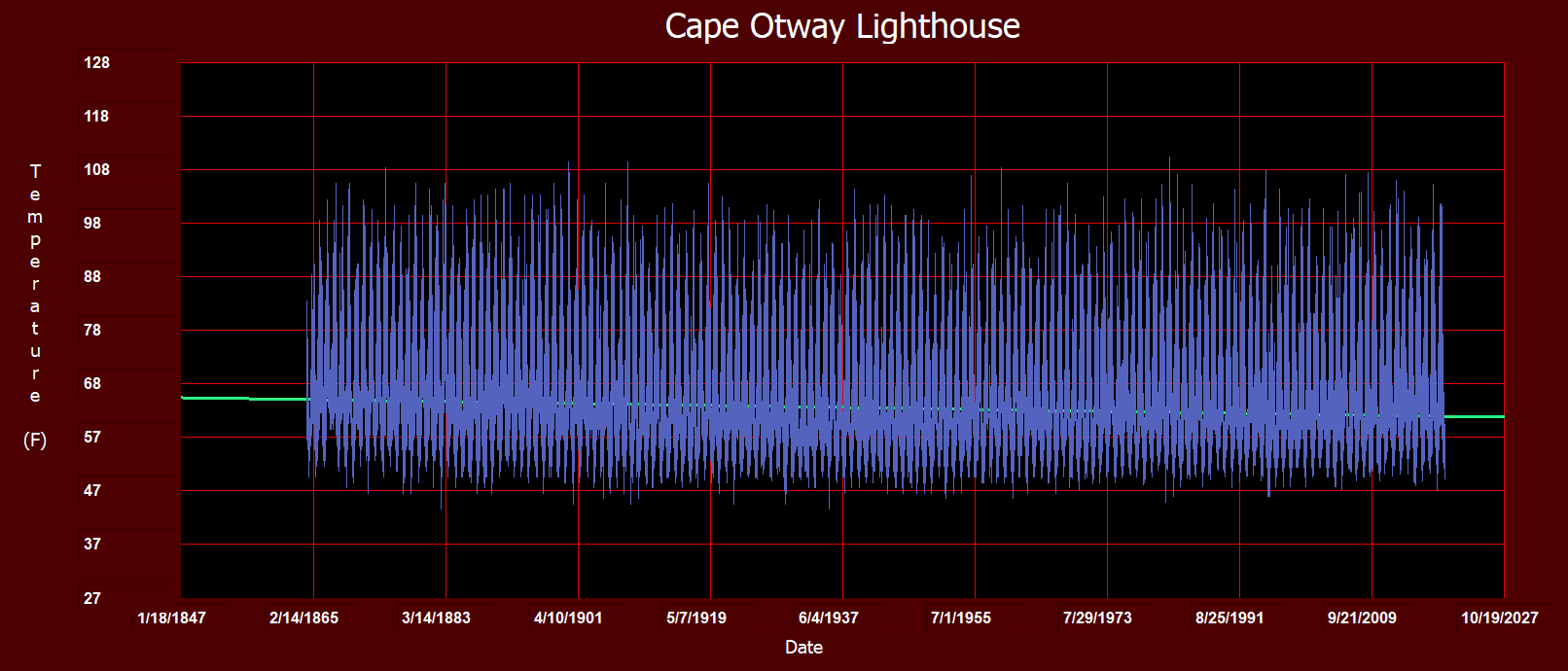
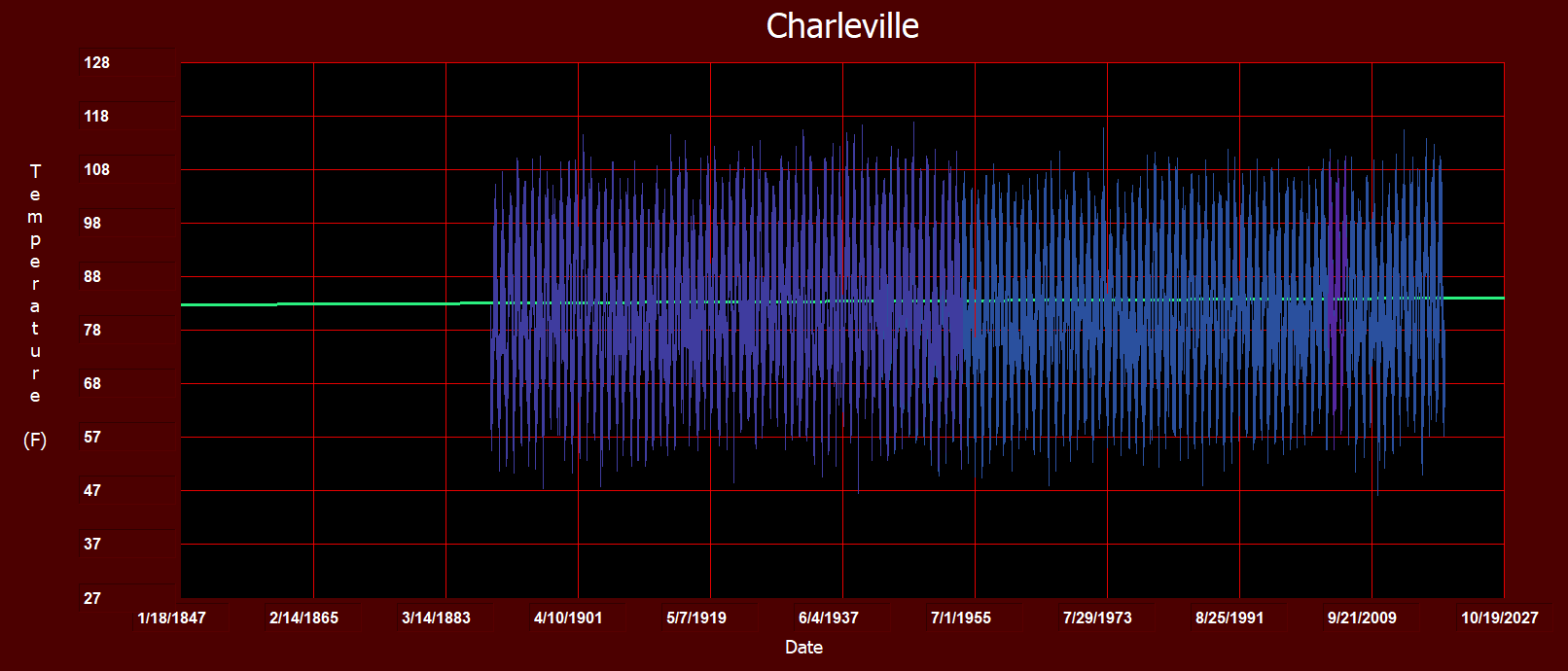
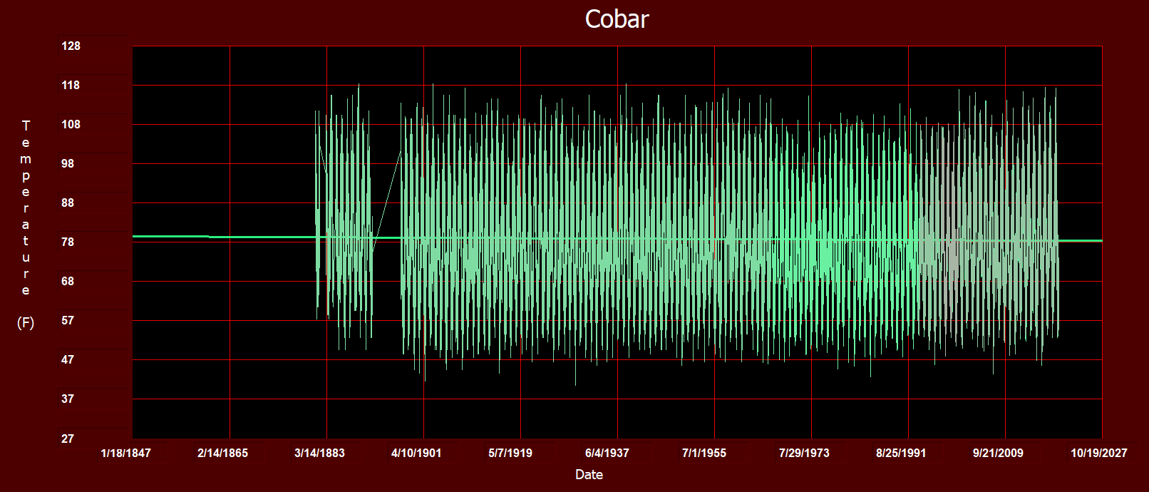
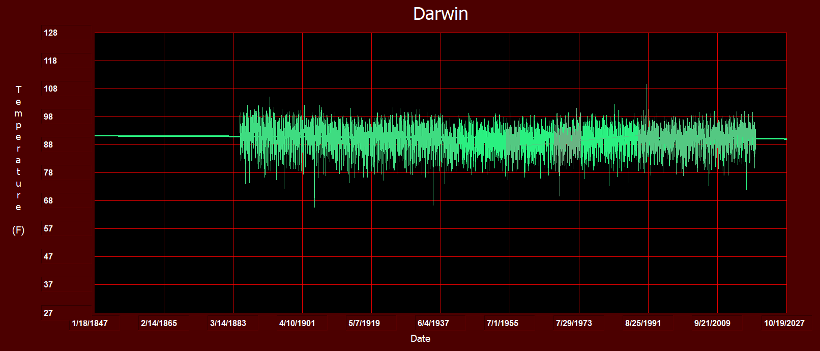
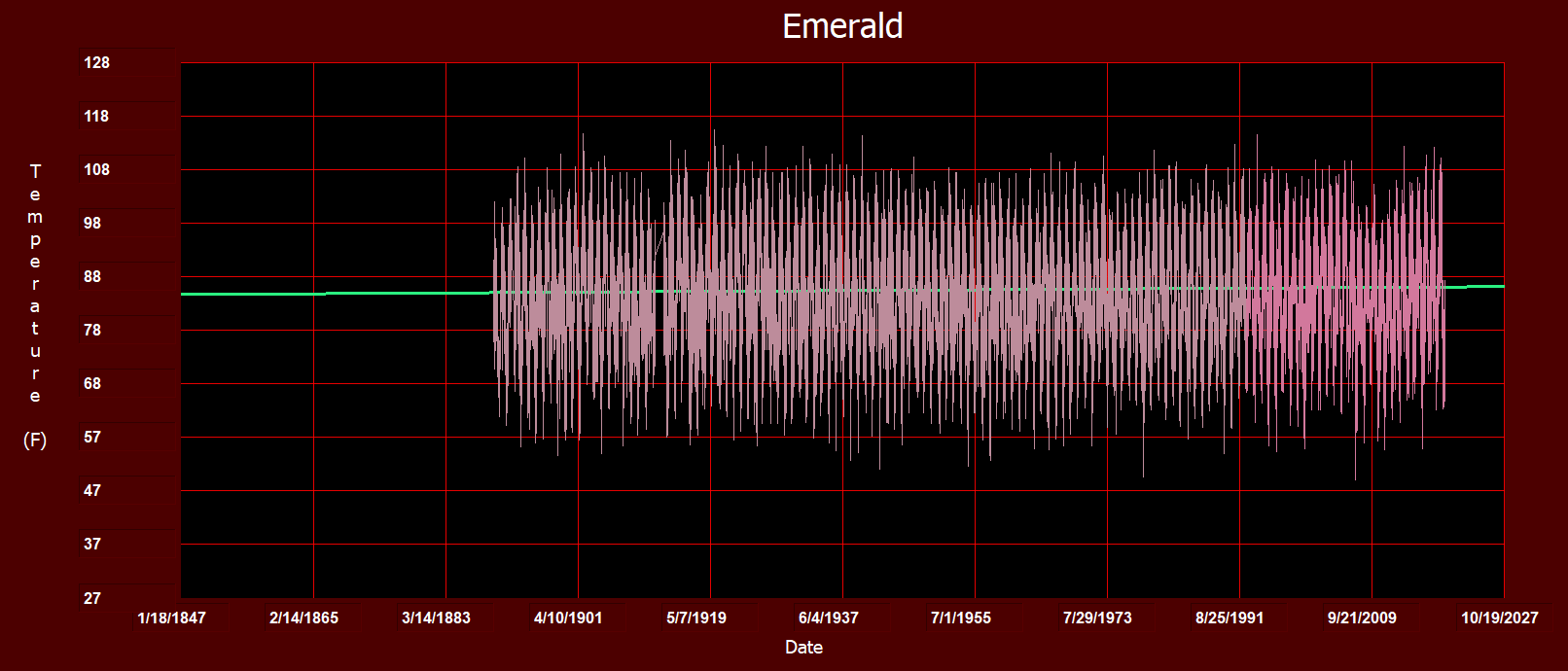
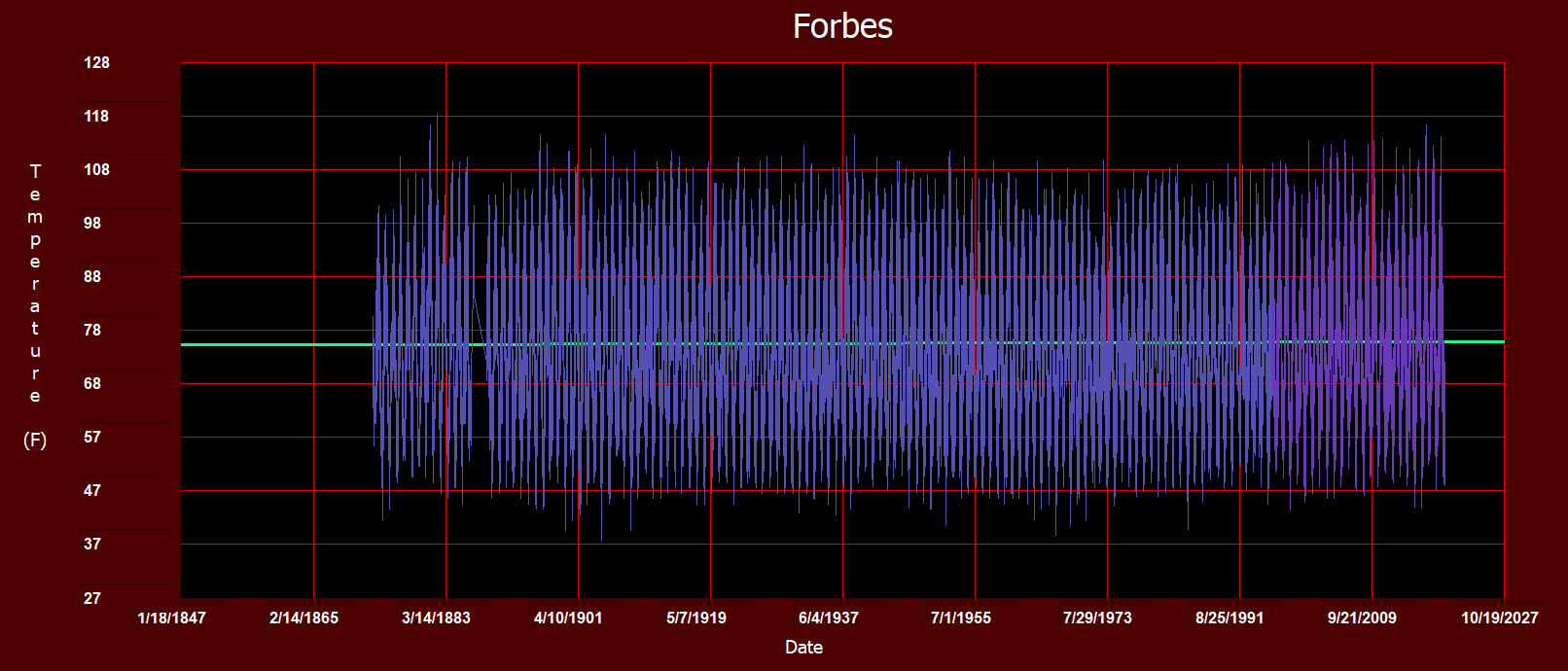
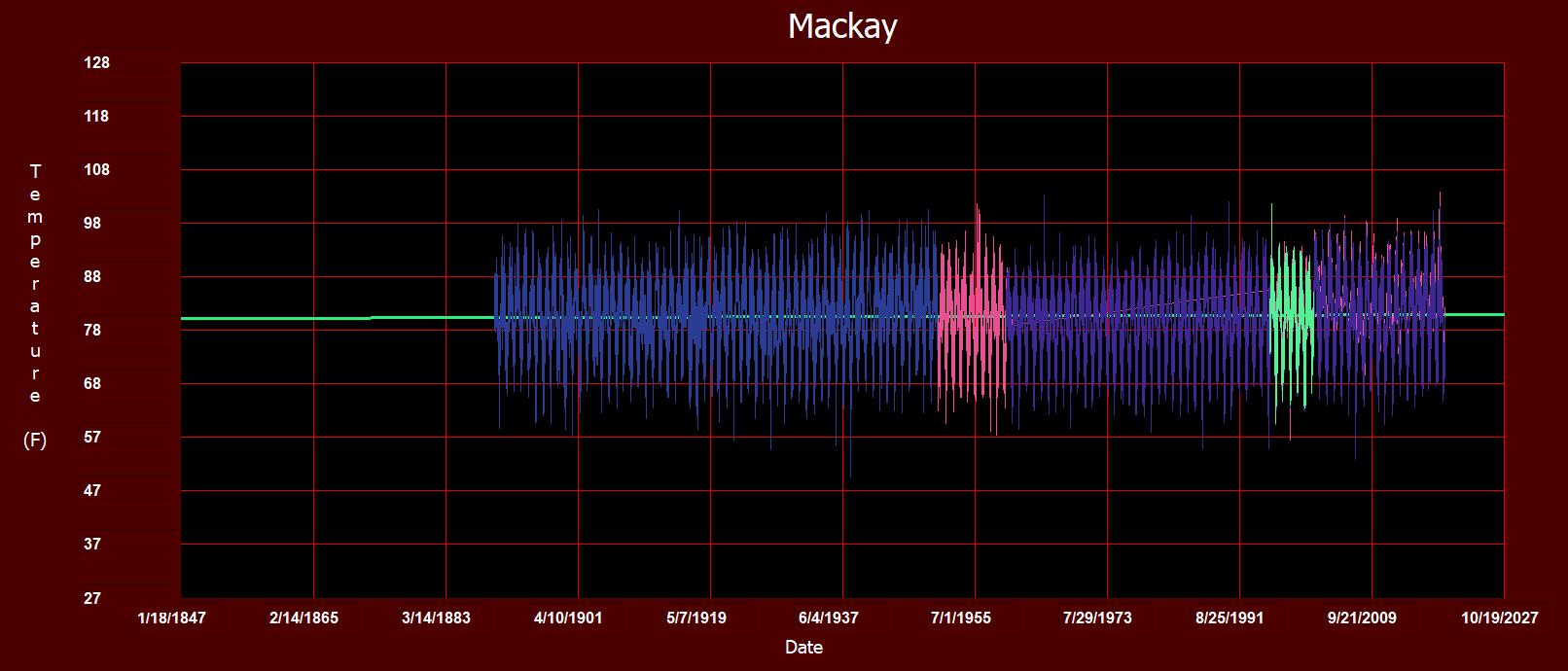
All of the locations with trend lines are shown below. Changes of color indicate a station change at the same city or town.
Something is wrong with the current Melbourne NOAA data.
To Tony’s followers,
1) Distorting perceptions of Australia’s temperature trends is globally important. A reason is: Oz is one of just a few countries south of the equator which has continuous temperature data going back to the mid and late 1800s. Southern Hemisphere data is vital to understanding the behavior of GLOBAL temperatures.
2) Others are confirming Tony’s analyses of temperature data manipulation around the world. One example is: http://clivebest.com/blog/ “A skeptics guide to global temperatures”. Pls overlook the grammatical errors. The points are valid and well supported.
Great Work, and Thank You!!
Thanks Tony for your efforts. Good timing because our Australian Medical Association (AMA) has declared a ‘Health Emergency’ because of ‘Climate Change’.
“The AMA president, Tony Bartone, argues the scientific evidence is clear. “There is no doubt that climate change is a health emergency. The AMA accepts the scientific evidence on climate change and its impact on human health and human wellbeing,” he says.”
https://www.theguardian.com/australia-news/2019/sep/03/australian-medical-association-declares-climate-change-a-health-emergency
Climate Disruption,
Climate Pollution,
Refugees,
Animals becoming smaller
and now even health.
This climate change is not just global but also so universal that more negative thing can be blame on it than on Trump.
And it is a perfect opportunity for those with mental issues to virtue signal .
this remark makes no sense.
Are you saying our president is to blame for climate change? which has happened one way or another over millennia? Really? REALLY? That would be a neat trick. How did you come up with that theory?
As usual, medicine continues to get science wrong. To call it ‘science based’ is an insult to science.
Just like the unfortunate CEO of BHP Andrew Mackenzie has recently stated. Another victim of the UN-EU environmental cabal.
Guardian story ??? Enough said
And ditto for this spring!
https://www.news.com.au/technology/environment/rare-antarctic-phenomenon-could-plunge-australian-temperatures-to-midwinter-lows/news-story/4ce69a7b65489d3dc8fbee64e5e0864b
Tony, do you have a map of the locations? I’m curious what coverage we are talking about here. I would assume the majority, if not all, are coastal (but I hate to assume).
TRM try reading the article
TRM. It really is disappointing when people are seemingly deliberately dopey. There is both a map and a list actually on this page of the stations involved, please instead of just looking for a smart arse comment do try reading.Tony thanks very much.?
I actually added the map after TRM asked for it.
Thank you Tony. I was going to see what I could do with Google Earth but thought I’d ask first.
Cheers to the others with the snarky uninformed comments.
Good for you TRM. hope you get the info you are looking for.
There is a wide distribution here, many inland.
Use Google Earth to find the locations. Only takes a few minutes
Very surprisingly good coverage. Almost half are inland. I was not expecting that. That is why I don’t like to assume.
Thanks again for putting the map up Tony.
Nice work. The idea of showing the change of position in the stations offers me more confidence in the quality of the analysis.
I recently checked, informally, the change in temperature data in Spain and I also see no warming. 2 funny things: in the AEMET (spanish agency of meteorology) page the data is not easily available (and it should), the temperatures checked for Portugal are not coherent with the Spanish ones, even if we are two adjacent countries.
Data from AEMET (given for free by another page different than AEMET), if you are curious.
https://datosclima.es/Aemethistorico/Meteostation.php
DM
The station data used in the analysis are clearly indicated above and a map showing station locations are provided.
You quote “Others are confirming Tony’s analyses of temperature data manipulation around the world. ” Yet I do not see any effort on your part to demonstrate how the above data presented has been “manipulated” . I would expect to see from you, your own work showing your data source and related material in order to counter what was presented.
It is a fair assessment that the Australian Bureau of Meteorology station data records are very fragmented and I have found it very difficult to generate anything useful from those records, you can even access the data on the website and see for yourself it is open and available to the public.
If anyone is distorting perceptions of Australia’s climate and trends, it is the Australian Bureau of Meteorology.
Tony
An outstanding job and we now have a true graph without “homogenisation” which shows basically no change since the early 1900s.
I have forwarded this to the IPA who have called for the homogenisation program to be investigated and they were very happy to receive this.
For us here in Australia we are fed a continual diet of warmist propaganda, and the current govt needs to hang its head in shame, with the BOM and CSIRO , on its watch, churning out questionable science, and we have ministers asleep at the wheel unprepared to ask hard questions and ensure that those under them are actually doing their job properly.
Quality assurance at the BOM is also debatable as we now have the below link showing over 70 BOM sites non compliant – but they still take the temps and use them anyway. Even though they are almost certainly distorted to the hotter (better for the BOM??) end of the temp scale. Tony has previously shown that one bad site will contaminate the data from others quite easily when homogenised.
https://kenskingdom.wordpress.com/
Thanks again!
Sounds like Auz could use a down under version of the USCRN.
https://wattsupwiththat.com/2017/11/08/the-uscrn-revisited/
No no significant trend in the continental US since its inception. I still wonder how real science like that can get done these days. Kudos to those involved with the USCRN as it is a class act.
Hi there!
I have a common question: Does somebody here know the mathematical definition and/or derivation of the NCEI-adjustments? (and/or the noaa adjustments?)
I have tried to google it and i found NOTHING. This is pretty strange, since if someone is convinced about his results, he is supposed to publish also the methods.
(I am a natural scientist, but not a metereologist, and i am trying to get a picture about this topic not relieing on second-hand data!)
Thank you in advance!
Tony, I noticed you didn’t use Hay (NSW) or Echuca (Vic). They have long temperature records going back to the 1880’s.
Deniliquin is also worth looking at
https://i.postimg.cc/D0TV5025/Deniliquin_Post_GISS&BoM.png
oops, Its already there. !
Why are you comparing means with maximums? All global warming measurement and discussion is about means.
There is good reason why climate alarmists choose to ignore maximum temperatures
“All global warming measurement and discussion is about means.” Makes it rather difficult to judge normal variation, wouldn’t you say ?
Ah yes, the meaningless means. They mean a lot to the creator, of means. Means nothing to me. But what they mean is critical.
I think I know what you mean.
David,
How many thermometer locations can you count here? (If it is too fast, on yousetube, you can slow it down to . 25.): https://realclimatescience.com/2019/09/new-video-stairway-to-climate-reality/
Is that enough means to satisfy you?
Tony,
the record of the daily minima for the 25 long -lived stations would be interesting as well.
I assume the daily average temperatures are simply the (maximum+minimum)/2?
Some big questions that need answers-
Who manipulated the raw data?
On who’s authority was it done?
Why was it done?
I suspect that – if the large urban centres were removed from the list – there would be a slight cooling trend.
Completely agree with High Treason!
Who had done this and why is nobody or anybody ever called to account officially.
Tony – You are as always doing an amazing job. I will be contributing again shortly.
Hi Tony, a few questions about this analysis:
1. Why do you use daily max? Why not the daily mean? Is there a justification for doing so? It seems to me that daily max is providing substantially different information than daily mean. You can’t say Australia has or hasn’t been warming based on the daily max alone (what if the daily max has stayed the same but the daily min has increased? This would be a profound effect climatically and would only be reflected in the daily average).
2. Why do you exclude any station that doesn’t go back to at least 1890? What about 1891? 1892? 1900? 1910? Why limit yourself to only the very longest station records? You lose most of the stations in Australia this way. In fact, Western Australia is almost not represented in your analysis.
3. What is the effect of station moves on your average? It’s clear that station moves are having huge impacts on the trend in these records (e.g. Brathurst has a complete trend reversal because of a station move in 1991). How are these moves being dealt with in your analysis?
4. How are you dealing with missing data? Brathurst above is a good example. You can’t do simple averaging across absolute temperatures this way when you have missing data in the station records because it will produce spurious trend changes in your average.
“This would be a profound effect climatically “
Yes, it would make things very much nicer.
COLD is the real worry for human existence.
The whole AGW farce is about places getting warmer.. they blather on endlessly when there is a tiny incremental high record set anywhere.
Well guess what, “Global warming” is not happening in Australia
“You can’t say Australia has or hasn’t been warming based on the daily max alone ”
Yes, but you can say there is no sign of DANGEROUS or runaway warming
There may not be runaway warming, but there is definitely runway warming.
AlJones1816:
Just looking at your first question, I think you need to flip it on its head. If there is a rising trend on the mean, but no rise in the max, where is the cause for alarm? Ask the climatologists how they build the case for claims of greater extremes from a study of trends in means.
+1
@Robert Swan,
I think there are other issues with the way Tony is aggregating the data, and I’m not convinced that the pattern he’s identified in the daily max is actually robust because of those (I admit I should just be looking at the data myself to answer these questions). But yes, I agree that it would be important information to know, my point is just that the daily max isn’t necessarily indicating whether a change is occurring overall.
He is not exaggerating anything.
Just reporting the data as is.
How can you exaggerate the FACT that nothing much is happening (unless you are a rabid climate alarmist)
The media only sensationalise reporting of maximum temps so what are you supposed to do to counter fight the bullshit?
The fact is that historical non-electronic weather stations have only ever reported the maximum and minimum temps and not the average for a day. And as Tony has reported even this may be subject to “Time of Observation Bias” if readings are not made twice a day.
AlJones1816:
In your earlier comment you said:
“You can’t say Australia has or hasn’t been warming based on the daily max alone”.
Is it not every bit as legitimate to base a “temperature of Australia” on some sort of mean of maxima as on some sort of mean of means? Why not?
Here you say that a lack of trend in daily max may not reflect a trend in mean. Very true, but the converse is true too. You cannot look at an upward trend in means and tell whether it’s the the min or max has risen, or that the range hasn’t changed at all and it’s just spending more time near the max.
Imagine an image with one pixel for every thermometer in the country. Now picture the image of the whole country’s temperature (however derived). What our host has done in this presentation is to give us a glimpse at what is being discarded in blurring the detailed picture down to one lousy pixel.
Douglas Adams gave us the answer to the ultimate question of life the universe and everything as 42. The climatologists have happened on a different number, but it’s equally useless.
On a scientific note, despite early sketchy data, the emergence of the nation from the lingering effects of the Little Ice Age appear to be well represented. Dont forget the Global Warming zealots at CRU in Britain and fellow travelers Mann and Gore have argued that the global LIA does not exist. No wonder the politicised Australian Bureau of Meteorolgy wont publish this data compilation or anything remotely like it.
Tony, while I agree wholeheartedly that there is no trend, it needs to be remembered that no Australian weather stations have stayed the same, which means that on a station by station basis, all continuous datasets consist of segmented or disjointed records. Also, before various types of Stevenson screens were introduced in the late 1800s, maximum temperature measured in ‘thermometer houses’, in the shade, or using open-fronted stands etc. was invariability warmer.
Of the 250 or so individual sites that I’ve researched (with the exception of Tennant Creek airport, but there could be others) Stevenson screens have been moved out of the way of developments, across the network all thermometers were replaced when they were metricated on 1 September 1972 (rainfall was metricated without a change of instrument in 1974) … telephone exchanges were built in post office yards through the 1940s and 1950s, microwave towers in the 1970s and 80s; SatComs were installed at 94 airports in 1986/87; post offices were air conditioned; dunnies in the yard were pulled down; expressways were opened, roads sealed and widened then from late 1990’s 230-litre screens were replaced with 60-litre ones, then automatic weather stations became primary instruments from 1 November 1996 …. get the picture, nothing stayed the same ANYWHERE. Further, most changes caused individual datasets to be warmer by a measurable up-step that cross referenced to a site change.
So the underlying assumption that T is measured relative to an unchanged ambient-base is invalidated EVERYWHERE. This also invalidates the supposed cycle.
Cheers,
Dr. Bill Johnston
AlJones1816
With regard to your first question, we know that minima in urban situations are increasing, due to UHI, so the mean (average of high and low) would be misleading.
It is only the maximum temperatures that get the media “scare” treatment, as the media does not understand UHI or “mean” and the warmist scientists do not want them to.
However, what Tony has done is shown that the 0.8degC in 100 years that seems the be the accepted figure for ”global warming” is a fiction, at least in Australia, and at least as far as maxima are concerned.
There’s no sea level rise, either.
Look at the photos!
https://en.wikipedia.org/wiki/Fort_Denison
What happens to the graph when you take out locations where UHI is likely to have had an effect? I suspect there is a slow downward trend in unchanged rural stations.
This is an invaluable resource..but..can you please provide more specific information about how you have come up with these graphs at the bottom?
Either a link to the specific data, or a description of how you produced these graphs?
This would make the link much more useful and shareable, because I only ever share things that are very well sourced (a habit everyone should follow).
Thank you,
Sasha
One of the worst pieces of data analysis I have ever seen! Taking only the Maximum average would totally ignore a period of the minimum temperature that was just under the maximum temperature for months and those charts wouldn’t show any difference at all!
Maximum temperature tend to stay relatively limited fortunately for us here on Earth due to specific heat. As the temperature rises so does evaporation of water in the soil and oceans etc. Otherwise really hot days could get over the boiling point of water. Evaporative air conditioners don’t do much cooling on cold days. This luckily will limit most days maximum temperatures. You might get a really, really hot day but it won’t be that much hotter than a really hot day. As the temperature goes up, it takes much more energy to raise it up further. An average of maximum temperatures is not a good indicator in terms of determining a warming trend as they tend to find a common peak of about 50 C anything over that is hard to achieve without extremely dry conditions. In damper regions you won’t even get near that, but the humidity could be a killer.
Wheere’s the data from Western Australia?
Your second figure contradicts your headline claim…. Would you care to fit a trendline to it and post the result?
Alternatively, if you can find an proper hypothesis to support your postulated “120 year wave”, could you derive some predictions from that as to the coming years? We should see a cooling soon or already, no? Maybe fit a sine wave with underlying trend and see what that results in?
In addition, what is the last point in that figure? If 2019, please correct the graph to include the full year and not only data up to September. If 2018, maybe show 2019 as well?
Another question: Wouldn’t it also be interesting to look at minimum temperatures? What’s the max supposed to mean anyway?
To be clear, you are using the same raw data from the 25 weather stations and coming up with different conclusions to the Bureau of Meteorology. And you are saying that BOM are either deliberately misleading the Government or being negligent in how they interpret the data? If so, why would they do this? Have you put your claims to it and what has the BOM said?