Thanks to Julienne for explaining what was going on around the periphery.
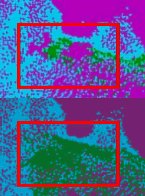
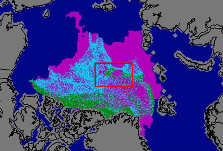
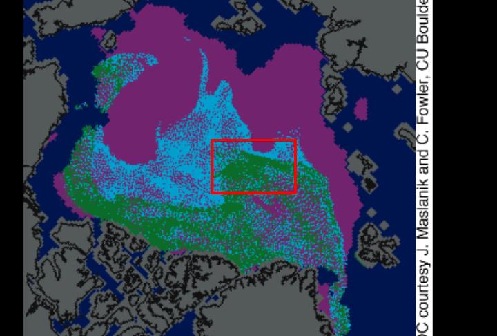
My questions have to do more with the interior. I made an animation (above) of one region – showing July/September normalised (i.e. adjusted for drift.) I think this makes my observation a little clearer.
Note that the thick multi-year ice (green) has almost all disappeared, while the thinner pink and blue ice from July is essentially untouched. There is no physical model I can think of where this kind of behaviour can happen.
I may be wrong, but it looks to me like something is amiss with either the July map or the September map.


Are they part of the astrologists that the astrophysicists are warning about?
http://climaterealists.com/index.php?id=6411&utm_source=feedburner&utm_medium=feed&utm_campaign=Feed%3A+ClimaterealistsNewsBlog+%28ClimateRealists+News+Blog%29
As I pointed out in your earlier post, that is one of the near-pole areas that saw substantial ice melt this year, down to a total concentration of ~60%. It is seen very clearly on Cryosphere Today, here:
http://igloo.atmos.uiuc.edu/cgi-bin/test/print.sh?fm=09&fd=05&fy=2010&sm=09&sd=05&sy=2010
… and also on the MODIS images should you care to look.
Given that there was 60% open water in this region at the start of September, the maximum possible percentage of multi-year ice there is 60%. The remaining 40% is first-year ice (in fact, a couple of weeks old). Assuming some of the 60% coverage at the date of the minimum was first- and second-year stuff, the multi-year percentage could have easily dropped below the 40% threshold.
You can say that this was due to tensile stress rather than melt, but the question for you is then: so where is the ice if it just got pulled apart rather than melting? Moreover, what forces did the pulling apart, given that at the time these holes open up the winds were blowing inwards towards the Pole (as you’ve often told us with regard to the ice edge retreat in late September)?
The plain fact is that a lot of multi-year ice near the Pole simply melted away this year, leaving large tracts of open water which are clearly visible in both microwave and visible wavelengths.
Edit to add: for the specific hole you highlight in your picture, the CT area map I linked shows that the total concentration dropped to around 40%, thus the multi-year ice concentration is also no more than 40%, hence it doesn’t count as “green” for the ice age map.
QED.
Again, you are looking at just one region. This also occurred in other regions of 95+% concentration ice.
How does first year ice survive adjacent to multi-year ice which melted?
Second edit: another potential mistake you’re making is to assume that the “pink” ice from the September map is the same as the “pink” ice in the July map. I would be surprised if this were the case: some of the September “pink” may be the newly-forming skim from after the yearly minimum, i.e. a couple of weeks old at most. It depends if it’s an end-September snapshot, a snapshot at the minimum itself, or an average across the month as a whole.
Finally (and perhaps Julienne can correct?), it may be that the ice age maps simply aren’t set up to cope with the idea of substantial open water within the pack. So, when you get an area that’s ~40% concentration of multi-year rubble floating in open water, as was the case for the area you highlight, it may end up colouring it as 1st year ice rather than as open water.
There is no new ice in the September map. Look at the East Siberian Sea.
Fair point, I guess it’s a snapshot at the minimum then. In which case I suspect it’s “filling in” anything that doesn’t qualify as 2-year (blue) or multi-year ice (green) with 1st-year ice (pink). That’s very obvious for the large polynyas and low-concentration areas in the pack.
Maybe a better way to represent the data would be as simple RGB values against a black background, with 1-year ice in the R channel, 2-year ice in B and multi-year ice in G. That would then show the overall ice concentration as well as age.
Specifically, for the region you box, I suspect it’s something like 35% multi-year ice, 5% 2y/1y ice and 60% open water. Thus under my proposal it would be represented as a dim green area (low concentration multi-year ice) rather than bright pink.
I’m writing up another post from an area north of Greenland which was close to 100% concentration all summer.
I’m looking at the region you highlighted, Steven. Why zoom in on it and box it if you don’t want to discuss it? Especially since you acknowledge Julienne has already explained “what was going on around the periphery” – i.e. the 95% concentration areas you’re now pointing at.
I see we are headed off into straw man territory.